
Your analytics dashboard says traffic is up. Your bounce rate looks acceptable. But signups are flat, and you have no idea why. The gap between traffic numbers and actual conversions is almost always a friction problem, and the standard metrics most website analyzers surface do a terrible job of explaining it. This article breaks down the specific analyzer metrics that actually predict where visitors get stuck, confused, or give up before converting.

- Standard metrics like page views and bounce rate tell you what happened but not why visitors failed to convert.
- Cognitive load indicators, interaction hesitation patterns, and scroll-to-action ratios are far better predictors of conversion friction.
- Tracking these friction-specific metrics lets you fix the actual comprehension barriers that cost you signups and sales.
Vanity metrics hide the real problem
Most website analyzer tools default to the same handful of numbers: sessions, bounce rate, average time on page, pages per session. These are fine for a board deck. They are nearly useless for diagnosing why a visitor who landed on your pricing page left without clicking "Start free trial."
The issue is that these metrics describe behavior at a surface level. A 45-second average time on page could mean visitors read everything and decided it was not for them. Or it could mean they spent 40 seconds trying to figure out what your product does and gave up. Same number, completely different problem.
Conversion friction is the cognitive and experiential resistance a visitor encounters between arriving on a page and completing the desired action. It is not the same as a slow load time or a broken button. Friction lives in unclear headlines, ambiguous CTAs, walls of text, jargon-heavy copy, and layouts that force visitors to think too hard about what to do next.
Metrics that actually predict friction

Here are the specific metrics worth tracking, grouped by what they reveal about visitor experience.
Interaction hesitation time
This measures the delay between a page fully loading and the visitor's first meaningful interaction (click, scroll, form focus). A long hesitation window signals that visitors are scanning the page and struggling to orient themselves. On a well-structured landing page, first interaction should happen within 3-5 seconds. If your analyzer shows 10+ seconds of dead time, your above-the-fold content is not doing its job.
Scroll depth vs. CTA position
Scroll depth alone is misleading. What matters is the relationship between how far visitors scroll and where your primary call-to-action sits. If 70% of visitors never scroll past 40% of the page, and your CTA is at the 60% mark, you have a structural friction problem. The fix is not "make the page shorter." The fix is understanding why visitors stop scrolling at that point.
Rage clicks and repeated clicks
Rage clicks are rapid, repeated clicks on the same element. They indicate a visitor expected something to happen and it did not. This could be a non-clickable element that looks clickable, a button that appears unresponsive, or a link that does not behave as expected. Any analyzer worth using should flag these automatically.
Form field abandonment sequence
For pages with forms, tracking which field visitors abandon on is critical. If 35% of users drop off at the "company size" field, that specific question is creating friction. Generic form completion rates hide this entirely.
Reading pattern disruption
Advanced analyzers can detect when scroll behavior shifts from steady reading to erratic jumping. This pattern suggests the visitor lost comprehension and started scanning desperately for something recognizable. It is one of the strongest signals of cognitive overload on a page.
"The conversion rate curve is our favorite, unique part of our Continuous Experience Optimization platform.">, Conversion Rate Curve
Common mistakes when measuring friction

Teams make the same errors repeatedly when trying to diagnose conversion friction. Recognizing these saves months of wasted optimization effort.
- Averaging everything. A 3-second average interaction time means nothing when half your visitors interact in 1 second and the other half take 8 seconds. Segment by traffic source, device, and new vs. returning visitors.
- Ignoring mobile separately. Friction on mobile is structurally different. Tap targets, text size, and scroll behavior create entirely different comprehension barriers. Always analyze mobile sessions independently.
- Treating bounce rate as a friction metric. A high bounce rate on a blog post is normal. A high bounce rate on a pricing page is a problem. Context determines whether a metric signals friction or expected behavior.
- Optimizing for speed alone. Yes, page speed matters. But a page that loads in 1.2 seconds and confuses every visitor is still a conversion killer. Speed is necessary but not sufficient.
Step-by-step friction audit process

Here is a practical workflow for identifying and fixing conversion friction using analyzer metrics. The process diagram below shows the high-level flow.
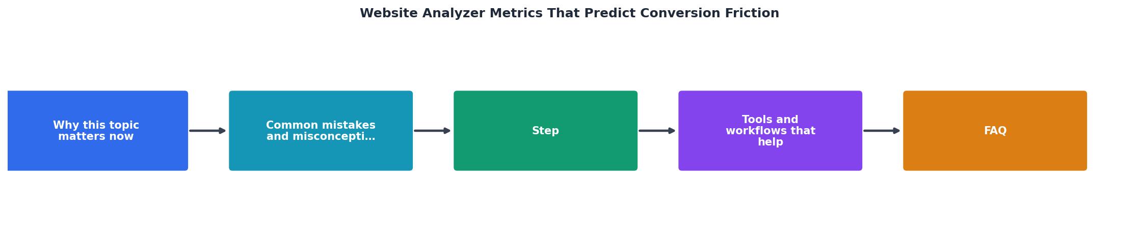
The steps break down like this:
- Identify high-value pages. Start with the pages that get the most traffic and have the clearest conversion goal: landing pages, pricing pages, signup flows. Do not try to audit your entire site at once.
- Collect friction-specific data. Set up tracking for hesitation time, scroll depth relative to CTA placement, rage clicks, and form field abandonment. Tools like Hotjar, FullStory, or PagePerson Insights can surface these.
- Segment by audience. Break the data by device type, traffic source, and new vs. returning visitors. Friction patterns differ dramatically across segments.
- Map friction hotspots. Overlay the data on your actual page layout. Where do visitors hesitate? Where do they rage-click? Where does scroll behavior break down?
- Prioritize by revenue impact. A friction point on a page that gets 10,000 monthly visits and feeds your primary signup flow matters more than one on a secondary blog post.
- Fix and re-measure. Make one change at a time. Re-collect data for at least one full week before evaluating impact.
Tools and workflows that help
Not every website analyzer surfaces friction-relevant metrics. Here is what to look for when choosing or configuring your stack.
- Session replay tools (FullStory, Hotjar, Microsoft Clarity): Look for rage click detection, scroll heatmaps with percentile breakdowns, and form analytics. Clarity is free and surprisingly capable for basic friction detection.
- Cognitive accessibility analyzers (PagePerson Insights): These go beyond standard UX metrics to flag comprehension barriers, reading level mismatches, and cognitive load issues that traditional tools miss entirely.
- A/B testing platforms (VWO, Optimizely, Google Optimize successor tools): Once you identify a friction point, you need a way to test fixes. Pair friction data with controlled experiments.
- Custom event tracking (Google Analytics 4 with custom events, Segment): Set up events for hesitation thresholds, scroll milestones relative to CTA positions, and form field focus/blur sequences.
Friction Metrics Dashboard
| Standard Metrics | Friction-Specific Metrics |
|---|---|
| Bounce rate | Hesitation time before first interaction |
| Time on page | Scroll depth relative to CTA position |
| Pages per session | Rage click frequency and location |
| Form completion rate | Per-field abandonment sequence |
| Page load speed | Cognitive load and reading pattern disruption |
The friction audit checklist
Conversion Friction Audit Checklist
Your progress is saved automatically in your browser.
FAQ
Frequently Asked Questions
What friction metric has been most revealing for your site? I would love to hear which signals actually changed how you optimize.
Additional Resources
- Conversion Rate Curve | Blue Triangle - Discover the impact of site performance on your bottom line with our Conversion Rate Curve to create an optimal, frictionless experience for maximum ROI.
- Understanding the New Conversion Analysis Metrics - By looking at Total Visits alongside Conversion Rate, you can determine if your site's performance issues are a result of "top-of-funnel" ...
- Conversion Rate Optimization for Financial Services ... - A practical framework for improving conversion rates on financial services sites without sacrificing compliance, security, or trust.