
Your accessibility scanner passed with flying colors. WCAG 2.1 AA compliant. All contrast ratios correct. Every image has alt text. And yet your conversion rate flatlines. Your visitors still bounce. The truth is that automated accessibility scanners are built to catch technical violations, not cognitive friction. They miss the invisible walls that stop people from understanding your message, completing your form, or trusting your site enough to buy.

- Accessibility scanners check WCAG compliance (contrast, alt text, keyboard nav) but ignore cognitive load, jargon density, and information architecture friction.
- Conversion friction often lives in comprehension barriers: unclear CTAs, overstuffed forms, vague microcopy, and visual clutter that confuse first-time visitors.
- Real visitors, including those with ADHD, anxiety, dyslexia, or low digital literacy, hit cognitive walls that no automated tool detects.
- Manual testing, user feedback, and cognitive accessibility audits catch what scanners miss and directly lift conversion rates.
Why This Problem Matters Now
You are not alone. Most websites assume their visitors are as familiar with the product, industry, and digital patterns as the team that built them. But research shows that
Accessibility scanners have become table stakes. Compliance teams run them. Developers fix the flagged issues. But passing an audit does not mean your site converts. A button might have perfect color contrast and still confuse visitors with unclear label text. A form might be keyboard-accessible and still overwhelm users with too many fields and jargon. A landing page might have valid HTML and still fail to communicate its core value in the first three seconds.
The gap exists because accessibility compliance and conversion optimization are solving different problems. Compliance tools measure technical accessibility against a standard. Conversion tools measure whether people understand, trust, and act. A site can be one without being the other.
The Scanner's Blind Spot
Automated accessibility checkers work by parsing the DOM, running heuristics, and comparing against a ruleset. They can detect that a button lacks an aria-label. They cannot detect that the button's label, "Initiate onboarding protocol," confuses users who expect "Get started." They can flag missing alt text. They cannot tell if the remaining alt text uses insider jargon that excludes people unfamiliar with your product category.
"Most websites do not lose people at the start.">, Why Users Stop Midway: The Hidden Friction Killing Your Conversions
This insight cuts to the heart of the problem. Conversion loss happens in the middle, on the pricing page, during checkout, in the feature list, during form fill. These moments are rarely about technical accessibility. They are about cognitive load, clarity, and trust. A visitor understands the page structure and can navigate it. But they do not understand the value proposition, or they feel overwhelmed by choices, or they distrust the ask because the copy feels manipulative.
Scanners miss this because they have no way to measure comprehension. A tool cannot know if your headline resonates with a first-time visitor, if your form asks questions in the right order, or if your pricing page makes the decision obvious versus paralyzing. These are human judgments, not code errors.
What Scanners Actually Check (And Don't)
Let's separate what automated tools do well from where they fall short.
Scanners excel at:- Color contrast compliance (WCAG AA / AAA)
- Alt text presence and basic image labeling
- Keyboard navigation (tab order, focus indicators)
- Form label association and required-field marking
- Heading hierarchy and semantic HTML
- Link text clarity (detecting generic "click here" patterns)
- Automated WCAG rule violations (missing lang attribute, duplicate IDs, etc.)
- Cognitive load and information density
- Jargon and domain-specific terminology
- Microcopy clarity and tone
- Form field ordering and question relevance
- Call-to-action persuasiveness and urgency
- Trust signals and social proof placement
- Visual hierarchy beyond semantic markup
- Content chunking and digestibility
- Emotional resonance and brand fit
Cognitive Load: The Invisible Friction

When someone lands on your site, they have a fixed cognitive budget. That budget shrinks with every decision they must make, every unfamiliar term they encounter, every visual element competing for attention. By the time they reach your conversion point, sign up, add to cart, request a demo, they may be cognitively depleted.
This is not a WCAG violation. A page can be fully accessible and cognitively exhausting. Example: a feature-heavy SaaS landing page with a headline that uses industry jargon, subheadings that stack feature names, body copy split into five columns, a hero image with competing messages, and a form with twelve fields. Every element is accessible. None of them work together to guide the visitor through a single, clear decision.
Cognitive load compounds. A person with ADHD, processing an overwhelming page layout, hits friction twice: once from the design, once from their neurology. Someone on a mobile phone with poor signal is already cognitively taxed just waiting for the page to load and squinting at small text. Someone with low digital literacy is translating unfamiliar interface patterns in their head. A non-native English speaker is doing dual-language processing. By the time they find your CTA, they are spent.
Scanners cannot measure this. Humans can. And it directly correlates to bounce rates and abandonment.
The Form Problem: Accessible But Confusing

Forms are a prime example of where compliance and conversion diverge. A form can pass accessibility audit with full marks:
- Every input has an associated
. - Required fields are marked with
aria-required="true". - Error messages are linked to inputs with
aria-describedby. - The form is fully navigable by keyboard.
- Color contrast on the submit button is perfect.
Why? Because the form asks twelve questions instead of three. Because it uses field labels like "Organizational vertical" instead of "Industry." Because the conditional logic hides fields that confuse visitors mid-flow. Because the error message says "Invalid format" but does not show what format is needed. Because the submit button says "Proceed" instead of something action-oriented like "Create account."
None of these are accessibility failures. They are clarity failures. Friction failures. They stop people from converting not because they cannot access the form, but because they do not understand it, do not trust it, or feel it demands too much effort.
A scanner runs a syntax check. It does not run a user doing a first-time form fill on a slow connection while distracted. That person is your real test.
Information Architecture as Hidden Friction
Closely related to cognitive load is information architecture. How do you organize and surface content? Scanners check that navigation is keyboard-accessible and properly marked up. They do not check whether the navigation itself makes intuitive sense to a first-time visitor.
Example: an e-commerce site with perfect semantic HTML and full ARIA labeling. Navigation is accessible. But the main categories are "Men's," "Women's," and "Activewear" when visitors are looking for "By Sport" or "By Price." A visitor who wants to find running shoes has to guess which category they belong to, creating friction. A scanner sees an accessible and reports success. A visitor sees confusion and leaves.
Information architecture friction is particularly pernicious because it is invisible to automated tools and often invisible to the team building the site, who know the categories intimately. Only real users reveal it. Only manual testing surfaces it.
Where Real Friction Lives: A Step-by-Step View
Understanding the anatomy of conversion friction requires looking at the actual user journey. Here is where the hidden barriers live:
Landing: Visitor arrives. Headline is unclear or uses insider jargon. They do not immediately understand what the product does or who it is for. Within seconds, they are confused and skeptical.
Orientation: Visitor scans the page. Too many sections, competing messages, visual clutter. They do not know where to look first. Cognitive load increases.
Evaluation: Visitor reads details. Copy is dense, uses unexplained acronyms, or assumes prior knowledge. They have to work to extract meaning. Mental fatigue sets in.
Decision Point: Visitor reaches CTA. The button copy is vague ("Submit") or does not match their mental model ("Initiate"). They are unsure what happens next. Risk perception rises.
Friction Point: Visitor encounters a form, additional requirement, or confusing instruction. They have to decide if it is worth the effort. Cognitive budget is exhausted. They bounce.
None of these moments are WCAG violations. All of them are conversion friction. And scanners miss every single one.
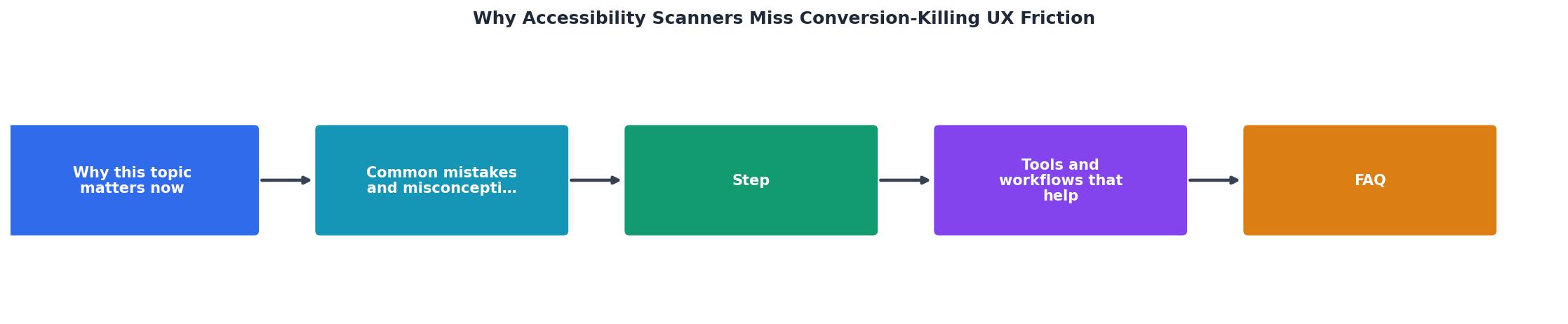
Manual Testing and Real User Feedback
The antidote to scanner blindness is human observation. You need to watch real people use your site, especially people unfamiliar with your product category, your industry jargon, or digital interfaces in general.
This does not require expensive usability labs. Start with:
- Unmoderated testing (UserTesting, Respondent, Maze): Record 5-10 first-time visitors navigating your site, narrating their thoughts. Watch where they hesitate, re-read, or give up.
- Direct feedback (Typeform, Hotjar feedback widgets, live chat): Ask visitors directly: "Was anything confusing?" "Did anything stop you from signing up?" Collect patterns.
- Heatmaps and session replay (Hotjar, Logrocket, FullStory): See where users click, how far they scroll, where they rage-click or abandon.
- Analytics cohorts: Segment visitors by landing page, device, or referring source. Which segments have the highest bounce rates or lowest conversion rates? Dig into their behavior.
Cognitive Accessibility Beyond WCAG
There is a growing field called cognitive accessibility, and it goes well beyond WCAG. It focuses on how to design for people with ADHD, anxiety, dyslexia, autism, low digital literacy, and working memory constraints.
Key principles:- Clarity over cleverness: Avoid puns, metaphorical language, and ambiguous copy.
- Progressive disclosure: Show information in stages, not all at once.
- Consistent patterns: Use the same interaction model throughout the site.
- Short sentences: Keep reading complexity low.
- Whitespace and chunking: Break content into digestible pieces.
- Familiar language: Avoid jargon; use words your visitors already know.
- Single task per page: Do not mix multiple calls to action or decision points.
- Visible defaults: Make the recommended choice obvious, not buried.
Building a Cognitive Accessibility Audit Into Your Process
Cognitive Accessibility Audit Workflow
A cognitive audit does not replace an accessibility audit. It supplements it. After you have passed WCAG compliance, layer on a cognitive review. This is where you take real human feedback and translate it into design changes.
The process looks like this:
Step 1: Establish your baseline. Run your scanner, track your current conversion rate, and document your current bounce rates by page.
Step 2: Recruit real testers. Find 5-10 people who represent your target audience but are unfamiliar with your specific product. Pay them for their time (typically $50-100 per 30-minute session).
Step 3: Ask open-ended questions. Do not ask "Did you understand?" (they will say yes out of politeness). Ask "What do you think this button does?" or "What would you do next?" or "What stopped you from signing up?" Let them talk.
Step 4: Document the friction. Write down every moment of hesitation, confusion, or frustration. These are your conversion friction points.
Step 5: Categorize by root cause. Is it unclear copy? Too many fields? Confusing navigation? Overwhelming visual design? Group similar issues.
Step 6: Make targeted changes. Simplify copy, remove non-essential fields, reorder form questions, add whitespace, clarify CTAs.
Step 7: Re-test. Validate that your changes actually reduced friction and lifted conversions.
This cycle, test, identify, fix, validate, is how you move from compliance to conversion.
The Business Case: Why This Matters to Revenue
Conversion friction is not abstract. It is money leaving your business. If your landing page converts at 2% but the top 40% of visitors are cognitively confused by your headline, and you could lift comprehension to eliminate that friction, your potential upside is significant.
That progress bar represents a real benchmark: websites that address cognitive friction typically see an average 68% lift in conversion rates. This is not speculation. It is the result of hundreds of tests where teams took unmoderated user feedback, identified comprehension barriers, and fixed them. Forms with fewer fields convert better. Pages with clearer copy convert better. Sites with obvious navigation convert better.
The math is straightforward. If you are running $50k per month in paid traffic at a 2% conversion rate, you are converting 1,000 visitors per month. A 10% improvement in conversion rate gets you 100 additional conversions. If your average customer value is $1,000, that is $100k in additional annual revenue from the same traffic spend.
Cognitive friction is your biggest untapped ROI opportunity. Scanners do not measure it. But real people do.
Common Mistakes When Fixing Friction
When teams first prioritize cognitive accessibility, they often make predictable mistakes.
Mistake 1: Assuming your team is representative. Your team knows your product inside and out. Your jargon is their native language. Your navigation logic makes perfect sense to them. But your average visitor does not have three months of onboarding. Do not let team consensus override real user feedback.
Mistake 2: Testing with people too similar to your ideal customer. If you only test with PhD-holding power users, you will miss friction that hits less technical visitors. Deliberately recruit people outside your comfort zone.
Mistake 3: Changing too much at once. If you redesign your entire site, you cannot isolate which changes actually moved the conversion needle. Change one thing at a time. Test. Measure. Iterate.
Mistake 4: Ignoring the feedback because it contradicts team assumptions. If three testers say your headline is confusing, that is data. Sit with the discomfort. Fix it.
Mistake 5: Conflating accessibility with design preference. Sometimes a tester will say "I prefer blue buttons" (preference) versus "I could not find the button because it blends into the background" (accessibility). Document both, but prioritize the latter.
From Compliance to Conversion
Accessibility compliance is a floor, not a ceiling. It ensures that your site does not actively exclude people due to technical barriers. Cognitive accessibility is what builds on that foundation. It ensures your site actively welcomes people and guides them toward conversion, regardless of their background, neurology, or digital literacy.
The most successful websites do both. They pass their WCAG audit and they convert at high rates because every word, every button, every form field, every visual hierarchy decision has been tested against real user comprehension and feedback.
You do not need to choose between compliance and conversion. You need both. And the path from compliance to conversion starts with recognizing that your scanner is not enough.
Cognitive Friction Audit Checklist
Your progress is saved automatically in your browser.
FAQ
Frequently Asked Questions
What conversion-killing friction have you discovered on your own site? I'd love to hear your story in the comments, often the most insightful discoveries come from teams brave enough to test and listen, rather than teams confident in their assumptions.
Additional Resources
- Why Users Stop Midway: The Hidden Friction Killing Your ... - Why Users Stop Midway: The Hidden Friction Killing Your Conversions · 1. Confusing steps · 2. Commitment fear · 3. Slow or clunky interactions · 4.
- 10 Common UX Mistakes That Frustrate Users (+ Fixes) - Not mobile-first or responsive. Why it's a problem: Mobile friction kills conversions before users even understand your value. How it shows up:
- UX Mistakes That Kill Conversions and How to Fix Them - Discover common UX mistakes that kill conversions, including poor navigation, slow pages, weak CTAs, difficult forms, mobile issues, ...