
Your website copy looks clean to you and your team. But roughly one in five visitors processes information differently due to ADHD, dyslexia, anxiety, or other cognitive conditions. They land on your page, hit a wall of dense text or ambiguous instructions, and leave without converting. The fix is not a redesign. It is rewriting your content with plain language, clear structure, and visual support so every visitor can actually understand what you offer.

- Use plain language (short sentences, common words, one idea per paragraph) to reduce cognitive load.
- Structure content with descriptive headings, bullet lists, and consistent layouts so readers can scan and navigate.
- Add visual aids like diagrams, icons, and whitespace to reinforce meaning without relying on text alone.
- These changes improve comprehension for users with cognitive disabilities and boost conversion for everyone.
Why accessible content matters
About 15-20% of the global population has some form of cognitive disability. That includes dyslexia, ADHD, autism spectrum conditions, intellectual disabilities, and acquired brain injuries. These are not edge cases. They are a significant chunk of your traffic.
When content is inaccessible to these users, they bounce. They do not fill out your form, read your pricing page, or complete checkout. The result is lost revenue from traffic you already paid to acquire.
Cognitive accessibility also overlaps with general usability. Stressed users, distracted mobile readers, non-native speakers, and older adults all benefit from the same writing techniques. Fixing content for cognitive accessibility lifts conversion across the board.
How plain language helps
Plain language means writing so the reader understands the first time they read it. No jargon. No compound sentences stacked three deep. No assumptions about prior knowledge.
Here is what plain language looks like in practice:
- Short sentences. Keep them under 20 words when possible. One idea per sentence.
- Common words. Use "start" instead of "commence." Use "help" instead of "facilitate."
- Active voice. "We process your order in 24 hours" beats "Your order will be processed within a 24-hour timeframe."
- Defined terms. If you must use a technical word, define it immediately in parentheses or the next sentence.
- Consistent vocabulary. Pick one word for a concept and stick with it. Do not alternate between "account," "profile," and "dashboard" for the same thing.
Users with dyslexia process unfamiliar words more slowly. Users with ADHD lose focus on long, complex sentences. Plain language removes those barriers without dumbing anything down. You are respecting the reader's time and attention.
Clear headings and structure
A wall of text is hostile to everyone. For someone with a cognitive disability, it is a dead end.
Headings act as signposts. They let readers scan the page, find what they need, and skip what they do not. Effective heading structure follows these rules:
- Use a logical hierarchy. H1 for the page title, H2 for main sections, H3 for subsections. Never skip levels.
- Make headings descriptive. "How to reset your password" tells the reader exactly what follows. "Getting started" does not.
- Keep headings short. Six to eight words maximum. Long headings defeat the purpose of scanning.
- Front-load keywords. Put the most important word first. "Password reset steps" scans faster than "Steps you can take to reset your password."
"It's your developer team's job to make the site accessible, but from then on, the torch is passed onto the content team.">, Accessible Writing Techniques for Web Content
Content creators own this. No amount of ARIA labels or semantic HTML compensates for a 400-word paragraph with no subheadings.
Visual aids reinforce meaning

Text alone is not enough for many users with cognitive disabilities. Visual aids create a second channel of understanding that reinforces written content.
Effective visual aids include:
- Icons next to key actions. A magnifying glass for search, a cart for checkout, a checkmark for confirmation. These reduce reliance on reading every label.
- Diagrams and flowcharts. Show processes visually instead of describing them in long paragraphs.
- Screenshots with annotations. When explaining a multi-step task, show the actual interface with numbered callouts.
- Consistent color coding. Use green for success, red for errors, blue for informational messages. Keep this consistent across every page.
- Whitespace as a visual aid. Generous margins and padding between sections reduce visual clutter and help users with attention difficulties focus on one block at a time.
The accessible writing process

Writing accessible content is not a one-time task. It is a repeatable process you apply to every page, every update, every new feature announcement. Here is the workflow that works:
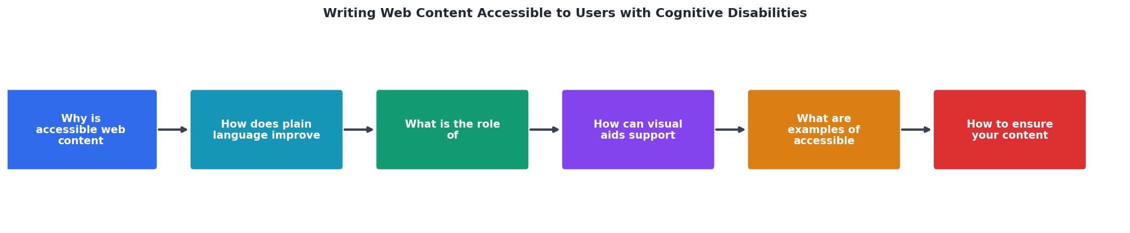
The steps break down like this:
- Audit existing content. Identify pages with high bounce rates or low conversion. These are your starting points.
- Check readability. Run text through a readability tool. Target grade 6-8 reading level.
- Simplify language. Replace jargon, shorten sentences, switch to active voice.
- Add structure. Insert headings, break up long paragraphs, convert lists from prose to bullets.
- Add visual support. Include icons, diagrams, or screenshots where text alone is insufficient.
- Test with real users. If possible, include participants with cognitive disabilities in usability testing.
- Iterate. Review analytics after changes. Did bounce rate drop? Did conversion improve? Adjust and repeat.
The following interactive card shows what a typical content accessibility audit might reveal on a single landing page:
Example: Landing Page Audit Results
| Before Rewrite | After Rewrite |
|---|---|
| Grade 12 reading level | Grade 7 reading level |
| 28-word average sentences | 14-word average sentences |
| No headings in body | H2 every 150-200 words |
| Zero visual aids | Icons + 1 diagram |
| 4 undefined jargon terms | All terms defined inline |
| 62% bounce rate | 44% bounce rate |
Real examples of accessible content
Several organizations demonstrate what accessible web content looks like at scale:
- Gov.uk strips every page to plain English, short paragraphs, and task-focused headings. Their design system documentation is a masterclass in clarity.
- Mailchimp's Content Style Guide provides specific rules: write at a grade 5-7 level, avoid idioms, define technical terms. It is publicly available and worth studying.
- Apple's support pages pair step-by-step numbered instructions with annotated screenshots. Each step is one action, one sentence.
- NHS.uk writes health information at a reading age of 9-11. Complex medical topics become understandable without losing accuracy.
Web Content Accessibility Checklist
Your progress is saved automatically in your browser.
FAQ
Frequently Asked Questions
What is the first page on your site you would rewrite for cognitive accessibility? Share your starting point below.
Additional Resources
- Accessible Writing Techniques for Web Content - When you write in plain language, you remove barriers for users with cognitive disabilities and make your content easier for everyone to ...
- Writing for Web Accessibility – Tips for Getting Started - This page introduces some basic considerations to help you get started writing web content that is more accessible to people with disabilities.
- Designing Digital Content For Users With Cognitive ... - Use plain, straightforward language, avoiding jargon, complex sentences, and ambiguous terms. · Present information in manageable sections and avoid overcrowding ...