Creating an Accessible Color Contrast Palette for Anxiety Reduction
Designing a website that is both visually appealing and accessible can be challenging, especially when considering the impact of color on user experience. The right color contrast can not only enhance readability but also reduce anxiety for users, making your site more welcoming and user-friendly. In this guide, we'll explore how UX designers can create an accessible color contrast palette that reduces user anxiety, enhancing both cognitive accessibility and conversion.

Designing a website that is both visually appealing and accessible can be challenging, especially when considering the impact of color on user experience. The right color contrast can not only enhance readability but also reduce anxiety for users, making your site more welcoming and user-friendly. In this guide, we'll explore how UX designers can create an accessible color contrast palette that reduces user anxiety, enhancing both cognitive accessibility and conversion.

TL;DR: Learn how to create color palettes that enhance cognitive accessibility and reduce anxiety. This guide covers color theory principles, calming color combinations, and tools for testing contrast, helping designers create user-friendly websites.
Understanding color contrast is essential in UX design. It’s more than just picking colors that look good together; it’s about ensuring that everyone, including those with visual impairments or anxiety, can interact with your website comfortably. By mastering color contrast, designers can significantly improve user experience and potentially increase conversion rates.
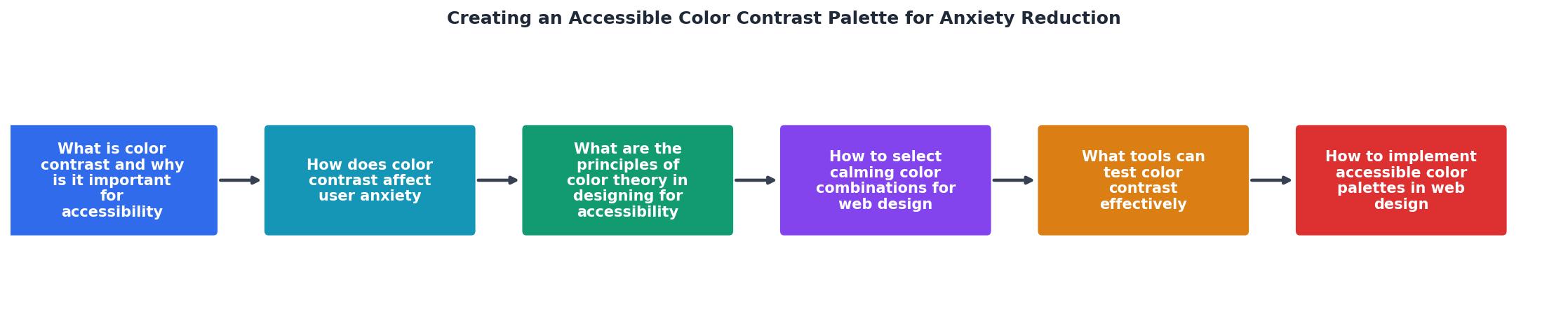
What is Color Contrast and Why is it Important for Accessibility?
Color contrast refers to the difference in luminance or color that makes an object distinguishable from others and the background. High contrast is crucial for readability, especially for users with visual impairments such as color blindness. It also plays a significant role in making sure that text and images are clear and easy to perceive.

How Does Color Contrast Affect User Anxiety?
Color can significantly influence emotions and perceptions. Poor color contrast can lead to frustration, confusion, and anxiety, especially for users who already experience these feelings regularly. When users struggle to read or understand content due to poor color choices, it increases their cognitive load, potentially causing them to leave your site.
Using calming color combinations can help mitigate these issues. Soft blues, greens, and neutral tones are generally considered calming and can help reduce anxiety levels. On the other hand, high contrast colors like bright reds or yellows can be stimulating and may increase anxiety if not used carefully.
What are the Principles of Color Theory in Designing for Accessibility?
Color theory is the art and science of using color effectively. It includes understanding the color wheel, color harmony, and the context of how colors are perceived. Here are some key principles:
- Complementary Colors: These are colors located opposite each other on the color wheel. While they create high contrast, they can be overwhelming if used excessively.
- Analogous Colors: These are colors that sit next to each other on the color wheel. They are harmonious and pleasing to the eye, making them ideal for backgrounds.
- Triadic Colors: This involves three colors evenly spaced around the color wheel, providing balance and vibrancy.

How to Select Calming Color Combinations for Web Design
Selecting calming color combinations is crucial to reducing user anxiety. Here are some effective palettes:
- Blue and Green: Known for their calming effects, they are perfect for backgrounds and large areas.
- Light Gray and Soft White: These colors provide a neutral, clean look that reduces visual clutter.
- Muted Pastels: Soft pinks, purples, and yellows can add a touch of warmth and friendliness.
What Tools Can Test Color Contrast Effectively?
Several tools can help you test and improve color contrast on your website:
- WebAIM Contrast Checker: This tool allows you to enter foreground and background colors to check their contrast ratio.
- Color Oracle: A color blindness simulator that helps you see what your design looks like to someone with color vision deficiencies.
- PagePerson Insights: This Chrome extension analyzes websites for cognitive accessibility, including color contrast issues.

How to Implement Accessible Color Palettes in Web Design
Implementing an accessible color palette involves several steps:
- Research and Plan: Understand your audience and their needs. Consider any specific requirements for accessibility.
- Choose Your Palette: Use color theory principles to select a harmonious and accessible color palette.
- Test Your Palette: Use tools to ensure your colors meet accessibility standards.
- Iterate and Improve: Gather feedback from users and be open to making changes.
"I decreased the opacity of one of the squares by 50%, and used the color dropper to find the hex code for an approximate solid color.">, How to design an accessible color scheme
Steps to Create and Implement an Accessible Color Palette
Your progress is saved automatically in your browser.
FAQ
Frequently Asked Questions
How do you plan to incorporate accessible color contrast into your next project? Share your thoughts in the comments below!
Additional Resources
- How to design an accessible color scheme | by Katie Riley - I set out on a journey to create a new color scheme with higher-contrast, more accessible colors. It took some time and thought to get it right.
- Tips to Create an Accessible and Contrasted Color Palette - Two tools and some quick tips to easily create an accessible contrasted color palette for your designs, whether it's web, ui or even mobile ...
- Accessible Color Palette Generator | WCAG Compliant - Discover beautiful color combinations your whole audience can appreciate with the click of a button. Try our free accessible color palette generator today.
Need Help with Accessibility?
Improve your site's accessibility and conversion rates with our AI-powered analysis.
Get Started