Analyzing A/B Test Results to Enhance Website Comprehension
You ran an A/B test on your landing page. The tool says Variant B won. You ship it, and conversions stay flat. The problem is rarely the test itself.

You ran an A/B test on your landing page. The tool says Variant B won. You ship it, and conversions stay flat. The problem is rarely the test itself. It is how you read the results, what you ignore in the data, and how quickly you jump from a green badge to a deploy button. This guide walks through a repeatable process for analyzing A/B test results so the changes you ship actually improve how visitors understand your site.
- Statistical significance alone does not make a test worth shipping. Pair it with practical significance and segment-level analysis.
- Structure your analysis around a clear hypothesis, pre-set success metrics, and a minimum detectable effect before looking at results.
- Translate raw numbers into comprehension-focused insights: did visitors understand the page better, not just click more?
Why A/B Testing Drives Comprehension
A/B testing is the closest thing to a controlled experiment you get on a live website. You show two versions of a page to comparable groups of visitors and measure which version produces better outcomes. But "better outcomes" should not stop at click-through rate. When the goal is website comprehension, you measure whether visitors understood the offer, found the information they needed, and took the intended action without confusion.
A pricing page test, for example, might compare a feature-matrix layout against a simplified three-card layout. The click rate on "Start Free Trial" could be identical, yet time-on-page, scroll depth, and support ticket volume tell a different story. The simplified layout reduced cognitive load, and visitors reached the button with less effort.
Running tests without enough traffic is the single biggest waste of testing resources. Before you analyze anything, confirm your sample size was adequate for the effect you wanted to detect.
Statistical Methods for Result Analysis

Three concepts matter every time you open a results dashboard:
- Statistical significance tells you whether the observed difference is likely real or just noise. A p-value below 0.05 (95% confidence) is the standard threshold. Most tools like Google Optimize, VWO, and Optimizely calculate this automatically.
- Confidence intervals show the range of plausible effect sizes. A conversion lift of 3% with a confidence interval of -1% to 7% is not the same as 3% with a range of 2% to 4%. The tighter the interval, the more you can trust the point estimate.
- Practical significance asks whether the measured lift justifies the cost of implementation. A 0.2% improvement on a page that gets 500 visits a month will not move revenue.
"Check both statistical significance and practical significance, a statistically significant 0.1% lift may not justify the engineering and design cost of shipping the change.">, Analyze A/B Testing Results
Bayesian vs. Frequentist Approaches
Frequentist testing gives you a binary answer: significant or not. Bayesian testing gives you a probability that one variant is better than the other (e.g., "92% chance Variant B beats Control"). For comprehension-focused tests where effect sizes tend to be smaller, Bayesian methods let you make nuanced decisions instead of waiting for a hard significance threshold.
Real Examples of Comprehension Gains

Concrete cases show what good analysis looks like in practice:
- Shopify checkout flow: A SaaS company tested a single-page checkout against a multi-step wizard. Raw conversion was nearly identical. But segment analysis revealed that first-time buyers converted 12% higher on the wizard because each step had a clear label and progress indicator. Returning customers preferred the single page. Without segmentation, the test would have been called a draw.
- SaaS pricing page: Replacing a dense feature comparison table with a "recommended plan" highlight and a short FAQ section below reduced support tickets about plan differences by 30%. The A/B test measured not just signups but also post-signup plan-change requests within 7 days.
- Content-heavy landing page: An education platform tested long-form copy against a version with expandable accordion sections. Bounce rate dropped 18% on the accordion variant, and scroll depth increased. Visitors consumed more content without feeling overwhelmed.
Drawing Actionable Insights
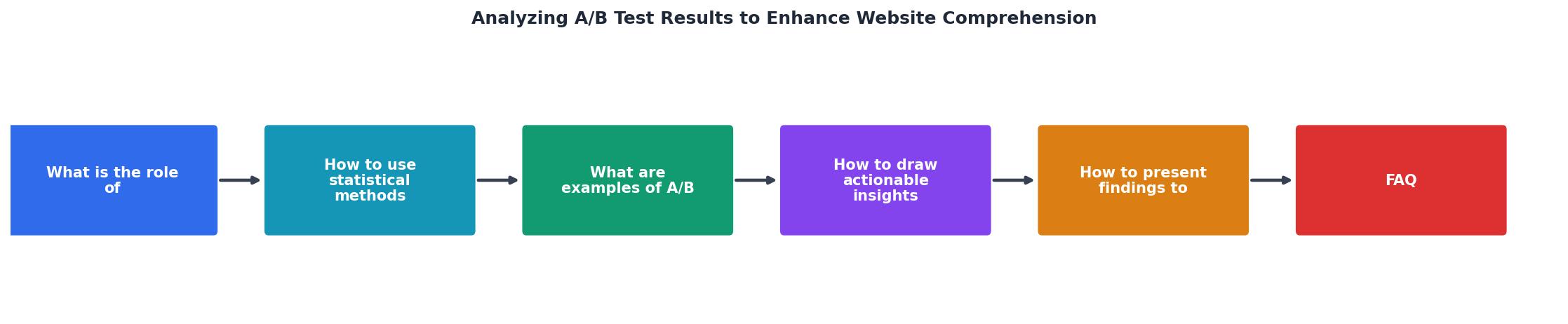
Follow these steps after every test concludes:
- Confirm validity. Check sample size, test duration (at least one full business cycle), and whether any external events skewed traffic.
- Read the primary metric. Did the variant beat the control with sufficient confidence?
- Check secondary metrics. Time on page, scroll depth, rage clicks, form abandonment, and support queries all signal comprehension changes.
- Segment the data. Break results by device, traffic source, new vs. returning visitors, and geography. A variant that wins on desktop but loses on mobile is not a universal win.
- Calculate practical impact. Multiply the lift by your monthly traffic and average order value (or signup value). Is the dollar impact worth the engineering effort?
- Document the hypothesis, result, and next test. Every test should feed the next one.
The following dashboard illustrates what a structured post-test summary looks like when you track both conversion and comprehension metrics side by side:
Example: Post-Test Summary Dashboard
Presenting Findings to Stakeholders

Stakeholders do not care about p-values. They care about revenue, risk, and effort. Structure your presentation around three questions:
- What did we test and why? One sentence on the hypothesis. "We tested a simplified pricing layout because 40% of visitors dropped off before reaching the CTA."
- What happened? Lead with the business metric. "Signups increased 28% with 96% confidence. Support tickets about pricing dropped by a third."
- What should we do next? Recommend shipping, iterating, or running a follow-up test. Include the estimated revenue impact over 90 days.
Common Pitfalls in Stakeholder Communication
- Showing too many metrics. Pick the primary metric and one or two supporting ones. Everything else goes in an appendix.
- Ignoring inconclusive results. A test that shows no difference is still valuable. It tells you the change does not matter, and you can focus effort elsewhere.
- Overstating confidence. If the confidence interval includes zero, say so. Credibility compounds over time.
A/B Test Analysis Checklist for Stakeholder Presentations
Your progress is saved automatically in your browser.
FAQ
Frequently Asked Questions
scipy.stats library handles both frequentist and Bayesian approaches. The tool matters less than understanding what the numbers mean.Additional Resources
- How to analyze and interpret A/B testing results - Start by checking the A/B test results to see if a winner has been declared, or for other information such as which variation is currently winning.
- Analyze A/B Testing Results - In this article, we'll dive deep into the world of A/B testing analysis, exploring key metrics, advanced techniques, and common pitfalls to avoid.
- Boost Your Website Success with A/B Testing - Learn A/B testing basics, best practices, and see how we increased conversions from 3% to 10% with one simple button change.
Need Help with Accessibility?
Improve your site's accessibility and conversion rates with our AI-powered analysis.
Get Started