Best Practices for Cognitive Accessibility on Wix
Wix powers over 250 million websites, yet most of them fail basic cognitive accessibility checks. Standard accessibility tools catch missing alt text and low contrast ratios, but they completely ignore whether a visitor with ADHD, dyslexia, or anxiety can actually understand the page. If your Wix site looks great but confuses real people, you are losing visitors and you do not even know why.

Wix powers over 250 million websites, yet most of them fail basic cognitive accessibility checks. Standard accessibility tools catch missing alt text and low contrast ratios, but they completely ignore whether a visitor with ADHD, dyslexia, or anxiety can actually understand the page. If your Wix site looks great but confuses real people, you are losing visitors and you do not even know why.

- Cognitive accessibility on Wix goes beyond WCAG contrast checks: it covers reading ease, navigation clarity, and predictable interactions.
- Choose templates with clean layouts, simplify your menu structure to five or fewer top-level items, and keep body text at a 16px minimum with generous line height.
- Run a structured audit using the checklist below to catch the issues automated scanners miss entirely.
What cognitive accessibility actually means
Most designers know WCAG. Color contrast, keyboard navigation, screen reader support. That is the visual and motor layer. Cognitive accessibility addresses a different question: can a person with limited working memory, attention difficulties, or reading challenges actually process what your page says and do what you want them to do?
On Wix specifically, this matters because the platform gives you enormous design freedom. Drag-and-drop editors let you place elements anywhere, pick any font combination, and stack animations on top of each other. Freedom without guardrails creates cognitive overload fast.
That number is not hypothetical. Cognitive and learning disabilities affect a significant portion of any audience. Add situational impairments like stress, multitasking, or using a phone in bright sunlight, and the percentage climbs higher.
Why Wix sites need special attention
Wix's drag-and-drop editor creates a specific set of cognitive risks:
- Inconsistent layouts across pages because each page is designed independently.
- Decorative animations enabled by default in many templates.
- Complex navigation menus with nested dropdowns that work on desktop but collapse unpredictably on mobile.
- Auto-playing media that splits attention and increases cognitive load.
"Limited motor-function accommodations: People whose motor function range limits the use of a mouse or touchpad, may instead use a keyboard coupled with visual indicators to navigate through a site.">, Accessibility: Checklist for Improving Your Site's Accessibility
Keyboard navigation is one piece. Cognitive accessibility requires you to think about what happens after the visitor reaches an element: do they understand it?
Choose the right template

Not all Wix templates are equal. Some start you off with clean, single-column layouts and clear heading hierarchies. Others pile on parallax scrolling, background videos, and overlapping text boxes.
When evaluating a template for cognitive accessibility, look for:
- Single-column or simple grid layouts that guide the eye top to bottom.
- Clear heading hierarchy with distinct visual differences between H1, H2, and H3.
- Minimal animation out of the box. You can always add motion later; removing baked-in animations is harder.
- Consistent navigation placement across all page types (home, about, contact, blog).
- Readable default fonts like Open Sans, Lato, or Roboto at 16px or larger.
Simplify navigation structure
A Wix site with seven top-level menu items, each containing three to five sub-items, creates a navigation tree of 20+ choices. That is too many decisions for someone scanning your site for the first time.
Best practices for Wix navigation:
- Limit top-level items to five or fewer. Group related pages under clear parent labels.
- Use descriptive labels. "Services" is better than "What We Do." "Pricing" is better than "Plans & Packages."
- Avoid mega menus. Wix supports them, but they dump dozens of links on screen at once. Use simple dropdowns with three to four items max.
- Keep the menu in the same position on every page. Wix lets you use different headers per page. Do not do this.
- Add a visible breadcrumb trail on content-heavy sites so visitors always know where they are.
Enhance text readability

Text readability is where most Wix sites fail cognitively. The editor makes it trivially easy to pick a thin decorative font at 14px with tight line spacing. It looks elegant in the editor. It is unreadable on a phone.
Concrete readability rules for Wix:
- Body text: 16px minimum, 18px preferred. In the Wix editor, set this in the theme manager so it applies globally.
- Line height: 1.5x the font size. For 16px text, that is 24px line height.
- Paragraph width: Keep text blocks under 75 characters per line. On Wix, this means constraining your text column width rather than letting it stretch full-screen.
- Font choice: Stick to sans-serif fonts for body text. Wix offers hundreds of fonts; ignore most of them. Open Sans, Inter, and Source Sans Pro are solid choices.
- Contrast: WCAG requires 4.5:1 for normal text. Aim for 7:1 when possible. Use a contrast checker before publishing.
- Left-align body text. Centered text works for short headings. For paragraphs, it creates ragged edges that slow reading.
The audit process step by step
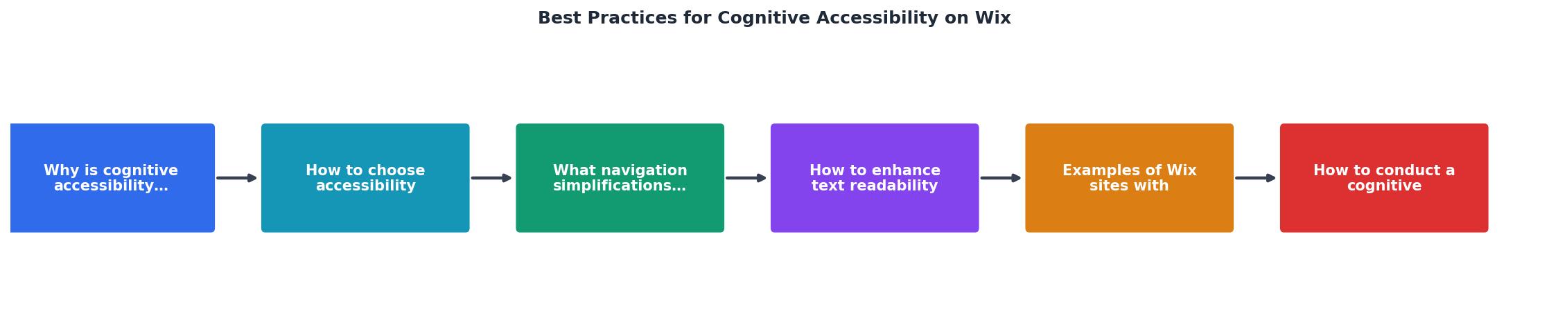
A structured audit catches issues that casual review misses. Follow these steps in order:
- Select template with a clean, single-column layout.
- Simplify navigation to five or fewer top-level items with descriptive labels.
- Set readable typography globally through the Wix theme manager.
- Remove distracting animations and auto-playing media.
- Test with real users who represent diverse cognitive profiles.
- Run PagePerson Insights to surface cognitive barriers that manual review and standard accessibility tools miss.
- Iterate and retest after each round of fixes.
Here is an example dashboard showing what a typical Wix site audit might reveal before and after applying these practices:
Example: Wix Site Cognitive Audit Results
Real examples worth studying
A few categories of Wix sites consistently get cognitive accessibility right:
- Single-product e-commerce sites that use Wix Stores with one clear call-to-action per page, minimal menu items, and large product images with short descriptions.
- Professional service sites (therapists, consultants) that use the "Business" template category with straightforward "About / Services / Contact" navigation.
- Non-profit sites built with Wix's accessibility-focused templates that default to high-contrast color schemes and simple layouts.
Wix Cognitive Accessibility Audit Checklist
Your progress is saved automatically in your browser.
FAQ
Frequently Asked Questions
prefers-reduced-motion media query and can be paused. Better yet, remove non-essential animations entirely.Additional Resources
- Checklist for Improving Your Site's Accessibility | Help Center - Set your site's language · Enable visual indicators · Check your site's DOM order · Prepare your site structure · Prepare your images and galleries · Prepare your ...
- Web Accessibility - Make Your Wix Website Accessible - Get a Wix Professional to audit your site and make any necessary adjustments to ensure compliance with the WCAG 2.0 accessibility guidelines for your region.
- Building Inclusive Websites with Wix - Choose clear fonts – Use legible and easily readable fonts, and maintain a sufficient font size and color contrast to improve readability.
Need Help with Accessibility?
Improve your site's accessibility and conversion rates with our AI-powered analysis.
Get Started