Auditing Cognitive Accessibility in Ecommerce Checkouts
In the bustling world of ecommerce, the checkout process is a critical point where user experience can make or break a sale. Yet, cognitive accessibility, ensuring that users of all abilities can navigate and complete these processes, is often overlooked. Simplifying user flows, reducing cognitive load, and optimizing text and button clarity are key strategies to enhance user experience. This article will guide you through auditing your checkout process for cognitive accessibility, leading to improved conversions and customer satisfaction.

In the bustling world of ecommerce, the checkout process is a critical point where user experience can make or break a sale. Yet, cognitive accessibility, ensuring that users of all abilities can navigate and complete these processes, is often overlooked. Simplifying user flows, reducing cognitive load, and optimizing text and button clarity are key strategies to enhance user experience. This article will guide you through auditing your checkout process for cognitive accessibility, leading to improved conversions and customer satisfaction.

TL;DR: Auditing cognitive accessibility in ecommerce checkouts involves simplifying user flows, reducing cognitive load through design, and optimizing text and button clarity. Successful implementations can lead to improved conversions and user satisfaction.
Understanding and improving cognitive accessibility in ecommerce checkouts is not just a trend, it's a necessity. As more people engage with digital platforms, ensuring that these experiences are accessible to everyone becomes crucial. Cognitive accessibility focuses on how people perceive, understand, and interact with digital content. By addressing this, ecommerce platforms can remove barriers that prevent users from completing purchases, ultimately boosting conversion rates and customer loyalty.
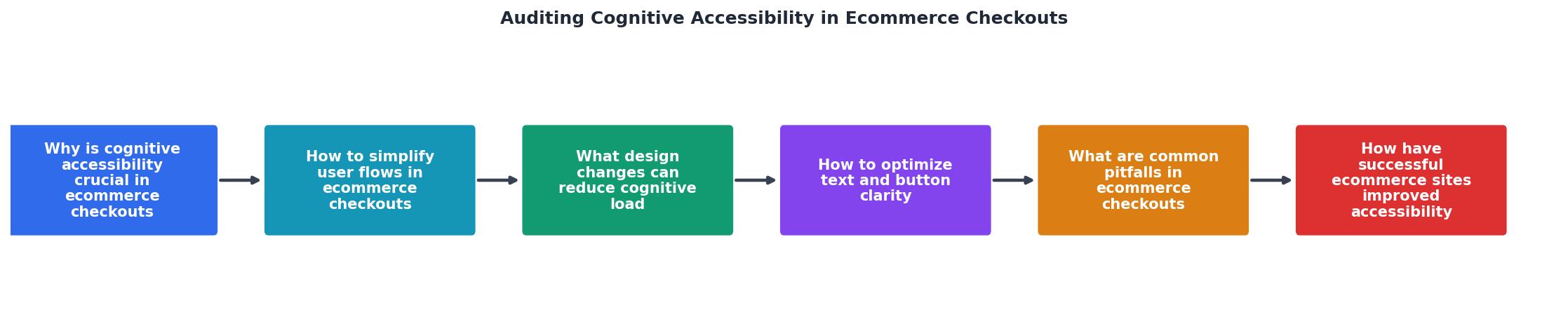
Why is cognitive accessibility crucial in ecommerce checkouts?
How to simplify user flows in ecommerce checkouts?

Simplifying user flows is about making the checkout process as intuitive as possible. Start by mapping out the current flow and identifying any unnecessary steps. Each step in the checkout should have a clear purpose and be easy to understand. Consider implementing a one-page checkout process, which can reduce the cognitive load by minimizing the number of steps a user needs to take.
Key strategies include:
- Streamlined Navigation: Use clear, descriptive labels and avoid jargon.
- Progress Indicators: Show users where they are in the checkout process.
- Guest Checkout Options: Allow users to purchase without creating an account.
What design changes can reduce cognitive load?

Design plays a crucial role in reducing cognitive load. A clean, uncluttered interface makes it easier for users to focus on the task at hand. Use high-contrast colors for text and buttons to enhance readability. Ensure forms are simple, with only essential fields required.
How to optimize text and button clarity?
Text and buttons are fundamental components of any checkout process. Use simple, straightforward language that is easy to read and understand. Buttons should have clear, action-oriented labels such as "Complete Purchase" or "Proceed to Payment." Ensure that text is not only readable but also provides necessary information without overwhelming the user.
Techniques include:
- Consistent Language: Use the same terminology throughout the checkout.
- Action-Oriented Buttons: Clearly indicate what will happen when clicked.
- Accessible Fonts: Use fonts that are easy to read on all devices.
What are common pitfalls in ecommerce checkouts?
Common pitfalls in ecommerce checkouts include overly complicated processes, lack of mobile optimization, and poor error handling. These issues can frustrate users and lead to cart abandonment. It's crucial to test your checkout process regularly and gather user feedback to identify and fix these problems.
How have successful ecommerce sites improved accessibility?
Successful ecommerce sites have made significant strides in improving accessibility. For instance, some have implemented voice-activated checkouts to assist users with disabilities. Others have simplified their forms and integrated real-time validation to prevent errors before submission.
"The idea is that at individual scales the additional load is ignorable, but at mass scraper levels it adds up and makes scraping much more expensive."
— Making sure you're not a bot!, Investigating cognitive accessibility in the check
Steps to audit ecommerce checkouts for cognitive accessibility
Conducting a cognitive accessibility audit involves a systematic review of your checkout process to identify and rectify barriers. Here’s a step-by-step guide:
Cognitive Accessibility Audit Checklist
Your progress is saved automatically in your browser.
FAQ
Frequently Asked Questions
Curious about how your ecommerce checkout stacks up? Share your thoughts and experiences in the comments below!
Additional Resources
- Investigating cognitive accessibility in the checkout process - This study concludes that adopting cognitive accessibility to a web interface of the checkout on an e-commerce website is beneficial and ...
- Accessible Checkout in Ecommerce accessibility audit - Improve conversions & compliance by fixing checkout accessibility barriers. Learn why an accessible checkout is a crucial step in ecommerce ...
- A Guide to Accessibility Audits and Improvements - This blog post will delve into the critical aspects of e-commerce website accessibility audits and improvements. We'll explore the “why,” the “ ...
Need Help with Accessibility?
Improve your site's accessibility and conversion rates with our AI-powered analysis.
Get Started