Conducting a Full Cognitive Accessibility Audit for New Websites
You launched a new website, traffic is flowing in, but conversions sit stubbornly below expectations. The design looks clean, the copy reads well to your team, and the analytics show visitors landing on the right pages. What the analytics do not show is that a significant chunk of those visitors cannot process your content fast enough to act on it, and a cognitive accessibility audit is the fastest way to find out why.

You launched a new website, traffic is flowing in, but conversions sit stubbornly below expectations. The design looks clean, the copy reads well to your team, and the analytics show visitors landing on the right pages. What the analytics do not show is that a significant chunk of those visitors cannot process your content fast enough to act on it, and a cognitive accessibility audit is the fastest way to find out why.

- A cognitive accessibility audit evaluates whether your website's structure, language, and interactions create unnecessary mental effort for visitors.
- The process covers navigation clarity, content readability, cognitive load in forms, and consistency of visual patterns.
- Prioritize findings by conversion impact, fix the highest-friction barriers first, and re-audit quarterly to keep comprehension high.
What is a cognitive accessibility audit?
A standard accessibility audit checks contrast ratios, alt text, and keyboard navigation. A cognitive accessibility audit goes deeper. It asks: can a first-time visitor with average attention, limited working memory, or a condition like ADHD, dyslexia, or anxiety actually understand what this page wants them to do?
That distinction matters for revenue. When visitors struggle to parse a headline, decode a navigation menu, or figure out what happens after clicking a button, they leave. They do not file a complaint. They do not send feedback. They just bounce, and your cost-per-acquisition climbs.
The audit systematically catalogs every point where cognitive friction exists: ambiguous labels, walls of text, inconsistent layouts, jargon-heavy copy, and unclear calls to action. Each finding gets a severity rating tied to its effect on comprehension and conversion.
"Around 1 in 5 people in the UK are disabled or neurodivergent.">, Website Accessibility Audits
That one-in-five figure only covers diagnosed conditions. Add situational impairments (stress, multitasking, poor connectivity, small screens) and the audience affected by cognitive barriers grows much larger.
Spot common cognitive barriers

Before you open any tool, you need to know what you are looking for. Cognitive barriers are design or content choices that increase the mental effort required to complete a task. Here are the most frequent offenders on new websites:
- Ambiguous navigation labels - "Solutions" and "Platform" mean nothing to a first-time visitor who does not know your product category yet.
- Dense paragraph blocks - Paragraphs longer than five sentences without subheadings or bullet points force visitors to hold too much information in working memory.
- Inconsistent interaction patterns - A button that looks like a link on one page and a filled rectangle on another creates hesitation.
- Jargon and acronyms - Internal shorthand that leaked into public-facing copy. If a visitor needs to Google a term to understand your value proposition, you lost them.
- Unclear error states - Form validation that says "Invalid input" without explaining what valid input looks like.
- Auto-playing media and animations - Motion that competes with the primary content for attention, especially harmful for visitors with ADHD or anxiety.
- Overloaded choices - Pricing pages with six tiers, feature comparison tables with 40 rows, or landing pages with five competing CTAs.
Most new websites ship with at least three of these issues. The audit's job is to find every instance, not just the obvious ones.
Evaluate site structure

Site structure determines how quickly a visitor builds a mental model of where things are and how to get to them. A confusing structure forces visitors to think about navigation instead of your product.
Check navigation depth
Count the clicks from the homepage to every key conversion page (signup, pricing, contact, product demo). Anything beyond three clicks adds friction. Map the full navigation tree and look for:
- Dead-end pages with no clear next step
- Orphan pages reachable only through search or direct links
- Duplicate paths to the same content (confusing when labels differ)
Audit the information hierarchy
Open each page and ask: what is the single most important action here? If the answer is not obvious within five seconds, the hierarchy needs work. Check that:
- H1 headings communicate the page purpose, not a clever tagline
- Visual weight (size, color, position) guides the eye toward the primary CTA
- Secondary content does not compete with the main message
Test breadcrumbs and wayfinding
Breadcrumbs, progress indicators, and "you are here" markers reduce cognitive load by offloading memory. On multi-step flows (checkout, onboarding, application forms), verify that every step shows the visitor where they are in the sequence and how many steps remain.
Tools that assist the audit

No single tool covers every cognitive accessibility dimension, but combining a few gets you solid coverage.
- WAVE (WebAIM) - Free browser extension. Flags structural issues, missing labels, and reading order problems. Good starting point for any audit.
- axe DevTools (Deque) - Automated WCAG testing integrated into Chrome DevTools. Catches technical violations that overlap with cognitive issues (missing form labels, empty headings).
- Hemingway Editor - Paste your page copy in and get a readability grade. Aim for grade 8 or below for general audiences.
- PagePerson Insights - Chrome extension built specifically for cognitive accessibility. It analyzes how real visitors with different cognitive profiles experience your pages and surfaces the comprehension barriers that generic tools miss.
- Lighthouse (Chrome) - Built into Chrome DevTools. The accessibility score is a useful baseline, though it skews toward technical WCAG compliance.
| Tool | Cognitive Focus | Cost |
|---|---|---|
| WAVE | Structural issues, reading order | Free |
| axe DevTools | WCAG violations, form labels | Free / Paid |
| Hemingway Editor | Readability grade level | Free / Paid |
| PagePerson Insights | Cognitive load, comprehension barriers | Extension |
| Lighthouse | Baseline accessibility score | Free |
Use automated tools for the first pass, then follow up with manual review. Automated scanners catch roughly 30-40% of accessibility issues. The rest requires human judgment.
Test content readability
Readability is not about dumbing things down. It is about reducing the processing effort per sentence so visitors spend their mental energy on decisions, not decoding.
Measure reading level
Run every key page through a readability scorer. The Flesch-Kincaid Grade Level is the most widely used metric. For SaaS landing pages and e-commerce, target grade 7-9. For technical documentation, grade 10-12 is acceptable if the audience expects it.
Check sentence and paragraph length
- Sentences over 25 words increase re-reading rates
- Paragraphs over 4-5 sentences on screen (not in a word processor, on the actual rendered page) create visual walls
- Bulleted lists outperform paragraphs for any content with three or more parallel items
Audit microcopy
Microcopy includes button labels, form field placeholders, error messages, tooltips, and confirmation screens. This is where cognitive friction hides because teams rarely review microcopy with the same rigor as headline copy.
Check that every button label answers "what happens when I click this?" A button that says "Submit" is worse than one that says "Create my account." A link that says "Learn more" is worse than "See pricing details."
The audit process flow
This diagram shows the six-step sequence from start to implementation. Each step feeds into the next.
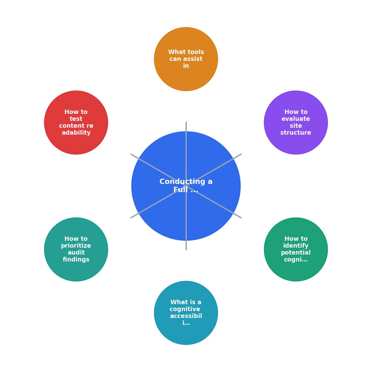
The steps in order:
- Define scope - Pick the pages and flows to audit (start with highest-traffic conversion paths).
- Automated scan - Run WAVE, axe, and Lighthouse on every in-scope page.
- Manual review - Walk each flow as a new visitor; document every friction point.
- Readability check - Score all copy; flag anything above target grade level.
- Prioritize findings - Rank by conversion impact and fix difficulty.
- Implement and re-test - Ship fixes, verify improvements, schedule next audit.
Prioritize audit findings
Not every finding deserves immediate attention. A missing breadcrumb on a blog post is less urgent than an ambiguous CTA on your pricing page. Use a simple impact-effort matrix:
- High impact, low effort - Fix immediately. Examples: rewriting a confusing headline, adding a progress indicator to checkout.
- High impact, high effort - Schedule for the next sprint. Examples: restructuring navigation, redesigning a multi-step form.
- Low impact, low effort - Batch and fix together. Examples: standardizing button styles, adding tooltips to jargon.
- Low impact, high effort - Deprioritize or revisit later.
Example Audit Findings
Tie every finding to a specific page URL and a screenshot. Vague findings like "navigation is confusing" do not get fixed. Specific findings like "the 'Solutions' dropdown on /pricing has 14 items with no grouping" get fixed in the next deploy.
Implement changes post-audit
Fixing cognitive accessibility issues follows the same workflow as any product improvement, but with one critical addition: re-test with fresh eyes after every batch of changes.
Group fixes by page
Shipping five small fixes to one page in a single deploy is more efficient than scattering one fix per page across five deploys. Group your prioritized findings by URL and assign each page to one owner.
Write clear acceptance criteria
For each fix, define what "done" looks like in cognitive terms. Instead of "improve the pricing page," write "reduce the pricing page Flesch-Kincaid score from grade 12 to grade 8 and replace all 'Submit' buttons with action-specific labels."
Verify with real users
If budget allows, run a quick five-person usability test on the updated pages. Ask participants to complete the primary task on each page while thinking aloud. Listen for hesitation, re-reading, and questions. Those signals reveal whether the fix actually reduced cognitive load or just moved the barrier somewhere else.
A well-executed first audit cycle typically resolves around 80% of identified issues. The remaining 20% usually require deeper structural changes that take more time.
Cognitive accessibility audit checklist
Cognitive Accessibility Audit Checklist
Your progress is saved automatically in your browser.
FAQ
Frequently Asked Questions
What was the most surprising cognitive barrier you found on your own website? Share your experience so others can learn from it.
Additional Resources
- Website Accessibility Audits | WCAG & Cognitive Access - A website accessibility audit is a structured review of how accessible your website is for disabled and neurodivergent users.
- How to Conduct a Digital Accessibility Audit - Below, you'll learn the steps to conduct a thorough digital accessibility audit and ensure your website is inclusive for all users.
- Website Accessibility Audit - TPGi - Conducting a web accessibility audit efficiently identifies necessary updates, whether those are customer-facing, internal, or within the code.
Need Help with Accessibility?
Improve your site's accessibility and conversion rates with our AI-powered analysis.
Get Started