Cognitive accessibility checklist #1 for SaaS signup
Your SaaS signup page looks clean, loads fast, and passes every Lighthouse audit. Yet 30 to 40 percent of visitors who click that signup button never finish the form. The problem is not visual design or page speed. It is cognitive friction, the invisible tax your form charges on working memory, reading comprehension, and decision-making.

Your SaaS signup page looks clean, loads fast, and passes every Lighthouse audit. Yet 30 to 40 percent of visitors who click that signup button never finish the form. The problem is not visual design or page speed. It is cognitive friction, the invisible tax your form charges on working memory, reading comprehension, and decision-making. This checklist gives you a concrete, item-by-item plan to fix it.

- Cognitive accessibility on signup pages means reducing mental effort, not just meeting contrast ratios.
- The biggest conversion killers are ambiguous labels, unnecessary fields, and missing progress cues.
- This checklist covers 15 specific items across copy, layout, error handling, and trust signals you can audit today.
Why signup pages leak conversions
Every extra form field, every vague label, every wall of legal text adds cognitive load. Cognitive load is the total mental effort required to complete a task. When it exceeds what a visitor can comfortably handle, they abandon the page. This is not limited to people with diagnosed conditions like ADHD or dyslexia. Stress, multitasking, a noisy environment, or simply being tired all reduce available cognitive bandwidth.
SaaS founders often test signup flows with their own team. The team already knows the product, the terminology, and the expected inputs. A first-time visitor from a paid ad does not. That gap between insider knowledge and outsider confusion is where conversions die.
Removing cognitive barriers is not charity work. It is a direct revenue lever. Fewer confused visitors means more completed signups from the same ad spend.

Common mistakes that increase friction

Here are the patterns I see repeatedly on SaaS signup pages that look fine but perform poorly:
- Asking for too much, too early. Requesting a company name, phone number, and team size before the visitor even knows what the product does. Each field is a micro-decision. Stack enough of them and the visitor bails.
- Placeholder text as labels. When the user starts typing, the label disappears. Now they cannot remember what the field was asking for. This is a known usability failure documented in WCAG 2.2 guidance.
- Vague error messages. "Invalid input" tells the visitor nothing. "Password must be at least 8 characters with one number" tells them exactly what to fix.
- No progress indicator on multi-step forms. Without a visible step count, the visitor has no idea if they are 20% or 90% done. Uncertainty increases anxiety, and anxiety increases abandonment.
- Dense terms-of-service blocks. A 400-word paragraph of legal text right above the submit button creates a wall of doubt. Summarize the key points and link to the full document.
"Most WCAG success criteria are related to access for people with vision impairments.">, WCAG Checklist 2.1 AA and 2.2 AA
This quote highlights exactly why cognitive accessibility gets overlooked. The standards focus heavily on visual access. Cognitive barriers like confusing copy, unclear flow, and decision overload fall through the cracks unless you actively check for them.
Step-by-step audit process

Use this four-step process to audit your signup page for cognitive accessibility issues. Each step builds on the previous one.
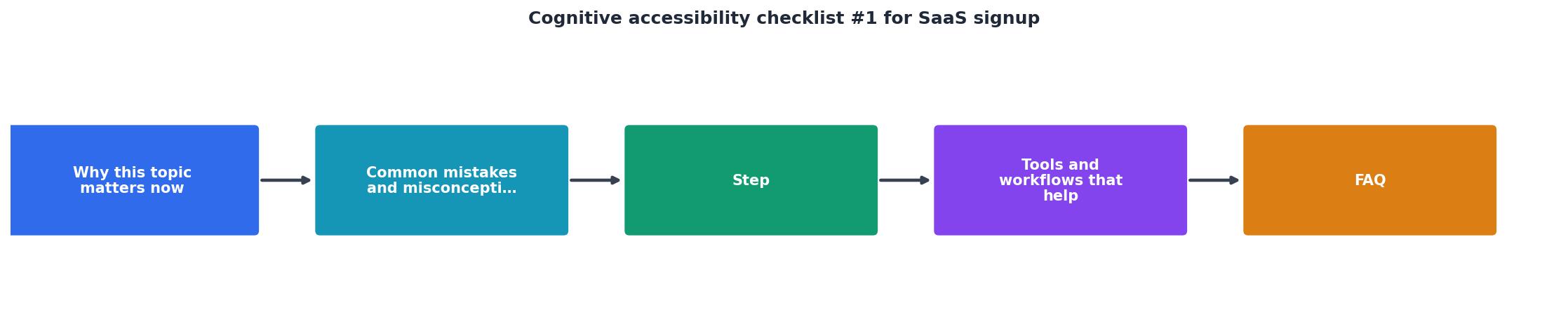
Step 1: Strip fields
Open your signup form and list every field. For each one, ask: "Can the user start using the product without this information right now?" If yes, remove it or move it to onboarding. Stripe famously reduced their initial signup to just email and password. The rest came later.
Step 2: Clarify labels and copy
Read every label, button, helper text, and error message out loud. If any phrase requires domain knowledge or could mean two things, rewrite it. Replace "Organization" with "Company name." Replace "Submit" with "Create my account." Specific verbs beat generic ones.
Step 3: Add progress and feedback
If your form has more than three fields, consider splitting it into steps with a visible progress bar. Each step should have a clear heading ("Step 2 of 3: Set your password"). After submission, show an immediate confirmation, not a blank screen or a redirect that takes three seconds.
Step 4: Test with real outsiders
Find three people who have never seen your product. Watch them complete the signup without any guidance. Note where they pause, re-read, or ask questions. Those pause points are your cognitive friction hotspots.
Tools and workflows that help
You do not need a full usability lab to catch cognitive issues. Here is a practical toolkit:
- Browser DevTools for checking focus order and label associations.
- WAVE or axe for baseline WCAG compliance (contrast, alt text, ARIA).
- PagePerson Insights for cognitive-layer analysis that goes beyond standard WCAG checks.
- Session replay tools (Hotjar, FullStory) to watch real users struggle in real time.
- Readability checkers (Hemingway Editor) to verify your copy stays at a grade 8 reading level or below.
Here is an example dashboard showing what a typical cognitive accessibility audit might reveal on a SaaS signup page:
Cognitive Audit: SaaS Signup Page
| Before Audit | After Audit |
|---|---|
| 8 form fields | 3 form fields |
| Placeholder-only labels | Persistent visible labels |
| "Invalid input" errors | Specific inline guidance |
| No progress indicator | "Step 1 of 2" bar |
| 400-word ToS paragraph | 2-line summary + link |
| Generic "Submit" button | "Create my free account" |
The checklist
SaaS Signup Cognitive Accessibility Checklist
Your progress is saved automatically in your browser.
FAQ
Frequently Asked Questions
What is the single biggest cognitive barrier on your signup page right now? Open it in a fresh browser, pretend you have never seen the product, and find out.
Additional Resources
- Software Accessibility Checklist: SaaS and ADA Compliance - How do you ensure your SaaS platform is ADA compliant? Learn more about software accessibility and how to build a checklist for compliance.
- WCAG Checklist 2.1 AA and 2.2 AA - Download our WCAG checklists in PDF format for free with no subscription required. WCAG 2.0 AA, 2.1 AA, and 2.2 AA are all covered.
- Accessibility in SaaS Platforms: Creating Accessible Software - Best practices for accessible SaaS design · Keyboard accessibility · Screen reader compatibility · Colour and contrast · Forms and data entry · Accessible multimedia.
Need Help with Accessibility?
Improve your site's accessibility and conversion rates with our AI-powered analysis.
Get Started