Cognitive accessibility checklist #10 for blog layout
Your blog posts might be well-written, deeply researched, and genuinely useful. None of that matters if the layout itself stops people from reading them. Blog layout is where cognitive accessibility breaks down most often because teams obsess over content quality while ignoring how the page structure, spacing, and visual hierarchy affect comprehension. This checklist gives you ten concrete layout checks that reduce cognitive load and keep readers engaged long enough to actually absorb what you wrote.

Your blog posts might be well-written, deeply researched, and genuinely useful. None of that matters if the layout itself stops people from reading them. Blog layout is where cognitive accessibility breaks down most often because teams obsess over content quality while ignoring how the page structure, spacing, and visual hierarchy affect comprehension. This checklist gives you ten concrete layout checks that reduce cognitive load and keep readers engaged long enough to actually absorb what you wrote.

- Blog layout directly impacts whether visitors with cognitive disabilities, ADHD, anxiety, or low digital literacy can process your content.
- Ten specific layout checks cover line length, heading hierarchy, whitespace, font sizing, link clarity, media placement, sidebar noise, mobile stacking, progress indicators, and consistent navigation.
- Each check takes minutes to audit and fix, but the cumulative effect on bounce rate and time-on-page is significant.
Why blog layout affects conversion
A blog post that looks like a wall of text loses readers in the first three seconds. That is not an exaggeration. Visitors with cognitive disabilities face an even steeper barrier: dense layouts, inconsistent spacing, and competing visual elements create a processing bottleneck that no amount of good writing can overcome.
"Research shows that 12.8% of adults have cognitive disabilities, but the real number of people who benefit from cognitive accessibility is much higher.">, Best Practices for Cognitive Accessibility in Web Design
That 12.8% figure only counts diagnosed cognitive disabilities. Add situational impairments (stress, multitasking, fatigue, reading in a second language) and you are looking at a much larger share of your audience. For a founder watching conversion metrics, every reader who bounces because the layout overwhelmed them is wasted ad spend.
Roughly two-thirds of blog visitors scan the page before deciding whether to read. Your layout is the first thing they evaluate, not your headline, not your opening sentence. If the structure looks exhausting, they leave.
Common layout mistakes

These are the layout problems I see on blog after blog. They are not obscure edge cases. They are defaults baked into popular WordPress themes, Webflow templates, and custom builds alike.
- Line length over 80 characters. Long lines force the eye to travel too far, making it easy to lose your place. Readers with dyslexia or attention difficulties are hit hardest. Aim for 50 to 75 characters per line.
- Skipped heading levels. Jumping from H1 to H3 breaks the logical outline. Screen readers and cognitive processing both rely on a predictable hierarchy: H1, then H2, then H3.
- Insufficient whitespace between sections. When paragraphs and headings are crammed together, the brain cannot chunk information into digestible pieces. Spacing is not decoration. It is a cognitive signal.
- Sidebar overload. Newsletter popups, related posts, social share buttons, ad banners, and category lists all competing for attention in a sidebar create noise that pulls focus from the content.
- Inconsistent link styling. If some links are blue and underlined, some are bold, and some are just a different color, readers cannot reliably identify what is clickable. That uncertainty increases cognitive load.
The ten-point layout checklist

Here is the full checklist, broken into the specific checks and why each one matters. Walk through these on any blog post and you will catch the majority of cognitive accessibility layout issues.
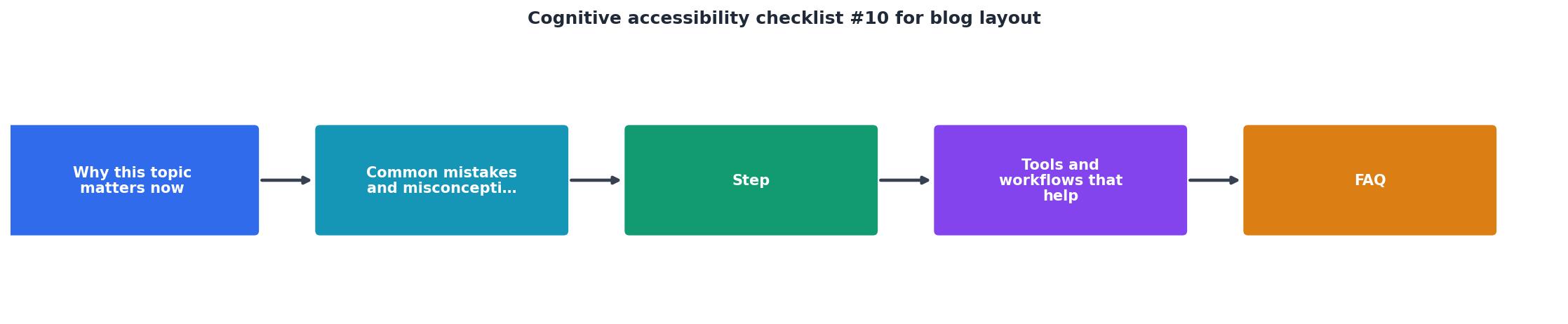
1. Line length: 50 to 75 characters
Open your blog post on a desktop browser. Select a full line of body text and count the characters. If you are consistently above 75, your content container is too wide. Set a max-width of around 680px to 720px on the article body.
2. Heading hierarchy: no skipped levels
Use your browser's developer tools or an extension like HeadingsMap to verify the heading order. Every H2 should follow an H1. Every H3 should follow an H2. No exceptions.
3. Whitespace: breathing room between sections
The space above an H2 should be noticeably larger than the space above an H3, which should be larger than the space between paragraphs. This visual hierarchy tells the brain "new topic" versus "new point within the same topic."
4. Font size: 18px minimum for body text
Body text below 16px is hard to read on most screens. For blog content specifically, 18px to 20px is the sweet spot. Pair it with a line-height of 1.5 to 1.7 for comfortable reading.
5. Link clarity: consistent, obvious styling
Every link in the body text should be visually distinct through color and underline. Do not rely on color alone (color-blind readers will miss it). Visited links should look different from unvisited ones.
6. Media placement: images near related text
An image placed three paragraphs away from the text it illustrates creates a disconnect. Place images, charts, and diagrams directly after the paragraph that references them. Add descriptive alt text that conveys the image's purpose, not just its content.
7. Sidebar: minimal or none
The most cognitively accessible blog layout is a single-column design with no sidebar. If you must have a sidebar, limit it to one or two elements (table of contents, search). Remove everything else.
8. Mobile stacking: logical content order
On mobile, sidebar elements stack above or below the main content. Check that the stacking order makes sense. A newsletter signup form appearing before the article content on mobile is a conversion killer, not a conversion tool.
9. Progress indicator: show reading position
A reading progress bar at the top of the page gives readers a sense of how far they have come and how much remains. This is especially helpful for readers with ADHD or anxiety who need to gauge their commitment before starting.
10. Consistent navigation: predictable placement
The blog's navigation (categories, search, home link) should appear in the same position on every page. Moving navigation elements between the blog index and individual posts forces readers to re-learn the interface.
Tools and workflows

You do not need expensive software to run this checklist. Here is a practical workflow:
- Browser DevTools for checking font sizes, line lengths, and spacing values. Right-click any element, inspect it, and read the computed styles.
- HeadingsMap (free Chrome/Firefox extension) for verifying heading hierarchy in one click.
- WAVE (free web accessibility evaluation tool) for catching missing alt text and link issues.
- PagePerson Insights for identifying cognitive accessibility barriers that go beyond technical WCAG checks, including how layout choices affect real visitor comprehension and where people get stuck.
- Responsively App (free) for testing mobile stacking order across multiple screen sizes simultaneously.
- Open the blog post in Chrome.
- Run HeadingsMap to check heading hierarchy.
- Use DevTools to measure line length, font size, and spacing.
- Run WAVE for link styling and alt text.
- Check mobile layout in Responsively or Chrome's device emulator.
- Document findings and fix in priority order.
Here is an example dashboard showing what a typical blog layout audit might reveal across those top posts:
Example: Blog Layout Audit Results (Top 3 Posts)
Most blogs fail on font size and line length because their theme defaults were never adjusted. These are also the two easiest fixes: a few CSS changes and you are done.
Blog Layout Cognitive Accessibility Checklist
Your progress is saved automatically in your browser.
FAQ
Frequently Asked Questions
Additional Resources
- Best Practices for Cognitive Accessibility in Web Design - Start forms with clear instructions. · Show exactly what went wrong if users make mistakes. · Add confirmation steps before important actions.
- Checklist: Accessible web design for your website - Want to make your web design accessible? Our step-by-step checklist shows you what's important—including tips for implementation and tools.
- Website Accessibility Checklist - Actionable Steps - Your web accessibility checklist · 1. Add text alternatives · 2. Ensure adaptable content · 3. Create distinguishable content · 4. Be keyboard accessible · 5. Ensure ...
Need Help with Accessibility?
Improve your site's accessibility and conversion rates with our AI-powered analysis.
Get Started