Cognitive accessibility checklist #11 for help center
Your help center exists to reduce support tickets and keep customers moving forward. But if the people who land there cannot parse your articles, scan your navigation, or understand your instructions, you have built a wall instead of a bridge. This checklist gives you 11 concrete checks to run against every help center page so visitors with ADHD, dyslexia, anxiety, low digital literacy, or plain old cognitive overload can actually find answers and stay converted.

Your help center exists to reduce support tickets and keep customers moving forward. But if the people who land there cannot parse your articles, scan your navigation, or understand your instructions, you have built a wall instead of a bridge. This checklist gives you 11 concrete checks to run against every help center page so visitors with ADHD, dyslexia, anxiety, low digital literacy, or plain old cognitive overload can actually find answers and stay converted.

- A cognitively accessible help center uses plain language, predictable layouts, clear navigation, and minimal distractions so every visitor can self-serve.
- This 11-point checklist covers headings, search, readability, visuals, error recovery, and more.
- Fixing these issues directly reduces support costs and keeps conversion funnels intact.
Why help center accessibility matters
About 15 to 20 percent of the global population has some form of neurodivergence or cognitive disability. Add situational impairments like stress, multitasking, or using a phone in bright sunlight, and the number of people who struggle with complex help pages climbs fast.
A help center that fails cognitively does two things: it generates more support tickets (expensive) and it pushes frustrated visitors toward competitors (more expensive). Every confusing article is a leak in your funnel. You paid to acquire that visitor. Letting them bounce from a help page because the instructions assume expert-level knowledge is money burned.
"The majority of web pages are overly complex, cluttered, unclear, and difficult to navigate and essentially shut these users out of the digital world.">, The Complete Guide to Cognitive Accessibility for Cognitive Disabilities
The good news: cognitive accessibility fixes are cheap. They are writing and layout decisions, not engineering projects. A single afternoon of edits can transform a help center from a frustration factory into a self-service engine.
Common mistakes that hurt users

Most help centers share the same set of cognitive traps. Recognizing them is the first step.
Jargon-heavy articles
Internal teams write help docs using the vocabulary they use in Slack. Terms like "provisioning," "SSO handshake," or "webhook payload" mean nothing to a founder trying to connect Stripe. Every article needs a plain language pass where technical terms are either replaced or defined inline on first use.
Walls of text
A 1,200-word article with zero headings, no bullet points, and no visual breaks is unreadable for someone with ADHD or working memory limitations. Chunking content into short paragraphs (two to four sentences) with descriptive H2/H3 headings lets readers jump to the section they need.
Inconsistent navigation
When the sidebar categories change names between pages, or the search bar moves from the top to the bottom, visitors with anxiety or low digital literacy lose their mental model of the site. Consistent layout across every help page is non-negotiable.
Missing search or bad search
If your help center search returns zero results for common misspellings or synonyms, it fails the people who need it most. Dyslexic users frequently type approximate spellings. Your search must handle that gracefully.
The 11-point checklist explained

Here is what each checkpoint covers and why it exists.
- Plain language - Write at an 8th-grade reading level or below. Tools like Hemingway Editor flag complex sentences instantly.
- Descriptive headings - Every H2 should tell the reader what the section answers. "Configure SMTP" beats "Step 3."
- Consistent layout - Same sidebar, same breadcrumb, same search bar position on every page.
- Typo-tolerant search - Use fuzzy matching. Algolia, Typesense, and MeiliSearch all support this out of the box.
- Chunked content - No paragraph longer than four sentences. Use bullets and numbered lists for sequential steps.
- Visual aids - Screenshots, short GIFs, or diagrams for every multi-step process. Annotate them with arrows or numbered callouts.
- One topic per page - Do not combine "How to reset your password" and "How to enable 2FA" in a single article. Separate concerns reduce cognitive load.
- Clear error recovery - When a step might fail, tell the reader what to do. "If you see a red banner, click Settings > Retry" is better than silence.
- Readable typography - Minimum 16px body text, 1.5 line height, sufficient contrast (4.5:1 minimum). Avoid justified text alignment.
- Predictable link labels - "Learn more" tells the reader nothing. "See how to connect Stripe" tells them exactly where they are going.
- Feedback mechanism - A simple "Was this helpful? Yes / No" at the bottom of each article lets you find broken pages fast.
Step-by-step implementation

You do not need to fix everything at once. Here is a practical sequence that delivers results fast.
Audit your top 10 pages first
Sort your help center by page views. The top 10 articles handle the vast majority of traffic. Open each one and score it against the 11 points above. Mark failures in a spreadsheet with the article URL, the failed checkpoint number, and a one-line fix description.
Rewrite headings and intros
For each flagged article, rewrite the H1 as a question the visitor would actually type. "How do I cancel my subscription?" converts better than "Subscription Management." Then rewrite the first paragraph to answer that question in two sentences. Everything after is supporting detail.
Add visual aids
Take fresh screenshots. Use a tool like CleanShot X or ShareX to capture the exact screen the user sees. Add numbered annotations. For complex flows, record a 15-second GIF. Compress images so pages load in under two seconds on mobile.
Fix search
If you use Zendesk, Intercom, or HelpScout, check their search settings for synonym lists and fuzzy matching toggles. If you run a custom docs site (Docusaurus, GitBook, Notion), integrate a search provider that handles typos. Test by deliberately misspelling your five most common search queries.
Add feedback loops
Drop a "Was this helpful?" widget on every article. Review the "No" responses weekly. Each "No" is a signal that the article failed someone cognitively. Rewrite, simplify, or split the article until the ratio improves.
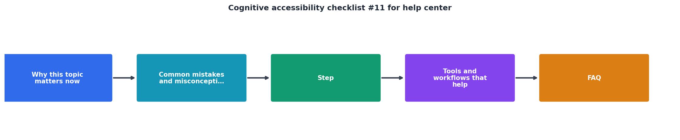
The following interactive card summarizes the core workflow at a glance. Each phase maps to a concrete action you can complete in a single work session.
Help Center Accessibility Workflow
Tools and workflows that help
You do not need expensive software. Here is a short stack that covers the checklist:
- Hemingway Editor (free) - Paste any article to get a readability grade and highlight complex sentences.
- Typesense or MeiliSearch (open source) - Drop-in search engines with built-in typo tolerance.
- CleanShot X / ShareX - Screenshot and GIF capture with annotation tools.
- PagePerson Insights - Run it on your help center pages to surface cognitive accessibility barriers and see exactly where visitors get stuck. It catches issues that standard accessibility scanners miss entirely.
- Google Lighthouse - Free performance and accessibility audit. Covers contrast, font size, and basic ARIA checks.
| Manual Review | Checklist-Driven Review |
|---|---|
| Subjective, inconsistent | Repeatable, scoreable |
| Misses cognitive barriers | Covers all 11 checkpoints |
| No tracking over time | Spreadsheet tracks progress |
| Depends on reviewer expertise | Any team member can run it |
Help Center Cognitive Accessibility Checklist
Your progress is saved automatically in your browser.
FAQ
Frequently Asked Questions
What is the first help center article you plan to run through this checklist? Share it below and let others learn from your before-and-after.
Additional Resources
- The Complete Guide to Cognitive Accessibility for ... - Cognitive accessibility refers to creating a digital environment, such as a website, that is accessible to those with cognitive and learning ...
- Introductory Guide to Cognitive Accessibility (COGA) - Include easily recognizable icons and labels. Use clear headings and visual boundaries to separate content areas. Use Clear Content (Text, Images, and Media) ...
- Cognitive Accessibility at W3C - This page introduces: accessibility for people with cognitive and learning disabilities (“cognitive accessibility”); existing standards from the World Wide ...
Need Help with Accessibility?
Improve your site's accessibility and conversion rates with our AI-powered analysis.
Get Started