Cognitive accessibility checklist #12 for settings screen
Settings screens are where users go to feel in control, yet most apps treat them as an afterthought. Confusing toggles, buried options, and jargon-heavy labels cause real visitors to abandon changes, revert to defaults, or leave your product entirely. This checklist gives you 12 concrete checks to make your settings screen cognitively accessible so every user can configure your product with confidence.

Settings screens are where users go to feel in control, yet most apps treat them as an afterthought. Confusing toggles, buried options, and jargon-heavy labels cause real visitors to abandon changes, revert to defaults, or leave your product entirely. This checklist gives you 12 concrete checks to make your settings screen cognitively accessible so every user can configure your product with confidence.

- Settings screens carry high cognitive load because every option demands a decision from the user.
- Group related settings, use plain-language labels, show the effect of each toggle, and always provide a safe undo path.
- Follow the 12-point checklist below to audit and fix your settings screen in a single sprint.
Why settings screens deserve attention
Most conversion work focuses on landing pages, onboarding flows, and checkout. Settings screens get ignored because they sit behind a login. That logic misses something critical: a user who cannot configure your product correctly will churn.
Research on SaaS retention consistently shows that users who personalize their setup stick around longer. But when the settings screen itself creates confusion, personalization never happens. The user clicks in, sees a wall of toggles, and clicks right back out.
This is not just a UX polish issue. It directly affects monthly recurring revenue. If someone cannot turn off email notifications, they unsubscribe from your product instead. If they cannot find the billing section, they contact support, which costs you money, or they simply cancel.
Settings screens also disproportionately affect users with ADHD, anxiety, dyslexia, or low digital literacy. Dense option grids, ambiguous toggle states, and missing confirmation feedback create barriers that go far beyond visual accessibility.
Common mistakes that hurt users

Three patterns show up in almost every settings screen audit:
- Jargon labels. "Enable SSO SAML 2.0 passthrough" means nothing to a founder managing their own account. Labels should describe the outcome, not the technology. "Let team members sign in with Google" works better.
- No grouping. Dumping 40 options into a single scrollable list forces the user to read every item to find the one they need. Group by task: Notifications, Billing, Security, Integrations.
- Silent saves vs. no saves. Some screens auto-save without telling the user. Others require a Save button that sits below the fold. Both patterns create anxiety. Users need clear feedback: "Saved" or "You have unsaved changes."
- Toggle switches with no visible on/off label (color alone is not enough)
- Destructive actions (delete account, revoke access) placed next to routine settings
- Help text that appears only on hover, invisible to touch users
- Settings that require a page reload to take effect, with no warning
Step-by-step audit process

Here is the process distilled into four stages. Each stage maps to specific checklist items you can verify in under an hour.
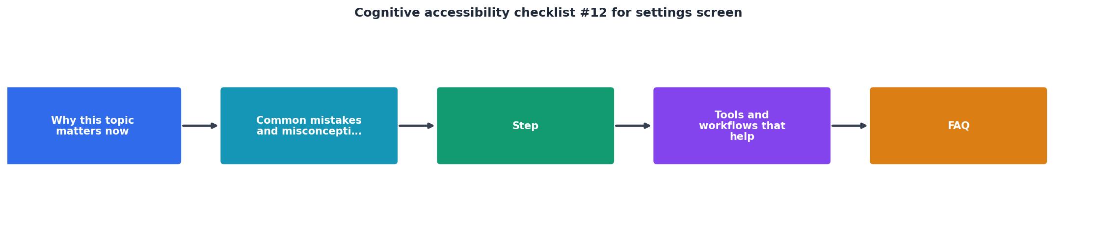
Stage 1: Inventory and group
Open your settings screen and list every single option. Write each one on a sticky note or spreadsheet row. Then sort them into groups based on user tasks, not engineering modules. A user thinks "I want to stop getting emails," not "I need to modify the notification microservice config."
Aim for 4 to 7 groups. Fewer than 4 means your groups are too broad. More than 7 means you are exposing internal complexity.
Stage 2: Label and describe
Rewrite every label in plain language. Each setting needs:
- A short label (3 to 6 words) that states the outcome
- A description line (one sentence) that explains what changes
- A current state indicator so the user knows what is active right now
"Except for captions and images of text, text can be resized without assistive technology up to 200 percent without loss of content or functionality.">, Web Content Accessibility Guidelines (WCAG) 2.1
This WCAG requirement applies directly to settings screens. If your labels and descriptions break or overlap at 200% zoom, users with low vision lose access to configuration entirely.
Stage 3: Feedback and undo
Every change needs visible confirmation. Auto-save is fine, but show a brief "Saved" toast or inline confirmation. For settings that require a reload or have delayed effects (like changing a subdomain), state that explicitly: "This change takes effect in about 5 minutes."
Undo is equally important. If a user toggles something and the result is unexpected, they need a clear path back. A simple "Undo" link in the confirmation toast handles this well. Slack, Google Docs, and Notion all use this pattern.
Stage 4: Test with real users
Recruit 3 to 5 people outside your team. Give them a task: "Turn off weekly email reports" or "Change your password." Watch where they hesitate, where they click the wrong thing, and where they give up. You will find problems no internal review catches.
Tools and workflows that help

Several tools speed up the audit:
- axe DevTools checks WCAG compliance on the rendered settings page, catching missing labels, low contrast, and focus order issues.
- Hemingway Editor helps rewrite setting labels and descriptions at a lower reading level. Aim for Grade 6 to 8.
- PagePerson Insights analyzes your settings screen for cognitive accessibility barriers, showing exactly where visitors with ADHD, anxiety, or low digital literacy struggle. Run it once and you get a prioritized list of fixes.
- Browser zoom test at 200% reveals layout breakage in settings grids. Just press Ctrl and + until you hit 200%.
The following card summarizes the key metrics you should track after applying this checklist to your settings screen:
Settings Screen Audit Targets
Settings Screen Cognitive Accessibility Checklist
Your progress is saved automatically in your browser.
FAQ
Frequently Asked Questions
Additional Resources
- Web Content Accessibility Guidelines (WCAG) 2.1 - Web Content Accessibility Guidelines (WCAG) 2.1 covers a wide range of recommendations for making web content more accessible.
- The Complete Guide to Cognitive Accessibility for ... - Reduce pop-ups: Avoid using too many pop-ups or other animations. Simplify navigation: Ensure navigational mechanisms. Provide alternative text ...
- Best Practices for Cognitive Accessibility in Web Design - Essential WCAG guidelines for cognitive accessibility · Site-wide search functionality. · Site map or table of contents. · Clear navigation menus.
Need Help with Accessibility?
Improve your site's accessibility and conversion rates with our AI-powered analysis.
Get Started