Cognitive accessibility checklist #13 for empty states
Empty states are the screens your visitors see when there is nothing to display yet. A blank search results page, an empty shopping cart, a dashboard with zero data points. Most teams treat these moments as edge cases and ship them with a generic message or no message at all. That silence costs you conversions, because visitors who hit a dead end without guidance leave and do not come back.

Empty states are the screens your visitors see when there is nothing to display yet. A blank search results page, an empty shopping cart, a dashboard with zero data points. Most teams treat these moments as edge cases and ship them with a generic message or no message at all. That silence costs you conversions, because visitors who hit a dead end without guidance leave and do not come back.

- Empty states are high-stakes moments where confused visitors abandon your site.
- A cognitively accessible empty state explains what happened, why, and what to do next in plain language.
- This checklist gives you 13 concrete checks to audit every empty state on your site, from zero-data dashboards to empty carts and no-results search pages.
Why empty states matter for conversion
Every product has empty states. A new user signs up and sees an empty dashboard. A shopper clears their cart. A search query returns zero results. These moments feel minor during development because the team is focused on the "happy path" where data exists. But for a first-time visitor, the empty state might be the first screen they encounter.
That number is not random. Session recordings consistently show that visitors who land on a page with no content and no clear next step bounce within seconds. The cognitive load spikes because the brain asks three questions at once: "Did I do something wrong?", "Is this site broken?", and "What am I supposed to do now?" If your empty state does not answer all three, you lose the visitor.
"According to the Centers for Disease Control and Prevention (CDC), "more than 28.7% of adults in the United States have a disability" and 13.9% of U.S.">, Designing Digital Content For Users With Cognitive Disabilities
For visitors with ADHD, anxiety, dyslexia, or low digital literacy, the stakes are even higher. A blank screen with no explanation triggers uncertainty. Uncertainty triggers anxiety. Anxiety triggers the back button.
Common empty state mistakes

Here are the patterns that hurt the most:
- Blank screen with no text. The page loads, the content area is empty, and there is zero explanation. The visitor assumes the site is broken.
- Technical error codes. Showing "0 results" or "null" without context. This means nothing to someone outside your engineering team.
- Cute illustrations with no guidance. A cartoon astronaut floating in space looks nice, but it does not tell the visitor what to do next.
- Jargon-heavy messages. "No entities match your query parameters" is clear to a developer. It is gibberish to a small business owner checking their analytics.
- Missing calls to action. Even when the message is clear, there is no button or link to move forward. The visitor is stuck.
The fix is not complicated. It requires treating empty states as first-class design deliverables instead of afterthoughts.
Step-by-step approach
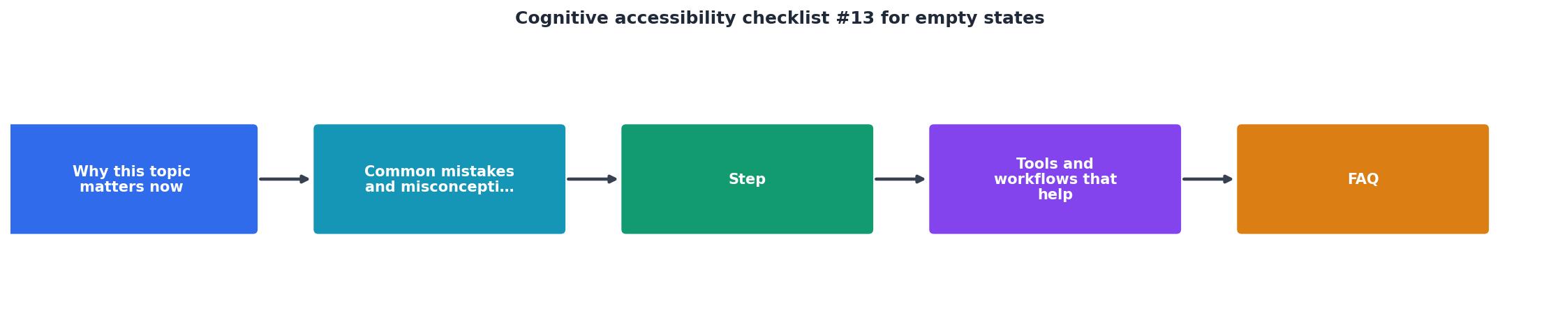
Follow these steps to audit and fix every empty state on your site:
1. Inventory all empty states
Open your product and list every screen that can appear with zero content. Common locations:
- Dashboard (new user, no data yet)
- Search results (no matches)
- Shopping cart (empty)
- Notifications (none yet)
- Saved items / favorites (none added)
- Activity feed (no activity)
- File uploads (nothing uploaded)
2. Evaluate each state against the checklist
For every empty state, run through the 13 checks listed in the checklist section below. Score each one as pass or fail.
3. Rewrite the copy
Replace technical or vague messages with plain-language text that answers three questions:- What happened? ("You have no saved items yet.")
- Why? ("Items you save will appear here so you can find them quickly.")
- What next? ("Browse the catalog to find something you like.")
4. Add a primary action
Every empty state needs at least one button or link. "Browse products", "Create your first project", "Try a different search term." Make the action specific, not generic.
5. Test with real users
Show the empty state to someone unfamiliar with your product. Ask them: "What would you do next?" If they hesitate for more than two seconds, the state needs more work.
Tools and workflows that help

You do not need expensive usability labs to get this right. Here is what works:
- PagePerson Insights can scan your pages and flag cognitive accessibility barriers, including confusing empty states that lack guidance. Running it across your key flows takes minutes and gives you a prioritized list of issues.
- Figma / Sketch annotations. Add an "empty state" frame to every component in your design system. Designers should never ship a component without defining what it looks like with zero data.
- Content checklists in your CMS. If you use a headless CMS or a component library, add a required field for empty-state copy. Make it impossible to publish a section without defining the zero-data message.
- Session replay tools like Hotjar or FullStory. Filter sessions where users hit empty states and watch what happens. You will see the confusion in real time.
Empty State Audit Scorecard
Real examples worth studying

A few products handle empty states well. Study them:
- Notion shows a friendly message with a "Create a page" button when a workspace is empty. The copy is short, the action is obvious, and there is a subtle illustration that does not distract.
- Shopify admin dashboard tells new merchants exactly what to set up first. The empty state is a guided onboarding flow, not a blank page.
- Mailchimp search results page suggests alternative search terms when a query returns nothing. It also links to help documentation. The visitor never hits a dead end.
- Slack empty channels display a message explaining the channel purpose and invite the user to start a conversation. The tone is warm without being patronizing.
| Bad Empty State | Good Empty State |
|---|---|
| Blank screen, no text | Clear explanation of what happened |
| "0 results" | "No results for 'blue shoes'. Try 'sneakers' or browse all shoes." |
| Cute illustration only | Illustration + explanation + action button |
| Technical jargon | Plain language a 12-year-old can understand |
| No next step | Primary action button + secondary link |
The 13-point checklist
Use this checklist to audit every empty state on your site. Print it, paste it into your project management tool, or share it with your team.
Cognitive Accessibility Checklist for Empty States
Your progress is saved automatically in your browser.
Most sites pass only about a third of these checks on their first audit. That is normal. The goal is to get every empty state to 13 out of 13 over time.
FAQ
Frequently Asked Questions
Additional Resources
- Designing Digital Content For Users With Cognitive ... - Avoid clutter and unnecessary elements that can distract or overwhelm users. Use consistent visual cues and icons
- Designing Empty States in Complex Applications - Empty states provide opportunities for designers to communicate system status, increase learnability of the system, and deliver direct pathways ...
- Empty State UX Examples & Best Practices - This free checklist lets you double check your data tables for their UX quality and assess various aspects which make or break the data table ...
Need Help with Accessibility?
Improve your site's accessibility and conversion rates with our AI-powered analysis.
Get Started