Cognitive accessibility checklist #14 for search results
Search results pages are where visitors decide to stay or leave. When those results are cluttered, ambiguous, or cognitively overloaded, people bounce before they ever reach the content they came for. This checklist breaks down exactly what to audit and fix so your on-site search actually helps users find what they need, instead of adding another layer of confusion that kills conversions.

Search results pages are where visitors decide to stay or leave. When those results are cluttered, ambiguous, or cognitively overloaded, people bounce before they ever reach the content they came for. This checklist breaks down exactly what to audit and fix so your on-site search actually helps users find what they need, instead of adding another layer of confusion that kills conversions.

- Cognitively accessible search results use clear labels, predictable layouts, and plain language so every visitor can parse them quickly.
- The biggest mistakes are walls of undifferentiated text, missing result counts, and zero feedback on empty queries.
- Follow the step-by-step checklist below to audit your search results page in under an hour and fix the issues that cost you conversions.
Why search results matter for conversions
Most site owners obsess over landing pages and checkout flows. Search results? They get the default template from whatever platform shipped it. That is a problem because on-site search users convert at 1.8x the rate of browsers, according to multiple e-commerce benchmarks. These visitors already have intent. If your search results page confuses them, you are losing the highest-value segment of your traffic.
Cognitive accessibility is not just about screen readers and contrast ratios. It covers how the brain processes information: working memory limits, reading comprehension, attention regulation, and decision fatigue. People with ADHD, dyslexia, anxiety, or low digital literacy hit these walls first, but every visitor has a cognitive ceiling. Search results that exceed it get abandoned.
Common mistakes that confuse visitors

Here are the patterns I see repeatedly on sites that wonder why search users bounce:
- No result count displayed. Visitors cannot gauge whether they need to refine their query or scroll further. A simple "Showing 12 results for 'pricing'" anchors expectations.
- Identical visual weight on every result. When every item looks the same, the brain has to read each one sequentially. No shortcuts, no scanning.
- Truncated snippets that cut mid-sentence. This forces users to click every result to understand what it contains. That is a cognitive tax.
- Missing "no results" guidance. A blank page or a generic "Nothing found" with no suggestions is a dead end. Users with lower digital literacy often assume the site is broken.
- Auto-scrolling or infinite scroll without a landmark. Visitors lose their place, especially those with attention difficulties.
- Jargon-heavy facets and filters. If your filter labels require domain expertise to understand, most visitors will ignore them entirely.
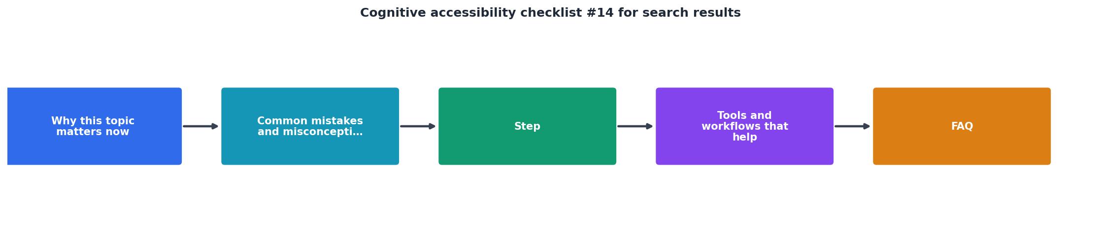
Step-by-step audit process

Follow these steps to audit your search results page. Each step maps to a specific cognitive accessibility principle.
Step 1: Run a test query
Open your site in an incognito window. Type a common query your visitors use (check your analytics for top search terms). Note your first impression: can you tell what each result is about within 2 seconds?
Step 2: Check result structure
Each result should have a clear visual hierarchy: title, snippet, metadata (date, category, price). These three layers let the eye jump to the relevant piece without reading everything. If your results are just a list of blue links with URLs underneath, that is a problem.
Step 3: Verify feedback elements
- Does the page show how many results were returned?
- Does it echo the search query back to the user (e.g., "Results for: pricing plans")?
- On zero results, does it suggest alternative queries or popular pages?
Step 4: Test keyboard navigation
Tab through the results. Each result link should receive visible focus. The focus order should match the visual order. Screen reader users and keyboard-only users depend on this.
"Except for captions and images of text, text can be resized without assistive technology up to 200 percent without loss of content or functionality.">, Web Content Accessibility Guidelines (WCAG) 2.1
Step 5: Resize text to 200%
Zoom your browser to 200%. Do the search results still display without horizontal scrolling? Do truncated snippets still make sense? This is a WCAG 1.4.4 requirement and it directly affects anyone who increases text size for readability.
Step 6: Review filter and sort controls
Filters should use plain language. "Sort by: Newest first" beats "Sort: DESC date." Every active filter should be visible as a removable tag so users know what constraints are applied. Hidden filters create confusion.
Step 7: Test with a screen reader
Use NVDA (free on Windows) or VoiceOver (built into macOS). Navigate the search results. Each result should announce its title, a brief description, and any key metadata. If the screen reader reads decorative icons or layout artifacts, those need aria-hidden="true".
Tools and workflows that help

You do not need a full usability lab to catch cognitive accessibility issues in search results. Here is a practical toolkit:
- Browser DevTools for checking heading hierarchy, focus order, and zoom behavior.
- WAVE (WebAIM) for automated WCAG checks on the search results page specifically.
- axe DevTools for component-level accessibility testing.
- PagePerson Insights to surface cognitive barriers that automated tools miss, like confusing language patterns, excessive cognitive load in result layouts, and comprehension issues that cause visitors to abandon search.
- Your own analytics. Look at the search exit rate: the percentage of users who leave the site directly from search results. If it exceeds 30%, your results page has a comprehension or relevance problem.
Here is a quick comparison of manual versus tool-assisted auditing:
| Manual Audit | Tool-Assisted Audit |
|---|---|
| 2-4 hours per page | 15-30 minutes per page |
| Catches visual/layout issues well | Catches code-level and cognitive issues |
| Requires accessibility expertise | Guides non-experts through findings |
| Hard to repeat consistently | Repeatable across pages and sprints |
Search results accessibility scorecard
Here is an example scorecard showing how a typical e-commerce site scores across the key cognitive accessibility dimensions for search results before running an audit:
Search Results Accessibility Scorecard
Example: typical e-commerce site before audit
Most sites score well on text resize (browsers handle it) but fail on empty state guidance and query feedback. Those two items take less than an hour to fix and have an outsized impact on user confidence.
The complete checklist
Use this checklist to audit any search results page. Work through it top to bottom; each item takes a few minutes to verify.
Cognitive Accessibility Checklist #14: Search Results
Your progress is saved automatically in your browser.
FAQ
Frequently Asked Questions
Additional Resources
- Web Content Accessibility Guidelines (WCAG) 2.1 - Web Content Accessibility Guidelines (WCAG) 2.1 covers a wide range of recommendations for making web content more accessible.
- Search accessibility tests | U.S. Web Design System (USWDS) - Open a dedicated screen reading app or your operating system screen reader. Test with both a keyboard and a mouse to complete the tests in the checklist.
- The State of Web Accessibility for People with Cognitive ... - Thus, the CASP checklist for qualitative research was used for all studies, and as noted in the previous section, no studies were excluded based on the CASP ...
Need Help with Accessibility?
Improve your site's accessibility and conversion rates with our AI-powered analysis.
Get Started