Cognitive accessibility checklist #3 for checkout
Your checkout page converts at 2.5% and you have no idea why the other 97.5% leave. The answer is almost never about price or shipping costs. Most abandoned checkouts fail because the page itself overwhelms, confuses, or exhausts the person trying to give you money. This checklist gives you 15 concrete items to audit and fix so your checkout stops losing customers to cognitive friction.

Your checkout page converts at 2.5% and you have no idea why the other 97.5% leave. The answer is almost never about price or shipping costs. Most abandoned checkouts fail because the page itself overwhelms, confuses, or exhausts the person trying to give you money. This checklist gives you 15 concrete items to audit and fix so your checkout stops losing customers to cognitive friction.

- Checkout abandonment is a cognitive accessibility problem, not just a UX polish issue.
- This checklist covers 15 specific items across form design, error handling, progress clarity, and payment confirmation.
- Each item takes minutes to audit and directly reduces the mental effort required to complete a purchase.
The real cost of confusing checkout
Every checkout page asks visitors to do something stressful: hand over money. That baseline stress gets multiplied when the page introduces unnecessary cognitive load. Unclear labels, surprise form fields, ambiguous error messages, and missing progress indicators all stack up.
Seven out of ten people who add items to a cart never complete the purchase. A significant portion of those abandonments happen because the checkout itself is too hard to process. Not "hard" in the sense of requiring a PhD. Hard in the sense that a tired parent at 11 PM, a person with ADHD, or someone with low digital literacy hits a wall of confusion and closes the tab.
This is not about edge cases. Cognitive accessibility in checkout affects every single visitor. Fatigue, distraction, anxiety, and unfamiliarity with your specific checkout flow are universal human conditions.
Common checkout mistakes

Most checkout pages share the same set of cognitive traps. Here are the ones I see repeatedly:
- Too many form fields. Asking for a phone number, company name, and "how did you hear about us" during checkout adds friction with zero benefit to the buyer.
- Ambiguous error messages. "Invalid input" tells the user nothing. "Please enter a 5-digit ZIP code" tells them exactly what to fix.
- No visible progress. Without a step indicator, users cannot estimate how much effort remains. That uncertainty triggers abandonment.
- Surprise costs at the end. Showing tax and shipping only on the final screen creates a trust violation. The cognitive response is "this feels wrong" and the tab closes.
- Tiny, low-contrast text. Order summaries and terms rendered in 11px gray-on-white are unreadable for a large portion of your audience.
"Except for captions and images of text, text can be resized without assistive technology up to 200 percent without loss of content or functionality.">, Web Content Accessibility Guidelines (WCAG) 2.1
That WCAG requirement exists because real people need it. If your checkout breaks at 150% zoom, you are actively blocking customers.
Only about a third of e-commerce checkouts handle these basics well. The rest leak revenue at every step.
Step-by-step audit process
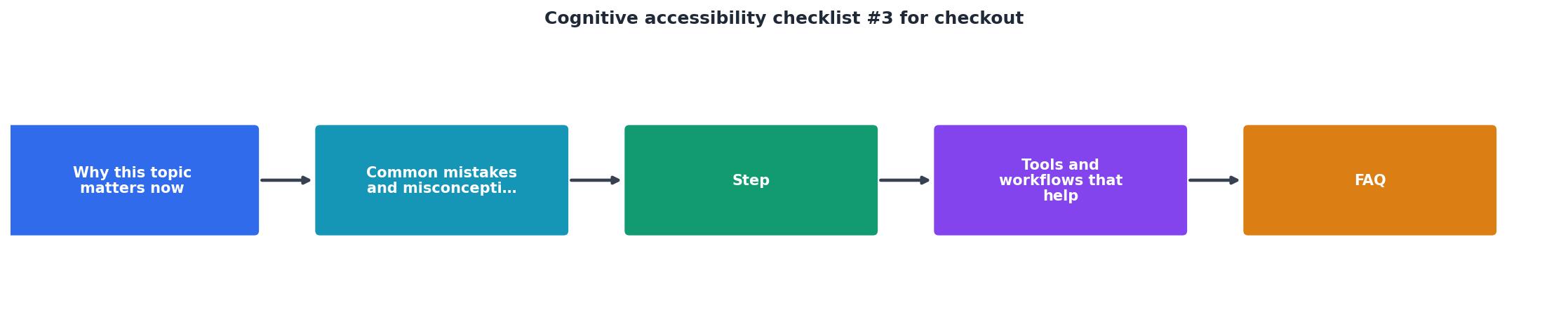
Follow these five phases to audit your checkout. Each phase maps to a specific layer of cognitive load:
1. Scan form fields
Open your checkout in a fresh browser. Count every field. For each one, ask: "Does the buyer need to provide this to receive their order?" If the answer is no, remove it or move it to a post-purchase screen. Shopify's default checkout asks for 7 fields. If yours asks for more than 10, you have a problem.
2. Test error states
Fill out every field incorrectly on purpose. Check that each error message names the specific field, describes the problem, and tells the user how to fix it. "Please enter a valid email address (e.g., name@example.com)" is good. "Error" is not.
3. Check progress visibility
Go through the checkout as a first-time visitor. At every screen, you should be able to answer: "How many steps are left?" If you cannot, add a progress bar or step indicator. Breadcrumb-style indicators (Cart > Shipping > Payment > Confirm) work well.
4. Verify cost transparency
Check that the order total, including tax and shipping, is visible from the first checkout screen onward. If costs change between steps, show exactly what changed and why. Amazon does this with a running order summary sidebar. Your checkout should do the same.
5. Test at 200% zoom
Zoom your browser to 200%. Complete the entire checkout. If any text overlaps, buttons become unreachable, or the layout breaks, those are cognitive accessibility failures that need fixing.
Tools and workflows that help

You do not need a full usability lab to catch cognitive accessibility issues in checkout. Here is a practical toolkit:
- Browser DevTools. Use the responsive design mode to test at different zoom levels and screen sizes. Chrome's Lighthouse audit catches some accessibility basics.
- Screen reader pass. Turn on VoiceOver (Mac) or NVDA (Windows) and tab through your checkout. If the reading order is confusing to you, it is confusing to everyone.
- Session recordings. Tools like Hotjar or FullStory show where real users hesitate, re-read, or rage-click during checkout. Look for patterns, not individual sessions.
- PagePerson Insights. Run the extension on your checkout page to surface cognitive barriers that standard accessibility tools miss. It flags issues like unclear labels, excessive cognitive load, and comprehension gaps that directly affect conversion.
Example: Checkout Cognitive Audit Results
Reducing cognitive load in forms

Forms are where most cognitive failures happen. Here are specific fixes:
- Use single-column layouts. Two-column forms force the eye to jump laterally, which increases reading errors. Baymard Institute's research consistently shows single-column outperforms.
- Auto-detect where possible. Derive city and state from ZIP code. Detect card type from the first digits. Every field you auto-fill is one less decision for the buyer.
- Group related fields visually. Shipping address, billing address, and payment details should be in clearly labeled sections with visible borders or spacing.
- Use inline validation. Show confirmation (green checkmark) or errors as the user completes each field, not after they hit "Submit." This reduces the memory load of tracking what went wrong.
- Label above the field, not inside it. Placeholder text that disappears when you start typing forces users to remember what the field was asking for. Persistent labels above the input solve this.
| Cognitively Inaccessible | Cognitively Accessible |
|---|---|
| Placeholder-only labels | Persistent labels above fields |
| "Invalid input" errors | "Enter a 5-digit ZIP code" |
| No progress indicator | Step breadcrumb (1 of 3) |
| Costs shown only at end | Running total from step 1 |
| 15+ form fields | 7-8 essential fields only |
| Two-column layout | Single-column layout |
Reducing form fields from 15 to 8 can lift checkout conversion by double digits. That is not a design opinion. That is revenue.
The complete checkout checklist
Use this checklist to audit your checkout page. Each item is binary: it passes or it does not.
Cognitive Accessibility Checkout Checklist
Your progress is saved automatically in your browser.
FAQ
Frequently Asked Questions
What is the single biggest cognitive barrier in your checkout right now? Open your checkout page, run through this checklist, and find out.
Additional Resources
- Web Content Accessibility Guidelines (WCAG) 2.1 - Web Content Accessibility Guidelines (WCAG) 2.1 covers a wide range of recommendations for making web content more accessible.
- Checklist - Each item on this checklist has a corresponding WCAG “success criterion.” Success criterion are the specific, testable rules that power the WCAG, described by a ...
- Website Accessibility Checklist - Actionable Steps - 1. Add text alternatives · 2. Ensure adaptable content · 3. Create distinguishable content · 4. Be keyboard accessible · 5. Ensure clear navigation · 6. Provide ...
Need Help with Accessibility?
Improve your site's accessibility and conversion rates with our AI-powered analysis.
Get Started