Cognitive accessibility checklist #4 for mobile nav
Your mobile navigation looks fine to you and your team. You built it, you know where everything lives, and you tap through it without thinking. But a first-time visitor with limited attention, high cognitive load, or an anxiety-driven browsing pattern hits that hamburger icon and gets lost in three seconds flat. This checklist gives you a concrete, item-by-item audit for mobile navigation that reduces cognitive friction and keeps visitors moving toward conversion.

Your mobile navigation looks fine to you and your team. You built it, you know where everything lives, and you tap through it without thinking. But a first-time visitor with limited attention, high cognitive load, or an anxiety-driven browsing pattern hits that hamburger icon and gets lost in three seconds flat. This checklist gives you a concrete, item-by-item audit for mobile navigation that reduces cognitive friction and keeps visitors moving toward conversion.

- Mobile nav fails cognitively when it hides too many options, uses ambiguous labels, or forces users to remember where they came from.
- This checklist covers label clarity, menu depth, touch targets, orientation cues, and error recovery across your entire mobile navigation.
- Each item is actionable and testable without specialized equipment.
The conversion cost of confusing mobile nav
Over 60% of web traffic comes from mobile devices. That number keeps climbing. Yet most mobile navigation patterns were designed for desktop-first information architectures and then squeezed into a hamburger menu as an afterthought.
The result: visitors who cannot find what they need, who tap the wrong link because targets are too small, or who open a mega-menu that covers the entire screen with no clear way back. Each of these moments costs you conversions. Not because your product is wrong, but because your navigation created a cognitive barrier the visitor could not overcome.
Cognitive accessibility in mobile nav means designing navigation that works for people with ADHD, anxiety, dyslexia, low digital literacy, age-related cognitive decline, or simply anyone multitasking on a bus. That is a much larger group than most founders realize.
Common mobile nav mistakes

These are the patterns I see break mobile nav for real users over and over again:
- Deep menu nesting. Three or more levels inside a hamburger menu. Users lose track of where they are after the second tap. Shopify stores with 40+ product categories are notorious for this.
- Ambiguous labels. "Solutions," "Platform," "Resources" tell a visitor nothing about what they will find. Stripe used to label a section "Developers" and another "Products," which worked because each word maps to a clear mental model. "Solutions" does not.
- No visible back path. The user taps into a submenu and the only way out is the browser back button or swiping. There is no breadcrumb, no "Back" link, no visual indicator of hierarchy.
- Tiny touch targets. WCAG 2.2 Success Criterion 2.5.8 recommends a minimum 24x24 CSS pixel target size. Many mobile navs use 16px text links with 8px padding. That is a miss for anyone with motor difficulties or large fingers.
- Disappearing context. Full-screen overlays that hide the page content entirely. The user forgets what page they were on and what they were trying to do.
Step-by-step audit process

Here is the process, broken into five phases. Each phase maps to a specific cognitive dimension.
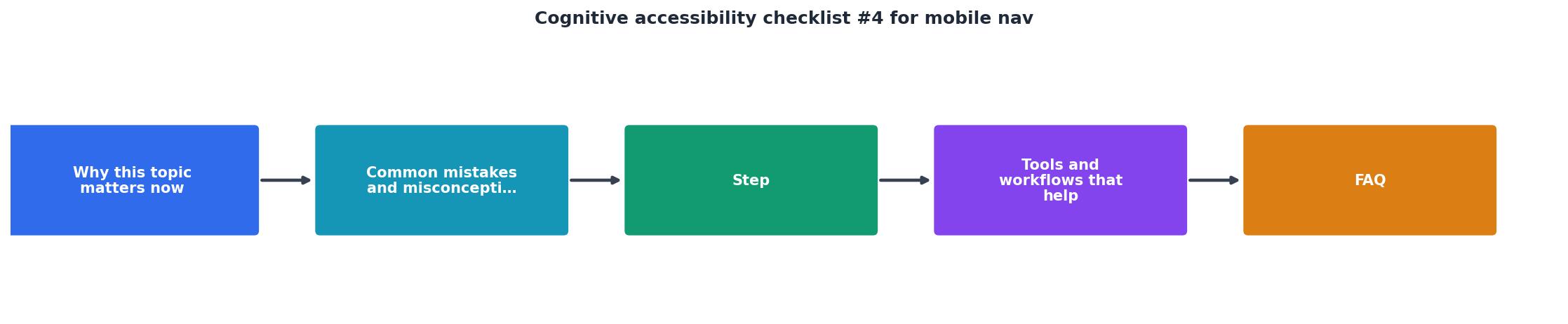
1. Audit labels
Open your mobile nav on a real phone. Read each label out loud. Ask: does this word tell me exactly what I will see when I tap it? Replace every abstract label with a concrete noun or verb phrase. "Pricing" beats "Plans." "Documentation" beats "Resources." "Contact Sales" beats "Get in Touch."
2. Flatten hierarchy
Count the maximum number of taps from the hamburger icon to any leaf page. If it exceeds two, restructure. Move high-traffic pages to the top level. Use a flat list with grouped sections instead of nested submenus. Airbnb's mobile nav is a good reference: five bottom tabs, each leading to a single-level view.
3. Size touch targets
Inspect every tappable element in your nav. Use Chrome DevTools device mode or Safari's responsive design mode. Each target needs at least 44x44 CSS pixels of tappable area (Apple's HIG recommendation) or 48x48dp (Material Design). The WCAG 2.5.8 minimum of 24x24 is a floor, not a goal.
4. Add orientation cues
Users need to know where they are at all times. Add:- A visible "Back" or "Close" button at the top of every submenu
- A highlighted current-page indicator in the nav list
- Breadcrumbs on content pages so users who arrived via nav can retrace their steps
- Transition animations that show spatial direction (slide left to go deeper, slide right to go back)
5. Test with real constraints
Put your phone in one hand. Hold a coffee in the other. Try to navigate to your pricing page, your signup form, and your support contact. Time yourself. If any path takes more than 10 seconds or requires precise tapping, you have a problem.
"However, even if your app doesn't fall into one of these categories, it's still in your best interest to make it accessible – more on that a bit later.">, Mobile App Accessibility, iOS, Android & WCAG Guide (2026)
Tools and workflows that help

You do not need a full usability lab to audit mobile nav for cognitive accessibility. Here is what works:
- Chrome DevTools Device Mode. Simulate any phone screen. Inspect touch target sizes. Throttle CPU to mimic low-end devices where animations stutter and add confusion.
- VoiceOver (iOS) and TalkBack (Android). Turn on the screen reader and navigate your menu. If the screen reader announces "button" without a label, or reads items in a confusing order, sighted users with cognitive difficulties will struggle too.
- PagePerson Insights. Run the extension on your mobile pages to surface cognitive barriers that standard accessibility checkers miss, like unclear labels, excessive menu depth, and comprehension gaps in your navigation copy.
- The "5-second test." Show someone your open mobile nav for five seconds. Close it. Ask them to name three pages they could reach. If they cannot, your labels and structure need work.
| Manual Testing | Tool-Assisted Testing |
|---|---|
| Requires real devices | Works in browser emulation |
| Catches physical ergonomic issues | Catches code-level target sizes |
| Slow across many pages | Scales to full site audits |
| Subjective observations | Quantified metrics and scores |
Here is an example dashboard showing what a typical mobile nav audit might reveal for a SaaS landing page:
Mobile Nav Audit, Example SaaS Site
The complete checklist
Use this checklist to audit your mobile navigation. Each item is pass/fail. Fix every failing item before your next traffic push.
Mobile Nav Cognitive Accessibility Checklist
Your progress is saved automatically in your browser.
FAQ
Frequently Asked Questions
Additional Resources
- Mobile App Accessibility — iOS, Android & WCAG Guide ... - Complete mobile app accessibility guide. Learn iOS VoiceOver, Android TalkBack, WCAG mobile criteria, and how to test apps for accessibility compliance.
- Essential Mobile Accessibility Checklist - Use this mobile accessibility checklist to build compliant, inclusive apps. Test with real devices and improve usability for every user.
- annotation-toolkit/checklists/mobile-checklist.md at main - This checklist summarizes accessibility considerations specific to iOS and Android, Cognitive function tests have an accessible alternative math challenges, ...
Need Help with Accessibility?
Improve your site's accessibility and conversion rates with our AI-powered analysis.
Get Started