Cognitive accessibility checklist #5 for dashboard
Dashboards pack dozens of metrics, charts, and controls into a single screen. For visitors dealing with cognitive load, ADHD, or anxiety, that density turns a useful tool into a wall of noise. This checklist gives you a concrete, item-by-item audit you can run on any dashboard today to strip out confusion and keep the data that actually drives decisions.


Dashboards pack dozens of metrics, charts, and controls into a single screen. For visitors dealing with cognitive load, ADHD, or anxiety, that density turns a useful tool into a wall of noise. This checklist gives you a concrete, item-by-item audit you can run on any dashboard today to strip out confusion and keep the data that actually drives decisions.

- Dashboard cognitive accessibility means reducing visual clutter, grouping related data, and giving every element a clear label.
- Most dashboards fail because they show everything at once instead of prioritizing the three to five metrics that matter.
- This checklist covers layout, typography, color, interaction patterns, and keyboard navigation so you can audit and fix your dashboard in one pass.
Why dashboard accessibility matters for conversion
A dashboard that confuses people does not get used. When your SaaS onboarding funnels users into a dashboard and they cannot parse it within the first ten seconds, they leave. They do not file a support ticket. They do not try again tomorrow. They churn.
That number is not hypothetical. Nearly half of all visitors encounter cognitive barriers on websites, and dashboards concentrate the problem. You have more data points per square centimeter than any other page type. Every unlabeled icon, every chart without a title, every color-only status indicator adds friction.
The business case is straightforward: fix the dashboard, reduce churn, increase feature adoption. No extra traffic needed.
Common mistakes that hurt comprehension

Teams building dashboards repeat the same errors. Here are the ones I see most often:
- Information overload on first load. Showing 20 widgets when the user needs three. Stripe's dashboard defaults to a focused view with expandable sections. Most SaaS dashboards do the opposite.
- Color as the only differentiator. Red for bad, green for good. Around 8% of men have some form of color vision deficiency. Without a secondary indicator (icon, text label, pattern), those users guess.
- Tiny click targets. Filter dropdowns and date pickers with 24px hit areas. On a dense dashboard, that is a motor-skill obstacle course.
- No logical reading order. Screen readers and keyboard users navigate linearly. If your DOM order does not match the visual layout, the dashboard becomes incoherent.
- Jargon-heavy labels. "MRR Delta %" means something to your team. It means nothing to a new user who signed up five minutes ago.
Step-by-step audit process
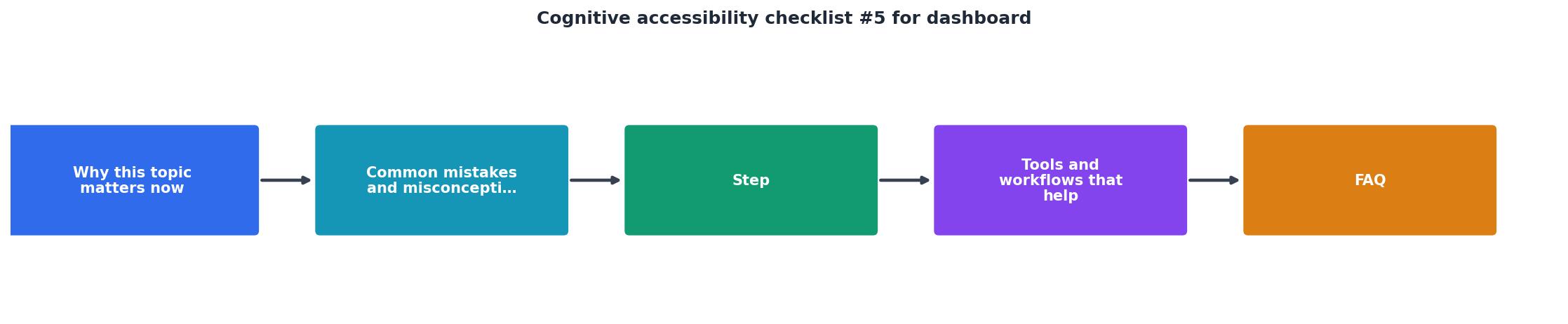
Follow these steps in order. Each one builds on the previous.
1. Inventory every element
Open your dashboard and list every widget, chart, button, filter, and label. A typical SaaS dashboard has 15 to 40 distinct elements. Write them down. You cannot fix what you have not counted.
2. Rank by user priority
Ask: which three to five data points does a user need on every visit? Move those to the top-left quadrant (for left-to-right languages). Everything else goes below the fold or into expandable sections.
3. Check labels and headings
Every chart needs a visible title. Every metric needs a unit. Every button needs a text label, not just an icon. Run through the list from step one and mark anything that relies on context or prior knowledge to understand.
4. Test keyboard navigation
Tab through the entire dashboard. Can you reach every interactive element? Is the focus indicator visible? Does the tab order match the visual layout? If you get stuck in a widget or skip a section, that is a blocker.
"Many users with motor impairments rely on keyboard navigation instead of a mouse.">, Smooth UX: A Handy Accessible Design Checklist
5. Validate color and contrast
Check every status indicator, chart color, and text element against WCAG AA contrast ratios (4.5:1 for normal text, 3:1 for large text). Add a secondary visual cue (icon, pattern, text) wherever color carries meaning.
6. Simplify language
Replace jargon with plain terms. "Monthly Recurring Revenue" instead of "MRR" on first appearance. Add a glossary tooltip if abbreviations are necessary, but always show the full term at least once.
Tools and workflows that help

You do not need a dedicated accessibility team to run this audit. These tools cover most of the ground:
- axe DevTools (browser extension): catches missing labels, contrast failures, and ARIA issues. Free tier handles single-page audits.
- Stark (Figma plugin): test color contrast and simulate color blindness directly in your design files before shipping.
- Keyboard only: no tool needed. Just unplug your mouse for ten minutes and try to complete a task on your dashboard.
- PagePerson Insights: analyzes cognitive accessibility barriers specifically, showing where real visitors get confused and what to fix. Useful for catching the comprehension issues that technical audits miss.
- NVDA or VoiceOver: free screen readers. Spend 15 minutes listening to your dashboard read aloud. You will find problems immediately.
Real-world patterns that work

Progressive disclosure in Notion. Notion's dashboard does not dump every database, page, and integration on screen. It shows recent items and lets you drill down. Apply this to your metrics dashboard: show the summary, let users expand for detail.
Consistent card layout in Shopify. Every card in Shopify's admin follows the same structure: title, primary metric, trend indicator, action link. Users learn the pattern once and can scan any card instantly. Consistency reduces cognitive load more than any single design change.
Clear empty states in Linear. When a section has no data, Linear shows a specific message explaining why and what action to take. Empty states on dashboards often show a blank space or a cryptic "No data." That creates confusion. Tell the user what happened and what to do next.
Here is an example dashboard scorecard showing how a typical audit might look after running through this checklist:
Dashboard Cognitive Accessibility Scorecard
This scorecard pattern gives you a snapshot. Two failures and one warning means you have specific, fixable items. That is better than a vague "the dashboard feels confusing."
The complete checklist
Dashboard Cognitive Accessibility Checklist #5
Your progress is saved automatically in your browser.
FAQ
Frequently Asked Questions
What is the single biggest cognitive accessibility issue on your dashboard right now? Open it in a new tab, run through the first five items on this checklist, and see what you find.
Additional Resources
- Smooth UX: A Handy Accessible Design Checklist - This guide presents a checklist to make your website more user-friendly for a diverse audience, covering visual, auditory, motor, and cognitive ...
- WebAIM's WCAG 2 Checklist - It is a checklist that presents our recommendations for implementing the most common accessibility principles and techniques for those seeking ...
- Dashboard Accessibility Checklist - Use this checklist to ensure your Dashboard meets all requirements for accessibility. Build a focused mobile view.
Need Help with Accessibility?
Improve your site's accessibility and conversion rates with our AI-powered analysis.
Get Started