Cognitive accessibility checklist #6 for onboarding
New users sign up, land on your onboarding flow, and vanish. Your analytics show the drop-off point but never explain why people leave. The answer is almost always cognitive: too many steps, unclear labels, competing calls to action, or instructions that assume knowledge your visitors do not have. This checklist gives you a concrete, item-by-item audit of your onboarding sequence so you can find and fix every cognitive barrier before it costs you another signup.

New users sign up, land on your onboarding flow, and vanish. Your analytics show the drop-off point but never explain why people leave. The answer is almost always cognitive: too many steps, unclear labels, competing calls to action, or instructions that assume knowledge your visitors do not have. This checklist gives you a concrete, item-by-item audit of your onboarding sequence so you can find and fix every cognitive barrier before it costs you another signup.

- Onboarding flows fail when they overload working memory, use ambiguous language, or skip progress indicators.
- This checklist covers six categories: clarity, sequencing, feedback, error recovery, cognitive load, and inclusive language.
- Audit each screen against these items, fix the worst offenders first, and retest with real users.
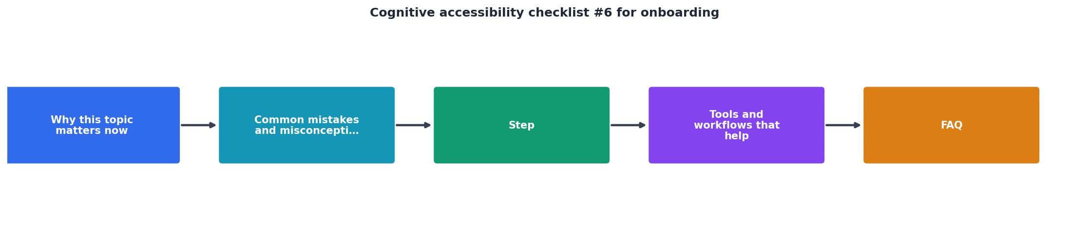
Why onboarding accessibility matters now
Every dollar you spend on paid acquisition leads to a signup page. If that page confuses someone with ADHD, anxiety, dyslexia, or simply low familiarity with your product category, you lose the click you already paid for. That is not a hypothetical scenario. Research consistently shows that a significant share of the general population experiences some form of cognitive difficulty when processing digital interfaces.
That number is not limited to people with diagnosed conditions. It includes anyone under stress, multitasking, sleep-deprived, or using a second language. Onboarding is the highest-stakes moment because the user has zero context. They do not know your terminology, your layout conventions, or where to look next. A single confusing screen can end the relationship before it starts.
Conversion rate optimization and cognitive accessibility are the same work here. Removing cognitive barriers from onboarding directly increases activation rates, trial-to-paid conversion, and long-term retention.
Common onboarding mistakes

Most onboarding flows share the same set of cognitive failures. Recognizing them is the first step toward fixing them.
- Information overload on step one. Asking for a name, email, company size, role, use case, and password on a single screen. Working memory holds roughly four chunks of information at once. Exceed that and users freeze or bail.
- Ambiguous button labels. "Continue", "Next", and "Submit" tell the user nothing about what happens after the click. Specific labels like "Create your workspace" reduce uncertainty.
- No progress indicator. Without a step counter or progress bar, users cannot estimate effort. Uncertainty about duration increases perceived cognitive load.
- Jargon in instructions. Terms like "provisioning", "instance", or "workspace" mean nothing to a first-time visitor. Plain language costs nothing and converts better.
- Missing error recovery. Inline validation that says "Invalid input" without explaining what valid input looks like forces trial-and-error guessing.
- Walls of text. Explanatory paragraphs on onboarding screens compete with the actual task. If you need to explain that much, the UI is too complex.
Step-by-step audit process

Use this process to walk through every screen in your onboarding flow. Each step maps to a category in the checklist below.
Map every screen
Open your onboarding flow and screenshot each distinct screen or state. Include loading states, error states, confirmation screens, and email verification steps. Number them sequentially. You cannot audit what you have not documented.
Score clarity per screen
For each screen, answer: "Can a new user explain what to do here in one sentence?" If the answer is no, the screen fails clarity. Common fixes include reducing form fields, rewriting headings as instructions, and removing decorative content that competes for attention.
Check sequencing logic
Steps should follow a logical order that matches the user's mental model. Asking someone to name their project before they understand what a project is in your system creates confusion. Sequence information requests so each step builds on the previous one.
Verify feedback loops
Every user action needs a visible response. Button clicks should produce immediate visual change. Form submissions should confirm success or explain failure. Progress indicators should update. Silence after an action is the fastest way to lose trust.
Test error recovery paths
Deliberately enter wrong data at every field. Check that error messages are specific ("Password needs at least 8 characters" not "Invalid password"), visible without scrolling, and placed next to the field that caused the problem.
Audit language and reading level
Run your onboarding copy through a readability checker. Aim for a grade 6-8 reading level. Replace jargon with plain equivalents. Use short sentences. One idea per sentence, one task per screen.
"The new employee onboarding checklist below gets you started in the right direction:.">, Employee Onboarding Checklist
Tools and workflows that help

You do not need a large budget or a dedicated accessibility team to run this audit. A few targeted tools cover most of the work.
- Hemingway Editor (free): Paste your onboarding copy and check the reading grade level. Anything above grade 8 needs rewriting.
- Browser DevTools: Use the "Emulate vision deficiencies" feature in Chrome to see how your screens look to users with various visual and cognitive conditions.
- PagePerson Insights: Run the extension on each onboarding screen to surface cognitive accessibility barriers and get specific fix recommendations. It catches issues that standard accessibility checkers miss entirely.
- Screen recording tools (Hotjar, FullStory): Watch real users go through onboarding. Pay attention to hesitation, repeated clicks, and backward navigation. Those are cognitive friction signals.
- Readability APIs (readable.com, Flesch-Kincaid calculators): Automate reading level checks across all onboarding screens.
| Manual Audit | Tool-Assisted Audit |
|---|---|
| 4-6 hours per flow | 30-60 minutes per flow |
| Subjective findings | Data-backed recommendations |
| Hard to repeat consistently | Repeatable on every deploy |
| Requires accessibility expertise | Guides non-experts through issues |
The following dashboard shows what a typical cognitive accessibility audit reveals for an onboarding flow with five screens. These numbers represent a real-world pattern where most issues cluster around clarity and cognitive load.
Onboarding Cognitive Audit
Measuring improvement
After fixing the issues your audit surfaces, you need to verify the changes worked. Track these metrics before and after:
- Onboarding completion rate: The percentage of users who finish every step. This is your primary signal.
- Time to complete: Shorter is not always better. A slight increase can mean users are reading and understanding instead of clicking blindly. Look for reduced variance, not just lower averages.
- Error rate per field: Count how often users trigger validation errors. A drop means your labels and instructions are clearer.
- Support tickets during onboarding: If users stop asking "how do I..." questions, your flow is self-explanatory.
- Drop-off by step: Identify which specific screen loses the most users. That screen gets priority in your next audit cycle.
Cognitive Accessibility Onboarding Checklist
Your progress is saved automatically in your browser.
FAQ
Frequently Asked Questions
Additional Resources
- Employee Onboarding Checklist for People With Disabilities - 6. Flexible Scheduling Recognize that disabled employees may require flexible scheduling for medical appointments, therapy, or other demos. And give the new ...
- Making Content Usable for People with Cognitive and ... - It is always important to follow Web Content Accessibility Guidelines WCAG [ WCAG22 ] and ensure the needs of all disabilities are addressed.
- Introductory Guide to Cognitive Accessibility (COGA) - 6. Ensure Processes Do Not Rely on Memory Objective: Avoid requiring users to remember information. Examples: Password Policies: Offer options for password ...
Need Help with Accessibility?
Improve your site's accessibility and conversion rates with our AI-powered analysis.
Get Started