Cognitive accessibility checklist #7 for error states
Error states are where most websites silently lose conversions. A visitor fills out your signup form, hits submit, and gets a red banner that says "Invalid input" with zero explanation of what went wrong or how to fix it. That visitor leaves. This checklist gives you a concrete, item-by-item approach to designing error states that people with varying cognitive abilities can actually understand and recover from.

Error states are where most websites silently lose conversions. A visitor fills out your signup form, hits submit, and gets a red banner that says "Invalid input" with zero explanation of what went wrong or how to fix it. That visitor leaves. This checklist gives you a concrete, item-by-item approach to designing error states that people with varying cognitive abilities can actually understand and recover from.

- Error messages need plain language, specific instructions, and placement directly next to the field that caused the problem.
- Color alone is never enough to signal an error. Combine color with icons, text, and focus management.
- Cognitive accessibility in error states means reducing memory load, preventing panic, and giving people a clear next step.
- This checklist covers inline validation, 404 pages, payment failures, and form errors with actionable items you can implement today.
The real cost of bad error states
A form with five fields and one cryptic error message can tank your conversion rate by double digits. The problem is not that users make mistakes. The problem is that your error handling punishes them for it.
People with ADHD lose context when an error message appears at the top of a long form and the problematic field is three scroll-lengths down. People with anxiety spiral when a payment error gives no indication whether their card was charged. People with dyslexia struggle when error text is small, red, and crammed into a tooltip.
That number is not a guess. Watch session recordings on any e-commerce checkout with poor error handling. The pattern is consistent: confusion, hesitation, abandonment.
Most websites still treat error states as an afterthought. That gap is your opportunity.
Common mistakes that cost you signups

Here are the patterns I see repeatedly on landing pages and checkout flows:
- Generic error text. "Something went wrong" tells the user nothing. It forces them to guess, which increases cognitive load and frustration.
- Color-only indicators. A red border on a field is invisible to colorblind users and meaningless to screen reader users. About 8% of men have some form of color vision deficiency.
- Error summaries at the top of the page. The user reads "3 errors found" but has to scroll down and hunt for them. Working memory gets overloaded fast.
- Disappearing error messages. Some sites show an error toast for three seconds, then hide it. If the user blinked, looked away, or was processing the previous sentence, the message is gone.
- Technical jargon. "Error 422: Unprocessable Entity" belongs in server logs, not on a signup form.
- No recovery path. The error says what is wrong but not how to fix it. "Invalid email" is less useful than "Enter an email address like name@example.com."
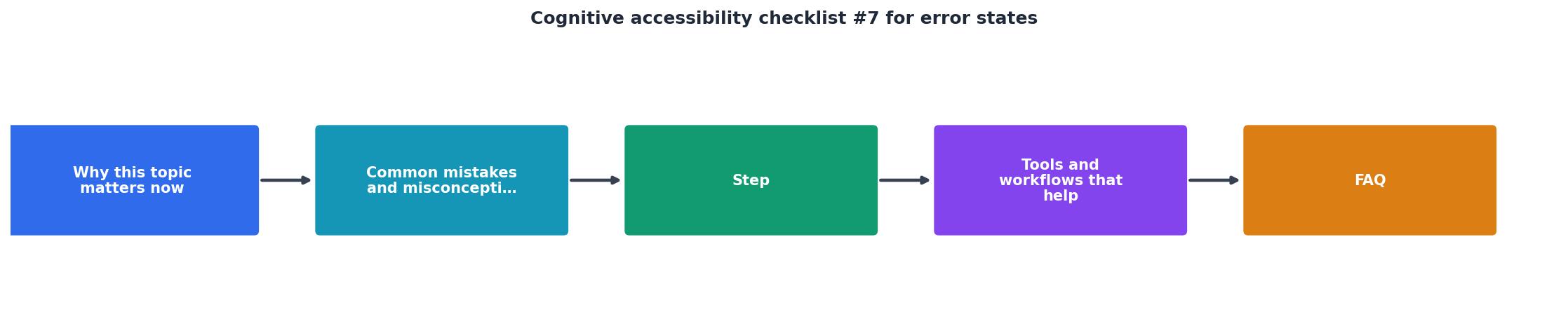
Step-by-step approach to accessible error states

This is the process I recommend. Each step builds on the previous one.
Identify error types
Start by cataloging every error state in your product. Group them into categories:
- Validation errors (form fields, input formats)
- System errors (server failures, timeouts)
- Navigation errors (404 pages, broken links)
- Payment errors (declined cards, insufficient funds)
- Authentication errors (wrong password, expired session)
Write plain-language messages
For every error, write a message that answers three questions:
- What happened?
- Why did it happen?
- What should the user do next?
| Poor Error Message | Accessible Error Message |
|---|---|
| "The phone number needs 10 digits. You entered 9." | |
| "Our server had a problem. Your data is saved. Try again in a minute." | |
| "That password does not match our records. Reset it or try again." | |
| "Your card was not charged. Check the card number and expiration date." |
Place messages inline
Put the error message directly below (or next to) the field that caused it. Use aria-describedby to connect the message to the input so screen readers announce it. Move keyboard focus to the first field with an error after form submission.
Use multiple signals
Never rely on color alone. Combine at least two of these:
- Color (red border, background tint)
- Icon (warning triangle, exclamation mark)
- Text (the error message itself)
- Position (inline, next to the field)
"Except for captions and images of text, text can be resized without assistive technology up to 200 percent without loss of content or functionality.">, Web Content Accessibility Guidelines (WCAG) 2.1
This WCAG requirement means your error messages must remain readable and properly positioned even at 200% zoom. Test this. Most sites break at 150%.
Persist the message
Keep the error visible until the user fixes it. No auto-dismissing toasts for critical errors. If you use a toast notification for non-critical warnings (like "Caps Lock is on"), that is fine. But validation errors and payment failures stay on screen.
Prevent errors proactively
The best error state is one that never appears. Use input masks for phone numbers and credit cards. Show password requirements before the user types, not after they fail. Auto-format dates. Offer suggestions for common typos in email domains ("Did you mean gmail.com?").
Tools and workflows that help

You do not need a massive budget to get this right. Here is what actually works:
- axe DevTools checks for missing
aria-describedbyassociations and color contrast on error text. Free browser extension. - WAVE highlights form elements without proper labels and flags color-only error indicators.
- Screen reader testing with NVDA (free, Windows) or VoiceOver (built into macOS). Submit a form with errors and listen. If the screen reader does not announce what went wrong and where, your implementation is broken.
- PagePerson Insights can surface cognitive barriers in your error flows, showing you where visitors with different cognitive profiles get stuck. It goes beyond standard WCAG checks into comprehension and cognitive load analysis.
- Session replay tools (Hotjar, FullStory) let you watch real users encounter errors. Filter for sessions with form abandonment and study the patterns.
The following card shows what a quick cognitive accessibility audit of error states typically reveals on a mid-size SaaS signup flow:
Example: SaaS Signup Error Audit
Those numbers are typical. Most of the work is rewriting messages and adding ARIA attributes. The code changes are small. The conversion impact is not.
The checklist
Use this checklist to audit every error state on your site. Go screen by screen, form by form.
Cognitive Accessibility Checklist #7: Error States
Your progress is saved automatically in your browser.
FAQ
Frequently Asked Questions
aria-describedby, adjusting focus management, adding icons alongside color) are straightforward for any front-end developer. Start with your highest-traffic form and work outward.Additional Resources
- Web Content Accessibility Guidelines (WCAG) 2.1 - Web Content Accessibility Guidelines (WCAG) 2.1 covers a wide range of recommendations for making web content more accessible.
- WCAG 2.1 Success Criteria Checklist - 1 Error Identification, A, If a user makes a mistake, the error must be identified. · 2 Labels or Instructions, A, Forms must include labels or instructions. · 3 ...
- WebAIM's WCAG 2 Checklist - It is a checklist that presents our recommendations for implementing the most common accessibility principles and techniques for those seeking ...
Need Help with Accessibility?
Improve your site's accessibility and conversion rates with our AI-powered analysis.
Get Started