Cognitive accessibility checklist #8 for forms
Forms are where conversions happen or die. A visitor clicks your CTA, lands on a signup or checkout form, and then leaves because the form itself created confusion, anxiety, or cognitive overload. This checklist gives you a concrete, item-by-item audit for every form on your site so you can catch the barriers that analytics never explain. Work through it once, fix what you find, and watch completion rates climb.

Forms are where conversions happen or die. A visitor clicks your CTA, lands on a signup or checkout form, and then leaves because the form itself created confusion, anxiety, or cognitive overload. This checklist gives you a concrete, item-by-item audit for every form on your site so you can catch the barriers that analytics never explain. Work through it once, fix what you find, and watch completion rates climb.

- Cognitively accessible forms use clear labels, minimal fields, visible error messages, and logical grouping to reduce mental effort.
- Most form abandonment stems from avoidable cognitive barriers: ambiguous labels, hidden requirements, and overwhelming field counts.
- This checklist covers 15+ specific items you can audit and fix today without redesigning your entire site.
Why form accessibility drives revenue
Every form on your site is a gate. Signup forms, checkout flows, contact forms, lead magnets. Visitors who reach a form already showed intent. They clicked. They scrolled. They decided to act. Then the form itself pushed them away.
That number includes every reason for abandonment, but cognitive friction in forms is one of the top contributors. Confusing field labels, unexpected validation errors, and forms that demand too much information at once create a wall between intent and completion.
Cognitive accessibility in forms means designing inputs, labels, errors, and flow so that people with varying cognitive abilities, attention spans, and stress levels can complete them without unnecessary mental effort. This includes visitors with ADHD, dyslexia, anxiety, low digital literacy, and anyone multitasking on a phone while riding the bus.
The business case is straightforward: reduce cognitive load in forms, and more people finish them. Same traffic, more conversions, lower cost per acquisition.
Common form mistakes that kill conversions

Most teams build forms that make sense to the people who built them. That is the core problem. Here are the mistakes I see repeatedly:
- Placeholder text as labels. Once a user starts typing, the label disappears. They forget what the field asked for. This is especially brutal for anyone with short-term memory challenges.
- Vague error messages. "Invalid input" tells the user nothing. They have to guess what went wrong and try again. Each failed attempt increases frustration and abandonment.
- Asking for too much, too early. A newsletter signup that demands first name, last name, company, role, phone number, and email is not a newsletter signup. It is an interrogation.
- No visible required-field indicators. Users fill out what they think is enough, submit, and get slapped with errors on fields they did not know were mandatory.
- Inconsistent input formats. Expecting a phone number in a specific format (like
(555) 555-5555) without telling the user, then rejecting5555555555. - Auto-advancing focus without warning. Some multi-step forms jump the cursor to the next field automatically. For users with motor or cognitive differences, this creates disorientation.
That low number means most of the web still gets this wrong. Fixing even the basics puts you ahead of the majority.
Step-by-step form audit process
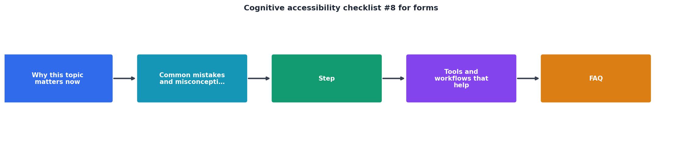
Follow these steps in order. Each one builds on the previous:
1. Inventory all forms
List every form on your site. Signup, login, checkout, contact, search, filters, newsletter, account settings. Miss one and you leave a gap.
2. Check labels and instructions
Every field needs a persistent visible label above or beside it. Not inside it. Not as placeholder text. Above it. Add brief helper text below fields that need clarification (like "We'll never share your email").
3. Audit field count
For each form, ask: "What is the absolute minimum information I need at this step?" Remove everything else. You can always ask for more later, after the user has committed.
4. Review error handling
Trigger every possible error state. Submit empty forms. Enter wrong formats. Skip required fields. For each error:- Does the message appear next to the field that caused it?
- Does it explain what went wrong in plain language?
- Does it tell the user how to fix it?
5. Test input flexibility
Phone numbers, dates, postal codes. Accept multiple formats. If you need a specific format, show an example and use input masking to guide the user.
6. Verify focus and flow
Tab through the entire form with your keyboard. Does focus move in a logical order? Does it skip fields? Does it get trapped? Screen reader users and keyboard-only users depend on this.
7. Check progress indicators
Multi-step forms need a visible progress bar or step counter. Users need to know where they are, how many steps remain, and that their previous answers are saved.
"There is no such thing as "perfect accessibility" or a site being "100% accessible." You should be wary of companies and services that make such promises.">, Checklist
That quote is a good reminder: this is not about perfection. It is about systematically reducing barriers.
Tools and workflows that help

You do not need a full usability lab to audit form accessibility. Here is a practical workflow:
- Browser DevTools. Inspect form elements, check for
associations, verifyaria-describedbyon error messages. - Keyboard-only testing. Unplug your mouse. Tab through every form. If you get stuck or confused, your users will too.
- Screen reader spot-checks. Use NVDA (free, Windows) or VoiceOver (built into macOS/iOS) to hear how your form reads aloud. Missing labels become immediately obvious.
- PagePerson Insights. Run the extension on your form pages to surface cognitive barriers that standard accessibility checkers miss, like excessive cognitive load, unclear instructions, and confusing flow patterns.
- Real user testing. Even three people completing your form while thinking aloud will reveal problems no automated tool catches.
| Manual Audit | Automated Tools | Combined Approach |
|---|---|---|
| Catches context issues | Catches code-level issues | Catches both |
| Time-intensive | Fast but shallow | Efficient and thorough |
| Subjective findings | Objective metrics | Evidence-based decisions |
| Hard to repeat | Easy to repeat | Repeatable with depth |
The combined approach is what works. Automated tools flag the structural problems. Manual review catches the human experience problems. Use both.
Real-world examples that work

Stripe Checkout keeps forms minimal. Card number, expiry, CVC. Three fields. Real-time validation shows a green checkmark as you type. Error messages appear inline, in plain language. The form accepts card numbers with or without spaces.
Gov.uk forms are a masterclass in cognitive accessibility. One question per page. Clear labels. Helper text that explains why information is needed. Error summaries at the top of the page with links to each problem field.
Typeform uses a one-question-at-a-time approach that reduces cognitive load dramatically. Each question gets the full screen. Progress is visible. Users report lower anxiety and higher completion rates compared to traditional long forms.
What these have in common: they respect the user's attention and working memory. They never ask for more than one decision at a time.
Here is an example dashboard showing how form cognitive accessibility metrics might look after an audit:
Form Accessibility Audit Summary
The complete form accessibility checklist
Use this checklist to audit every form on your site. Work through it field by field, form by form.
Cognitive Accessibility Checklist #8: Forms
Your progress is saved automatically in your browser.
FAQ
Frequently Asked Questions
Additional Resources
- Checklist - The issues this checklist prompts you to check for covers a wide range of disability conditions. Use plain language and avoid figures of speech, idioms, and ...
- Your eight-step PDF accessibility checklist - Ensure form fields have clear labels and descriptive tooltips. · Ensure the appropriate tab order has been set. · Ensure hyperlinks have ...
- WCAG Checklist 2.1 AA and 2.2 AA - Download our WCAG checklists in PDF format for free with no subscription required. WCAG 2.0 AA, 2.1 AA, and 2.2 AA are all covered.
Need Help with Accessibility?
Improve your site's accessibility and conversion rates with our AI-powered analysis.
Get Started