Cognitive accessibility checklist #9 for legal pages
Your terms of service, privacy policy, and cookie consent pages are probably the hardest pages on your entire site to understand. Legal language creates a wall of text that most visitors abandon within seconds, and the ones who stay leave confused about what they actually agreed to. This checklist gives you a concrete, item-by-item plan to make legal pages cognitively accessible without watering down the legal substance.

Your terms of service, privacy policy, and cookie consent pages are probably the hardest pages on your entire site to understand. Legal language creates a wall of text that most visitors abandon within seconds, and the ones who stay leave confused about what they actually agreed to. This checklist gives you a concrete, item-by-item plan to make legal pages cognitively accessible without watering down the legal substance.

- Legal pages rank among the least readable content on most websites, with average reading levels above grade 16.
- Cognitive accessibility for legal pages means plain-language summaries, clear structure, consistent terminology, and resizable text.
- This checklist covers 12 specific items you can audit and fix today to make terms, privacy policies, and disclaimers understandable for visitors with ADHD, dyslexia, anxiety, or low digital literacy.
Why legal pages fail visitors
Most legal pages exist to protect the company, not to inform the reader. That priority shows up in the writing. Sentences stretch past 40 words. Defined terms appear without definitions. Paragraphs run for 300+ words without a single heading or break.
The result: visitors click "I agree" without understanding a single clause. That is not informed consent. It is also a conversion problem. When someone lands on your privacy policy from a Google search or a signup flow and bounces, you lost a potential customer who wanted to trust you.
Cognitive accessibility addresses the comprehension layer. Standard accessibility tools check contrast ratios and alt text. They do not flag a 200-word sentence or a paragraph that uses "notwithstanding" three times. Cognitive barriers on legal pages hit people with dyslexia, ADHD, anxiety disorders, low literacy, and anyone reading in a second language.
Common mistakes on legal pages

Here are the patterns that cause the most cognitive friction:
- Wall-of-text formatting. No headings, no bullet points, no white space. The entire terms of service reads like a single block.
- Legalese without plain-language alternatives. Phrases like "indemnify and hold harmless" or "notwithstanding the foregoing" mean nothing to most readers.
- Undefined defined terms. The document capitalizes "Services" or "Content" but never explains what those words cover.
- No table of contents. A 4,000-word privacy policy with zero navigation forces readers to scroll blindly.
- Tiny, fixed font sizes. Legal pages often use smaller type than the rest of the site, making them harder to read for people with low vision or cognitive fatigue.
- No summaries. Each section dives straight into legal language without a one-sentence plain explanation of what it covers.
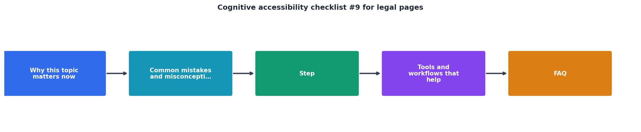
Step-by-step approach

Follow these steps to audit and improve your legal pages. The process works for terms of service, privacy policies, cookie policies, refund policies, and any other legal content on your site.
Audit current readability
Run each legal page through a readability scorer. Tools like Hemingway Editor or readable.com give you a grade level. Aim for grade 8-10 for summaries and grade 12-14 for the legal text itself. Document the current scores so you can measure improvement.
Add structure and navigation
Break the document into sections with clear H2 and H3 headings. Add a clickable table of contents at the top. Each section should cover one topic: data collection, data sharing, user rights, termination, liability. Short sections (150-300 words) are easier to process than long ones.
Write plain-language summaries
Add a short summary at the top of each section. Use a visually distinct callout or highlighted box. Example: before the "Data We Collect" section, add a summary like "We collect your name, email, and usage data when you use our product. We explain each type below."
Define every term
Create a glossary section or define terms inline on first use. Bold the term and follow it with a parenthetical definition. Example: Personal Data (any information that identifies you, like your name or email address).
Fix typography and spacing
- Set body text to at least 16px.
- Use line height of 1.5 or greater.
- Limit line length to 65-75 characters.
- Add spacing between sections (at least 24px margin).
- Ensure text resizes cleanly up to 200%.
"Except for captions and images of text, text can be resized without assistive technology up to 200 percent without loss of content or functionality.">, Web Content Accessibility Guidelines (WCAG) 2.1
Test with real users
Ask three to five people outside your team to find specific information in your legal pages. Time them. If someone cannot find the answer to "Can I delete my account?" within 30 seconds, the structure needs work.
Tools and workflows that help

A few specific tools make this work easier:
- Hemingway Editor highlights complex sentences and passive voice. Paste each section individually.
- readable.com gives Flesch-Kincaid scores and flags jargon.
- WAVE (WebAIM) checks heading structure and contrast on the rendered page.
- PagePerson Insights analyzes cognitive barriers across your site, including legal pages, and shows you where visitors with ADHD, dyslexia, or anxiety are likely to struggle.
- axe DevTools catches missing landmarks and heading hierarchy issues.
The following card shows what a typical legal page audit reveals before and after applying this checklist:
Legal Page Audit: Before vs. After
Comparing approaches
| Unstructured Legal Page | Cognitively Accessible Legal Page |
|---|---|
| Single block of text | Sections with H2/H3 headings |
| Grade 16+ reading level | Grade 10 summaries, grade 13 legal text |
| No table of contents | Clickable TOC at top |
| Undefined jargon | Glossary or inline definitions |
| 12px fixed font | 16px+ responsive font, 1.5 line height |
| No summaries | Plain-language summary per section |
The checklist
Legal Page Cognitive Accessibility Checklist
Your progress is saved automatically in your browser.
FAQ
Frequently Asked Questions
Additional Resources
- Web Content Accessibility Guidelines (WCAG) 2.1 - For web pages that cause legal commitments or financial transactions for the user to occur, order for it to be classified as accessibility ...
- WebAIM's WCAG 2 Checklist - It is a checklist that presents our recommendations for implementing the most common accessibility principles and techniques for those seeking ...
- WCAG Checklist 2.1 AA and 2.2 AA - Download our WCAG checklists in PDF format for free. Error Prevention (Legal, Financial, Data) For pages that involve legal commitments or financial ...
Need Help with Accessibility?
Improve your site's accessibility and conversion rates with our AI-powered analysis.
Get Started