Cognitive Accessibility Considerations for Financial Services Websites
Banking, insurance, and investment websites handle some of the most consequential decisions people make online, yet they routinely bury critical information behind walls of jargon, multi-step forms, and confusing navigation. For users with cognitive disabilities, anxiety disorders, ADHD, or low digital literacy, these barriers do not just frustrate. They block access to essential financial services. This guide walks through the specific cognitive accessibility considerations that financial services teams need to address, with concrete strategies, audit steps, and real examples you can act on today.

Banking, insurance, and investment websites handle some of the most consequential decisions people make online, yet they routinely bury critical information behind walls of jargon, multi-step forms, and confusing navigation. For users with cognitive disabilities, anxiety disorders, ADHD, or low digital literacy, these barriers do not just frustrate. They block access to essential financial services. This guide walks through the specific cognitive accessibility considerations that financial services teams need to address, with concrete strategies, audit steps, and real examples you can act on today.

- Financial services websites create outsized cognitive barriers through complex language, multi-step transactions, and time-pressured interfaces.
- Clear communication, predictable navigation, and forgiving form design are the three pillars of cognitive accessibility in finance.
- A structured audit checklist covering language, navigation, error handling, and security flows helps compliance teams document and track improvements systematically.
Common cognitive barriers in finance

Financial websites create cognitive barriers in predictable ways. Recognizing the patterns is the first step toward fixing them.
- Jargon overload. Terms like "APR," "amortization," "deductible," and "fiduciary" appear without definitions. Users with cognitive disabilities or limited financial literacy cannot parse these without context.
- Dense information architecture. Insurance comparison pages, for example, often present five or more plan tiers in a single table with 20+ rows. Working memory limits mean most users cannot hold that much data in their heads to compare.
- Time-pressured sessions. Security timeouts on banking portals log users out after 2-5 minutes of inactivity. For someone who reads slowly, needs to look up a term, or gets distracted, this creates a cycle of frustration and repeated logins.
- Inconsistent navigation. A mortgage application that changes its sidebar menu between steps, or hides the "back" button on certain pages, breaks the mental model users rely on to track their progress.
- Error messages that blame the user. "Invalid input" next to a phone number field tells the user nothing. Someone with anxiety may abandon the form entirely rather than guess what went wrong.
"The ADA also encompasses digital platforms such as websites and mobile apps.">, Accessibility for Financial Websites to Meet Industry Standards
These barriers compound. A user who struggles with jargon, then hits a confusing navigation change, then gets timed out, is unlikely to return. For compliance teams, each of these patterns represents a documentable risk.
Clear communication strategies
Simplifying financial content does not mean dumbing it down. It means structuring information so the reader can process it without unnecessary cognitive effort.
Plain language first, technical terms second. Every instance of a specialized term should be followed by a short inline definition or linked to a glossary tooltip. For example: "Your APR (Annual Percentage Rate, the yearly cost of borrowing expressed as a percentage) is 5.9%." This pattern lets expert users skim past the definition while giving everyone else the context they need.
Chunk information into small sections. Instead of a single page listing all terms and conditions for a credit card, break the content into labeled sections: Fees, Interest Rates, Rewards, Penalties. Each section should answer one question. Barclays UK restructured their credit card terms pages this way in 2024 and reported a measurable drop in support calls related to terms confusion.
Use progressive disclosure. Show the summary first, then let users expand for detail. A loan calculator result page might show: monthly payment, total interest, and loan term at the top, with expandable sections for the amortization schedule and fee breakdown below.
- Write at a 6th-8th grade reading level for consumer-facing content
- Limit paragraphs to 3-4 sentences
- Use bullet points for any list of three or more items
- Provide a glossary page and link to it from every product page
- Test content with readability tools like Hemingway Editor or Flesch-Kincaid scoring
Secure yet accessible transactions

Security and accessibility are often treated as opposing forces. They do not have to be. The goal is to design transaction flows that protect users without creating cognitive traps.
Session timeouts need warnings and extensions. WCAG 2.2 Success Criterion 2.2.1 requires that users can turn off, adjust, or extend time limits. A banking portal should display a clear warning at least 60 seconds before timeout, with a single-click "extend session" button. Chase and Wells Fargo both implemented visible countdown timers with extension options on their online banking platforms.
Multi-factor authentication should offer choices. SMS codes, authenticator apps, and biometric options each have different cognitive demands. Offering at least two methods lets users pick the one that works for their situation. A user with ADHD who frequently loses track of SMS codes might prefer fingerprint authentication.
Form design must be forgiving. Financial forms should:
- Accept multiple input formats (phone numbers with or without dashes, dates in various formats)
- Show inline validation as the user types, not only after submission
- Preserve entered data if the user navigates away and returns
- Provide a clear summary/review step before final submission
| Inaccessible Pattern | Accessible Alternative |
|---|---|
| 5-minute timeout with 60-second warning + extend button | |
| Choice of SMS, authenticator app, or biometric | |
| "Please enter your date of birth as MM/DD/YYYY" | |
| Form state preserved across navigation | |
| Step-by-step review with edit links per section |
How to audit financial websites

A cognitive accessibility audit for financial services requires a structured, repeatable process. Here is the workflow that covers the critical areas.
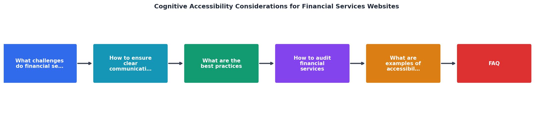
The process follows five steps: Inventory critical user journeys, Scan each page for cognitive barriers, Test with real users (including those with cognitive disabilities), Prioritize fixes by severity and user impact, and Document findings for compliance records.
Step 1: Inventory. List every user-facing journey: account opening, loan application, bill payment, claims filing, benefits enrollment. Rank them by traffic volume and business criticality.
Step 2: Scan. For each journey, evaluate:- Reading level of all visible text
- Number of steps to complete the task
- Presence of jargon without definitions
- Navigation consistency across steps
- Timeout behavior and warnings
- Error message specificity
- Form field labeling and input flexibility
Step 4: Prioritize. Score each finding by severity (blocks task completion vs. causes confusion) and frequency (affects all users vs. edge case). Fix task-blocking issues first.
Step 5: Document. Record each finding, its WCAG mapping (where applicable), the remediation plan, and the completion date. This documentation is what regulators and legal teams need to see.
The following interactive card summarizes the key audit dimensions and their typical compliance status across financial services websites:
Financial Website Audit: Typical Compliance Rates
Real-world accessibility improvements
Concrete examples show what cognitive accessibility improvements look like in practice and what they deliver.
Nationwide Building Society (UK) redesigned their mortgage application in 2023, reducing the number of screens from 14 to 8 and adding inline definitions for every financial term. Application completion rates increased by 19%, and calls to the support line about the application process dropped by 23%.
USAA introduced a "simple view" toggle on their insurance dashboard that strips away secondary information and shows only the policy summary, next payment date, and claims status. Members who activated simple view completed self-service tasks 34% faster.
ING (Netherlands) replaced generic error messages across their online banking platform with context-specific guidance in 2024. For example, "Transfer failed" became "This transfer exceeds your daily limit of EUR 5,000. You can adjust your limit in Settings > Transfer Limits." Support tickets related to failed transfers dropped by 41%.
These are not hypothetical improvements. Each one targeted a specific cognitive barrier, measured the outcome, and documented the result. That documentation is exactly what compliance teams need when demonstrating due diligence to regulators.
Financial services accessibility checklist
Use this checklist to audit your financial services website systematically. Each item maps to a specific cognitive accessibility concern.
Financial Services Website Cognitive Accessibility Checklist
Your progress is saved automatically in your browser.
FAQ
Frequently Asked Questions
Additional Resources
- Accessibility for Financial Websites to Meet Industry ... - By prioritizing accessibility, these websites can remove barriers related to vision, hearing, mobility, or cognitive differences, creating a ...
- Cognitive Accessibility of Digital Payments: A Literature ... - This literature review examines 30 scholarly publications, nuancing the challenges of online banking for older adults and people with neurodiverse needs.
- Making Financial Services Accessible for Everyone - Level Access equips financial services providers with the technology, testing, and strategic support needed to simplify digital accessibility.
Need Help with Accessibility?
Improve your site's accessibility and conversion rates with our AI-powered analysis.
Get Started