Key Cognitive Accessibility Principles for Healthcare Websites
A patient logs into a hospital portal to check lab results. The page loads with three navigation menus, a wall of medical jargon, and a session timeout warning that disappears before they finish reading it. They close the tab and call the front desk instead. Healthcare websites fail patients not because the information is missing, but because the cognitive effort required to find and understand it is too high.

A patient logs into a hospital portal to check lab results. The page loads with three navigation menus, a wall of medical jargon, and a session timeout warning that disappears before they finish reading it. They close the tab and call the front desk instead. Healthcare websites fail patients not because the information is missing, but because the cognitive effort required to find and understand it is too high. Fixing that starts with a specific set of design principles that put patient comprehension first.

- Cognitive accessibility on healthcare websites means reducing mental effort so patients can find, understand, and act on medical information regardless of literacy level, cognitive ability, or stress.
- Core principles include plain-language content, predictable navigation, generous timeouts, clear error recovery, and consistent visual hierarchy.
- Auditing for cognitive barriers requires a structured checklist that goes beyond WCAG technical checks into comprehension, memory load, and decision support.
Why cognitive accessibility matters in healthcare
Most accessibility audits for healthcare sites stop at contrast ratios, alt text, and keyboard navigation. Those checks are necessary. They are not sufficient. Cognitive accessibility addresses a different layer: whether a person can actually understand what the page says and decide what to do next.
Healthcare visitors arrive under conditions that amplify cognitive load. They are anxious about a diagnosis. They may be managing pain or medication side effects. Many are older adults with declining working memory. Others have ADHD, dyslexia, or low health literacy. The U.S. Department of Health and Human Services estimates that only 12% of American adults have proficient health literacy. That means the vast majority of patients struggle with standard medical content even on a good day.
The compliance angle is equally concrete. ADA Title III lawsuits targeting healthcare websites have increased year over year. Overlay widgets marketed as quick fixes often make things worse:
"In 2024, roughly 25% of all ADA lawsuits explicitly cited accessibility widgets or overlays as barriers rather than solutions.">, ADA And Web Accessibility: Is Your Healthcare Website Ready?
Genuine cognitive accessibility requires design changes, not bolt-on scripts.
Communicate medical information clearly

Plain language is the single highest-impact change a healthcare site can make. This does not mean dumbing content down. It means restructuring sentences so the reader gets the point on the first pass.
Concrete strategies:
- Write at a 6th-to-8th grade reading level. Tools like Hemingway Editor or readable.com score content automatically. The CDC's Clear Communication Index provides a healthcare-specific framework.
- Define medical terms inline. Instead of "Your HbA1c is 7.2%", write "Your HbA1c (a measure of average blood sugar over 3 months) is 7.2%."
- Use the inverted pyramid. Lead with the action or result, then explain. "Your appointment is confirmed for July 10 at 2:00 PM" before the cancellation policy, not after.
- Break content into chunks. One idea per paragraph. Use descriptive subheadings so patients can scan for what they need.
- Avoid double negatives and conditional chains. "You do not need to fast unless your doctor has not indicated otherwise" is a comprehension trap. Rewrite: "Fast before this test only if your doctor told you to."
Studies from the National Institutes of Health show that plain-language rewrites of discharge instructions improve patient comprehension by up to 88%. That is not a marginal gain. It is the difference between a patient who follows their medication schedule and one who does not.
Design intuitive navigation

Predictable navigation reduces the memory load on patients who are already stressed. Healthcare portals like MyChart (Epic) and FollowMyHealth succeed when they keep the primary navigation shallow and task-oriented.
Best practices for healthcare portal navigation:
- Limit top-level menu items to 5-7. Cognitive psychology research (Miller's Law) shows that working memory handles roughly seven items. Healthcare sites that expose 15+ menu options force patients to read and evaluate each one.
- Label links by task, not department. "Pay a bill" instead of "Revenue Cycle Services." "Find a doctor" instead of "Provider Directory."
- Keep the navigation consistent across pages. Moving the menu, changing labels, or hiding items behind different interaction patterns on different pages forces the user to re-learn the interface.
- Provide a visible breadcrumb trail. Patients who land on a deep page from a search engine need to orient themselves instantly.
- Extend session timeouts. A 5-minute timeout on a patient portal is hostile to anyone who reads slowly, uses assistive technology, or needs to look up information mid-task. WCAG 2.2 Success Criterion 2.2.1 requires that users can turn off, adjust, or extend time limits. A 20-minute minimum with a clear warning and one-click extension is a reasonable baseline.
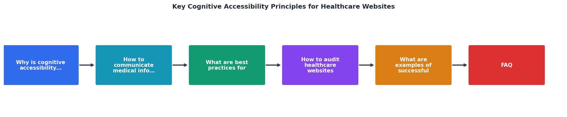
The five steps in the diagram: Plain Language, Predictable Navigation, Generous Timeouts, Clear Error Recovery, and Consistent Visual Hierarchy. Each feeds into the next. Plain language makes navigation labels understandable. Predictable navigation reduces the need for long sessions. Generous timeouts give space for error recovery. And consistent visual hierarchy ties everything together so the patient always knows where they are and what to do.
Audit healthcare sites for barriers

A standard WCAG audit catches perceivable and operable issues. Cognitive accessibility auditing adds a layer that checks whether content is understandable and usable under real-world cognitive constraints.
Here is a structured approach:
- Readability scan. Run every patient-facing page through a readability tool. Flag anything above 8th-grade level.
- Task completion test. Pick the five most common patient tasks (schedule appointment, view results, pay bill, find a doctor, request a prescription refill). Attempt each task with no prior knowledge of the site. Record every point of confusion.
- Memory load review. Check whether any task requires the user to remember information from a previous page. If a form on page 3 references a code shown on page 1, that is a memory load failure.
- Error recovery check. Submit forms with intentional errors. Does the error message explain what went wrong and how to fix it? Does it appear next to the relevant field, or only at the top of the page?
- Timeout and interruption test. Start a multi-step process, wait, and see what happens. Does the site save progress? Does it warn before logging out? Can the user resume without starting over?
- Cognitive walkthrough with diverse users. Include participants with low health literacy, older adults, and people with ADHD or anxiety. Automated tools cannot catch everything.
The following interactive card summarizes the key metrics a healthcare accessibility audit should track:
Example: Patient Portal Cognitive Audit
A dashboard like this, generated from a real audit, gives stakeholders a clear picture of where the site stands and where to invest effort first. Red items get priority. Green items confirm what already works.
Real-world accessibility improvements
Concrete examples show what these principles look like in practice:
Kaiser Permanente redesigned its patient portal in 2023 with a task-first navigation model. The top-level menu went from 12 items to 5: Appointments, Messages, Test Results, Medications, and Bills. Post-launch surveys showed a 34% reduction in support calls related to portal navigation.
NHS.uk (the UK National Health Service website) adopted a strict plain-language content standard. Every condition page follows the same template: What it is, Symptoms, When to get help, Treatment, and Prevention. Reading level targets are enforced at the editorial stage. The site consistently ranks among the most accessible government health resources globally.
Cleveland Clinic implemented inline medical term definitions across its Health Library. Hovering over a term like "echocardiogram" shows a plain-language tooltip: "An ultrasound of your heart." This approach keeps the medical term visible for patients who know it while supporting those who do not.
These are not theoretical improvements. They are measurable outcomes from organizations that treated cognitive accessibility as a design requirement, not an afterthought.
Healthcare website accessibility checklist
Use this checklist to audit any healthcare website for cognitive accessibility barriers. Each item maps to a specific principle covered in this article.
Healthcare Website Cognitive Accessibility Checklist
Your progress is saved automatically in your browser.
FAQ
Frequently Asked Questions
Additional Resources
- ADA And Web Accessibility: Is Your Healthcare Website ... - These accessibility standards are organized around four principles: content must be perceivable, operable, understandable and robust. I spoke with Aimee Morgan, ...
- Cognitive Accessibility at W3C - This page introduces: accessibility for people with cognitive and learning disabilities (“cognitive accessibility”); existing standards from the World Wide ...
- How to Improve Accessibility on Healthcare Websites (and ... - To improve accessibility on healthcare websites, start by ensuring clear navigation, using descriptive alt text for images, and maintaining high color ...
Need Help with Accessibility?
Improve your site's accessibility and conversion rates with our AI-powered analysis.
Get Started