Cognitive Accessibility Strategies for Mobile App Design
Most mobile apps make sense to their makers but confuse first-time users. The cognitive load is too high, navigation is buried in jargon, and text blocks overwhelm small screens. Users with ADHD, anxiety, dyslexia, or low digital literacy abandon the app before reaching the core value. The fix isn't complicated: strip away cognitive friction by designing for clarity, structure, and simplicity from the start.

Most mobile apps make sense to their makers but confuse first-time users. The cognitive load is too high, navigation is buried in jargon, and text blocks overwhelm small screens. Users with ADHD, anxiety, dyslexia, or low digital literacy abandon the app before reaching the core value. The fix isn't complicated: strip away cognitive friction by designing for clarity, structure, and simplicity from the start.

- Use clear labels, consistent navigation, and large touch targets to reduce cognitive strain
- Break content into short chunks with visual hierarchy; bold key terms and use whitespace
- Minimize steps to task completion; remove optional features and redundant information
- Test with real users early and often; cognitive accessibility issues compound over time
Mobile apps sit at the intersection of tight screens, quick decisions, and high stakes. Users are rushed, screens are small, and they have seconds to understand if an app is worth their time. Cognitive accessibility, designing so that all users, regardless of cognitive ability, can understand and use your app, directly impacts whether someone converts to an active user or deletes the app.
Research shows that 12.8% of adults have cognitive disabilities, but the real number of people who benefit from cognitive accessibility is much higher. People with ADHD, anxiety, dyslexia, or even just cognitive overload from their day respond better to apps that are simple, clear, and direct. A well-designed app for them is a better app for everyone.
This resource walks through concrete strategies to build cognitive accessibility into mobile apps from design through launch, so that your app feels intuitive to first-time users and rewarding for repeat users.
Why cognitive accessibility matters in mobile apps

Mobile devices are a primary way most people access digital services. Unlike desktop users, mobile users are often in motion, distracted, or using their phone with one hand. The cognitive load compounds: small text, nested menus, unclear labels, and too many choices create friction that drives abandonment.
Cognitive accessibility in mobile apps delivers measurable benefits:
- Higher engagement: Users stay longer when they don't have to decode the interface
- Better retention: Clear apps feel less frustrating; users return
- Reduced support tickets: Intuitive flows mean fewer "how do I...?" questions
- Broader audience reach: Inclusive design captures users who might otherwise bounce
- Faster onboarding: New users understand the app without tutorials or help text
- Competitive advantage: Most apps don't prioritize this; yours will stand out
The cost of ignoring cognitive accessibility is real. Users with cognitive disabilities or cognitive overload abandon apps that feel confusing. Even power users appreciate simplicity, it's a feature, not a limitation.
Design intuitive navigation for mobile
Navigation is the skeleton of an app. If users can't find what they need, nothing else matters.
Key principles for mobile navigation:
- Minimize depth: Three taps to core features, no more. Nested menus are cognitive traps.
- Consistent location: Navigation bars, buttons, and menus should appear in the same place every screen.
- Clear labels: Use plain language. "Export" is clearer than "Sync data to device." "Delete account" is better than "Remove profile."
- Visual hierarchy: The most important action should be the most obvious. Buttons should be bigger than secondary links.
- Breadcrumbs or back: Show users where they are and how to return. The Android back button helps, but explicit breadcrumbs work on any platform.
Avoid these navigation mistakes:
- Hiding primary actions behind hamburger menus or modals
- Changing menu locations between screens
- Using icons without labels (unclear what "≡" does without context)
- Deep nesting; more than 3 taps breaks cognitive flow
- Unclear or technical labels; "Settings" is better than "Configure system preferences"
Ensure readability in mobile content

Small screens mean text is harder to read. Add cognitive load and many users will skip it entirely.
Readability fundamentals for mobile:
- Font size: 16px minimum for body text. Smaller feels rushed; users skip it.
- Line length: 40–60 characters per line (mobile fits this naturally, but avoid two-column layouts).
- Contrast: WCAG AA (4.5:1 for body text). Test with a contrast checker; don't guess.
- Line spacing: 1.5x is standard; 1.4x minimum. Packed text is unreadable on mobile.
- Font choice: Sans-serif is safe and clear (Arial, Helvetica, -apple-system). Decorative fonts tire eyes fast.
- Avoid text blocks: Break content into short paragraphs (2–4 sentences). One sentence per paragraph is often clearer.
- Whitespace: Don't fill every pixel. Whitespace is like breathing room for the eye.
- Bold the first key term in a sentence when it appears for the first time
- Use headings to break up sections; users scan, they don't read linearly
- Use icons (with labels) to speed comprehension
- Use bullet points instead of paragraphs for lists
- Use color to highlight important info, but never rely on color alone (use text or shape too)
"Research shows that 12.8% of adults have cognitive disabilities, but the real number of people who benefit from cognitive accessibility is much higher.">, Best Practices for Cognitive Accessibility in Web Design
Minimize cognitive load in app design
Cognitive load is the mental effort required to use your app. High load means users quit. Low load means users return.
Practical ways to reduce cognitive load:
- Limit choices: The paradox of choice is real. Too many options paralyze users. Prioritize 3–5 main actions per screen; hide the rest in menus.
- Remove jargon: Use words users already know. "Payment method" is better than "billing instrument." "Save" is better than "Persist."
- Pre-fill when possible: Don't ask for data you already have. Apps that remember email addresses, delivery addresses, or recent searches feel smarter.
- One primary action per screen: A prominent button for the main task, smaller buttons for alternatives.
- Consistent patterns: If you use a swipe on one screen, use it everywhere (or don't use it at all). Inconsistency forces users to re-learn.
- Remove unnecessary steps: Every screen users don't see is cognitive load removed. Combine related fields; skip confirmation screens for low-risk actions.
- Progressive disclosure: Show advanced options only to users who need them. Beginners see basics; experts see settings.

Common challenges and solutions in mobile app design
Challenge: Onboarding is too complex
Many apps throw users into tutorials, feature tours, or multi-step setup flows. Users skip them and feel lost.
Solution: Minimize onboarding. Show one–two essential setup steps, then let users explore. Surface help in context (tooltips on key buttons) rather than forced tutorials. Airbnb lets you search immediately; account setup comes later. Users feel productive right away.
Challenge: Forms are overwhelming
Long forms on mobile are torture. Eight fields visible at once is too many.
Solution: Ask one question per screen if possible. Or group related fields. Use input masks (e.g., phone number auto-formats). Pre-fill defaults. Remove optional fields. Remember what users entered, in case they return later.
Challenge: Users don't understand notifications
Notifications with unclear labels ("Sync completed") confuse users. They don't know if they need to do something or if something went wrong.
Solution: Make notifications clear and actionable. "John replied to your message" is better than "New activity." Include a primary action: "View" or "Reply." Don't overuse notifications; they train users to ignore them.
Challenge: Users get lost between screens
Unclear transitions, inconsistent back buttons, and no breadcrumbs leave users disoriented.
Solution: Always provide a clear back button or breadcrumb. Show the current screen title. Don't use full-screen animations that disrupt orientation. Test with real users; watch where they get stuck.
Challenge: Touch targets are too small
Small buttons look elegant but are hard to tap, especially for users with tremors or limited dexterity.
Solution: Touch targets should be at least 44 × 44 pixels (Apple and Android standards). Space buttons so taps don't miss. Test with your thumb on a real phone.
Below is a step-by-step checklist to implement cognitive accessibility in your mobile app design process.
Implementing Cognitive Accessibility in Mobile Apps
Your progress is saved automatically in your browser.
Implementing cognitive accessibility is a process. Use the process diagram below to guide your design workflow.
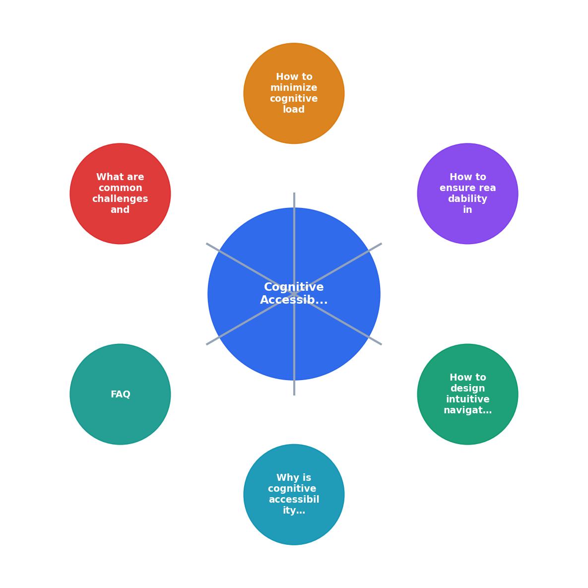
To show how these principles come together, here's an interactive visual of the key design metrics and their impact on user success:
Understanding how readability metrics directly influence user retention helps prioritize which accessibility improvements to tackle first. The dashboard below simulates real-world data for a typical mobile app when cognitive accessibility is applied.
Cognitive Accessibility Impact
FAQ
Frequently Asked Questions
Additional Resources
- Optimizing mobile app design for older adults - PMC - The findings highlight several essential design elements, including simplified navigation, enlarged text and touch targets, voice interaction, ...
- Best Practices for Cognitive Accessibility in Web Design - Memory assistance · Add breadcrumb navigation to show location and progress indicators for multi-step processes. · Use familiar icons consistently ...
- Designing Mobile Apps with Accessibility in Mind - The primary goal of accessibility and inclusive design is to make your app work equivalently for different ranges of users.
Need Help with Accessibility?
Improve your site's accessibility and conversion rates with our AI-powered analysis.
Get Started