Cognitive Accessibility Practices for UX Designers
Most accessibility audits stop at contrast ratios and alt text. They miss the layer that actually determines whether someone can use your product: cognitive accessibility. If a visitor with ADHD, anxiety, or low digital literacy lands on your interface and cannot figure out what to do next within seconds, no amount of color contrast will save that session. This guide covers the specific practices UX designers can adopt to reduce cognitive barriers and build interfaces that work for every brain.

Most accessibility audits stop at contrast ratios and alt text. They miss the layer that actually determines whether someone can use your product: cognitive accessibility. If a visitor with ADHD, anxiety, or low digital literacy lands on your interface and cannot figure out what to do next within seconds, no amount of color contrast will save that session. This guide covers the specific practices UX designers can adopt to reduce cognitive barriers and build interfaces that work for every brain.

- Integrate user-centered design principles that account for cognitive differences, not just physical or sensory ones.
- Reduce cognitive load through progressive disclosure, plain language, and consistent patterns.
- Use inclusive design techniques like predictable navigation, clear error recovery, and generous touch targets to make every interaction accessible.
Why cognitive accessibility matters
Standard WCAG checks cover perceivable and operable criteria well. Screen reader compatibility, keyboard navigation, color contrast: these are solved problems with mature tooling. Cognitive accessibility sits in a different category. It asks whether a user can understand what they see, remember what they need to do, and decide on the next step without confusion.
That number is not hypothetical. It accounts for people with dyslexia, ADHD, anxiety disorders, age-related cognitive decline, temporary cognitive impairment from stress or fatigue, and low digital literacy. Designing only for the "ideal" focused user ignores a massive segment of your actual audience.
The business case is straightforward: confused users leave. They do not file bug reports. They do not send feedback emails. They just close the tab. Every cognitive barrier you remove directly improves task completion rates and, by extension, conversion.
Most UX teams acknowledge this gap exists but lack a repeatable process to address it. The sections below give you that process.
User-centered design for cognition

User-centered design (UCD) applied to cognitive accessibility means recruiting participants who represent cognitive diversity, not just demographic diversity. Here is what that looks like in practice:
- Recruit broadly. Include participants with ADHD, dyslexia, anxiety, and older adults in usability testing. Even three to five participants from these groups surface issues that ten "typical" testers miss.
- Test comprehension, not just completion. After a task, ask "What did that screen tell you?" If the answer does not match your intent, the design failed regardless of whether the task was technically completed.
- Observe cognitive load signals. Long pauses, re-reading, back-button usage, and verbal confusion ("Wait, what?") are direct indicators of cognitive friction.
- Iterate on language first. Copy changes are cheaper than layout changes. Test headlines, button labels, and error messages before reworking wireframes.
Reduce cognitive load in design
Cognitive load breaks into three types: intrinsic (complexity of the task itself), extraneous (complexity added by poor design), and germane (effort spent learning and building mental models). You control extraneous load almost entirely. Here are the techniques that cut it:
- Progressive disclosure. Show only what the user needs at each step. Checkout flows that reveal shipping, then payment, then confirmation outperform single-page forms with 15 fields visible at once.
- Chunking. Group related information visually. Phone numbers displayed as
(555) 123-4567are easier to process than5551234567. Apply the same principle to form sections, navigation groups, and content blocks. - Consistent patterns. If your primary action button is blue and bottom-right on one screen, keep it blue and bottom-right everywhere. Pattern-breaking forces the user to re-learn the interface on every page.
- Plain language. Replace "Authenticate your credentials" with "Log in." The Hemingway App and Grammarly both offer readability scores. Aim for a Grade 8 reading level or lower.
- Whitespace. Dense layouts increase scanning time. Generous spacing between elements lets the eye rest and reduces the feeling of overwhelm.
Inclusive design techniques

Inclusive design goes beyond accommodating disabilities. It builds interfaces that flex for situational impairments too: a parent holding a baby, someone in bright sunlight, a user on a slow connection with high stress. These techniques serve everyone:
- Predictable navigation. Place the main menu in the same location on every page. Use descriptive labels ("Pricing", "Documentation") instead of clever ones ("Explore", "Discover").
- Error prevention over error messages. Inline validation, sensible defaults, and confirmation dialogs before destructive actions prevent mistakes that cause frustration and cognitive spirals.
- Generous touch and click targets. Small icons and tight spacing punish users with motor difficulties, tremors, or simply large fingers on mobile.
"The icons may be smaller and you can work with your developer to extend padding past the icon.">, Accessibility for user experience designers
- Multiple input modes. Let users type, select from a dropdown, or use voice where possible. Different cognitive profiles favor different input methods.
- Time flexibility. Session timeouts, auto-advancing carousels, and disappearing notifications all punish slow readers and users who need extra processing time. Provide pause, extend, or disable options.
The design process at a glance

The following diagram maps the cognitive accessibility design process from research through validation. Each step feeds the next, and the loop repeats with every release.
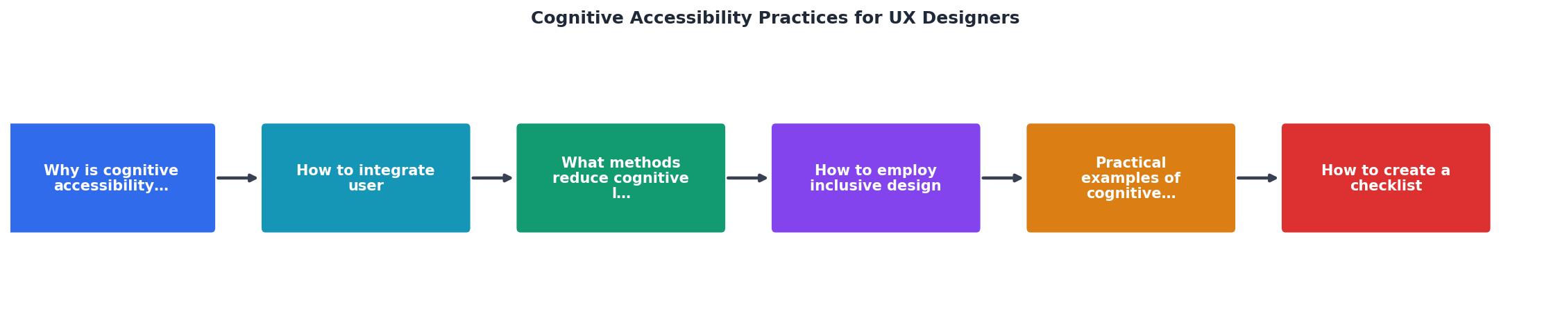
The steps in the diagram:
- Research users with cognitive diversity.
- Audit existing flows for cognitive barriers.
- Simplify language, layout, and interactions.
- Prototype with reduced cognitive load.
- Test comprehension with diverse participants.
- Iterate based on observed confusion points.
Real-world examples
Here is how cognitive accessibility practices show up in shipped products:
- GOV.UK rewrote every government service page at a Grade 5 reading level and saw task completion rates jump. Their design system enforces plain language, consistent components, and step-by-step task flows.
- Mailchimp uses progressive disclosure in its campaign builder. Instead of showing every option at once, it walks users through audience, content, and schedule as separate focused steps.
- Apple's iOS provides a "Reduce Motion" setting that replaces parallax and zoom animations with simple dissolves. This directly helps users with vestibular disorders and ADHD who find motion distracting.
Cognitive Accessibility Impact Areas
Cognitive accessibility checklist
Use this checklist on every project. Run through it during design review, before handoff to development, and again after launch.
UX Designer Cognitive Accessibility Checklist
Your progress is saved automatically in your browser.
FAQ
Frequently Asked Questions
What cognitive accessibility challenge are you currently facing in your design work? Share your experience in the comments.
Additional Resources
- Accessibility for user experience designers | Digital.gov - A 'quick-start' guide for embedding accessibility and inclusive design practices into your team's workflow
- Design Tactics for Cognitive Disabilities - This article will explore the fundamentals of designing websites with cognitive disabilities in mind. We'll cover practical strategies to enhance usability.
- Give Users' Brains a Break: UX Tips for Cognitive ... - Intentional, approachable designs, lots of white space, and minimal visual clutter help users focus and accomplish tasks more easily. Tips for ...
Need Help with Accessibility?
Improve your site's accessibility and conversion rates with our AI-powered analysis.
Get Started