Improving Cognitive Accessibility in Public Sector Websites
Government websites serve everyone. That includes people with dyslexia, ADHD, anxiety disorders, low digital literacy, and age-related cognitive decline. Yet most public sector sites are built for the bureaucrats who wrote the content, not the citizens who need it. This guide walks through concrete strategies for making public sector websites cognitively accessible, from plain language rewrites to auditable design patterns that satisfy both regulators and real users.

Government websites serve everyone. That includes people with dyslexia, ADHD, anxiety disorders, low digital literacy, and age-related cognitive decline. Yet most public sector sites are built for the bureaucrats who wrote the content, not the citizens who need it. This guide walks through concrete strategies for making public sector websites cognitively accessible, from plain language rewrites to auditable design patterns that satisfy both regulators and real users.

- Public sector websites must serve users with a wide range of cognitive abilities, not just meet minimum WCAG contrast ratios.
- Plain language, predictable navigation, and consistent layouts reduce cognitive load for all visitors.
- A repeatable audit checklist covering language complexity, navigation clarity, and error handling keeps compliance demonstrable and genuine inclusion achievable.
Why cognitive accessibility matters
Public sector websites are not optional. Citizens go to them to file taxes, apply for benefits, renew licenses, and access emergency information. When a site buries critical instructions inside dense legal paragraphs or scatters form fields across unpredictable layouts, it creates a barrier as real as a locked door.
That number is not hypothetical. Cognitive and learning disabilities are the largest disability category worldwide, and they overlap heavily with situational impairments like stress, fatigue, and unfamiliar language. A parent filling out a childcare subsidy form at midnight after a long shift faces cognitive load that mirrors a diagnosed attention deficit.
Regulatory pressure is increasing too. The European Accessibility Act (EAA) took effect in June 2025, extending obligations beyond the public sector into private services. Section 508 in the United States already requires federal agencies to meet WCAG standards. And WCAG itself is evolving:
"The latest version of the Web Content Accessibility Guidelines (WCAG), which underpins many global accessibility laws, places a stronger emphasis on accommodating cognitive disabilities.">, Making the Web Accessible: A Focus on Cognitive Disabilities
Compliance is the floor, not the ceiling. The goal is a site that people can actually use without calling a helpline.

Use plain language effectively
Plain language means writing so the intended audience can find what they need, understand it the first time, and act on it. For public sector sites, the intended audience is everyone.
Here is what that looks like in practice:
- Limit sentence length to 20 words or fewer. Long compound sentences with multiple clauses force readers to hold too many ideas in working memory at once.
- Replace jargon with common words. "Remuneration" becomes "pay." "Domicile" becomes "home address." If a legal term must appear, define it inline the first time.
- Use active voice. "You must submit your application by March 15" beats "Applications must be submitted no later than March 15."
- Front-load the action. Start paragraphs and list items with the verb or the key information. Citizens scanning a page need to find the answer in the first few words, not the last.
- Break content into short sections with descriptive headings. A heading like "How to renew your driver's license online" tells the reader exactly what follows. "Section 4.2.1" tells them nothing.
The UK's GOV.UK platform is the gold standard here. Their style guide mandates a reading level equivalent to a 9-year-old's comprehension. That is not dumbing things down. It is removing friction so that a PhD holder and a first-generation immigrant both get the same information in the same amount of time.
Design intuitive navigation

Navigation is where cognitive accessibility either works or collapses. A user with ADHD who clicks three wrong links before finding the right page will not try a fourth time. A user with anxiety who encounters an unexpected layout change mid-form may abandon the process entirely.
Predictability is the core principle. Every page should answer three questions instantly:
- Where am I?
- What can I do here?
- How do I get back?
- Persistent breadcrumbs showing the full path from homepage to current page.
- Consistent primary navigation that does not rearrange between sections. The menu on the tax page should look identical to the menu on the benefits page.
- Visible progress indicators on multi-step forms. "Step 2 of 5" with a progress bar reduces uncertainty.
- Descriptive link text. "Learn more" and "Click here" are meaningless out of context. "Download the 2026 tax return form (PDF, 240KB)" tells the user exactly what will happen.
- One primary action per page. If a page asks the user to do three things, they will do none. Prioritize.
| Poor Navigation | Accessible Navigation |
|---|---|
| Descriptive link text with file type/size | |
| Grouped categories with max 7 items per level | |
| Persistent breadcrumb trail | |
| Consistent navigation across all sections | |
| "Step 2 of 5" with visual progress bar |
The U.S. Web Design System (USWDS) provides tested, accessible components that federal agencies can adopt directly. It includes breadcrumbs, step indicators, and alert components that follow these principles out of the box.
Audit public sector sites for accessibility

Automated scanners catch contrast ratios and missing alt text. They do not catch a form that confuses people or a paragraph that requires a law degree to parse. Cognitive accessibility auditing requires a structured manual process layered on top of automated checks.
Here is a process that works at scale across dozens or hundreds of pages:
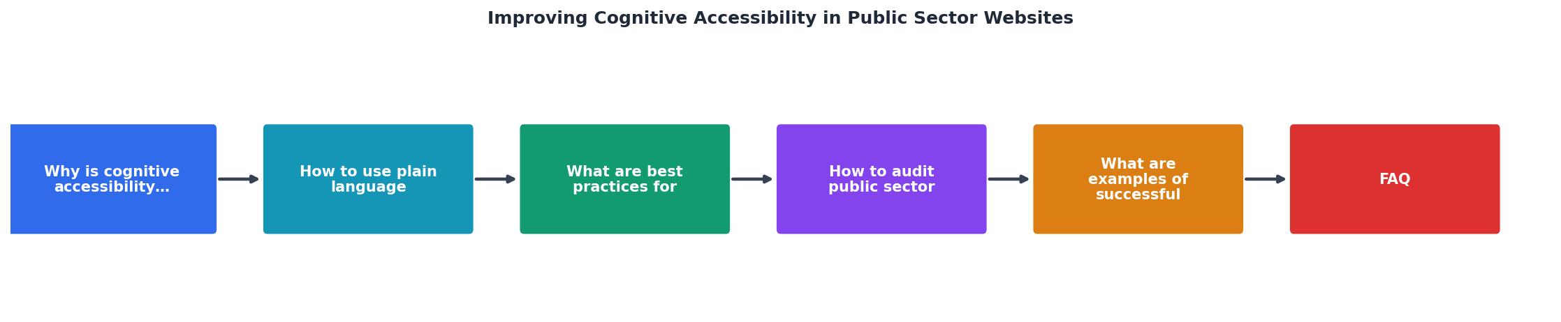
The diagram breaks the audit into clear steps: Inventory pages, Run automated scan, Score readability, Test navigation paths, Review forms and errors, and Document findings. Each step feeds into the next, and the output is a prioritized remediation list.
Walk through each step:
- Inventory pages. List every public-facing page. Group them by task: applying for something, paying something, finding information. Prioritize high-traffic and high-stakes pages.
- Run automated scan. Use axe, WAVE, or Lighthouse to catch the technical baseline. Fix those issues first because they are cheapest.
- Score readability. Paste page content into a readability tool. Flag anything above Grade 8. Rewrite flagged content using the plain language strategies above.
- Test navigation paths. Pick the five most common user tasks. Try to complete each one starting from the homepage. Count clicks, note dead ends, record confusion points.
- Review forms and errors. Fill out every form incorrectly on purpose. Check that error messages are specific ("Enter a valid email address like name@example.com"), appear next to the field, and do not clear already-entered data.
- Document findings. Record each issue with a severity rating, the affected page URL, a screenshot, and a recommended fix. This documentation satisfies regulators and gives developers clear tickets.
Successful accessibility enhancements
Real examples show what improvement looks like.
GOV.UK (United Kingdom): Rebuilt from scratch in 2012 with plain language and task-based navigation as founding principles. Every piece of content goes through a "2nd pair of eyes" review focused on clarity. The result: a single domain serving 300+ government organizations with consistent patterns. User satisfaction scores consistently exceed 80%.
Canada.ca: The Canadian government consolidated hundreds of departmental sites into one platform using the Canada.ca design system. They introduced mandatory task-based testing: if users cannot complete a task within a set number of clicks during testing, the page gets redesigned. Task completion rates improved from around 40% to over 70% on redesigned pages.
U.S. Digital Service projects: Teams embedded in agencies like the VA (Veterans Affairs) rewrote benefits application flows. The VA.gov redesign replaced a 1,000-page legacy site with task-focused pages. Veterans applying for healthcare benefits went from a multi-hour paper process to a 20-minute online flow.
The following dashboard illustrates the kind of improvement metrics these projects track:
Public Sector Accessibility Improvements
These are not vanity metrics. Higher task completion means fewer phone calls to overwhelmed call centers. Better readability means fewer errors on submitted forms. Both save money.
Public sector accessibility checklist
Use this checklist to audit any public sector website for cognitive accessibility. It covers the areas automated tools miss.
Public Sector Website Cognitive Accessibility Checklist
Your progress is saved automatically in your browser.
FAQ
Frequently Asked Questions
What is the biggest cognitive accessibility barrier you have encountered on a government website? Share your experience so others can learn from it.
Additional Resources
- Making the Web Accessible: A Focus on Cognitive ... - Explore what cognitive disabilities are, why they matter in digital accessibility, and how to make the web more usable for everyone.
- Cognitive Accessibility (Digital) in 2026: Helping Users Stay ... - Cognitive accessibility plays an essential role in ensuring people with cognitive disabilities can equitably access digital government services.
- A Guide to Improving Cognitive Accessibility - By implementing cognitive accessibility practices, websites can become more inclusive and user-friendly, accommodating a broader audience and improving the ...
Need Help with Accessibility?
Improve your site's accessibility and conversion rates with our AI-powered analysis.
Get Started