Improving Cognitive Accessibility on Salesforce Dashboards
Salesforce dashboards pack dozens of metrics, charts, and tables into a single screen. For many users, that density creates real cognitive barriers that slow decision-making and increase errors. The good news is that a handful of deliberate layout, terminology, and visualization choices can turn an overwhelming dashboard into one that any team member can read in seconds. This guide walks through specific strategies, with examples you can apply today.


Salesforce dashboards pack dozens of metrics, charts, and tables into a single screen. For many users, that density creates real cognitive barriers that slow decision-making and increase errors. The good news is that a handful of deliberate layout, terminology, and visualization choices can turn an overwhelming dashboard into one that any team member can read in seconds. This guide walks through specific strategies, with examples you can apply today.

- Salesforce dashboards often overload users with inconsistent labels, dense charts, and competing visual hierarchies.
- Organize data into clear visual groups, simplify layouts to 6-8 components max, and enforce a shared terminology glossary.
- Collect user feedback regularly and iterate on dashboard design to reduce cognitive friction over time.
Why dashboards create cognitive overload
A default Salesforce dashboard can display up to 20 components on a single page. Each component has its own chart type, color scheme, and labeling convention. When a sales rep opens that dashboard at 8 AM to check pipeline numbers, their brain has to parse all of those competing signals before extracting a single useful insight.
The core cognitive challenges break down into three categories:
- Data complexity - too many metrics shown simultaneously without clear priority
- Inconsistent terminology - one component says "Closed Won," another says "Deals Closed," a third says "Revenue Booked"
- Visual noise - mismatched chart types, redundant legends, and decorative elements that add zero information
These are not aesthetic complaints. They directly affect how quickly someone can find the number they need and act on it. A user with ADHD, dyslexia, or high cognitive load from multitasking hits these barriers even harder.
Organize data visually

Visual grouping is the single most effective technique for reducing cognitive load on any dashboard. In Salesforce Lightning, you can use the dashboard grid layout to cluster related components together.
Proximity grouping means placing components that answer the same question next to each other. Pipeline metrics (open deals, weighted forecast, close dates) go in one row. Activity metrics (calls made, emails sent, meetings booked) go in another. The user's eye scans one group at a time instead of jumping across the entire screen.
Specific techniques that work in Salesforce:
- Use consistent chart types within a group. If your pipeline section uses horizontal bar charts, keep all pipeline components as horizontal bars. Switching between donut charts, line graphs, and tables within the same logical group forces the brain to re-calibrate for each component.
- Apply a single color palette per group. Salesforce lets you customize component colors. Assign blue tones to pipeline, green tones to activity, and orange tones to revenue. Users learn the color-meaning association within a few sessions.
- Add header components as group labels. Drop a rich text component above each cluster with a short, bold title like "Pipeline Health" or "Team Activity." This gives the eye an anchor point.
Simplify dashboard layouts

Fewer components, better outcomes. That is the rule. Salesforce allows up to 20 components per dashboard, but using all 20 slots is almost always a mistake.
Here is a practical approach to simplification:
- Audit every component. For each one, ask: "What decision does this help someone make?" If the answer is vague or the component duplicates information available elsewhere, remove it.
- Target 6-8 components per dashboard. This keeps the layout scannable on a standard 1920x1080 monitor without scrolling.
- Use drill-down reports instead of cramming detail into the dashboard. A summary metric on the dashboard links to a full report. The dashboard stays clean; the detail is one click away.
- Standardize component sizes. Salesforce Lightning uses a 12-column grid. Pick two or three standard widths (full-width, half-width, third-width) and stick with them. Irregular sizing creates visual chaos.
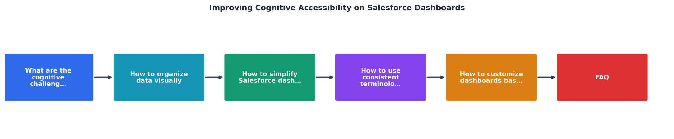
The process follows a clear loop: Audit components, Group related data, Simplify layout, Standardize terms, Collect feedback, and Iterate. Each step feeds the next, and the cycle repeats as your team's needs evolve.
"The Lightning Design System guides developers in creating keyboard-accessible components, enabling users to navigate and interact with the application without relying on a mouse.">, Salesforce Accessibility Overview: Features and Tips
Use consistent terminology
Terminology inconsistency is one of the most common and most invisible accessibility problems in Salesforce orgs. It happens gradually: one admin creates a report using "Closed Won," another uses "Deals Closed," and a third invents "Bookings." All three mean the same thing, but a user scanning the dashboard has to mentally translate each label.
Fix this with a terminology glossary:
- Create a shared document (a Salesforce Knowledge article works well) that defines every metric name used in dashboards.
- Map synonyms to a single canonical term. If the org standard is "Closed Won," then every dashboard, report, and component uses "Closed Won."
- Review custom field labels. Salesforce custom fields often have API names that differ from display labels. Align both.
- Apply the glossary to chart axis labels, component titles, and filter names.
| Inconsistent Approach | Consistent Approach |
|---|---|
| "Closed Won" / "Deals Closed" / "Bookings" | "Closed Won" everywhere |
| "MRR" / "Monthly Revenue" / "Recurring Rev" | "Monthly Recurring Revenue (MRR)" |
| "Leads" / "Prospects" / "Inquiries" | "Leads" for top-of-funnel |
| Abbreviations without context | Full term with abbreviation in parentheses on first use |
This is not busywork. When every label matches, users stop guessing and start reading. The cognitive savings compound across every dashboard view, every day.
Customize based on user feedback

Building an accessible dashboard is not a one-time project. User needs shift as teams grow, products change, and new roles join the org. The most effective dashboard designers build a feedback loop directly into their process.
Practical methods for collecting and acting on feedback:
- 5-second tests. Show a user the dashboard for five seconds, then ask them what they remember. If they cannot recall the primary metric, the hierarchy needs work.
- Task-based observation. Ask a user to find a specific number (e.g., "What is this quarter's pipeline value?"). Time them. If it takes more than 10 seconds, the layout or labeling needs adjustment.
- Quarterly review sessions. Schedule a 30-minute session each quarter where dashboard users vote on which components they actually use. Remove anything that gets zero votes.
- Accessibility-specific questions. Ask users directly: "Is anything confusing?" and "Do any labels feel unclear?" People with cognitive accessibility needs often have precise feedback if you ask.
Here is an example scorecard showing how a typical Salesforce dashboard might perform across key cognitive accessibility dimensions before and after optimization:
Cognitive Accessibility Score (Example Dashboard)
Salesforce Dashboard Cognitive Accessibility Checklist
Your progress is saved automatically in your browser.
FAQ
Frequently Asked Questions
Additional Resources
- Salesforce Accessibility Overview: Features and Tips - To activate Salesforce accessibility mode, go to "Setup," select "User Interface," and enable the "Accessibility Mode." This empowers users, including those ...
- How to improve accessibility for SF users? - Trailhead - I am conducting an accessibility audit to improve access (things like ensuring there is alt-text, proper heading structures for screen readers, ...
- Build Dashboards for Accessibility - Format for accessibility at the dashboard and workbook level. Aggregate and reduce marks. Eliminate redundant information. Use color and shape to differentiate ...
Need Help with Accessibility?
Improve your site's accessibility and conversion rates with our AI-powered analysis.
Get Started