Creating a Cognitive Accessibility Template for Website Audits
Every accessibility audit you run probably checks contrast ratios, alt text, and keyboard navigation. But when a user with ADHD abandons your checkout flow because the form has 14 fields on one page, none of those checks catch it. A cognitive accessibility audit template gives you a repeatable, evidence-based structure to find exactly those invisible barriers and fix them before they cost conversions.

Every accessibility audit you run probably checks contrast ratios, alt text, and keyboard navigation. But when a user with ADHD abandons your checkout flow because the form has 14 fields on one page, none of those checks catch it. A cognitive accessibility audit template gives you a repeatable, evidence-based structure to find exactly those invisible barriers and fix them before they cost conversions.
- A cognitive accessibility audit template covers user flow analysis, cognitive load scoring, readability checks, and error recovery evaluation.
- Tailor the template to your website type: e-commerce sites need checkout-focused criteria, educational platforms need content comprehension checks.
- Building the template once saves hours on every future audit and gives you defensible evidence for design decisions.
Why build a reusable audit template?
Running a cognitive accessibility review from scratch each time wastes effort and produces inconsistent results. One audit catches readability issues, the next skips them entirely. A template standardizes what you check, how you score it, and what "good" looks like.
The practical benefits stack up fast:
- Consistency across projects. Whether you audit a SaaS dashboard or a nonprofit landing page, the same criteria apply.
- Faster stakeholder buy-in. A structured report with scores and severity ratings looks like evidence, not opinion. "The checkout flow scores 2/10 on cognitive load" lands differently than "I think it's confusing."
- Onboarding new team members. Hand someone the template and they can run a baseline audit on day one.
- Tracking improvements over time. Re-run the same template after design changes and compare scores directly.
"A thorough manual accessibility audit combines automated scanning tools with human expert testing, because automation alone catches only 30–40% of real accessibility barriers.">, How to Perform a Web Accessibility Audit: Step
That gap between automated and manual testing is exactly where cognitive accessibility lives. Your template fills it.
Essential template elements

Your template needs six core sections. Each one targets a different dimension of cognitive accessibility.
1. User flow analysis
Map every critical path on the site: signup, purchase, account recovery, content search. For each flow, document:
- Total number of steps
- Decision points where the user must choose between options
- Points where the user needs to recall information from a previous step
- Dead ends or loops
2. Cognitive load scoring
Rate each page or screen on three dimensions:
- Intrinsic load (complexity of the task itself)
- Extraneous load (unnecessary complexity from poor design)
- Germane load (effort spent actually learning or completing the task)
3. Readability assessment
Check body copy, CTAs, error messages, and navigation labels separately. Tools like Hemingway Editor or readable.com give you Flesch-Kincaid scores, but also check:
- Sentence length (aim for 15-20 words average)
- Jargon density (flag industry terms without definitions)
- Instruction clarity (can someone follow the steps without guessing?)
4. Navigation and wayfinding
Evaluate whether users can answer three questions at any point: Where am I? Where can I go? How do I get back? Check breadcrumbs, active states, back-button behavior, and whether the information architecture matches user mental models.
5. Error prevention and recovery
Count how many form fields lack inline validation. Check whether error messages explain what went wrong AND how to fix it. Test what happens when a user hits the back button mid-flow.
6. Sensory and attention factors
Audit for auto-playing media, animation that cannot be paused, time limits on forms, and competing visual elements that split attention. These hit users with ADHD, anxiety, and sensory processing differences hardest.
Step-by-step template creation
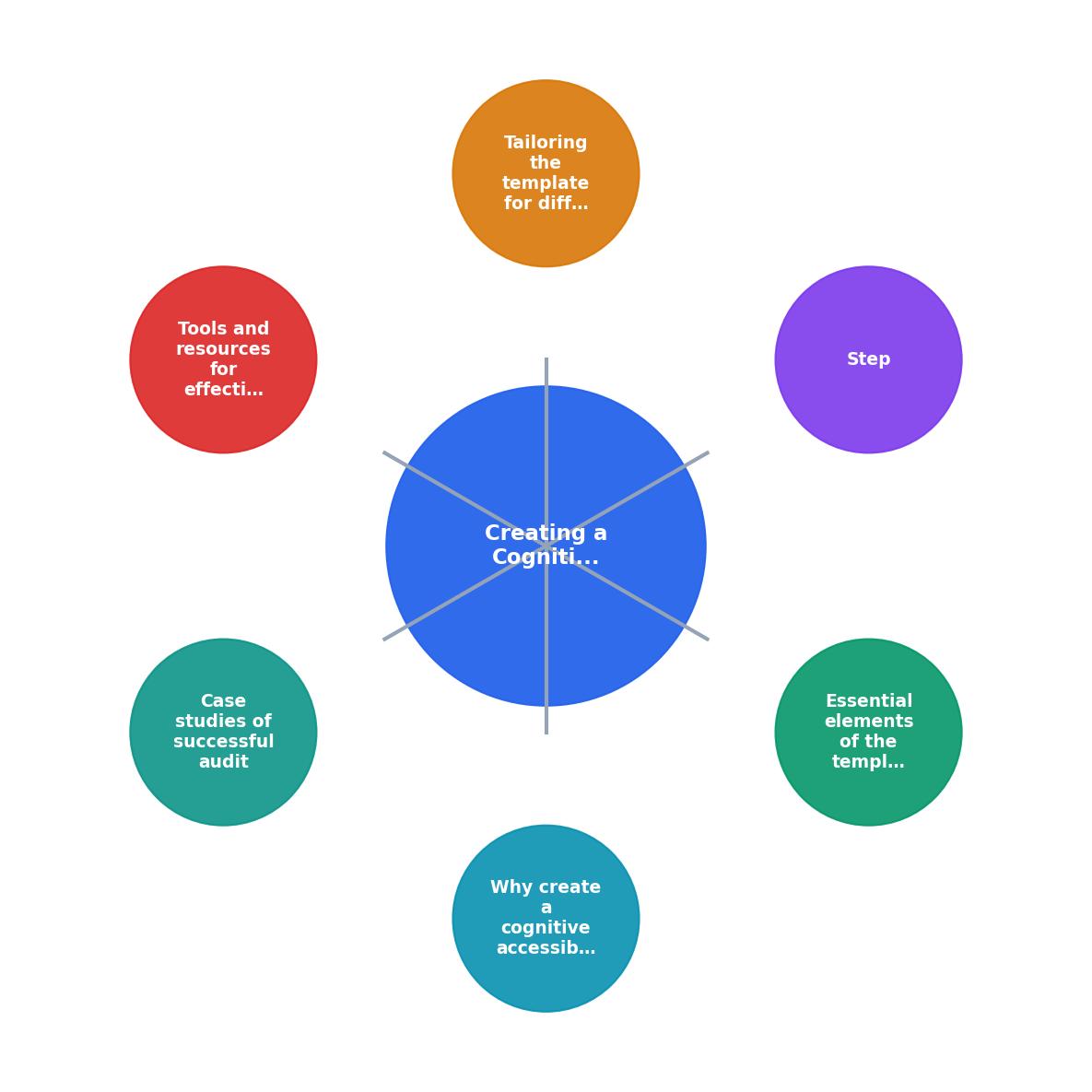
Follow these steps to build your template from scratch. The diagram above shows the high-level flow: Define scope, Identify flows, Build criteria, Set scoring, Test and refine, Document.
Step 1: Define scope. Decide which pages or flows the template covers. A full-site audit template differs from a checkout-only template. Start narrow and expand.
Step 2: Identify flows. List every user journey that matters. For an e-commerce site: browse, search, filter, add to cart, checkout, account creation, returns. For an educational platform: course discovery, enrollment, lesson navigation, quiz completion, certificate download.
Step 3: Build criteria per section. For each of the six sections above, write specific yes/no or scored questions. Example: "Does the checkout form group related fields visually?" (yes/no). "Rate the cognitive load of the product comparison page" (1-5).
Step 4: Set scoring and severity. Define what scores mean. A page scoring 4-5 on extraneous cognitive load is a critical issue. A readability score of grade 12+ on a consumer site is high severity. Tie scores to priority levels: critical, major, minor.
Step 5: Test and refine. Run the template on one real site. You will find questions that are ambiguous, criteria that overlap, and gaps where something obvious has no checkbox. Fix those before distributing the template.
Step 6: Document. Write a short guide explaining each criterion, what to look for, and how to score it. Without this, two auditors will interpret the same question differently.
Here is an example dashboard showing what a completed audit summary might look like for a mid-size e-commerce site:
Cognitive Accessibility Audit Summary
Tailoring for different site types

A generic template gets you 70% of the way. The last 30% comes from site-specific criteria.
E-commerce sites
Add these to your template:
- Cart persistence check. Does the cart survive a session timeout? Users with cognitive fatigue often take breaks mid-purchase.
- Price clarity. Are totals, taxes, and shipping visible before the final step? Surprise costs at checkout create cognitive overload and abandonment.
- Product comparison. Can users compare 2-3 items side by side without holding details in working memory?
- Filter usability. Do filters use plain language? "Under $50" beats "Price range: $0.00-$49.99."
Educational platforms
Add these criteria:
- Progress indicators. Can learners see where they are in a course, module, and lesson?
- Chunking. Are lessons broken into segments under 10 minutes? Long unbroken content blocks overwhelm users with attention difficulties.
- Recall support. Do quizzes reference the specific lesson section where the answer was taught?
- Glossary access. Can users look up terms without leaving the current page?
Tools for cognitive audits

No single tool covers everything. Combine these:
| Tool Category | Examples | What It Catches |
|---|---|---|
| Automated a11y scanners | axe DevTools, WAVE, Lighthouse | Technical WCAG violations |
| Readability analyzers | Hemingway Editor, readable.com | Reading level, sentence complexity |
| Cognitive load analysis | PagePerson Insights, manual heuristic review | Comprehension barriers, flow complexity |
| User testing platforms | Maze, UserTesting | Real user confusion points |
| Screen reader testing | NVDA, VoiceOver | Content structure and flow |
PagePerson Insights fits into the cognitive load analysis category. It flags comprehension barriers and conversion friction that automated scanners miss entirely, which makes it a useful complement to your template-based audit.
Real-world audit results
Two quick examples of what template-based cognitive audits uncover:
E-commerce checkout redesign. A mid-size clothing retailer ran the template on their 6-step checkout. The audit flagged: extraneous cognitive load from 23 form fields on one page, no inline validation, and shipping options presented as a wall of radio buttons with no visual grouping. After redesigning based on audit findings (progressive disclosure, grouped fields, inline validation), cart abandonment dropped by 18% over 8 weeks.
University course portal. An online university applied the template to their course enrollment flow. The audit identified: no progress indicator during a 4-page enrollment, jargon-heavy course descriptions (grade 14 readability), and a timeout that erased form data after 5 minutes. Fixing these three issues increased enrollment completion by 24%.
These are not edge cases. They are the kind of barriers that exist on most sites and go undetected without a structured cognitive audit.
The audit template
Use this checklist as your starting point. Customize it for your specific site type and add scored criteria where you need quantitative data.
Cognitive Accessibility Audit Template
Your progress is saved automatically in your browser.
FAQ
Frequently Asked Questions
What criteria would you add to this template for your specific site type? Share your additions so other designers can build on them.
Additional Resources
- How to Perform a Web Accessibility Audit: Step-by- ... - A definitive guide outlining the process of how to do an accessibility audit and create an accessibility audit report to achieve WCAG conformance.
- Website Accessibility Audits | WCAG & Cognitive Access - Website accessibility audits covering WCAG 2.2, cognitive accessibility, assistive technology testing and prioritised remediation guidance.
- Your Comprehensive Website Accessibility Audit Checklist - Ensure your website is inclusive with this accessibility audit checklist. Identify and fix issues to meet compliance and improve usability.
Need Help with Accessibility?
Improve your site's accessibility and conversion rates with our AI-powered analysis.
Get Started