Cognitive Accessibility Considerations for Travel Websites
Travel websites rank among the most cognitively demanding experiences on the web. A single booking flow can involve date pickers, seat selectors, fare class comparisons, insurance upsells, passport fields, and payment forms spread across a dozen screens. For the roughly 15 to 20 percent of the population living with a cognitive disability such as ADHD, dyslexia, anxiety, or age-related memory decline, these flows create barriers that go far beyond inconvenience. This guide covers the specific practices that make travel platforms usable for everyone and reduce the compliance risk that keeps accessibility leads up at night.

Travel websites rank among the most cognitively demanding experiences on the web. A single booking flow can involve date pickers, seat selectors, fare class comparisons, insurance upsells, passport fields, and payment forms spread across a dozen screens. For the roughly 15 to 20 percent of the population living with a cognitive disability such as ADHD, dyslexia, anxiety, or age-related memory decline, these flows create barriers that go far beyond inconvenience. This guide covers the specific practices that make travel platforms usable for everyone and reduce the compliance risk that keeps accessibility leads up at night.

- Clear itinerary displays, simplified booking steps, and accessible customer support are the three pillars of cognitive accessibility in travel.
- Leading platforms that adopted these practices saw measurable gains in completion rates and user satisfaction.
- A repeatable checklist tied to WCAG cognitive guidance gives compliance teams documentable evidence of due diligence.
Why Travel Sites Fail Cognitively
Most accessibility audits for travel platforms stop at contrast ratios, alt text, and keyboard navigation. Those checks matter, but they miss the cognitive layer entirely. A user with working memory limitations does not struggle because a button lacks focus styling. They struggle because the booking flow demands they hold six pieces of information in their head across four separate pages.
Common cognitive barriers on travel websites include:
- Information overload on search results pages showing dozens of fare options with inconsistent labeling
- Time pressure elements like countdown timers on held fares that spike anxiety
- Inconsistent terminology where the same concept appears as "itinerary," "trip summary," and "booking details" across different screens
- Hidden costs revealed only at the final checkout step, forcing users to recalculate and re-evaluate
"The WCAG 2.0 are what appear in most policies, and are organised around the acronym POUR [18], as illustrated in Figure 2, on the following page.">, The State of Web Accessibility for People with Cognitive Disabilities: A Rapid E
The POUR framework (Perceivable, Operable, Understandable, Robust) applies directly here, but the "Understandable" principle is the one travel sites consistently underperform on.
Designing Clear Itinerary Displays

An itinerary display is the single most revisited element on any travel site. Users check it before booking, during booking, and after booking. If it confuses them at any stage, they either abandon or contact support.
Effective itinerary design follows these rules:
- One visual timeline that shows departure, connections, and arrival in a linear, top-to-bottom or left-to-right layout
- Consistent date and time formatting across every page, including confirmation emails
- Plain language labels like "Leaves at 9:15 AM" instead of "ETD 0915"
- Persistent summary sidebar that stays visible during the entire booking flow so users never lose context
- Color plus icon coding for status indicators (green checkmark for confirmed, yellow clock for pending) so the information does not rely on color alone
Simplifying the Booking Process
The booking funnel is where most cognitive accessibility failures happen. Each additional step, each unexpected form field, and each ambiguous label increases the chance of abandonment.
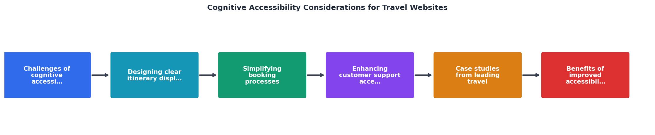
The process diagram above outlines the core steps: Search, Select, Customize, Review, Pay, Confirm. Each step should map to exactly one screen. When referencing these steps in your own audit, use these short labels to keep documentation consistent.
Best practices for each step:
- Search: Limit required fields to destination and dates. Offer smart defaults (e.g., tomorrow's date, round trip pre-selected).
- Select: Show no more than five results at a time. Let users filter rather than scroll through fifty options.
- Customize: Group add-ons (baggage, seats, insurance) on a single page. Use progressive disclosure so optional extras do not overwhelm.
- Review: Display the full itinerary and total cost on one screen. No hidden fees.
- Pay: Support autofill. Accept multiple payment methods without forcing account creation.
- Confirm: Provide a printable confirmation with a unique reference number in large, readable text.
Platforms that reduced their booking flow from nine or more screens to six or fewer consistently report higher completion rates. The cognitive cost of each additional screen is not linear; it compounds as fatigue and uncertainty build.
Accessible Customer Support

When a booking flow fails a user cognitively, support becomes the last line of defense. If support itself is inaccessible, the user is locked out entirely.
Key strategies for accessible travel support:
- Live chat with human escalation: Chatbots handle simple queries, but users with cognitive disabilities often need a human who can rephrase and confirm understanding. Always offer a clear "Talk to a person" option.
- Visual call-back scheduling: Instead of forcing users to wait on hold (which demands sustained attention), let them pick a time slot from a simple calendar widget.
- Plain language help articles: Write support content at a sixth-grade reading level. Use short sentences, bullet points, and screenshots.
- Consistent contact placement: The support link or phone number should appear in the same location on every page. Do not hide it behind three clicks.
Lessons from Leading Platforms

Several travel platforms have made measurable progress on cognitive accessibility:
- Booking.com invested in a "Genius" simplification layer that reduces the number of choices shown to returning users based on their previous preferences. This cuts decision fatigue significantly.
- Trainline redesigned their mobile booking flow to use a single-column layout with large tap targets and real-time price updates, eliminating the need to navigate back and forth.
- Airbnb introduced a "What's included" summary card on every listing that standardizes how amenities, house rules, and cancellation policies are presented, reducing the cognitive effort of comparing listings.
Tools like PagePerson Insights can help identify where cognitive barriers exist on your travel platform by analyzing real visitor behavior patterns and flagging comprehension issues that traditional accessibility scanners miss entirely.
Measuring the Impact
The following interactive card shows a typical before-and-after scenario when a travel website implements cognitive accessibility improvements across its booking funnel.
Booking Funnel: Before vs. After
These numbers represent a composite scenario based on common patterns observed across mid-size travel platforms that undertook cognitive accessibility redesigns. The reduction in support tickets alone often justifies the investment within a single quarter.
Cognitive Accessibility Checklist for Travel Websites
Your progress is saved automatically in your browser.
FAQ
Frequently Asked Questions
What cognitive accessibility barrier on travel websites frustrates you the most? Share your experience so others can learn from it.
Additional Resources
- The State of Web Accessibility for People with Cognitive ... - Web accessibility can include considerations of usability, which “is about effective, efficient, and satisfying design of websites and mobile applications”
- Accessible Vacation Planning: A Guide for Travel Websites - Learn top tips for building accessible travel websites. We cover everything from ADA compliance to designing user-friendly experiences for all travelers.
- What Is Cognitive Accessibility? - Cognitive accessibility seeks to remove barriers for people with information-processing disabilities. Here's how accessible design improves ...
Need Help with Accessibility?
Improve your site's accessibility and conversion rates with our AI-powered analysis.
Get Started