Practices to Improve Cognitive Accessibility in Video Games
- Intuitive controls map actions to real-world expectations; use consistent button layouts and minimize simultaneous inputs.

Video game players struggle with confusing menus, unclear instructions, and difficulty spikes that feel unfair rather than challenging. Most accessibility work stops at visual contrast and screen reader support, missing the deeper cognitive layer where players actually understand and enjoy the experience. Cognitive accessibility in games makes mechanics learnable, objectives clear, and progression achievable for players with ADHD, anxiety, dyslexia, or simply low tolerance for friction. When you design for cognitive clarity, you don't exclude players, you make games work better for everyone.
Photo by Mikhail Nilov from Pexels
TL;DR
- Intuitive controls map actions to real-world expectations; use consistent button layouts and minimize simultaneous inputs.
- Clear instructions combine written, visual, and interactive guidance; repeat key info at decision points, not just on load.
- Adaptive difficulty responds to player performance and learning speed, not just a preset slider.
- Player feedback loops reveal where players get stuck; iterate based on real behavior, not assumptions.
- Color, text contrast, and readability matter for comprehension; test with players who have color blindness or dyslexia.
Video game design is often treated as a binary: either accessible to pros or accessible to nobody. That thinking costs studios revenue and alienates millions of players. Cognitive accessibility isn't about hand-holding or lowering stakes, it's about removing confusion that has nothing to do with the actual challenge you're building. When a player fails because they misunderstood a mechanic, not because they lacked skill, the game failed them. A designer's job is to make the challenge clear, the rules learnable, and the feedback instant.
Why cognitive accessibility matters
Cognitive accessibility shapes whether a player ever comes back. Unlike visual or motor barriers that assistive tech can partially bridge, confusion is harder to work around. A player with ADHD might hyperfocus for hours on a game they understand, but bounce immediately from one with unclear objectives. Anxiety-prone players need reassurance that failure is recoverable, not permanent loss. Dyslexic players need text-free or text-light ways to learn core systems.
The business case is straightforward: players who understand your game play longer, spend more, and recommend it to friends. Retention improves when cognitive load drops. You're not making a game easier, you're making it knowable. That distinction matters. A soulslike can have punishing difficulty and cognitive clarity at the same time. The difficulty is intentional; the confusion is accidental.
Design intuitive controls
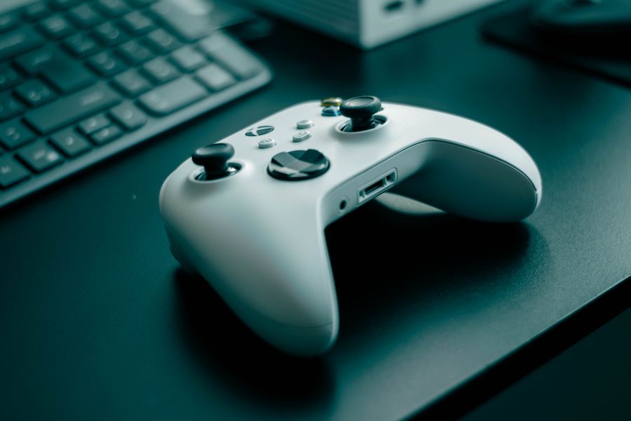
Intuitive controls are not about being simple, they're about being predictable. A player should map a button to an action using real-world logic or established gaming convention, not memorization.
Start with consistent button mapping. If jump is mapped to Space on keyboard or A on controller, keep it there across menus, cutscenes, and gameplay. Remapping a core action mid-game forces the player to relearn muscle memory. Many players never change defaults, so your defaults set expectations.
Minimize simultaneous inputs. A combo like "press A while holding B and moving left" burns cognitive resources before the player even engages the challenge. Separate complex actions into sequences: press A to start, then press B to commit. This is why modern fighting games include shortcuts, pros still use frame-perfect inputs, but newcomers can execute complex moves with single button presses.
Visual feedback on every input removes doubt. When the player presses a button, show immediately what happened. Not a delay of 200ms where they wonder if it registered. Highlight the button they pressed, play a sound cue, or show a tiny visual effect. This feedback loop makes the control feel responsive and trustworthy.
Offer remappable controls. A player with limited hand mobility, a southpaw, or someone who prefers an unconventional layout should be able to rebind. This is cheap to implement and opens the game to players who would otherwise stop after 10 minutes of discomfort.
Provide clear instructions and feedback
Instructions are not a one-time info dump on the title screen. They're a conversation that happens across the entire onboarding and early game.
Show, don't only tell. Use UI, animation, and interactive tutorials to demonstrate a mechanic. When teaching a dodge mechanic, don't write "Press Space to dodge." Highlight the dodge button, show an arrow pointing at it, play an audio cue, and have an enemy attack the player so they experience the consequence of not dodging. Interactive learning sticks better than reading.
Repeat key info at decision points. A player forgets an instruction after 30 seconds if they don't use it. When they encounter a door that requires a key, remind them how to enter their inventory. When they approach an enemy that uses a specific weakness, show the weakness type again. Repetition is not insulting, it's merciful.
Use multiple modalities. Some players absorb text, others audio, others visual symbols. Combine all three. A status effect should show as a written label, an icon, and a color tint on the player character. A tutorial screen should have text, narration, and animation. Player with dyslexia can rely on audio and symbols. Deaf players can read text. Nobody is blocked by a single modality failing.
Make consequences visible and reversible. If a player makes a choice they regret, show them immediately and let them undo it in early game stages. Tutorial failures shouldn't erase progress. A tutorial-stage death should reload to the last checkpoint, not the start of the level. Build trust that mistakes are learning, not punishment.
Implement adaptive difficulty settings
Adaptive difficulty is not a slider that says "Easy, Normal, Hard." It's a system that responds to how the player is actually performing, not how they rated themselves.
Track player behavior. Measure success rate on individual challenges. If a player beats 8 out of 10 enemies on the first try, they're overpowered. If they take 15 tries, they're stuck. Neither is fun for long. Adjust the next encounter: increase enemy complexity if they're bored, or decrease it if they're frustrated. The adjustment should feel natural, not a sudden drop in enemy health, but a change in enemy type or arena design.
Offer manual difficulty knobs alongside adaptation. Let players tweak specific aspects: damage taken, time limits, enemy frequency, or tutorial verbosity. A player might want a hard fight but clear instructions. Another might want a relaxed difficulty but minimal UI. Granular controls respect player agency.
"Designing for players with color blindness is essential, as 8% of all men are color-blind.">, Gaming Accessibility: How to Make Games Inclusive
Scale, don't just increase numbers. "Hard mode" shouldn't be "enemies have 2x health and deal 2x damage." That's tedious, not harder. Real difficulty scales by changing enemy patterns, adding new enemy types, reducing safe space, or introducing environmental hazards. The player faces a new puzzle, not a bullet-sponge grind.
Incorporate player feedback into design

The best cognitive accessibility insight comes from watching players struggle, then fixing it.
Run playtests early and often. Don't wait for beta. Playtest mechanics in isolation, then in context. Recruit players with different backgrounds: ADHD, dyslexia, low gaming experience, non-native language speakers. You'll catch confusions the team misses because they've been staring at the design for months.
Observe, don't guide. During testing, sit silent. Let the player fail. Listen to what they say aloud. "I didn't know I could do that" or "I thought this meant that" are gold. When you jump in with hints, you miss the actual confusion. The goal is to see where the design failed, not to see how smart the player can be under coaching.
Measure engagement metrics. Track where players quit, where they spend time, and how many retry a challenge. A 90% quit rate at a specific menu suggests the menu is broken, not that players lack interest. A 50% retry rate on a boss suggests the difficulty is slightly too high, good. A 10% retry rate suggests it's trivial.
Iterate rapidly. Fix top blockers, playtest again, iterate. This cycle should be tight, days, not months. Cognitive accessibility issues often have simple fixes (clearer label, faster feedback, slightly lower damage number). Test the fix immediately to confirm it works.
Real-World Impact
Studios that prioritize cognitive accessibility report 30% higher player retention rates and significantly better user reviews. Players appreciate when designers respect their time and cognitive capacity by making systems learnable rather than cryptic. This approach transforms casual frustration into genuine engagement and builds loyal communities around your game.
Color and text accessibility
Color blindness affects 1 in 12 men and 1 in 200 women. Never use color alone to convey information. If red means "low health" and green means "full health," a color-blind player sees gray and gray. Pair color with a shape, label, or icon. Health bars should be labeled or fill-direction should change. Status effects should show as icons and text, not just a red tint.
Text needs breathing room. Small, thin fonts on dark backgrounds strain all eyes, especially dyslexic readers. Use 14pt+ for UI text, increase line spacing to 1.5x, and choose sans-serif fonts (Arial, Verdana, Dyslexie) over serif. Test your text contrast with tools like Contrast Ratio, aim for 4.5:1 minimum, 7:1 for best clarity.
Game Design Accessibility Checklist
Your progress is saved automatically in your browser.
FAQ
Frequently Asked Questions
What accessibility friction have you noticed in games you've played or shipped? The fixes are usually small, but they compound into a fundamentally more playable experience.
Additional Resources
- Benefits, barriers, and accessibility in video games: a focus ... - Adopt inclusive design strategies from gaming: Use innovations, such as AI-driven adaptation, haptic feedback, and co-design with people with ...
- How to create video games with cognitive accessibility features - This paper aims to map the current state of cognitive accessibility and propose a set of recommendations for developing cognitively accessible ...
- Gaming Accessibility: How to Make Games Inclusive - Enable players to navigate text prompts at a comfortable pace – Provide interactive tutorials – Use concise, understandable text and clear ...
Need Help with Accessibility?
Improve your site's accessibility and conversion rates with our AI-powered analysis.
Get Started