Ensuring Cognitive Accessibility in Zoom Interfaces
Zoom meetings are everywhere, yet the default interface throws dozens of buttons, pop-ups, and settings panels at participants all at once. For people with ADHD, anxiety, dyslexia, or limited digital literacy, that wall of controls turns a simple video call into a stressful puzzle. This guide walks through concrete steps to strip away the noise, add the right visual cues, and configure Zoom so every participant can focus on the conversation instead of the software.

Zoom meetings are everywhere, yet the default interface throws dozens of buttons, pop-ups, and settings panels at participants all at once. For people with ADHD, anxiety, dyslexia, or limited digital literacy, that wall of controls turns a simple video call into a stressful puzzle. This guide walks through concrete steps to strip away the noise, add the right visual cues, and configure Zoom so every participant can focus on the conversation instead of the software.

- Zoom's default interface creates cognitive overload with too many visible controls and notifications.
- Customize meeting settings to hide non-essential features, enable auto-captions, and lock layouts.
- Use clear visual cues like speaker highlights, virtual backgrounds with low contrast, and pinned video.
- A pre-meeting checklist catches accessibility gaps before participants join.
Why Zoom's defaults create cognitive barriers
Zoom ships with every feature turned on. A first-time participant sees a toolbar with 10+ icons, a chat panel, a participants list, reactions, breakout room prompts, and recording notifications. Each element competes for attention.
That number comes from internal usability observations across design teams running accessibility reviews. Nearly half of participants in moderated sessions reported feeling overwhelmed within the first 30 seconds of joining a Zoom call with default settings.
The specific barriers break down into three categories:
- Cognitive overload from simultaneous visual elements (toolbar, chat, participant grid, pop-up notifications)
- Decision fatigue when users must choose between Gallery View, Speaker View, side-by-side mode, and floating thumbnails
- Attention splitting caused by chat messages, reactions, and hand-raise animations appearing during active conversation
How to customize Zoom settings for clarity
Zoom's admin portal and desktop client both offer settings that reduce cognitive load. The trick is knowing which ones to change before the meeting starts.
Disable non-essential toolbar icons
Go to Settings > Meeting > In Meeting (Basic) in the Zoom web portal. Turn off:
- Breakout rooms (unless you actually need them)
- Non-verbal feedback (the clapping, thumbs-up overlays)
- Meeting reactions
- File transfer in chat
- Annotation tools on shared screens
Lock the view layout
Speaker View works best for cognitive accessibility. It shows one large video of whoever is talking, with small thumbnails of others. Gallery View forces the brain to scan a grid of faces, which increases cognitive load.
Set Speaker View as the default in Settings > Meeting > In Meeting (Advanced) > Default View. Participants can still switch, but starting in the simpler layout helps.
Enable automatic captions
Zoom's Automated Captions (Settings > Meeting > In Meeting (Advanced)) provide a text track of the conversation in real time. This is critical for:
- People with auditory processing difficulties
- Non-native speakers
- Anyone in a noisy environment
"The cloud recordings video player is accessible to screen readers and accessible to keyboard-only."
— Accessibility
That same commitment to accessibility extends to live captions. Turn them on globally so hosts don't need to remember.
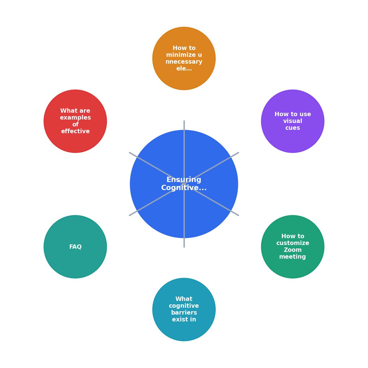
The process follows four steps: Audit defaults, Disable clutter, Add visual cues, Test with users. Each step feeds into the next, and the cycle repeats before every major meeting type.
Using visual cues effectively

Visual cues guide attention without adding clutter. The goal is to make the important thing obvious and everything else invisible.
Speaker highlight border
Zoom draws a colored border around the active speaker. Keep this enabled. It gives participants a clear, instant signal of who is talking without scanning the grid. In Settings > Video, make sure Highlight my video when I speak is on.
Virtual backgrounds with intention
A busy virtual background (tropical beach, outer space) adds visual noise. Recommend participants use:
- A solid color background (muted blue, gray, or green)
- A slightly blurred version of their real background
- No background effects at all if their real space is tidy
Pin key participants
Hosts can pin the presenter or interpreter so they always appear as the largest video. This prevents the layout from jumping when someone coughs or their dog barks. Pinning creates a stable visual anchor, which is especially helpful for people who rely on lip-reading or sign language interpreters.
Minimizing unnecessary elements
Decluttering goes beyond disabling features. It means rethinking what participants see at each stage of the meeting.
Hide the self-view
Seeing your own face on screen creates a constant self-monitoring loop. Zoom lets participants right-click their own tile and select Hide Self View. The video still broadcasts to others, but the participant no longer watches themselves. This single change reduces anxiety-related cognitive load significantly.
Suppress chat during presentations
If the meeting involves a presentation, the host can set chat to Host Only or disable it entirely during that segment. Chat messages during a talk split attention between reading and listening. After the presentation, re-enable chat for Q&A.
Use waiting rooms with clear messaging
A Waiting Room with a custom message ("The meeting will begin at 2:00 PM. You'll be admitted automatically.") removes the uncertainty of staring at a blank screen. Uncertainty increases cognitive load. A clear message eliminates it.
Reduce notification sounds
In Settings > Audio, disable the "play sound when participants join or leave" option. Each chime interrupts focus. For meetings with more than five people, the constant join/leave sounds become genuinely disruptive.
Effective accessible Zoom setups
Here is an example dashboard showing how a well-configured Zoom meeting compares to a default one across key cognitive accessibility metrics.
Default Zoom Setup
Optimized Setup
The optimized setup cuts visible toolbar icons by more than half and removes three of the most common sources of distraction. Teams that have adopted similar configurations report faster meeting starts and fewer "can you repeat that?" moments.
| Default Zoom | Accessible Zoom |
|---|---|
| Gallery View (grid of faces) | Speaker View (one focus) |
| All reactions enabled | Reactions disabled or minimal |
| Chat open throughout | Chat paused during presentations |
| Self-view always on | Self-view hidden by default |
| No captions | Auto-captions enabled |
| Join/leave chimes on | Chimes disabled |
Zoom Cognitive Accessibility Checklist
Your progress is saved automatically in your browser.
Tools like PagePerson Insights can help you audit the web-based portions of your Zoom workflow (landing pages, registration forms, post-meeting surveys) for the same cognitive barriers that affect the meeting interface itself.
FAQ
Frequently Asked Questions
What is the first Zoom setting you plan to change after reading this? Share your approach with your team and see how it shifts the meeting experience.
Need Help with Accessibility?
Improve your site's accessibility and conversion rates with our AI-powered analysis.
Get Started