Handling Common Cognitive Accessibility Issues on Landing Pages
Your landing page loads in under two seconds, your hero image looks sharp, and your ad spend keeps climbing. Yet visitors leave without converting, and your analytics cannot tell you why. The problem is often cognitive, not visual. Simplifying content structure, fixing visual hierarchy, and writing clearer calls to action can recover the conversions you are losing right now.

Your landing page loads in under two seconds, your hero image looks sharp, and your ad spend keeps climbing. Yet visitors leave without converting, and your analytics cannot tell you why. The problem is often cognitive, not visual. Simplifying content structure, fixing visual hierarchy, and writing clearer calls to action can recover the conversions you are losing right now.
- Most landing page drop-offs trace back to cognitive barriers: too much text, unclear hierarchy, and vague CTAs.
- Fixing these issues does not require a redesign. Targeted changes to content density, layout structure, and button copy can lift conversion rates significantly.
- Cognitive accessibility improvements benefit every visitor, not just those with diagnosed conditions.
Why visitors leave (and analytics won't tell you)
Standard analytics tools report where users drop off. Heatmaps show what they click. Neither explains the cognitive reason behind the behavior. A visitor with ADHD skips your pricing section because the table has 14 columns. A first-time user ignores your CTA because three competing buttons sit above the fold. Someone with low digital literacy reads your headline, fails to understand the offer, and hits the back button.
These are cognitive accessibility failures. They affect an enormous share of your audience.
That number is not hypothetical. It accounts for people dealing with stress, distraction, fatigue, dyslexia, ADHD, anxiety, aging-related cognitive changes, and low digital literacy. Every one of them is a potential customer you are paying to bring to your page.
"If [your page] isn't accessible, you're losing customers.">, Best Practices for Accessible Landing Pages
Common cognitive barriers on landing pages

Here are the barriers that show up on landing pages over and over again:
- Information overload - cramming every feature, testimonial, and stat above the fold. Visitors freeze when faced with too many inputs at once.
- Unclear value proposition - the headline uses internal jargon or abstract language. "Synergize your workflow" means nothing to a new visitor.
- Competing visual elements - multiple animations, banners, and pop-ups fight for attention. The brain cannot prioritize, so it disengages.
- Walls of text - long paragraphs without subheadings, bullets, or whitespace. Scanning becomes impossible.
- Ambiguous calls to action - buttons labeled "Learn More" or "Get Started" without context. The visitor does not know what happens next.
- Poor contrast and small text - technically a visual issue, but it directly increases cognitive effort to read.
- Inconsistent navigation - links that change style or position across sections. The user has to re-learn the interface mid-scroll.
Most landing pages carry at least three of these issues simultaneously. The compounding effect is what kills conversion rates.
Simplify content for comprehension
The fix starts with content, not design. Strip your landing page copy down to one core message per section. If a paragraph tries to explain the product, list benefits, and handle objections, split it into three distinct blocks.
Concrete techniques:
- One idea per section. Each H2 block addresses a single question the visitor has. "What does this do?" is separate from "How much does it cost?"
- Short sentences. Aim for 15-20 words per sentence. Cut filler words like "actually", "basically", and "in order to."
- Plain language. Replace "leverage" with "use." Replace "utilize our platform" with "sign up." The Hemingway Editor is a free tool that flags complex sentences.
- Front-load key information. Put the answer before the explanation. Visitors scan the first few words of each line and skip the rest.
Build a clear visual hierarchy

Visual hierarchy tells the brain what to look at first, second, and third. Without it, every element competes equally, and the visitor's working memory overloads.
Three rules that work:
- Size signals importance. Your headline should be the largest text on the page. Subheadings smaller. Body text smaller still. If your feature list uses the same font size as your headline, nothing stands out.
- Whitespace creates grouping. Elements close together are perceived as related (Gestalt proximity principle). Add generous padding between unrelated sections. Stripe's landing pages use whitespace aggressively, and their conversion rates reflect it.
- Color draws the eye. Use your accent color for exactly one thing: the primary CTA. If your accent color appears on decorative icons, background shapes, and the button, the button loses its pull.
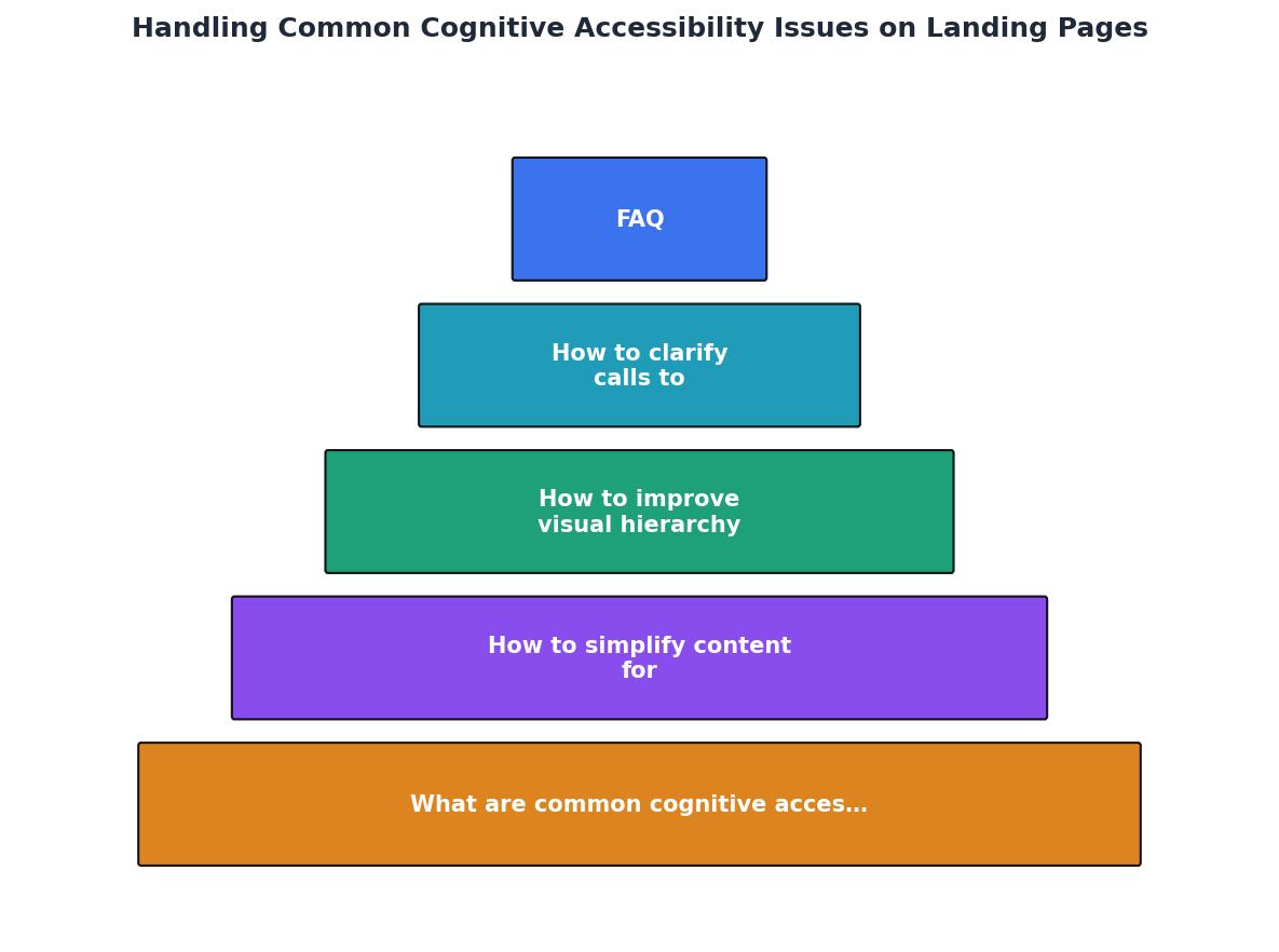
Follow the flow: Audit barriers, Simplify content, Fix hierarchy, Clarify CTAs, Test and iterate. Each step feeds the next. Skipping the audit means you are guessing which barriers exist.
Here is an example dashboard showing how cognitive accessibility metrics might look for a typical landing page before and after optimization:
Landing Page Cognitive Accessibility Score
Write CTAs that remove doubt

A call to action fails when the visitor does not know what clicking the button will do. "Get Started" is vague. "Start your free 14-day trial" is specific. The difference in conversion can be dramatic.
Rules for effective CTAs:
- State the outcome, not the action. "See my results" beats "Submit." "Download the checklist" beats "Click here."
- One primary CTA per screen. If you show "Sign Up", "Book a Demo", and "Watch Video" in the same viewport, the visitor has to make a decision before they have enough information. Decision fatigue kills conversions.
- Reduce perceived risk. Add a single line below the button: "No credit card required" or "Cancel anytime." This addresses the objection before it forms.
- Use contrast. The button color should be the highest-contrast element in its section. Test it by squinting at the page. If the button disappears, it needs more contrast.
| Weak CTA | Strong CTA |
|---|---|
| Learn More | See pricing plans |
| Get Started | Start free 14-day trial |
| Submit | Send my free report |
| Click Here | Download the checklist |
| Contact Us | Book a 15-min call |
Test with real cognitive scenarios
Fixing cognitive barriers is not a one-time task. You need to test changes against realistic conditions. Ask a colleague to review your page while distracted (music playing, phone buzzing). Have someone unfamiliar with your product read the headline and tell you what the product does. If they cannot answer in one sentence, the headline needs work.
Tools like PagePerson Insights can surface cognitive accessibility issues automatically, flagging sections where visitors with ADHD, dyslexia, or high cognitive load are likely to struggle. That kind of targeted feedback replaces guesswork with specific, fixable problems.
Run A/B tests on your simplified copy against the original. Track not just click-through rates but also scroll depth and time-on-page. A page where visitors scroll further and spend more time reading (not bouncing) signals better comprehension.
Landing Page Cognitive Accessibility Checklist
Your progress is saved automatically in your browser.
FAQ
Frequently Asked Questions
Additional Resources
- Best Practices for Accessible Landing Pages - 1. Keep Your Copy Short and Descriptive “Time is limited” is clearer 2. Make Sure Your Form Is Accessible … a cognitive impairment, or dyslexia ...
- Creating Accessible Landing Pages: 5 Tips - 1. Don't treat accessibility as an afterthought · 2. Don't rely on images, video, or audio to convey information · 3. Make sure people have ...
- Best Strategies for Cognitive Accessibility in Digital Design - Common relative issues users may face include broken links, unexpected web page redirects, unclear form instructions, intrusive pop-up ads, and ...
Need Help with Accessibility?
Improve your site's accessibility and conversion rates with our AI-powered analysis.
Get Started