Comprehensive Cognitive Accessibility Checklist
Most accessibility audits stop at color contrast ratios and missing alt text. That leaves an entire category of users behind: people with ADHD, dyslexia, anxiety, low digital literacy, or anyone dealing with temporary cognitive overload from stress or multitasking. This checklist covers the cognitive layer that standard WCAG tooling ignores, giving you concrete items to evaluate navigation, content layout, and multimedia across any website. Print it, share it with stakeholders, and run through it on every project.

Most accessibility audits stop at color contrast ratios and missing alt text. That leaves an entire category of users behind: people with ADHD, dyslexia, anxiety, low digital literacy, or anyone dealing with temporary cognitive overload from stress or multitasking. This checklist covers the cognitive layer that standard WCAG tooling ignores, giving you concrete items to evaluate navigation, content layout, and multimedia across any website. Print it, share it with stakeholders, and run through it on every project.

- A cognitive accessibility checklist goes beyond WCAG visual checks to cover navigation clarity, content structure, reading level, and multimedia inclusivity.
- Each item includes a concrete evaluation method so you can score pages objectively, not just guess.
- The checklist adapts to e-commerce, SaaS, healthcare, government, and education sites with industry-specific add-ons.
Why cognitive accessibility needs its own checklist
Standard accessibility tools like axe, WAVE, and Lighthouse catch about 30-40% of WCAG issues. Almost all of those are technical: missing labels, broken ARIA roles, insufficient contrast. None of them tell you whether a user with ADHD can actually parse your pricing page or whether someone with dyslexia can follow your onboarding flow.
Cognitive accessibility sits in the gap between "technically compliant" and "actually usable." A page can pass every automated check and still confuse a significant portion of visitors. That confusion shows up as bounce rates, abandoned carts, and support tickets that nobody connects back to design decisions.
"The majority of web pages are overly complex, cluttered, unclear, and difficult to navigate and essentially shut these users out of the digital world.">, The Complete Guide to Cognitive Accessibility for Cognitive Disabilities
This checklist gives you a repeatable, evidence-based process. Each item maps to a specific cognitive barrier, includes an evaluation method, and produces a pass/fail result you can document in an audit report.
Navigation clarity

Navigation is where cognitive load hits first. A user lands on your site and has roughly 3-5 seconds to figure out where they are and what to do next. If your navigation structure demands too much working memory, they leave.
Menu structure and labeling
- Primary navigation should contain no more than 7 top-level items. Research on working memory capacity (Miller's Law) suggests 7 plus or minus 2 chunks. Most sites exceed this.
- Labels need to be plain language. "Solutions" means nothing. "Pricing," "Features," "Docs" mean something.
- Dropdown menus should be no deeper than two levels. Triple-nested menus require users to hold a mental map of three hierarchy levels simultaneously.
Consistent placement
Every page on the site should place navigation in the same location. Sounds obvious, but marketing landing pages frequently strip navigation or move it. That breaks the user's spatial memory.
Evaluation method: Open five random pages on the site. Check that the primary nav appears in the same position, with the same items, in the same order. Score: pass if all five match, fail if any differ without clear justification (like a dedicated checkout flow).
Breadcrumbs and wayfinding
Breadcrumbs reduce cognitive load by showing users their current position in the site hierarchy. They are especially useful for e-commerce category pages and documentation sites. If a user arrives via search, breadcrumbs answer "where am I?" without requiring them to reverse-engineer the site structure.
Search functionality
Search should be visible, not hidden behind an icon. Autocomplete suggestions help users with spelling difficulties or uncertain vocabulary. Search results should show context snippets, not just page titles.
Content layout and readability

Layout determines whether content gets read or skipped. Cognitive accessibility in layout means reducing the effort required to extract meaning from a page.
Reading level
Run your body copy through a readability scorer (Hemingway Editor, readable.com, or the Flesch-Kincaid formula). Aim for a grade 8 reading level or lower for general audiences. Healthcare and government sites should target grade 6.
- Short sentences: 15-20 words average
- Short paragraphs: 2-4 sentences
- One idea per paragraph
- Active voice over passive
Visual hierarchy
Users scan in an F-pattern or Z-pattern. Your layout should support this:
- Headings break content into scannable chunks. Every 200-300 words should have a subheading.
- Bold key terms on first use so scanning eyes can anchor on them.
- Bullet lists for any sequence of three or more related items.
- White space between sections. Cramped layouts increase perceived complexity even when the actual content is simple.
Line length and typography
Line length should stay between 50-75 characters per line. Wider lines force the eye to travel too far, causing users to lose their place. This is especially problematic for people with dyslexia.
Font size: 16px minimum for body text. Line height: 1.5 or greater. Sans-serif fonts (Inter, Open Sans, Atkinson Hyperlegible) perform better for screen reading than serif fonts.
Color and contrast beyond WCAG
WCAG requires 4.5:1 contrast for normal text. Cognitive accessibility goes further:
- Do not rely on color alone to convey meaning (red/green for error/success)
- Use icons or text labels alongside color indicators
- Avoid pure white (#FFFFFF) backgrounds; a slight off-white (#F8F8F8 or #FAFAFA) reduces glare for users with light sensitivity
Multimedia accessibility
Multimedia content (video, audio, animations, interactive elements) introduces unique cognitive barriers that static text does not.
Video and audio
- Captions are required, but cognitive accessibility also demands simplified captions for complex content. Standard captions transcribe speech verbatim; simplified captions rephrase jargon.
- Transcripts should accompany every video. Users with processing speed differences often prefer reading at their own pace over watching video.
- Playback speed controls let users slow down or speed up content to match their processing speed.
Animation and motion
- Respect
prefers-reduced-motionin CSS. Users who enable this OS-level setting are telling you that motion causes them problems. - Auto-playing carousels and sliders are a cognitive accessibility failure. They demand split attention: the user must read the current slide while anticipating the next one.
- Progress indicators on timed content (like slideshows or onboarding flows) reduce anxiety by showing how much remains.
Interactive elements
- Form fields need visible labels (not just placeholders that disappear on focus)
- Error messages should appear next to the field, not in a banner at the top of the page
- Multi-step forms should show a progress bar and allow backward navigation without losing data
The audit process
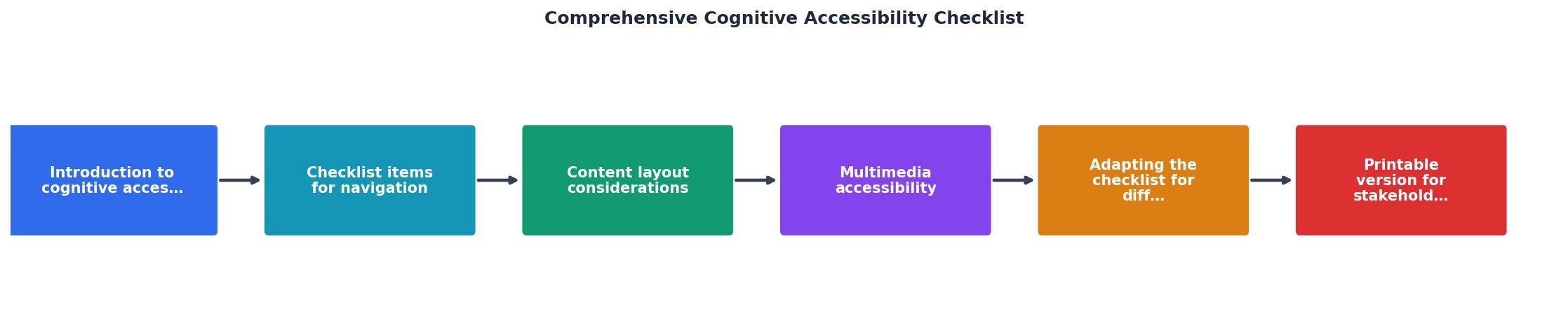
The diagram above shows the five-step process: Scope the pages to audit, Evaluate each checklist item, Score pass/fail, Prioritize fixes by impact, and Report findings to stakeholders.
Here is how each step works in practice:
- Scope - Select 5-10 representative pages: homepage, key landing page, product/pricing page, a form or checkout flow, and a content-heavy page (blog post or documentation).
- Evaluate - Go through every checklist item on each page. Use the evaluation methods described in each section.
- Score - Mark each item as pass, partial, or fail. Partial means the item is implemented but inconsistently.
- Prioritize - Rank failures by user impact. Navigation failures and form issues typically affect more users than typography tweaks.
- Report - Compile results into a shareable document. Include screenshots of failures and specific fix recommendations.
Adapting for different industries

The core checklist applies everywhere, but specific industries have additional cognitive accessibility concerns.
Here is an example dashboard showing how checklist coverage might break down across industries:
E-commerce
Healthcare
Government
SaaS / B2B
E-commerce additions
- Product filters should show applied filters clearly and allow one-click removal
- Cart summaries should be visible without scrolling
- Checkout forms should auto-detect card type and format fields accordingly
- Size/variant selectors need clear visual states (selected vs. available vs. out-of-stock)
Healthcare additions
- Medical terminology should include plain-language definitions on hover or inline
- Consent forms need summaries in addition to full legal text
- Patient portal navigation should support users under stress or medication effects
- Appointment booking flows should confirm date/time in multiple formats
Government and education
- All content should meet plain language standards (grade 6 reading level)
- Forms should include inline help text, not just a separate FAQ page
- Multi-step processes (applications, registrations) need save-and-return functionality
- Multilingual support should be discoverable from every page, not buried in a footer link
SaaS and B2B
- Pricing pages should make plan differences scannable (comparison tables, not paragraphs)
- Onboarding flows should offer skip and revisit options
- Feature descriptions should lead with the user benefit, not the technical capability
- Trial expiration warnings should be clear and non-threatening
Presenting to stakeholders
A checklist is only useful if it drives action. When presenting audit results to stakeholders who do not have a UX background, focus on three things:
- Impact numbers - Connect each failure to a user segment size. "42% of visitors may struggle with this navigation pattern" lands harder than "the menu is confusing."
- Screenshots - Show the problem visually. Annotate screenshots with red circles and brief labels.
- Fix effort - Categorize each item as quick win (CSS/copy change), medium effort (component redesign), or major effort (architecture change). Stakeholders need to know what they can fix this sprint.
A printable version of the checklist below works well as a leave-behind after stakeholder meetings. Hand it over with the audit report so the team has a reference during implementation.
Cognitive Accessibility Audit Checklist
Your progress is saved automatically in your browser.
FAQ
Frequently Asked Questions
Additional Resources
- The Complete Guide to Cognitive Accessibility for ... - Cognitive accessibility refers to creating a digital environment, such as a website, that is accessible to those with cognitive and learning ...
- A Guide to Improving Cognitive Accessibility - How to create Cognitive Accessibility on your Website? · Create Readable, Clear and Concise Content · Accessible Navigation · Predictable Web Pages · Give users ...
- Cognitive Accessibility at W3C - This page introduces: accessibility for people with cognitive and learning disabilities (“cognitive accessibility”); existing standards from the World Wide ...
Need Help with Accessibility?
Improve your site's accessibility and conversion rates with our AI-powered analysis.
Get Started