Content Strategies to Reduce Cognitive Load on Visitors
Your website makes perfect sense to you. You built it, you wrote the copy, you know where everything lives. But a first-time visitor lands on that same page and their brain stalls. They see too many choices, too much text, and no clear path forward.


Your website makes perfect sense to you. You built it, you wrote the copy, you know where everything lives. But a first-time visitor lands on that same page and their brain stalls. They see too many choices, too much text, and no clear path forward. The fix is not a redesign. It is a set of content strategies that cut cognitive load so visitors actually read, understand, and convert.

- Cognitive load is the mental effort your visitors spend processing your page. Too much of it kills conversions.
- Clear information architecture, bullet points, summaries, and purposeful visuals reduce that load dramatically.
- Small, testable content changes can lift comprehension and engagement without touching your codebase.
What is cognitive load in web content?
Cognitive load refers to the total amount of mental effort a person uses to process information at any given moment. In the context of a website, every headline, navigation link, image, form field, and paragraph competes for a slice of that limited mental budget.
There are three types that matter for content creators:
- Intrinsic load comes from the complexity of the topic itself. Explaining tax law is inherently harder than explaining a sandwich menu.
- Extraneous load comes from poor presentation. Cluttered layouts, inconsistent terminology, and buried calls to action all add friction that has nothing to do with the actual message.
- Germane load is the productive effort a visitor spends building understanding. This is the one you want to maximize.
"Most computer users have learned that running too many programs at the same time can slow down or even crash the machine.">, Minimize Cognitive Load to Maximize Usability
Your visitors' brains work the same way. Overload them and they close the tab.
How information architecture helps

Information architecture (IA) is the structural blueprint of your content. It determines how pages relate to each other, how navigation labels are worded, and how deep a visitor has to dig to find an answer.
A strong IA reduces cognitive load in three concrete ways:
- Predictable navigation. When your top-level menu uses labels visitors already expect ("Pricing", "Features", "Docs"), they do not have to guess where things live. Clever or branded labels ("The Vault", "Mission Control") force visitors to decode your internal language.
- Shallow depth. Every extra click is a decision. If a visitor needs four clicks to reach your pricing comparison, three of those clicks are extraneous load. Flatten the hierarchy.
- Logical grouping. Related content belongs together. Stripe groups API reference, guides, and changelogs under a single "Developers" section. A visitor looking for integration docs never has to wonder whether to check "Resources" or "Support."
Bullet points and summaries
Long paragraphs are where comprehension goes to die on the web. Visitors scan. They do not read line by line. Bullet points and summary blocks work because they match how people actually consume web content.
Here is what to do:
- Lead with a summary. Put a two-sentence TL;DR at the top of every long-form page. Visitors who get the gist immediately are more likely to keep reading for details.
- Break lists out of paragraphs. If a sentence contains three or more items separated by commas, convert it to a bulleted list. The visual separation reduces parsing effort.
- Use numbered lists for sequences. Steps, priorities, and rankings benefit from explicit ordering. Readers do not have to infer the sequence themselves.
- Bold the lead phrase. In each bullet, bold the first few words so scanners can grab the key point without reading the full sentence.
Visual elements and comprehension

A well-chosen image or diagram can replace hundreds of words of explanation. But visuals only reduce cognitive load when they carry meaning. Decorative stock photos of people shaking hands add zero information and actually increase load because the visitor's brain still processes them.
Effective visual strategies include:
- Annotated screenshots. Show the actual interface with arrows or highlights pointing to the element you are discussing. Notion's help docs do this consistently.
- Diagrams for processes. A flowchart showing "Visitor lands > Scans headline > Checks CTA > Converts or bounces" communicates a process faster than four paragraphs describing it.
- Icons as signposts. Small icons next to section headings act as visual anchors. They help visitors orient themselves when scrolling back up to find something.
- Consistent image style. Mixing illustration styles, photo filters, and icon sets creates visual noise. Pick one style and stick with it across the site.
Sites that manage cognitive load well

Looking at real examples makes these strategies concrete:
- GOV.UK strips every page to the essentials. One column, plain language, clear headings, no sidebar distractions. It serves millions of users with wildly different literacy levels and still achieves high task-completion rates.
- Stripe Docs uses progressive disclosure. The overview page is short. Detailed API parameters are hidden behind expandable sections. Visitors only see complexity when they ask for it.
- Mailchimp's marketing site uses generous whitespace, short paragraphs, and a single primary CTA per section. The eye always knows where to go next.
- Apple product pages combine large visuals with minimal text. Each scroll section makes one point. There is no competing information.
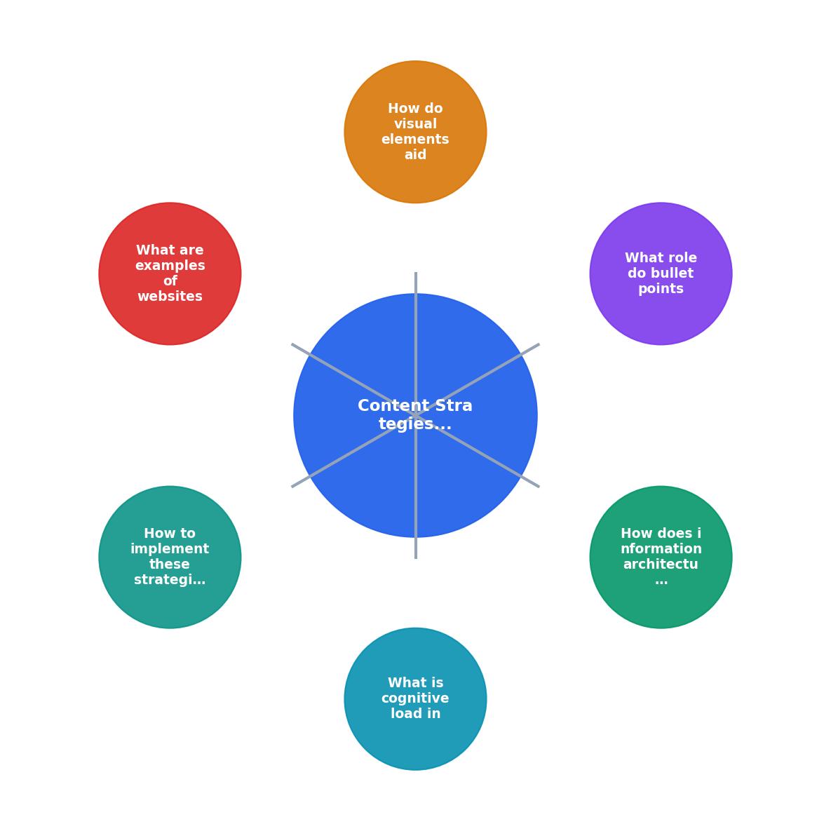
The following diagram summarizes the core content strategies and how they connect to reduced cognitive load:
How to implement these strategies
Knowing the theory is one thing. Applying it to your existing content is another. Here is a practical sequence:
- Audit your top pages. Start with the five pages that get the most traffic. Read each one as if you have never seen the product before. Note every moment of confusion.
- Rewrite headlines as questions. Visitors arrive with questions. If your headline answers one, they stay. "How Pricing Works" beats "Pricing Information."
- Break up long sections. Any paragraph longer than four sentences gets split. Any section longer than 300 words gets a subheading.
- Add a summary block. Put a two-to-three sentence summary at the top of each page or major section.
- Replace decorative images. Swap generic stock photos for annotated screenshots, diagrams, or nothing at all.
- Test with real visitors. Use a tool like PagePerson Insights to see where visitors experience confusion or hesitation. Data beats assumptions.
Here is an example dashboard showing the kind of cognitive load metrics you should track when restructuring content:
Cognitive Load Audit, Example Landing Page
Cognitive Load Reduction Checklist
Your progress is saved automatically in your browser.
FAQ
Frequently Asked Questions
Additional Resources
- Minimize Cognitive Load to Maximize Usability - Minimizing Cognitive Load · Avoid visual clutter: redundant links, irrelevant images, and meaningless typography flourishes slow users down.
- How To Minimize Cognitive Load In Web Design And ... - Stick to a clean structure with clear sections, enough white space, and a visual flow. A simple layout guides the eye naturally, reducing mental ...
- Reducing Cognitive Load in the Digital Age - Unsubscribing from unnecessary email lists, limiting news intake, or curating the social media content you engage with can significantly reduce the cognitive ...
Need Help with Accessibility?
Improve your site's accessibility and conversion rates with our AI-powered analysis.
Get Started