Design Principles to Reduce Cognitive Load in Mobile Apps
Every tap, swipe, and scroll in a mobile app costs your user a tiny slice of mental energy. Stack enough of those slices together and the user quits, uninstalls, or simply stops caring. The good news is that a handful of concrete design principles can cut that mental tax dramatically. This guide walks through the specific strategies that keep mobile interfaces clear, fast to parse, and genuinely usable for everyone.


Every tap, swipe, and scroll in a mobile app costs your user a tiny slice of mental energy. Stack enough of those slices together and the user quits, uninstalls, or simply stops caring. The good news is that a handful of concrete design principles can cut that mental tax dramatically. This guide walks through the specific strategies that keep mobile interfaces clear, fast to parse, and genuinely usable for everyone.

- Cognitive load in mobile apps is the total mental effort a user spends to understand and operate the interface.
- Simplifying navigation, using universally recognized icons, and building a strict information hierarchy are the three highest-impact levers.
- These principles improve usability for all users, but they are especially critical for people dealing with anxiety, ADHD, or low digital literacy.
What cognitive load means in mobile
Cognitive load is the amount of working memory a person uses to process what they see and decide what to do next. On a 6-inch screen, working memory fills up fast. Users juggle tiny touch targets, truncated labels, and context switches between apps. When the interface demands too much processing, comprehension drops and errors spike.
Three types matter for designers:
- Intrinsic load comes from the task itself (filing taxes is inherently complex).
- Extraneous load comes from bad design (a cluttered settings screen, ambiguous icons).
- Germane load is the useful effort spent learning and forming mental models.
Simplify navigation structure

Navigation is the skeleton of every mobile app. When it is bloated or inconsistent, users burn mental energy just trying to find where they are.
Keep primary destinations under five. The bottom tab bar in apps like Spotify and Google Maps tops out at five icons. That number is not arbitrary. It aligns with the capacity of short-term memory. Once you push past five, recognition turns into a scanning exercise.
Use a flat hierarchy. Deep nesting (three or more levels) forces users to remember the path they took. A flat structure with clear category labels lets them jump directly. If a section must go deeper, show a breadcrumb or a clear back label instead of a generic arrow.
Consistent placement matters. The back button, search icon, and primary action should live in the same spot on every screen. Stripe's mobile dashboard keeps the navigation bar fixed at the bottom across all views. Users never have to hunt for it.
Practical steps:
- Audit your sitemap and count taps to reach any feature. If it takes more than three taps, flatten the path.
- Label every navigation item with a verb or a clear noun. "Activity" beats "Misc."
- Test with five real users. If two or more get lost, the structure needs work.
Use intuitive iconography
Icons save space, but only when users already know what they mean. A magnifying glass for search, a house for home, a gear for settings: these are universal. A custom illustration of a rocket for "boost your profile" is not.
Pair icons with text labels. Google's Material Design guidelines recommend text labels on all bottom navigation icons. The label removes guesswork. Users with anxiety or low confidence especially benefit because they do not have to wonder if they tapped the right thing.
Stick to platform conventions. iOS users expect a share icon that looks like a box with an upward arrow. Android users expect three connected dots. Swapping them creates a split-second of confusion that compounds across sessions.
"The most effective forms use language that mirrors how users naturally think and speak about the information being requested.">, Few Guesses, More Success: 4 Principles to Reduce Cognitive Load in Forms
The same principle applies to icons: mirror the mental model users already carry.
Build a strict information hierarchy
Not every piece of content on a screen deserves equal visual weight. Information hierarchy is the deliberate ranking of elements so the eye lands on the most important item first, then flows naturally to supporting details.
Techniques that work on mobile:
- Size contrast. The primary headline should be at least 1.5x the body text size. Airbnb's listing screens use a large photo, a bold title, and smaller metadata below. The scan path is instant.
- Progressive disclosure. Show only what the user needs at each step. Duolingo hides advanced lesson settings behind a single "more" tap instead of dumping every option on the main screen.
- Whitespace as a signal. Generous padding between sections tells the brain "this is a new group." Cramped layouts force the user to parse boundaries manually.
Real apps that get it right

Looking at shipped products is the fastest way to internalize these principles.
- Apple Health groups dozens of data categories into a summary dashboard. Users see trends first, details on demand. Navigation uses a simple four-tab bar.
- Revolut handles complex financial tasks (currency exchange, stock trading, crypto) with a single home feed and contextual action sheets. The bottom bar has five items, each with a text label.
- Notion mobile strips the desktop sidebar into a bottom tab bar with four destinations. Editing controls appear only when the user taps into a block, keeping the reading view clean.
- Headspace uses large illustrations, minimal text, and a single primary CTA per screen. The onboarding flow asks one question at a time, reducing form anxiety.
Apply these principles step by step
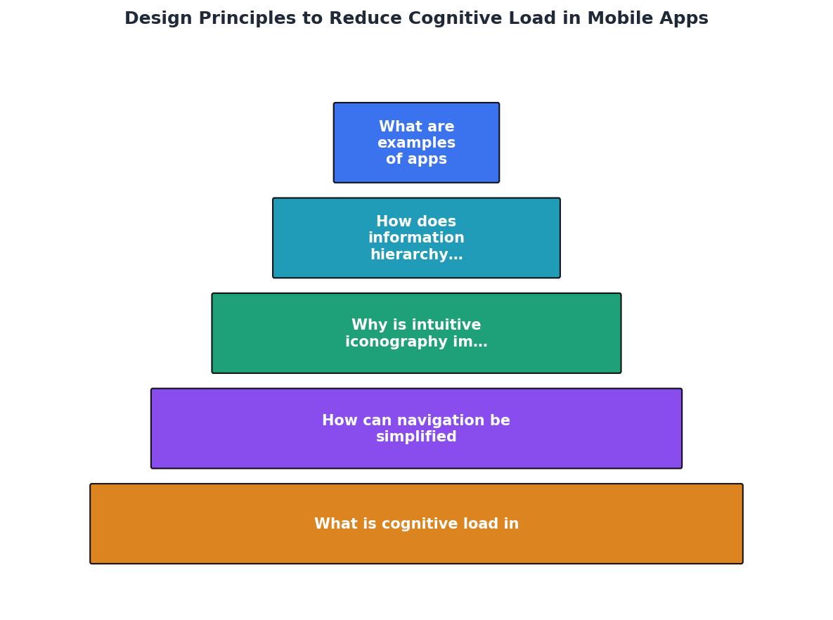
Here is a repeatable process you can follow for any mobile project:
- Audit current screens for extraneous elements.
- Prioritize content by user goal, not by business wish list.
- Simplify navigation to five or fewer primary destinations.
- Label every icon with text.
- Test with real users, focusing on task completion time and error rate.
- Iterate based on where users hesitate or backtrack.
The following interactive card summarizes the core metrics a design team should track when measuring cognitive load reduction across an app redesign:
Cognitive Load Reduction Dashboard
Tools like PagePerson Insights can help you spot cognitive load barriers on web-based flows that feed into your mobile experience, giving you evidence-backed data to justify design changes to stakeholders.
Cognitive Load Reduction Checklist for Mobile Designers
Your progress is saved automatically in your browser.
FAQ
Frequently Asked Questions
What is the single biggest cognitive load problem you have spotted in your own app? Share it below and let's figure out a fix together.
Additional Resources
- 4 Principles to Reduce Cognitive Load in Forms - Four principles of form design — structure, transparency, clarity, and support — minimize users' cognitive load and improve usability.
- Web Design Principles that Reduce Cognitive Load - Design principles that reduce cognitive load—hierarchy, consistency, mental models, feedback, accessibility, minimalism, task analysis, ...
- Design principles for reducing cognitive load - Avoid unnecessary elements · Leverage common design patterns · Eliminate unnecessary tasks · Minimize choices · Display choices as a group · Strive for readability.
Need Help with Accessibility?
Improve your site's accessibility and conversion rates with our AI-powered analysis.
Get Started