Enhancing Cognitive Accessibility on Squarespace Sites
Squarespace gives you gorgeous templates and drag-and-drop simplicity, but none of that matters if visitors with ADHD, dyslexia, anxiety, or low digital literacy cannot parse what your site actually says. Cognitive accessibility goes beyond color contrast ratios and alt text. It addresses whether a real human brain can process your layout, navigation, and content without hitting a wall. This guide walks through concrete steps to make your Squarespace site cognitively accessible, from template selection to a full audit checklist you can run today.

Squarespace gives you gorgeous templates and drag-and-drop simplicity, but none of that matters if visitors with ADHD, dyslexia, anxiety, or low digital literacy cannot parse what your site actually says. Cognitive accessibility goes beyond color contrast ratios and alt text. It addresses whether a real human brain can process your layout, navigation, and content without hitting a wall. This guide walks through concrete steps to make your Squarespace site cognitively accessible, from template selection to a full audit checklist you can run today.

- Pick Squarespace templates with clean layouts, logical heading hierarchies, and minimal visual clutter.
- Optimize site structure by limiting navigation depth, using descriptive labels, and breaking content into scannable chunks.
- Run regular cognitive accessibility audits using the checklist below to catch issues automated tools miss entirely.
Why cognitive accessibility matters
Most accessibility conversations stop at WCAG's perceivable and operable criteria. Screen reader compatibility, keyboard navigation, sufficient contrast. Those are table stakes. Cognitive accessibility targets the "understandable" principle: can someone with a processing difference, temporary stress, or unfamiliar context actually comprehend your content and complete a task?
That number is not hypothetical. It accounts for people with diagnosed conditions like ADHD and dyslexia, plus situational impairments: fatigue, multitasking, using a phone in bright sunlight, or navigating in a second language. For a Squarespace site selling services or products, every confused visitor is a lost conversion.
Squarespace's closed ecosystem creates a specific challenge. You cannot install arbitrary plugins or rewrite the underlying HTML structure the way you can on WordPress. That constraint actually helps: fewer moving parts means fewer places for cognitive barriers to hide. But you need to know where to look.
"Note: This guide is a resource, but it's not legal advice.">, Improving site accessibility with inclusive design
Choosing accessible templates

Not all Squarespace templates treat cognitive load equally. Some prioritize dramatic full-bleed imagery and animation-heavy transitions. Those look stunning in a portfolio but create processing barriers for visitors who need clarity over spectacle.
When evaluating a template, check these specifics:
- Heading hierarchy - Does the template generate proper H1 > H2 > H3 nesting? Inspect the rendered HTML. Some templates skip heading levels or use styled elements instead of semantic headings.
- Content width - Lines longer than 80 characters per line increase cognitive load. Templates with narrow content columns (600-700px max) improve readability.
- Animation defaults - Templates like Brine and Bedford use scroll-triggered animations. These can disorient users with vestibular sensitivities or ADHD. Check if you can disable them in the Design panel under Site Styles.
- Navigation placement - Top-bar navigation with visible links outperforms hamburger-only menus for cognitive accessibility. Templates that hide navigation behind an icon on desktop force users to remember what options exist.
Squarespace 7.1 templates share a unified engine, so structural differences are smaller than in 7.0. Still, the default layout choices vary. Start with templates from the "Professional Services" or "Portfolio" families. They tend toward clean grids and readable typography.Cognitive load reduction with clean template choice0%Pro tip: After selecting a template, open your site in Chrome DevTools and run Lighthouse's accessibility audit. It catches heading-order issues and missing landmarks that affect cognitive navigation.Optimizing site structure
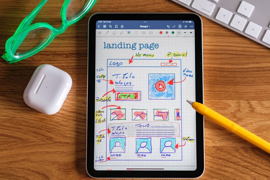
Photo by Optical Chemist from Pexels A cognitively accessible site structure means visitors can build a mental model of your site within seconds. If they cannot figure out where they are and where to go next, they leave.
Limit navigation depth to two levels. Squarespace supports dropdown folders in the main navigation. Use one level of dropdowns at most. Nested sub-folders force users to hold multiple categories in working memory simultaneously.
Use descriptive page names. "Services" is better than "What We Do." "Pricing" beats "Investment." Every label should answer the question: "What will I find when I click this?" Avoid clever or branded navigation labels like "The Studio" or "Our World."
Break long pages into sections with anchor links. Squarespace lets you add anchor links to any content block. For pages longer than three screen-heights, add a mini table of contents at the top using anchor links. This gives visitors a preview of the page structure before they scroll.
Consistent layout across pages. If your homepage puts the call-to-action button in the top-right corner, every page should follow that pattern. Squarespace's section-based editor makes it easy to copy section layouts between pages. Use that.
Here is a quick reference for structure decisions:
Cognitive Barrier Fix in Squarespace Deep navigation nesting Flatten to max 2 levels in Navigation panel Vague page labels Rename in Pages panel with task-oriented words Long scrolling pages Add anchor-link TOC using Code Block or Button Block Inconsistent layouts Duplicate sections across pages, keep CTA placement fixed Auto-playing media Disable autoplay in Video Block and Background settings Implementing clear navigation

Photo by Erik Mclean from Pexels Navigation is where cognitive accessibility succeeds or fails. A visitor with ADHD scanning your menu needs to locate the right link in under two seconds, or their attention shifts elsewhere.
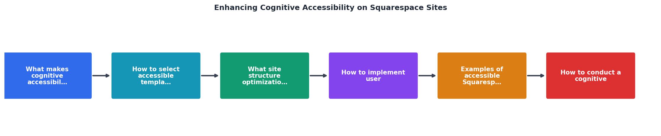
Figure 1: Enhancing Cognitive Accessibility on Squarespace Sites at a glance. Follow these steps to tighten navigation on your Squarespace site:
- Audit current nav items - List every link in your header and footer navigation. Remove anything that duplicates another link or serves an internal-only purpose.
- Group related pages - Use Squarespace's folder feature to group related pages under a single dropdown. Keep each folder to 5-7 items maximum.
- Add a visible search bar - Enable search in the header through the Navigation panel. For content-heavy sites, search is a cognitive shortcut that bypasses navigation entirely.
- Use breadcrumbs on blog posts - Squarespace 7.1 does not natively support breadcrumbs, but you can add them with a simple Code Block containing a text-based breadcrumb trail. This tells visitors exactly where they are in the site hierarchy.
- Test with real users - Ask three people unfamiliar with your site to find a specific page. Watch where they hesitate. That hesitation is a cognitive barrier.
0sAverage time to locate navigation item (target)The following interactive card summarizes the key navigation principles for quick reference:
Navigation Accessibility Checklist
1Flatten nav to max 2 levels deep2Label every link with task-oriented words3Limit each dropdown to 5-7 items4Enable visible search in the header5Test with 3 unfamiliar users and watch for hesitationAccessible content formatting
Good structure and navigation get visitors to the right page. Content formatting determines whether they actually read and understand what is there.
Font size and spacing. Squarespace's Site Styles panel lets you set global font sizes. Body text should be at least 16px (1rem). Line height of 1.5 to 1.8 gives readers with dyslexia room to track lines. Paragraph spacing should be at least 1.5x the line height.
Plain language. Write at an 8th-grade reading level. Tools like Hemingway Editor flag complex sentences. Replace jargon with common words. "Buy now" instead of "Proceed to checkout." "Contact us" instead of "Get in touch with our team."
Chunk content visually. Use Squarespace's spacer blocks, divider blocks, and alternating background colors to create clear visual boundaries between content sections. A wall of same-colored text blocks forces the reader's brain to segment content on its own.
Consistent button styles. Pick one primary button style and one secondary style. Use them consistently across every page. When buttons change shape, color, or position unpredictably, users with cognitive differences lose confidence in what clicking will do.
|Key takeaway: Cognitive accessibility on Squarespace comes down to three things: choosing a clean template, structuring navigation for instant comprehension, and formatting content so every visitor can process it without strain.Cognitive accessibility audit
Running a structured audit catches issues that automated scanners miss. PagePerson Insights can help identify cognitive barriers like confusing navigation patterns and high-load content sections, but a manual review adds context no tool can replicate alone.
Squarespace Cognitive Accessibility Audit
Your progress is saved automatically in your browser.
Run this audit quarterly, or after any major design change. Cognitive barriers creep in gradually as new pages and sections get added without the same care as the original build.
Warning: Squarespace's built-in accessibility features cover basics like alt text fields and ARIA landmarks, but they do not address cognitive load, reading level, or navigation complexity. You need a separate process for those.FAQ
Frequently Asked Questions
Templates with single-column layouts, visible top navigation, and minimal default animations work best. In Squarespace 7.1, start with templates from the Professional Services or Personal categories. Avoid templates that default to full-screen video backgrounds or parallax scrolling, as these increase cognitive load. After choosing any template, inspect the rendered HTML to confirm proper heading hierarchy and landmark regions.Flatten your navigation to two levels maximum. Rename every link with descriptive, task-oriented labels. Keep dropdown folders to 5-7 items each. Enable the search bar in your header for content-heavy sites. Remove duplicate links and internal-only pages from public navigation. Test by asking someone unfamiliar with your site to find a specific page and observe where they pause.Audit quarterly at minimum, and always after a major redesign, new page additions, or template changes. Cognitive barriers accumulate as content grows. A quarterly review using the checklist above takes about 30-45 minutes for a typical Squarespace site with 10-20 pages. Pair the manual audit with a tool like PagePerson Insights to catch patterns across multiple pages simultaneously.Squarespace provides foundational accessibility features: alt text fields, semantic HTML output, keyboard navigation support, and ARIA landmarks in newer templates. However, WCAG's cognitive accessibility success criteria (like 3.1.5 Reading Level and 3.3.2 Labels or Instructions) require manual implementation. You control reading level through your copy, label quality through your form design, and navigation clarity through your site structure choices.Yes. Scroll-triggered animations, parallax effects, and auto-playing videos create barriers for users with vestibular disorders, ADHD, and anxiety. Squarespace lets you disable most animations through Design > Site Styles. For any animation you keep, ensure it respects theprefers-reduced-motionmedia query. Test your site with this setting enabled in your browser's developer tools.What cognitive accessibility barrier on your Squarespace site has been the hardest to fix? Share your experience below.
Additional Resources
- Improving site accessibility with inclusive design - You can customize many aspects of your site to make it more accessible and easier to navigate for all visitors, including those with disabilities.
- Squarespace Websites Made Accessible ✅ Exclusive Tips - Learn how website owners can prioritize digital inclusion with exclusive Squarespace website design and development features, for barrier-free online UX.
- Squarespace Accessibility: How to Achieve ADA Compliance - In this post, we share tips on how to help make your Squarespace site accessible and explain why that matters for accessibility laws like the Americans with ...
Need Help with Accessibility?
Improve your site's accessibility and conversion rates with our AI-powered analysis.
Get Started