Improving Cognitive Accessibility on WordPress Websites
WordPress powers over 40% of the web, yet most accessibility work on these sites stops at color contrast ratios and alt text. Visitors with ADHD, dyslexia, anxiety, or low digital literacy hit cognitive walls that no contrast checker will ever flag. This guide walks through concrete theme choices, plugin configurations, layout strategies, and audit steps that make WordPress sites genuinely comprehensible for the widest possible audience.

WordPress powers over 40% of the web, yet most accessibility work on these sites stops at color contrast ratios and alt text. Visitors with ADHD, dyslexia, anxiety, or low digital literacy hit cognitive walls that no contrast checker will ever flag. This guide walks through concrete theme choices, plugin configurations, layout strategies, and audit steps that make WordPress sites genuinely comprehensible for the widest possible audience.

- Pick themes built on accessibility-ready standards (like Flavor, flavor, flavor) and pair them with plugins such as WP Accessibility and One Stop Accessibility.
- Structure content with short paragraphs, clear headings, consistent navigation, and plain language to reduce cognitive load.
- Run regular cognitive accessibility audits using a repeatable checklist that goes beyond WCAG technical checks.
What cognitive accessibility means
Cognitive accessibility refers to how easily a person can perceive, understand, navigate, and act on web content regardless of cognitive ability. It covers memory load, reading comprehension, attention demands, and decision complexity. Standard WCAG audits catch missing alt attributes and insufficient contrast. They do not catch a checkout flow that requires remembering seven steps, a navigation menu with 45 links, or body text set in 11px italic serif.
That number includes a large share of cognitive and neurological conditions: ADHD, dyslexia, autism spectrum, traumatic brain injury, age-related cognitive decline. Designing for these users does not mean dumbing content down. It means removing unnecessary friction so the content itself can do its job.
Choose accessibility-ready themes

WordPress.org maintains an accessibility-ready tag in its theme directory. Themes tagged this way have passed a review for keyboard navigation, ARIA landmarks, skip links, and semantic heading structure. That is a solid baseline, but cognitive accessibility demands more.
When evaluating a theme, check for:
- Predictable layout across pages. The header, navigation, and footer should stay in the same position on every template.
- Readable default typography. Body text at 16px minimum, line height of at least 1.5, and a sans-serif font stack.
- Minimal visual noise. Avoid themes with auto-playing sliders, parallax backgrounds, or animated sidebars. Each moving element competes for attention.
- Clear focus indicators. Tab through the theme's demo. If you cannot see where focus lands, move on.
That gap represents a huge opportunity. Switching to an accessibility-ready theme is the single highest-impact change most WordPress site owners can make.
Configure plugins that reduce friction

Plugins fill the gaps that themes leave open. Here are the ones that directly address cognitive barriers:
- WP Accessibility by Joe Dolson. Adds skip links, removes title attributes that clutter screen readers, forces focus outlines, and lets you add language attributes. Free and lightweight.
- One Stop Accessibility by developer developer. Provides a front-end toolbar letting visitors adjust font size, spacing, contrast, and highlight links. Gives users control over their own reading experience.
- Reading Time WP. Displays estimated reading time at the top of posts. This small addition reduces anxiety for users who need to plan their attention budget.
- Table of Contents Plus or Easy Table of Contents. Auto-generates anchor-linked headings. Visitors with working memory challenges can jump directly to the section they need instead of scrolling through a wall of text.
"Around 8% of men and 0.5% of women have some form of color blindness.">, How to Ensure Accessibility in WordPress: Best Practices in 2024
That statistic alone justifies installing a plugin that lets users switch to a high-contrast mode. Color should never be the only way to convey meaning on your site.
Optimize content layout for comprehension
Layout decisions have a direct effect on cognitive load. Two sites can have identical text, but the one with better structure will be understood faster and remembered longer.
Heading hierarchy matters. Use H2 for main sections, H3 for subsections. Never skip levels. Screen readers and scanning eyes both rely on this structure to build a mental model of the page.
Short paragraphs win. Three to five sentences per paragraph. A dense block of text triggers avoidance behavior in readers with ADHD or anxiety. White space is not wasted space.
Use lists for sequences and groups. If you are describing three or more related items, a bulleted or numbered list is always clearer than a run-on sentence.
Consistent navigation reduces memory load. The main menu should appear in the same location on every page. Breadcrumbs help users understand where they are. A visible search bar gives an escape hatch when navigation fails.
| Cognitive Barrier | Poor Practice | Better Practice |
|---|---|---|
| Memory overload | 12-item dropdown menus | Max 7 items, grouped logically |
| Reading difficulty | 10px font, justified text | 16px+ font, left-aligned |
| Decision fatigue | 5 CTAs on one page | 1 primary CTA per section |
| Orientation loss | No breadcrumbs, generic titles | Breadcrumbs + descriptive page titles |
| Attention competition | Auto-play video + sidebar ads | Static content, minimal distractions |
Run a cognitive accessibility audit

Technical accessibility scanners like WAVE or axe catch HTML-level issues. Cognitive accessibility requires a different lens. Here is a repeatable process:
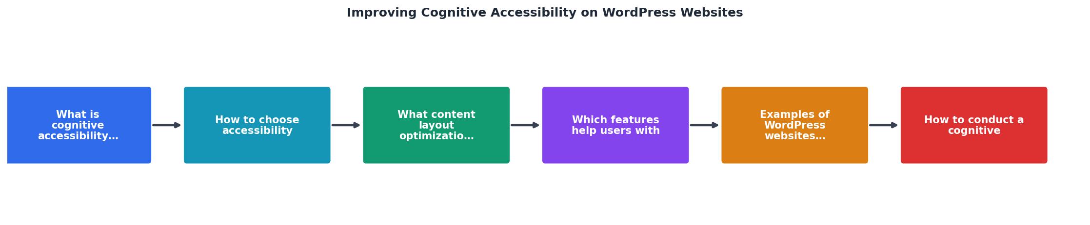
The diagram breaks the audit into five steps: Select pages, Check structure, Test readability, Evaluate navigation, and Document fixes. Walk through each one on your highest-traffic pages first.
- Select pages. Start with your homepage, main landing page, and checkout or signup flow. These carry the most traffic and the highest stakes.
- Check structure. Validate heading hierarchy (no skipped levels), confirm every page has a single H1, and verify that lists use proper
- Test readability. Paste your body copy into a readability tool. Aim for a Flesch-Kincaid grade level of 8 or below. Replace jargon with plain language.
- Evaluate navigation. Tab through the entire page. Count the number of tab stops before reaching main content. If it exceeds 5, add or fix your skip link. Check that focus order matches visual order.
- Document fixes. Log each issue with its page URL, a screenshot, and a severity rating (critical, major, minor). Assign owners and deadlines.
Tools like PagePerson Insights can speed up step 2 and 3 significantly by flagging cognitive load issues, confusing copy, and comprehension barriers that manual scanning misses.Here is an example dashboard showing what a typical audit might surface on a mid-size WordPress site:
Example Audit: Mid-Size WordPress Site (32 pages)
Heading hierarchy issues14 criticalReadability above grade 109 pagesMissing skip links6 pagesCompeting CTAs per page (avg)3.2Auto-playing media elements2Pages passing all checks4 / 32Only 4 out of 32 pages passed every cognitive accessibility check. That is typical. The good news: most fixes are straightforward content and configuration changes, not code rewrites.
|WordPress cognitive accessibility checklist
Cognitive Accessibility Audit Checklist for WordPress
Your progress is saved automatically in your browser.
Print this list. Run through it quarterly. Cognitive accessibility is not a one-time project. Content changes, theme updates, and new plugins can introduce regressions at any time.
FAQ
Frequently Asked Questions
Start with themes tagged accessibility-ready in the WordPress.org directory. The default Twenty Twenty-Five theme is a strong baseline because it ships with core and receives regular accessibility updates. Beyond that, look for themes with clean typography defaults (16px+ body text, 1.5 line-height), predictable layouts, and no auto-playing animations. Always test a theme by tabbing through its demo and checking heading structure in the browser's accessibility tree.Plugins address specific gaps. WP Accessibility adds skip links and focus outlines. One Stop Accessibility gives visitors a front-end toolbar to adjust font size, spacing, and contrast. Reading Time WP sets expectations for attention investment. Table of Contents plugins provide anchor navigation for long content. The key is choosing lightweight, well-maintained plugins that solve a specific cognitive barrier rather than installing a bloated "accessibility suite" that slows your site down.Run a full cognitive accessibility audit at least once per quarter. Between audits, check any new page or major content update against the checklist before publishing. WordPress core updates, theme updates, and plugin updates can all introduce regressions, so a quick spot-check after each update cycle is worth the five minutes it takes.Not at all. Cognitive accessibility constraints (clear hierarchy, readable type, consistent layout, minimal distractions) align with good visual design principles. The sites that score highest on cognitive accessibility tend to look cleaner and more professional, not less. Constraints breed creativity.WCAG 2.2 includes some cognitive-related success criteria (like consistent navigation and error identification), but it was primarily designed around perceivable and operable requirements. True cognitive accessibility goes further: plain language, reduced decision complexity, predictable interactions, and manageable information density. Meeting WCAG is necessary but not sufficient.What is the first cognitive accessibility fix you plan to tackle on your WordPress site? Share your starting point in the comments.
Additional Resources
- WordPress Accessibility Guide: Build an Accessible Website - Learn how to build an accessible WordPress website with our practical guide covering key accessibility tips, tools, and best practices.
- How to Ensure Accessibility in WordPress: Best Practices ... - Making WordPress sites accessible to everyone: The resources, checklists, and legal requirements every agency owner needs to know.
- Improving Accessibility on WordPress Website – Best ... - Utilize Landmarks: Incorporate the three landmarks
, , and
Need Help with Accessibility?
Improve your site's accessibility and conversion rates with our AI-powered analysis.
Get Started