Improving Text Readability for Users with Dyslexia
Improving text readability is essential for users with dyslexia to access information effectively. Dyslexia, a learning disability affecting a significant portion of the population, can make reading a challenging task. By implementing specific design techniques, we can enhance text comprehension and accessibility for these users. This article explores various methods, including the use of dyslexia-friendly fonts, optimized line spacing, and effective color contrasts, to improve readability and user experience.

Improving text readability is essential for users with dyslexia to access information effectively. Dyslexia, a learning disability affecting a significant portion of the population, can make reading a challenging task. By implementing specific design techniques, we can enhance text comprehension and accessibility for these users. This article explores various methods, including the use of dyslexia-friendly fonts, optimized line spacing, and effective color contrasts, to improve readability and user experience.

TL;DR: Improving text readability for users with dyslexia involves using dyslexia-friendly fonts, optimizing line spacing, and employing effective color contrasts. These changes enhance accessibility and user comprehension.
Imagine navigating a world where every word is a puzzle, and reading is more about deciphering than understanding. For individuals with dyslexia, this is a daily reality. Dyslexia affects how people process written words, making it difficult to read fluently. Fortunately, with thoughtful design and accessibility practices, we can create digital environments that ease this challenge. Below, we delve into practical steps to improve text readability, ensuring inclusivity and better comprehension for all users.
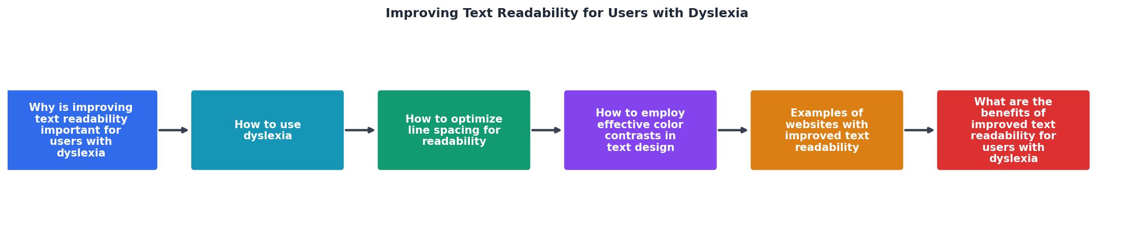
Why is Improving Text Readability Important for Users with Dyslexia?
The importance of readability cannot be overstated. When text is difficult to read, it can lead to frustration, decreased comprehension, and a lack of engagement. These barriers can prevent individuals with dyslexia from accessing the same level of information as their peers, leading to disparities in education and information acquisition. By focusing on making text more accessible, we can help bridge this gap, promoting equality and inclusivity.
"It can be important to understand that dyslexia is not a visual or hearing problem but a learning disability affecting 3 to 7% of the world population."
— Improving Text Readability for Users with Disabili, Improving Text Readability for Users with Disabili
How to Use Dyslexia-Friendly Fonts Effectively?

Fonts play a significant role in text readability. Dyslexia-friendly fonts are designed to reduce letter confusion and improve reading speed. Fonts such as OpenDyslexic, Dyslexie, and Lexend are specifically crafted to assist dyslexic readers. These fonts often feature heavier bottom weights and distinct letter shapes, which help differentiate similar-looking characters.
- Select Appropriate Fonts: Choose fonts with clear, distinct characters to minimize confusion. Dyslexia-friendly fonts often have larger spaces between letters, heavier bottoms, and unique character shapes to prevent common reading mistakes.
- Implement Consistent Usage: Maintain font consistency across content to avoid cognitive overload. Switching fonts frequently can disrupt the reading process and lead to additional confusion.
- Test Readability: Conduct user testing with individuals with dyslexia to evaluate font effectiveness. Gathering feedback from actual users can provide insights into which fonts are most helpful and why.
How to Optimize Line Spacing for Readability?
Line spacing, or leading, significantly impacts text readability. Proper line spacing can reduce visual stress and make text appear less crowded, which is particularly beneficial for dyslexic readers.
- Increase Line Spacing: Use a line spacing of 1.5 to 2 times the font size to enhance readability. This spacing allows for easier tracking of lines, helping users with dyslexia to follow text without losing their place.
- Avoid Justified Text: Left-align text to prevent irregular spacing between words, which can disrupt reading flow. Justified text can create uneven spaces that make sentences harder to follow.
- Use Ample Margins: Provide sufficient white space around text blocks to reduce visual clutter. White space acts as a visual buffer, helping to separate content and reduce cognitive load.
Another consideration is paragraph spacing. Adequate space between paragraphs can help users distinguish between different sections of text, making it easier to process information in chunks. This approach aligns with how dyslexic individuals often prefer to read, as breaking text into manageable parts can facilitate better comprehension.
How to Employ Effective Color Contrasts in Text Design?

Color contrast is another critical factor in enhancing text readability. High contrast between text and background can make reading easier for users with dyslexia.
- Choose High Contrast Colors: Ensure there is a strong contrast between text and background colors. High contrast makes text stand out more clearly, reducing the effort required to read.
- Avoid Clashing Colors: Steer clear of color combinations that can cause visual discomfort. Some color pairings can create visual vibrations or make text appear less stable.
- Use Color Sparingly: Limit the use of color to essential elements to maintain focus on the text. Overuse of colors can distract from the content and make it difficult to follow the main message.
In addition to color contrast, consider the impact of color blindness, which can co-occur with dyslexia. Ensuring that your design is accessible to colorblind users can further enhance readability and inclusivity. This can be achieved by using patterns or textures alongside colors to distinguish different elements without relying solely on color.
Examples of Websites with Improved Text Readability
These examples show that improving text readability is not only possible but also beneficial for a wide audience. By adopting these practices, websites can ensure they cater to a diverse group of users, including those with dyslexia, thereby broadening their reach and impact.
What are the Benefits of Improved Text Readability for Users with Dyslexia?
Enhanced text readability offers numerous benefits for users with dyslexia:
- Improved Comprehension: Clearer text helps users understand and retain information better. When text is presented in a way that is easy to read, users can focus more on the content rather than the act of reading itself.
- Reduced Reading Fatigue: Easier-to-read text can lower cognitive load and reduce fatigue. This allows users to engage with content for longer periods without experiencing as much mental exhaustion.
- Increased Engagement: Accessible content encourages users to spend more time interacting with the material. When users feel comfortable and confident in their ability to read, they are more likely to explore and engage with content.

FAQ
Frequently Asked Questions
Enhancing text readability for users with dyslexia is a continuous process of learning and adaptation. Have you implemented any of these techniques on your website? Share your experiences and insights in the comments below.
Additional Resources
- Improving Text Readability for Users with Disabilities ... - The most important thing to keep in mind is to ensure readability by avoiding any object to interact with the shape of a letter or a word. How ...
- Optimal Colors to Improve Readability for People with ... - In this study we analyze how an specific aspect of text customization, text and background colors, can improve readability of people with dyslexia.
- How to present more readable text for people with dyslexia - These results provide evidence that people with dyslexia may benefit from specific text presentation parameters that make text on a screen more readable.
Need Help with Accessibility?
Improve your site's accessibility and conversion rates with our AI-powered analysis.
Get Started