Incorporating Inclusive Design for Cognitive Accessibility
Most accessibility audits stop at color contrast ratios and missing alt text. That leaves an entire layer of user experience untouched: the cognitive one. Roughly one in five adults processes information differently due to ADHD, dyslexia, anxiety, or other cognitive conditions, and standard WCAG tooling barely scratches the surface of what they need. Inclusive design fills that gap by building interfaces that adapt to diverse cognitive abilities from the start, not as an afterthought.

Most accessibility audits stop at color contrast ratios and missing alt text. That leaves an entire layer of user experience untouched: the cognitive one. Roughly one in five adults processes information differently due to ADHD, dyslexia, anxiety, or other cognitive conditions, and standard WCAG tooling barely scratches the surface of what they need. Inclusive design fills that gap by building interfaces that adapt to diverse cognitive abilities from the start, not as an afterthought.
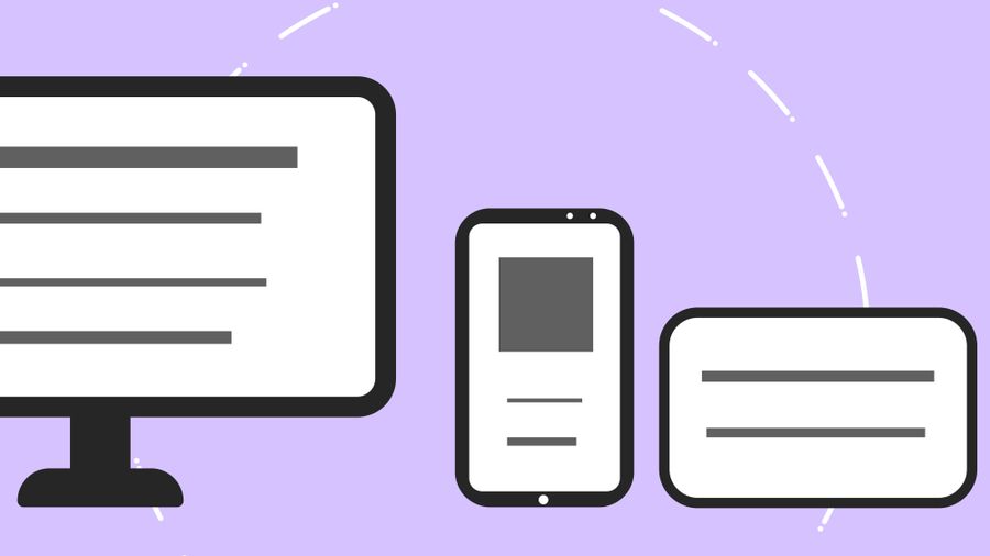
- Inclusive design goes beyond visual accessibility to address how people understand, remember, and act on information.
- Adaptive interfaces, multiple interaction methods, and progressive disclosure reduce cognitive barriers for all users.
- Real-world implementations at companies like Microsoft, BBC, and GOV.UK prove the approach works at scale.
- Testing cognitive accessibility requires specific tools and methodologies that complement traditional a11y checkers.
Why inclusive design matters now
Accessibility compliance has focused on perceivable and operable criteria for years. Cognitive accessibility stayed in the background because it is harder to quantify. A missing alt attribute triggers an automated flag. A confusing three-step form that causes 40% abandonment does not.
That gap costs real money and excludes real people. Inclusive design treats cognitive diversity as a design constraint from day one. It asks: can someone with working memory limitations complete this task? Can a person with ADHD stay focused through this checkout flow? Can a user with low digital literacy understand this error message?
The answer, more often than not, is no. And fixing it benefits everyone, not just the 20% with diagnosed conditions. Clear language, predictable layouts, and forgiving interactions make products better for stressed, distracted, or tired users too.
What is inclusive design?

Inclusive design is a methodology that considers the full range of human diversity throughout the design process. It differs from universal design (one solution for everyone) by acknowledging that different people may need different paths to the same outcome.
For cognitive accessibility specifically, inclusive design means:
- Reducing memory load by keeping navigation consistent and showing progress indicators.
- Supporting attention through clear visual hierarchy and minimal distractions.
- Enabling comprehension with plain language, familiar patterns, and contextual help.
- Allowing recovery by making errors easy to undo and instructions easy to re-read.
"Generally, providing about 50% whitespace on your screens gives your course both a clean, organized feel and gives learners enough clarity to read and understand the content.">, INCLUSIVE DESIGN FOR COGNITIVE DISABILITIES
That whitespace principle applies far beyond e-learning. Dense product pages, cluttered dashboards, and text-heavy onboarding flows all improve when you give content room to breathe.
Designing for diverse cognitive abilities
Adaptive interfaces are the core mechanism. Instead of forcing every user through the same rigid flow, you offer multiple ways to interact with content and complete tasks.
Progressive disclosure
Show only what the user needs at each step. A registration form with 12 visible fields overwhelms. The same form split into three steps with a progress bar does not. GOV.UK pioneered this pattern in government services, and their research showed completion rates jumped when they moved to one-question-per-page flows.
Multiple input methods
Some users process text better. Others prefer visual cues. A few need audio. Offering the same information through multiple channels is not redundancy; it is resilience. BBC iPlayer provides audio descriptions, subtitles, and sign language options for the same content. That same principle applies to product interfaces: pair text labels with icons, offer tooltips alongside inline help, and provide both search and browse navigation.
Predictable patterns
Cognitive load spikes when users encounter unexpected behavior. Buttons that look the same should act the same. Navigation that appears in one location on the homepage should not move on subpages. The Nielsen Norman Group calls this "consistency and standards," and it is the single cheapest cognitive accessibility improvement you can make.
Error prevention and recovery
Autosave, confirmation dialogs for destructive actions, and clear undo options reduce the anxiety of making mistakes. For users with attention difficulties, losing 10 minutes of form input because they accidentally hit the back button is not a minor annoyance. It is a reason to leave and never come back.
Successful inclusive design examples
Real products have shipped these principles at scale:
- GOV.UK redesigned all government services around plain language and one-thing-per-page patterns. Reading age target: 9 years old. Result: millions of users complete tax filings, benefit applications, and license renewals with fewer errors and less support contact.
- Microsoft Office introduced the Immersive Reader across Word, OneNote, and Edge. It strips formatting, adjusts spacing, highlights parts of speech, and reads text aloud. Originally built for dyslexic students, it is now used by language learners, people with low vision, and anyone reading long documents.
- Slack uses progressive disclosure throughout its interface. New users see a simplified sidebar. Features reveal themselves as usage patterns develop. Keyboard shortcuts exist for power users, but the mouse-driven interface works without them.
- Apple's iOS offers Guided Access (locks the device to a single app), Reduce Motion, and Speak Screen as system-level cognitive accessibility features that every app inherits automatically.
Inclusive Design Impact Snapshot
Tools for testing inclusive design
Standard automated accessibility checkers (axe, WAVE, Lighthouse) catch structural issues but miss cognitive ones. You need a different toolkit:
| Traditional A11y Tools | Cognitive Accessibility Tools |
|---|---|
| Check contrast ratios | Evaluate reading level |
| Flag missing ARIA labels | Measure cognitive load per screen |
| Validate heading hierarchy | Test task completion with diverse users |
| Automated, fast | Often manual or semi-automated |
| Binary pass/fail | Spectrum of severity |
Specific tools worth evaluating:
- Hemingway Editor scores reading level and highlights complex sentences. Free for basic use.
- Flesch-Kincaid readability tests built into Microsoft Word and Grammarly.
- Stark (Figma/Sketch plugin) includes vision simulation and soon cognitive load heuristics.
- PagePerson Insights analyzes websites for cognitive accessibility barriers and conversion friction, showing where real visitors struggle with comprehension and what specific changes improve clarity.
- UserTesting / Lookback for moderated sessions with participants who have cognitive disabilities.
- WCAG 2.2 Cognitive Accessibility Guidance (the "Making Content Usable" supplemental document from W3C) provides testable success criteria.
Implementing inclusive design step by step
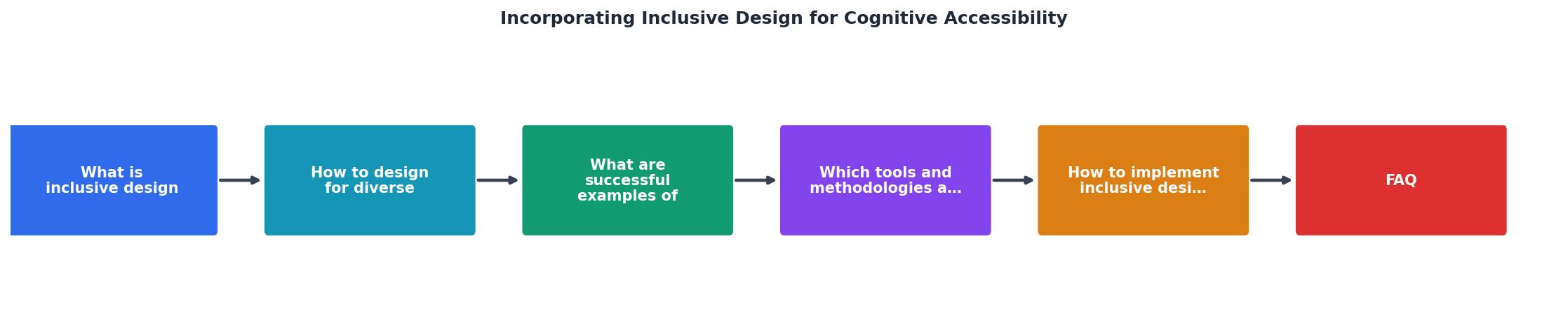
The diagram above outlines the core process. Here is how each step works in practice:
- Audit current state. Run your existing pages through readability scoring, cognitive walkthrough heuristics, and at least one session with a user who has a cognitive disability. Document every friction point.
- Define cognitive personas. Add cognitive diversity to your existing personas. Include a user with ADHD, one with dyslexia, one with low digital literacy, and one experiencing situational cognitive load (stress, multitasking, unfamiliar language).
- Prioritize by impact. Rank issues by how many users they affect and how severely. A confusing primary CTA on your homepage outranks a tooltip issue on a settings page.
- Design adaptive solutions. For each issue, create at least two interaction paths. Text + visual. Simple + detailed. Linear + exploratory.
- Test with real users. Recruit participants with cognitive disabilities for usability testing. Remote moderated sessions work well. Five participants catch roughly 80% of usability issues.
- Iterate and document. Build cognitive accessibility into your design system documentation. Create component-level guidelines so every new feature inherits inclusive patterns.
Cognitive Accessibility Assessment Template
Your progress is saved automatically in your browser.
FAQ
Frequently Asked Questions
Additional Resources
- INCLUSIVE DESIGN FOR COGNITIVE DISABILITIES - This article delves into the critical role of inclusive design in addressing the unique challenges faced by individuals with cognitive disabilities.
- Inclusive Design: Neurodiversity and Cognitive Accessibility - Learn how accessibility shapes user interfaces, particularly through the lens of cognitive accessibility and neurodiversity.
- What is Inclusive Design? — updated 2026 - Inclusive design is an approach to create accessible products and experiences that are usable and understandable by as many people as ...
Need Help with Accessibility?
Improve your site's accessibility and conversion rates with our AI-powered analysis.
Get Started