Index person: Practical Guide
Your website has an index page. Every visitor who lands on it becomes your index person, the first-time reader who decides in seconds whether to stay or leave. Most sites treat this page as a table of contents, but the real job is cognitive triage: helping a stranger figure out where they are, what you offer, and what to do next. This guide gives you a concrete, step-by-step method to design your index page around that person instead of around your internal org chart.


Your website has an index page. Every visitor who lands on it becomes your index person, the first-time reader who decides in seconds whether to stay or leave. Most sites treat this page as a table of contents, but the real job is cognitive triage: helping a stranger figure out where they are, what you offer, and what to do next. This guide gives you a concrete, step-by-step method to design your index page around that person instead of around your internal org chart.

- The index person is the first-time visitor who uses your homepage or landing page to orient themselves. They need clarity, not cleverness.
- Most index pages fail because they prioritize internal structure over visitor intent.
- Fix it by mapping visitor questions, reducing cognitive load, and testing with real newcomers.
What "index person" actually means
The term index person refers to the prototypical first-time visitor arriving at your site's main entry point. They have no context. They did not read your pitch deck. They clicked a link, an ad, or a search result, and now they need to answer three questions fast:
- What is this site about?
- Is it relevant to my problem?
- Where do I go next?
That number is not unusual. For many SaaS and DTC sites, more than half of all sessions end on the first page. The index person never makes it deeper because the page did not orient them.
Why this matters for conversion

You pay for traffic. Every click from Google Ads, every referral from a blog post, every social share lands someone on a page. If that page confuses the index person, you just burned money.
Here is what typically goes wrong:
- Jargon-heavy headlines. Your team understands "AI-powered RevOps orchestration." A first-time visitor does not.
- Too many choices. Seven navigation items, three CTAs, a banner, a chatbot popup. The index person freezes.
- Missing context. The page assumes the visitor already knows what category you belong to. They do not.
- Visual clutter. Animations, carousels, and stock photos that add zero information but consume attention.
Common mistakes and misconceptions

Mistake 1: Designing for returning users. Your index page is not a dashboard. Returning users already know where things are. The index person does not. Prioritize first-visit clarity over power-user shortcuts.
Mistake 2: Treating the homepage as a brochure. Listing every feature, every integration, every testimonial above the fold creates a wall of noise. The index person needs a single clear message, not a catalog.
Mistake 3: Assuming one persona. Your visitors arrive from different channels with different intents. A paid ad click expects to see the promise from the ad. An organic search click expects to see the answer to their query. One generic hero section rarely serves both.
Mistake 4: Ignoring cognitive accessibility. About 15-20% of the population has some form of neurodivergence (ADHD, dyslexia, anxiety). For these visitors, dense text blocks and ambiguous navigation are not just annoying; they are impassable. Tools like PagePerson Insights can surface these cognitive barriers automatically, showing you exactly where the index person gets stuck.
"The 2022 Clinical Practice Guideline includes 12 recommendations for clinicians providing pain care for outpatients aged 18 years or older with acute pain, subacute pain, or chronic pain.">, 2022 CDC Clinical Practice Guideline at a Glance
That quote comes from healthcare, but the principle transfers directly: structured, evidence-based guidelines beat guesswork. Your index page deserves the same rigor.
Step-by-step approach
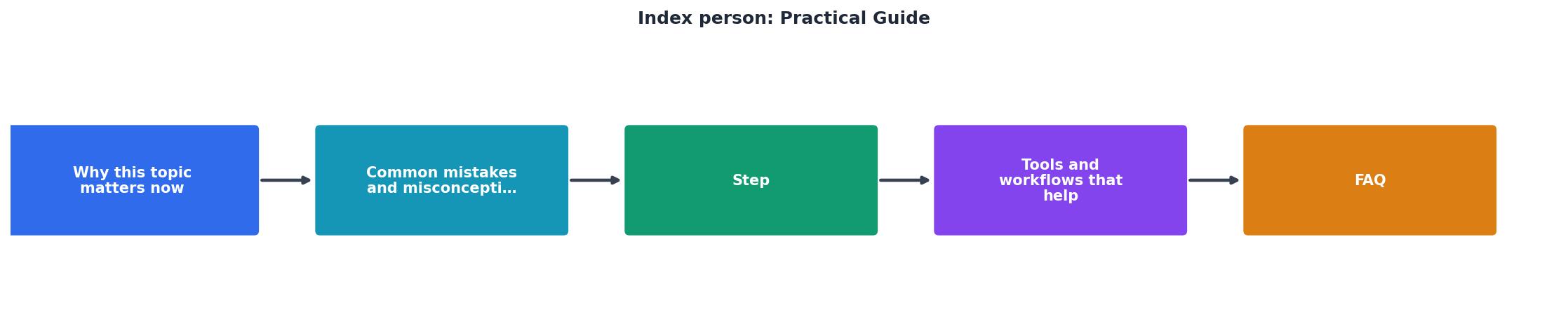
Here is the process, broken into five stages. Each one builds on the previous.
1. Map visitor questions
Before touching any design tool, list the questions your index person brings. Pull them from:
- Search queries in Google Search Console
- Support tickets from new users
- Sales call transcripts (first 60 seconds)
- Chat logs from your website widget
2. Audit current page
Open your index page and score it against those three questions. For each one, ask: can a stranger answer this within five seconds of landing? If not, mark it as a gap.
Check these specific elements:
- Headline: Does it state what you do in plain language?
- Subheadline: Does it say who it is for or what problem it solves?
- Primary CTA: Is there exactly one obvious next step?
- Navigation: Are labels self-explanatory without context?
- Visual hierarchy: Does the eye flow top-to-bottom in a logical order?
3. Reduce cognitive load
Cut everything that does not serve the index person's three questions. That means:
- Remove or collapse secondary navigation items
- Replace jargon with plain language
- Limit above-the-fold CTAs to one primary action
- Use whitespace to separate sections clearly
- Replace autoplay videos with static images that load instantly
4. Test with newcomers
Recruit three to five people who have never seen your site. Use a simple five-second test: show them the page for five seconds, then ask what the site does and what they would click. If they cannot answer, your page is not ready.
5. Iterate and measure
Track these metrics before and after changes:
- Bounce rate on the index page
- Time to first click (how fast visitors engage)
- Scroll depth (how far they explore)
- Conversion rate from index page to next step
Before Optimization
After Optimization
Tools and workflows that help

You do not need a big budget to optimize for the index person. Here are specific tools mapped to each step:
| Step | Tool | What it does |
|---|---|---|
| Map visitor questions | Google Search Console | Shows actual queries driving traffic |
| Audit current page | PagePerson Insights | Flags cognitive barriers and comprehension issues |
| Reduce cognitive load | Hemingway Editor | Highlights complex sentences and passive voice |
| Test with newcomers | UsabilityHub (Lyssna) | Runs five-second tests remotely |
| Iterate and measure | Google Analytics 4 | Tracks bounce rate, scroll depth, conversions |
- Export top 50 search queries from Search Console
- Run PagePerson Insights on your index page to get a cognitive accessibility score
- Rewrite the headline and subheadline using language from actual visitor queries
- Remove one CTA and one navigation item (start small)
- Run a five-second test with five participants
- Deploy changes and compare metrics after two weeks
Index Person Optimization Checklist
Your progress is saved automatically in your browser.
FAQ
Frequently Asked Questions
What does your index page look like through the eyes of a complete stranger? Try the five-second test this week and share what you learn.
Additional Resources
- A Practical Guide to Measuring Physical Activity - PMC - NIH - Activities are rated on a scale of 1 to 9 (1 = sedentary activity, 9 = intense manual work or high intensity sports) to yield a total energy ...
- 2022 CDC Clinical Practice Guideline at a Glance - The 2022 Clinical Practice Guideline includes 12 recommendations for clinicians providing pain care for outpatients aged 18 years or older with ...
- Care of the adult cancer patient at the end of life - This ESMO Clinical Practice Guideline provides key recommendations for end-of-life care for patients with advanced cancer. •. It details care that is focused on ...
Need Help with Accessibility?
Improve your site's accessibility and conversion rates with our AI-powered analysis.
Get Started