Best Practices for Iterating on Cognitive Accessibility Design
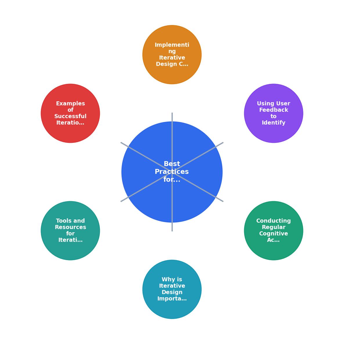
Cognitive accessibility isn't a one-time fix, it's a continuous cycle of testing, learning, and refinement. Most websites launch with good intentions but drift into confusion as features pile up, copy gets longer, and navigation complexity creeps in. Users with ADHD, dyslexia, anxiety, or simply cognitive overload hit friction points that traditional accessibility tools never catch. The solution is systematic iteration: regular audits, real user feedback, and methodical design changes that compound into genuinely usable experiences.


Cognitive accessibility isn't a one-time fix, it's a continuous cycle of testing, learning, and refinement. Most websites launch with good intentions but drift into confusion as features pile up, copy gets longer, and navigation complexity creeps in. Users with ADHD, dyslexia, anxiety, or simply cognitive overload hit friction points that traditional accessibility tools never catch. The solution is systematic iteration: regular audits, real user feedback, and methodical design changes that compound into genuinely usable experiences.

- Conduct cognitive accessibility audits every 3-6 months, not once and done.
- Gather feedback from real users (including those with cognitive disabilities) early and often.
- Implement changes in small, measured batches; track improvements against baseline metrics.
- Use tools like heatmaps, session recordings, and accessibility checkers to identify barriers.
- Successful iteration compounds: small wins in clarity, task flow, and cognitive load add up to dramatically better conversion and inclusion.
Iterative design for cognitive accessibility means treating your website or app as a living system, not a finished product. The people who struggle most, those with cognitive load, ADHD, dyslexia, or low digital literacy, are often the first to tell you what's broken. But they rarely volunteer that feedback unless you ask, measure, and act on it. This cycle of audit, feedback, change, and re-audit is what separates inclusive products from well-intentioned ones that still confuse half their visitors.
This matters because cognitive accessibility barriers directly impact conversion and retention. According to the Centers for Disease Control and Prevention, more than 28.7% of adults in the United States have a disability, and a significant portion experience cognitive barriers online. Every iteration that removes friction benefits not just people with diagnosed disabilities, but everyone trying to use your product under time pressure, distraction, or stress.
Why Iterative Design Matters for Cognitive Accessibility
Cognitive accessibility is invisible until it fails. Unlike broken images or missing alt-text, cognitive barriers manifest as confusion, abandonment, or slow task completion. A user doesn't report "your form has too much cognitive load", they just leave and never come back.
Iteration solves this because each cycle surfaces new problems. Your first audit catches the obvious bloat: too many form fields, dense paragraphs, vague button labels. The second iteration (after user feedback) catches the subtle ones: button placement that confuses scanning patterns, instructions that only make sense to the team, or a checkout flow that branching logic makes harder than it needs to be. By the third or fourth cycle, you've chipped away at the friction layers and built a product that works for your actual users, not just the designers' mental model.
The compounding effect is real. Small wins, clearer headings, shorter paragraphs, simpler navigation, accumulate into an experience that feels intuitive. Users stay longer, convert more, and don't need to call support because they got lost.
Conducting Regular Cognitive Accessibility Audits
An audit is your baseline. It tells you where friction lives and gives you something to measure against in future iterations.

Schedule audits every 3 to 6 months, depending on how active your site is. If you ship features monthly, audit quarterly. If you update once a year, an annual audit is enough. The point is regularity, not reactivity.
A solid cognitive accessibility audit covers:
- Content clarity: Paragraph length, sentence complexity, jargon, and readability scores (Flesch-Kincaid or similar).
- Visual hierarchy: Heading structure, spacing, emphasis, and whether users can scan without getting lost.
- Form and task flow: Number of fields, steps, and decision points. Can users complete a task in under five clicks?
- Navigation and wayfinding: Is it obvious where you are and how to get where you're going? Or do people get trapped?
- Color and contrast: Beyond WCAG AA, does the color scheme introduce cognitive overload?
- Language and tone: Are instructions clear or buried in corporate-speak?
Document everything in a spreadsheet or audit report: what you found, severity, where it appears, and a baseline metric (e.g., "average form completion time: 4 minutes 32 seconds"). This baseline is crucial, it's your benchmark for knowing whether iteration is working.
Using User Feedback to Identify Cognitive Barriers

User feedback is your early warning system. It tells you what actually confuses people, not what you assume is confusing.
Gather feedback from multiple sources:
- Usability testing with real users: Run moderated sessions (remote or in-person) where users attempt key tasks while you observe. Recruit participants with and without cognitive disabilities, you want both perspectives. Watch where they hesitate, re-read, or ask for clarification.
- Unmoderated testing tools: Use Maze or Validately to observe users independently; you'll see authentic behavior without prompting.
- Session recordings and heatmaps: Tools like Hotjar or Microsoft Clarity show where users scroll, click, and get stuck. Heatmaps reveal pages people bounce from; session recordings reveal why.
- Support tickets and feedback forms: Your support team hears directly from confused users. Tag feedback by theme (navigation, checkout, copy clarity, etc.) and review monthly.
- Customer interviews: Ask a few recent customers or churned users: "What was confusing about our site?" You'll get specific, honest answers.
"According to the Centers for Disease Control and Prevention (CDC), "more than 28.7% of adults in the United States have a disability" and 13.9% of U.S.">, Designing Digital Content For Users With Cognitive Disabilities
Prioritize feedback by impact and frequency. If three users got confused by the same form field, fix it first. If one user misunderstood a phrase, log it but don't prioritize it as heavily unless it aligns with other feedback.
Implementing Iterative Design Changes

Iteration works best when changes are small, intentional, and measured.
Here's the cycle:
- Identify the friction point: From your audit or user feedback, pick one specific problem. Not "the site is confusing", something concrete, like "users don't understand what 'dynamic pricing' means" or "the checkout has too many steps."
- Design a minimal fix: Don't overhaul the entire page. Change the confusing phrase to simpler language. Reduce form fields by two. Restructure the navigation to three levels instead of four. Minimal changes are easier to test and rollback if they don't work.
- Implement and measure: Push the change to a subset of users (A/B test) or your whole site if it's low-risk. Measure the same metric you used as a baseline: task completion time, form abandonment rate, scroll depth, time on page, conversion rate, or user satisfaction score.
- Analyze and iterate: Did the metric improve? By how much? Enough to be meaningful (not just statistical noise)? If yes, keep the change and move to the next friction point. If no, roll back, try a different approach, or dig deeper with user feedback.
- Repeat: Never stop. Each quarter, repeat the cycle with new friction points. Small, consistent improvements compound fast.
Real-World Examples of Successful Iteration
Consider a SaaS product that launched with a dense pricing page. Users got confused by feature comparisons; the sales team heard complaints. The first iteration: simplified the copy from 45 words per feature to 15 words. Clarity improved, but conversion stayed flat. The second iteration: removed the comparison table and let users filter by use case instead. Task completion time dropped 40%. The third iteration: added a "not sure?" flow that guided uncertain users to a demo or sales call. Conversion bumped 12%. None of these changes were revolutionary, but each one targeted a specific user friction point, and together they transformed the pricing flow from a barrier into a driver.
Another example: an e-commerce site had a checkout flow with eight steps. Users abandoned at step three. The team guessed it was too long, so they redesigned for four steps. Abandonment dropped 8%, good, but not enough. User testing revealed the real problem: users didn't understand why they were being asked for so much information at step two. The fix wasn't to cut steps, but to explain them. They rewrote the form labels and added inline help text. Abandonment dropped another 15%. Same number of steps; better cognitive clarity.
These examples work because the teams didn't guess. They measured. They asked users. They changed one thing. They measured again. That discipline is iterative design.
Tools and Resources for Iterative Design
Building iteration into your workflow requires tools that make testing and measurement frictionless.
For audits and accessibility:- PagePerson Insights: Identifies cognitive barriers specific to your audience, showing exactly where users struggle with comprehension and task flow.
- WAVE and axe DevTools: Catch technical accessibility issues; good baseline checks.
- WebAIM contrast checker: Ensure color choices don't add cognitive overload.
- Hemingway Editor or Grammarly: Simplify copy and measure readability.
- Hotjar or Clarity: Heatmaps and session recordings show real behavior.
- Validately or Maze: Unmoderated usability testing at scale.
- Calendly + Zoom: Schedule moderated usability tests with real users.
- Typeform or SurveySparrow: Quick feedback forms to ask users directly what confused them.
- Google Analytics 4: Track task completion, form submissions, and scroll depth.
- Amplitude or Mixpanel: Measure user behavior funnels and drop-off points.
- Hotjar polls: Ask users why they bounced, right when they're about to leave.
- Figma: Prototype changes before building them; collaborate with stakeholders.
- Notion or Confluence: Document audit findings, feedback themes, and iteration history.
- GitHub or Jira: Track changes by sprint; link design decisions to tickets.
The Iteration Cycle
Find a specific friction point from audit or user feedback.
Create a minimal, focused fix, one change, not overhaul.
Deploy to users; measure against your baseline metric.
Did the metric improve? By how much? Is it meaningful?
Keep the win, move to the next friction point. Never stop iterating.
The visualization above shows the core rhythm of iterative design. Each cycle typically takes 2-4 weeks, depending on your release cadence and the complexity of the change. The compounding effect becomes clear after three or four cycles: users notice the site feels less confusing, tasks take less time, and frustration drops.
Cognitive Accessibility Audit Checklist
Your progress is saved automatically in your browser.
FAQ
Frequently Asked Questions
Additional Resources
- Designing Digital Content For Users With Cognitive ... - Use plain, straightforward language, avoiding in manageable sections and avoid overcrowding screens with excessive content to reduce cognitive overload.
- Best Practices for Cognitive Accessibility in Web Design - Unlock the full potential of your website with expert cognitive accessibility tips. Explore WCAG guidelines, design patterns, and real-world ...
- Best Strategies for Cognitive Accessibility in Digital Design - Four Strategies for Cognitive Accessibility in Digital Design · 1. Consistent User Interaction · 2. Compatibility with Assistive Technology · 3.
Need Help with Accessibility?
Improve your site's accessibility and conversion rates with our AI-powered analysis.
Get Started