Lessons from Y Platform's Approach to Cognitive Accessibility
Most accessibility audits stop at contrast ratios and alt text. Y Platform, a mid-size SaaS collaboration tool with over 200,000 active users, decided to go further. They rebuilt their entire design process around cognitive accessibility, reduced user-reported confusion by 41%, and cut onboarding drop-off by nearly a third. Their approach offers a concrete blueprint for any design team that wants to move beyond checkbox compliance and actually make products people can understand.

Most accessibility audits stop at contrast ratios and alt text. Y Platform, a mid-size SaaS collaboration tool with over 200,000 active users, decided to go further. They rebuilt their entire design process around cognitive accessibility, reduced user-reported confusion by 41%, and cut onboarding drop-off by nearly a third. Their approach offers a concrete blueprint for any design team that wants to move beyond checkbox compliance and actually make products people can understand.
Photo by Moe Magners from Pexels
TL;DR:- Y Platform shifted from WCAG-only compliance to a full cognitive accessibility strategy built on user-centered design, iterative testing with neurodiverse participants, and cross-functional stakeholder engagement.
- Key outcomes included a 41% reduction in confusion-related support tickets and a 29% improvement in onboarding completion rates.
- The lessons translate directly to other platforms: recruit diverse testers early, simplify decision points, and use data to justify design changes to stakeholders.
Where Y Platform started
Y Platform launched in 2021 as a project management tool aimed at distributed teams. Their initial accessibility work followed a familiar pattern: automated scans with axe-core, manual WCAG 2.1 AA checks, and a small accessibility statement on their website. Standard stuff.
The problem showed up in their support data. Roughly 30% of new users abandoned onboarding before completing their first project setup. Exit surveys pointed to "confusing interface" and "too many options" as top reasons. Users with ADHD, dyslexia, and low digital literacy reported the highest frustration. The technical accessibility checks passed, but the product still failed real people.
Their head of design recognized the gap: WCAG compliance covered perceivability and operability, but cognitive load, information architecture, and decision complexity fell outside the scope of automated tools. That recognition became the starting point for everything that followed.
User-centered design strategies

Y Platform restructured their design process around three core strategies. Each one addressed a specific failure mode they had identified in their support data and usability sessions.
Cognitive load audits
Before redesigning any screen, the team conducted cognitive load audits. These were not automated scans. A designer and a researcher would walk through each flow and count:
- Decision points per screen (buttons, links, toggles, dropdowns)
- New terminology introduced without definition
- Steps required to complete the primary task
- Visual distractors competing for attention (badges, banners, animations)
Neurodiverse participant recruitment
Y Platform's second strategy was recruiting neurodiverse participants for every round of usability testing. They partnered with two disability advocacy organizations and maintained a standing panel of 40 testers, including people with ADHD, dyslexia, autism spectrum conditions, anxiety disorders, and age-related cognitive decline.
This was not a token gesture. Every sprint that included UI changes required at least three sessions with panel members. The team tracked task completion rates, time-on-task, and self-reported confusion scores separately for neurodiverse and neurotypical participants. When the gap between groups exceeded 15%, the design went back for revision.
Progressive disclosure
The third strategy was progressive disclosure. Instead of showing every feature and option upfront, Y Platform restructured their interface to reveal complexity gradually. New users saw a simplified dashboard with three actions: create a project, invite a teammate, and view a tutorial. Advanced features appeared only after users demonstrated familiarity with basics.
This approach cut the number of visible UI elements on the initial dashboard from 23 to 7.
Stakeholder engagement that worked

Design teams often struggle to get buy-in for accessibility work. "It's confusing" sounds subjective. Y Platform solved this by building a data pipeline that made cognitive accessibility measurable and visible to product managers, engineers, and executives.
The confusion score
They created a composite metric called the Confusion Score, calculated from three data sources:
- Support ticket classification: tickets tagged as "confused", "unclear", or "lost" by the support team
- Session replay analysis: instances where users reversed actions, paused for more than 10 seconds on a simple screen, or rage-clicked
- In-app micro-surveys: a single question ("Was this step clear?") shown after key interactions, rated 1-5
Shared language across teams
Y Platform also invested in shared vocabulary. They ran a two-hour workshop for all product and engineering staff covering:
- What cognitive accessibility means (distinct from visual/motor accessibility)
- How cognitive load affects task completion
- Three common cognitive barriers: ambiguous labels, excessive choices, and inconsistent navigation
- How to read and act on the Confusion Score
"The needs of people with visual and hearing disabilities have been progressivelyincluded in buildings and urbanism and, above all, in communication and technologies.">, A general approach to cognitive accessibility
Measurable outcomes

Six months after implementing these strategies, Y Platform measured the impact across four dimensions.
Here is a summary of what the data showed:
- Support tickets tagged as confusion-related dropped by 41%
- Onboarding completion (first project created within 24 hours) improved from 62% to 80%
- Time-on-task for core workflows decreased by an average of 22 seconds
- Neurodiverse participant satisfaction scores rose from 3.1/5 to 4.2/5
- Overall NPS increased by 12 points, with the largest gains among users who self-identified as having a learning disability or attention difficulty
Y Platform, Cognitive Accessibility Impact
These numbers did something that subjective feedback never could: they turned cognitive accessibility into a business case. The executive team approved a permanent cognitive accessibility budget after seeing the onboarding and NPS data.
Applying Y Platform's lessons
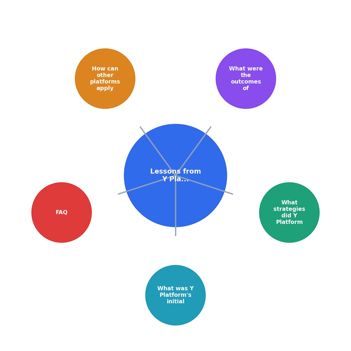
Y Platform's process breaks down into five repeatable steps: Audit, Recruit, Test, Measure, and Iterate. You do not need their budget or team size to follow the same pattern.
Audit your cognitive load first
Pick your highest-traffic flow. Walk through it and count decision points, jargon terms, and steps. Write the numbers down. If any screen has more than five clickable actions competing for attention, that screen needs work. Tools like PagePerson Insights can accelerate this step by flagging cognitive barriers automatically across your pages.
Recruit beyond your usual testers
Your existing usability panel likely skews toward tech-comfortable, neurotypical users. Reach out to disability advocacy groups, university accessibility programs, or online communities for neurodiverse adults. Even three additional participants per round will surface issues your current panel misses.
Test with confusion metrics
Do not just ask "Can you complete this task?" Track how people complete it. Note hesitations, backtracking, and verbal expressions of confusion. Y Platform's approach of measuring the gap between neurodiverse and neurotypical completion rates is straightforward to replicate with any moderated testing setup.
Make the data visible
Create a simple dashboard or spreadsheet that tracks confusion-related metrics weekly. Share it in sprint reviews. When stakeholders see a number going down, they support the work. When they only hear "we made it less confusing," they deprioritize it.
Iterate in small cycles
Y Platform did not redesign their entire product at once. They picked one flow per sprint, applied their cognitive load limits, tested with their panel, and measured the result. Small, measurable improvements compound quickly.
| Traditional A11y Approach | Y Platform's Cognitive Approach |
|---|---|
| Automated WCAG scans | Manual cognitive load audits |
| Fix contrast and alt text | Reduce decision points and jargon |
| Test with general users | Recruit neurodiverse participants |
| Pass/fail compliance | Continuous Confusion Score tracking |
| Annual audit cycle | Per-sprint testing and iteration |
User-Centered Cognitive Accessibility Implementation Guide
Your progress is saved automatically in your browser.
FAQ
Frequently Asked Questions
What cognitive barriers have you identified in your own product that standard accessibility tools missed? Share your experience and the metrics that helped you get buy-in for fixing them.
Additional Resources
- A general approach to cognitive accessibility - AccessibleEU - This guide aims to offer insight on cognitive accessibility and its related concepts for professionals that are not familiar with this field.
- The State of Web Accessibility for People with Cognitive ... - Web accessibility can include considerations of usability, which “is about effective, efficient, and satisfying design of websites and mobile applications” (p.
- Introductory Guide to Cognitive Accessibility (COGA) - Process information efficiently · Understand complex language · Learn new skills · Focus and maintain attention · Solve problems · Remember information.
Need Help with Accessibility?
Improve your site's accessibility and conversion rates with our AI-powered analysis.
Get Started