Optimizing Product Pages for Clarity and Conversion
In the competitive world of e-commerce, the clarity of your product pages can significantly impact conversion rates. Visitors to a product page need quick access to essential information that convinces them to make a purchase. This article explores how optimizing product pages for clarity using design principles can enhance user engagement and reduce bounce rates, ultimately boosting conversions.

In the competitive world of e-commerce, the clarity of your product pages can significantly impact conversion rates. Visitors to a product page need quick access to essential information that convinces them to make a purchase. This article explores how optimizing product pages for clarity using design principles can enhance user engagement and reduce bounce rates, ultimately boosting conversions.

TL;DR: Optimize product pages by enhancing clarity through design principles like hierarchy and visual cues. These strategies improve user engagement and reduce bounce rates.
Creating effective product pages requires a keen understanding of what visitors need to make informed purchasing decisions. By focusing on clarity, you can guide users seamlessly through the decision-making process, increasing the likelihood of conversion. This involves using clear design principles, examining successful examples, and leveraging analytics to continually improve your pages.
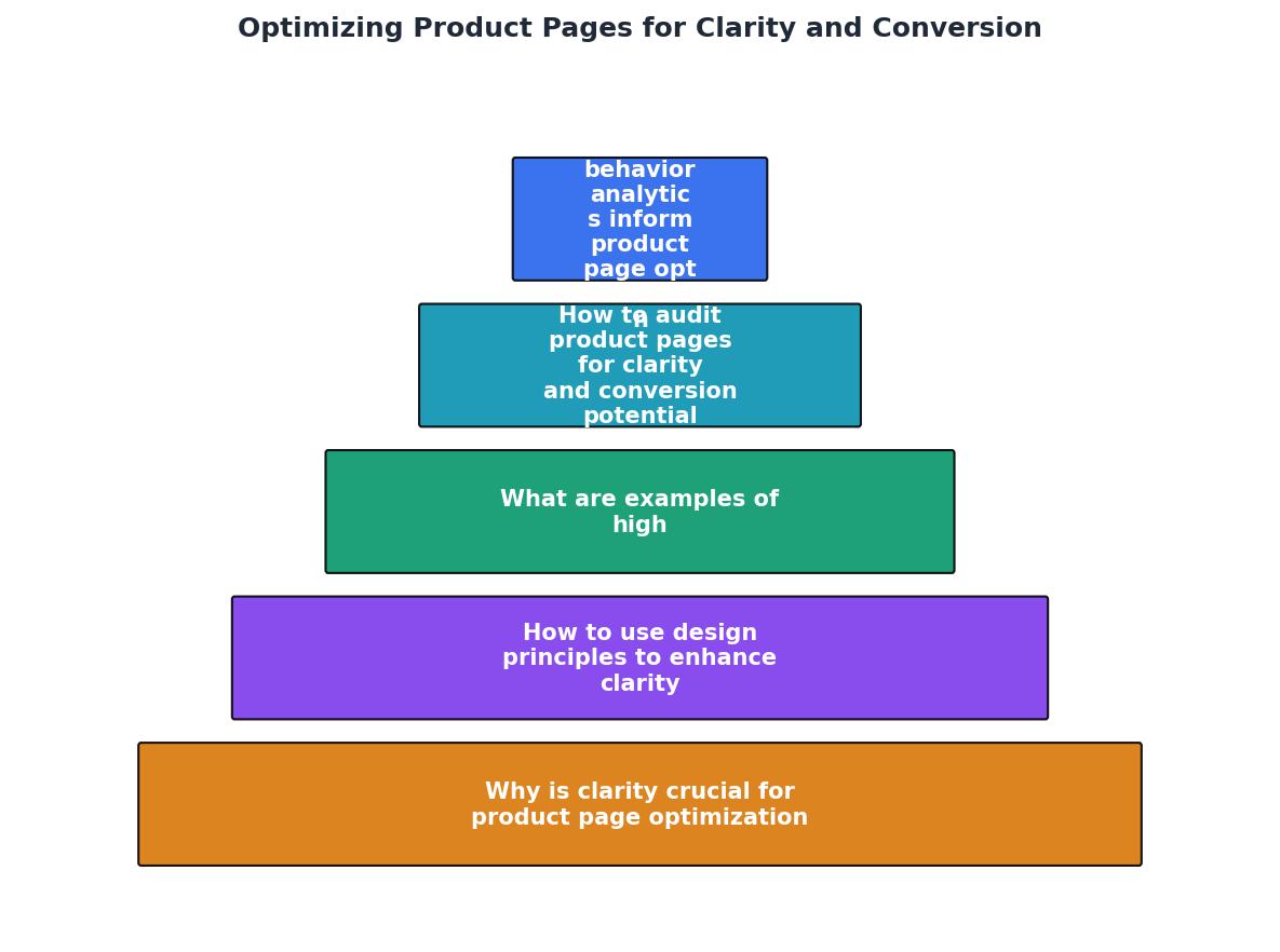
Why is Clarity Crucial for Product Page Optimization?
Clarity in product pages is pivotal because it directly influences a user's ability to make purchase decisions. When a page is clear, users can easily find the information they need without feeling overwhelmed or confused. This clarity reduces friction in the decision-making process and enhances the overall user experience.

By presenting information logically and transparently, you can help users quickly identify product features, benefits, and prices, leading to higher conversion rates. Clarity also minimizes bounce rates, as users are less likely to leave the page in search of better information elsewhere.
In addition to improving user experience, clarity builds trust. When potential customers can easily understand what they are buying, they are more likely to trust your brand and feel confident in making a purchase. This trust is crucial in e-commerce, where the physical interaction with products is absent.
Moreover, clear product pages can improve SEO. Search engines favor pages that provide clear and relevant information, which can lead to better search rankings and increased visibility. This, in turn, can drive more traffic to your site, presenting even more opportunities for conversion.
How to Use Design Principles to Enhance Clarity
Design principles like hierarchy and visual cues play a crucial role in establishing clarity on product pages. Hierarchy involves organizing content in a way that guides the eye naturally from one piece of information to another. Visual cues, such as icons, colors, and typography, can direct attention to important details.

For instance, using larger fonts for headings and contrasting colors for call-to-action buttons can make it easier for users to navigate a page. Additionally, ensuring that text is legible and images are high-quality can significantly enhance the user experience.
Visual hierarchy can be achieved by strategically using size, color, and placement. For example, the most important information, like the product name and price, should be prominent and easily visible. Supporting details such as product specifications or customer reviews can be slightly smaller but still accessible.
Moreover, whitespace, or negative space, is a effective tool in design. It prevents clutter, makes content more digestible, and helps direct the user's focus to key elements on the page. A well-structured page with ample whitespace can reduce cognitive load and increase user satisfaction.
What are Examples of High-Performing Product Pages?
High-performing product pages share several common characteristics: they are visually appealing, easy to navigate, and provide all necessary information without overwhelming the user. Websites like Amazon and Apple excel in these areas by maintaining a clean design, clear product images, and concise descriptions.

"The title of your product should be clear, concise, and include relevant keywords.">, Create High
These companies effectively use design principles to highlight important features and benefits, ensuring that users can make informed decisions quickly. For example, Apple's product pages use a minimalist design that emphasizes high-quality images and succinct text, making the product the star of the page. Similarly, Amazon’s product pages are structured with clear sections for product details, reviews, and related items, making navigation straightforward.
Another example is Shopify, which provides templates that inherently support good design principles. Their product pages often feature large, high-resolution images, clear pricing, and comprehensive product details. These elements work together to create an engaging user experience that encourages conversion.
How to Audit Product Pages for Clarity and Conversion Potential
Auditing your product pages is essential to identify areas for improvement. Start by evaluating the page layout, ensuring that the hierarchy of information is logical and easy to follow. Check for consistency in design elements and ensure that visual cues are used effectively to guide users.
Conducting user testing can also provide valuable insights into how real users interact with your pages. Use analytics tools to track user behavior and identify common drop-off points. This data can guide targeted improvements to enhance clarity and conversion rates.
A comprehensive audit should include both qualitative and quantitative assessments. Qualitatively, gather feedback from users through surveys or interviews to understand their experience and challenges. Quantitatively, analyze metrics such as bounce rates, conversion rates, and time spent on page to identify trends and areas needing attention.
Product Page Audit Checklist
Your progress is saved automatically in your browser.
Regular audits will not only help maintain the effectiveness of your product pages but also adapt them to evolving user preferences and market trends.
How Do User Behavior Analytics Inform Product Page Optimization?
User behavior analytics offer a wealth of information that can inform product page optimization efforts. By analyzing metrics such as time spent on page, click-through rates, and bounce rates, you can gain insights into areas where users may be struggling or losing interest.
Tools like Google Analytics and PagePerson Insights can help you track these metrics and provide data-driven recommendations for improvement. For example, if analytics reveal that users frequently abandon their carts, it may indicate that the checkout process is unclear or too complicated.
These insights can be instrumental in making informed decisions about page design and content. For instance, if a product page has a high bounce rate, it may suggest that users are not finding the information they need quickly enough. In response, you might simplify the layout or enhance the visibility of key information.
FAQ
Frequently Asked Questions
Do you have any tips or experiences to share about optimizing product pages for clarity and conversion? Let us know in the comments!
Additional Resources
- Create High-Converting Product Pages in 10 Easy Steps - Create High-Converting Product Pages in 10 Easy Steps · 1. Product Images · 2. Product Title · 3. Product Description · 4. Product Ratings and ...
- How to Optimize Product Pages for More Conversions & ... - By focusing on clarity, trust-building elements, and revenue-driving strategies, you can increase both conversions and AOV. Whether you're ...
- eCommerce Product Page Optimization: 4 Quick Wins - Optimize Product Titles 2. Use High-Quality Product Images 3. Provide Detailed but Relevant Product Descriptions 4. Highlight Reviews and ...
Need Help with Accessibility?
Improve your site's accessibility and conversion rates with our AI-powered analysis.
Get Started