Page personn: Practical Guide
Your landing page converts at 2.3%. You spent weeks on copy, hired a designer, ran three rounds of A/B tests on button colors. Yet almost half your visitors leave without doing anything. The problem is not your offer or your traffic source.

Your landing page converts at 2.3%. You spent weeks on copy, hired a designer, ran three rounds of A/B tests on button colors. Yet almost half your visitors leave without doing anything. The problem is not your offer or your traffic source. The problem is that real people with real cognitive constraints hit your page and cannot process what you are asking them to do. This guide gives you a concrete, step-by-step method to build page personas, map cognitive barriers, and fix the leaks that analytics alone will never explain.

- A page persona is a profile of how a specific visitor type cognitively experiences one page: reading speed, attention span, anxiety triggers, literacy level, and device context.
- Building page personas exposes conversion barriers that heatmaps and funnel charts miss entirely.
- This guide walks you through creating your first page persona in under two hours, auditing your page against it, and prioritizing fixes by revenue impact.
What a page persona actually is
Forget the marketing persona slide deck with stock photos and fictional hobbies. A page persona strips away demographics and focuses on one thing: how does this visitor's brain interact with this specific page?
A page persona captures:
- Cognitive load tolerance - how many decisions or information chunks the visitor can handle before they bail.
- Reading behavior - scanning patterns, vocabulary ceiling, tolerance for jargon.
- Emotional state on arrival - anxious (comparing prices), skeptical (burned before), distracted (mobile, multitasking).
- Device and environment - small screen in bright sunlight, desktop with 14 tabs open, screen reader.
- Decision triggers - what specific proof or clarity converts this person.
That number is not hypothetical. Cognitive accessibility research consistently shows that a large segment of any audience faces barriers like ADHD, dyslexia, low digital literacy, anxiety, or simple information overload. Your page either accounts for them or loses them.
Why this matters for revenue

Every visitor who bounces because your page confused them is money you already paid to acquire. If you run paid ads at a $4 CPC and 40% of clicks leave due to cognitive friction, you are burning $1.60 per click on comprehension failures.
Page personas connect UX decisions directly to conversion outcomes. Instead of guessing why your signup form has a 68% abandonment rate, you model the experience through the eyes of a visitor who:
- Arrived from a Google ad and has zero context about your brand
- Reads at a 7th-grade level (the US adult average)
- Is on a phone during a commute
- Has mild anxiety about entering payment details
Common mistakes that waste your time

Before walking through the method, here are the traps I see teams fall into repeatedly:
- Recycling marketing personas. "Sarah, 34, likes yoga and drives a Tesla" tells you nothing about how Sarah processes a pricing page. Page personas are cognitive, not demographic.
- Building too many at once. Three page personas per key page is the sweet spot. More than that and you will never act on any of them.
- Ignoring emotional state. A visitor comparing your SaaS to three competitors is in a different mental mode than someone who clicked your founder's tweet. Same page, completely different cognitive experience.
- Skipping the audit step. Creating the persona feels productive. The value comes from walking your actual page through that persona's eyes and writing down every friction point.
- Treating it as a one-time exercise. Pages change. Traffic sources shift. Revisit page personas quarterly or after any major page redesign.
Step-by-step: build your first page persona
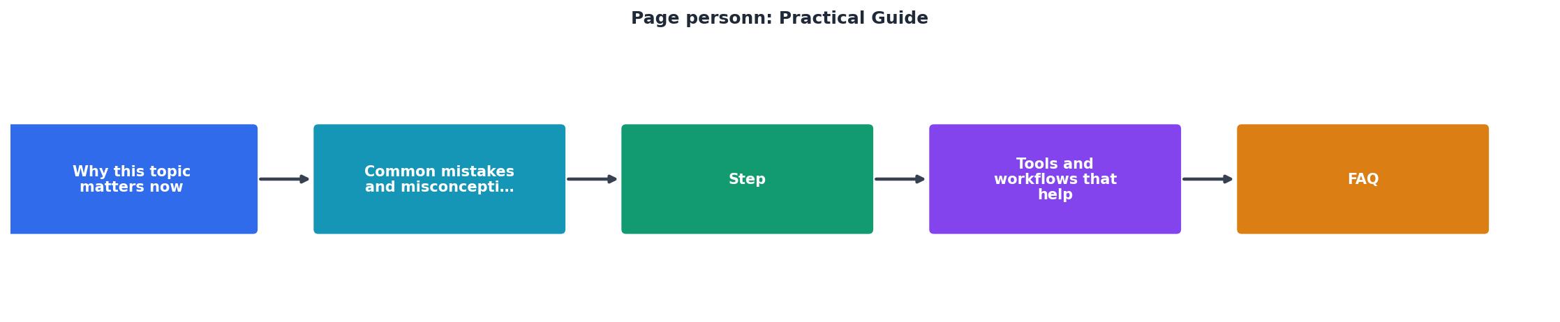
Follow these five steps. The whole process takes 90 minutes to two hours for your first page.
Step 1: Pick one page
Choose the page with the biggest gap between traffic and conversions. For most sites, that is the homepage or the primary landing page for paid campaigns. Do not start with a blog post or an about page.
Step 2: Pull real visitor data
Open your analytics and answer these questions:
- Top 3 traffic sources for this page (tells you visitor intent and context)
- Device split (mobile vs. desktop ratio)
- Average time on page and bounce rate
- Exit points if it is a multi-step flow
Step 3: Draft three cognitive profiles
Based on your data, create three distinct page personas. Give each a short label and fill in the five dimensions listed earlier (cognitive load tolerance, reading behavior, emotional state, device/environment, decision triggers).
Example for a SaaS pricing page:
| Dimension | "Rushed Comparer" | "Cautious First-Timer" | "Returning Evaluator" |
|---|---|---|---|
| Load tolerance | Low - scanning 4 tabs | Medium | High - already familiar |
| Reading | Skims headings only | Reads everything slowly | Scans for changes |
| Emotion | Impatient, skeptical | Anxious about commitment | Cautiously interested |
| Device | Desktop, 12+ tabs | Mobile, distracted | Desktop, focused |
| Trigger | Clear price comparison | Risk reversal, social proof | Feature diff vs. current plan |
Step 4: Walk the page as each persona
This is where the value lives. Open your page and go through it as each persona. For every section, ask:
- Would this persona even see this content given their scanning pattern?
- Would they understand every word?
- Does this section increase or decrease their anxiety?
- Is the next action obvious?
Step 5: Prioritize and fix
Sort your friction points by two criteria: how many personas are affected, and how close the friction is to the conversion action. A confusing CTA button label that trips up all three personas is a higher priority than a jargon term in paragraph six that only affects one.
The dashboard below shows what a typical audit output looks like after completing all five steps on a single landing page.
Example: Landing Page Persona Audit
Tools and workflows that help

You do not need expensive software to build page personas. Here is what works:
- A spreadsheet. A simple Google Sheet with one tab per page and columns for each persona dimension is enough to start. Share it with your team so everyone references the same profiles.
- Session recordings (Hotjar, FullStory, Microsoft Clarity). Watch 20 real sessions filtered by your top traffic sources. You will see the scanning patterns and hesitation points that inform your personas.
- Readability checkers (Hemingway Editor, readable.com). Run your page copy through one. If it scores above 9th-grade reading level, your "Cautious First-Timer" persona is already struggling.
- PagePerson Insights. The Chrome extension analyzes your page for cognitive accessibility barriers automatically, showing you where visitors with ADHD, anxiety, dyslexia, or low digital literacy are likely to get stuck. It saves hours of manual walkthrough.
Keep the practice alive
Page personas are not a deliverable you file away. Build them into your workflow:
- Before any page redesign, pull up existing personas and check whether the new design addresses known friction.
- After launching changes, re-run the persona walkthrough to verify fixes and catch new issues.
- When traffic sources shift (new ad campaign, viral post, partnership referral), create a new persona for that visitor type.
- Quarterly review. Spend one hour per quarter updating personas based on fresh session recordings and conversion data.
| Without Page Personas | With Page Personas |
|---|---|
| "Bounce rate is high" | "Rushed Comparers leave because pricing table lacks competitor context" |
| "Users don't click the CTA" | "Cautious First-Timers can't find the guarantee before the button" |
| "Mobile converts worse" | "Mobile visitors miss the value prop because it's in a carousel they never swipe" |
| Guessing what to A/B test | Testing specific fixes tied to specific cognitive barriers |
Page Persona Quick-Start Checklist
Your progress is saved automatically in your browser.
FAQ
Frequently Asked Questions
What is the one page on your site where you suspect visitors are confused but you have never been able to prove it? That is your starting point.
Additional Resources
- Contact Michael Page Belgium & Luxembourg - Practical guidance to help you move forward with confidence. From interviews to progression, we'll help you take the next step. Salary guide. Understand what ...
- A Practical Guide to Job Analysis - This unique guide contains a series of eight ready-to-use templates that provide the basis for conducting job analyses for eight different levels of job ...
- Managing People: A Practical Guide for Line Managers - It covers performance management, the development and reward of employees, health and safety, and welfare matters. explaining all the personnel terminology, ...
Need Help with Accessibility?
Improve your site's accessibility and conversion rates with our AI-powered analysis.
Get Started