Pageperson: Practical Guide
Your landing page looks clean, loads fast, and your team thinks the copy is crystal clear. Yet visitors bounce after six seconds and your conversion rate sits at half the industry average. The gap between what your team sees and what a first-time visitor experiences is cognitive accessibility, and PagePerson exists to close it. This guide walks you through the exact steps to audit your site, interpret the results, and ship fixes that turn confused visitors into paying customers.

Your landing page looks clean, loads fast, and your team thinks the copy is crystal clear. Yet visitors bounce after six seconds and your conversion rate sits at half the industry average. The gap between what your team sees and what a first-time visitor experiences is cognitive accessibility, and PagePerson exists to close it. This guide walks you through the exact steps to audit your site, interpret the results, and ship fixes that turn confused visitors into paying customers.
- Install the PagePerson Insights Chrome extension, run it on any page, and get a cognitive accessibility score in under 60 seconds.
- Focus on the top three barriers the report flags: confusing navigation, dense text blocks, and unclear calls to action.
- Fix those barriers first, re-scan, and track conversion lift week over week.
Why cognitive accessibility matters for conversion
Most analytics tools tell you where visitors drop off. Heatmaps show which buttons get ignored. Neither tells you why a visitor's brain gave up. Cognitive accessibility is the missing layer: it measures whether your content, layout, and interaction patterns are understandable to the full range of human attention spans, reading levels, and mental states.
That number is not hypothetical. It accounts for people browsing on a phone while commuting, visitors with ADHD skimming your pricing page, non-native speakers parsing your feature list, and anyone who simply had a long day. Every one of those people represents revenue you already paid to acquire.
When you remove the top cognitive barriers on a landing page, conversion improvements of 20% to 65% are common. Not because you redesigned everything, but because you stopped asking visitors to work so hard.
Common mistakes that waste your audit

Before you run your first scan, know the traps that derail most teams:
- Auditing only the homepage. Your homepage might be fine. The pricing page, the signup flow, and the post-click landing pages are where confusion kills conversions. Scan every page in the funnel.
- Treating the report as a to-do list from top to bottom. Not every issue has equal revenue impact. A confusing CTA on a high-traffic page matters more than a dense paragraph on your "About" page.
- Fixing visuals but ignoring language. Swapping a button color is easy. Rewriting a headline so a tired reader grasps it in three seconds is harder and more valuable.
- Running one audit and calling it done. Content changes, new features ship, seasonal campaigns launch. Cognitive accessibility is a recurring check, not a one-time project.
Step-by-step: your first PagePerson audit
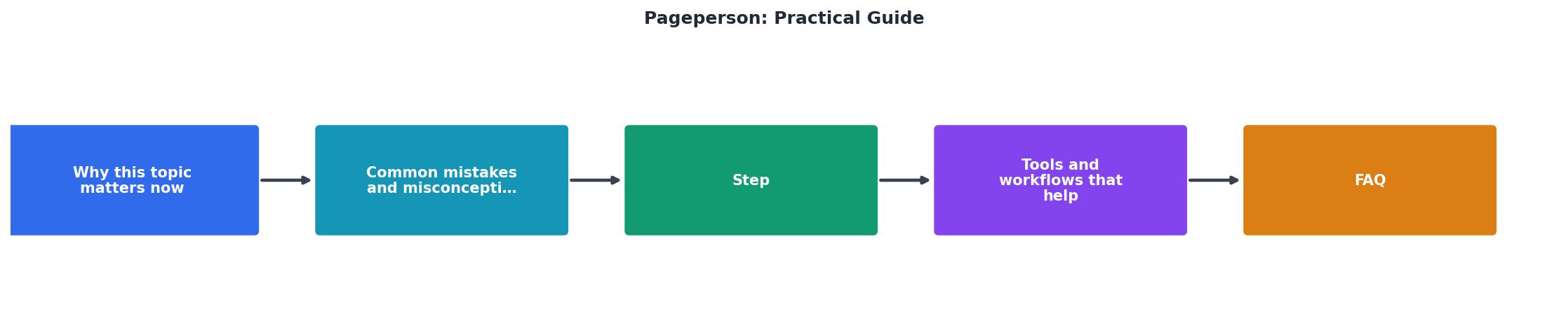
Here is the process broken into five concrete steps. Each one maps to the diagram above.
1. Install and open
Install the PagePerson Insights Chrome extension from the Chrome Web Store. Navigate to the page you want to audit. Click the extension icon in your toolbar. That is it. No account creation, no API key, no configuration file.
2. Scan the page
Hit the scan button. PagePerson analyzes the page content, layout structure, navigation patterns, and text complexity. The scan takes under 60 seconds for most pages.
3. Read the score
You get an overall cognitive accessibility score plus individual scores for categories like text readability, navigation clarity, CTA visibility, and information density. Each category includes a plain-language explanation of what the score means.
4. Prioritize fixes
Sort the flagged issues by page traffic and severity. A "high severity" issue on your top landing page goes first. A "medium severity" issue on a blog post from 2023 can wait.
5. Fix, re-scan, measure
Make the change. Re-scan the page to confirm the score improved. Then check your analytics over the next one to two weeks for conversion movement.
"The content of a website is often too long to be displayed at once.">, Pagination
That quote captures a core problem PagePerson flags constantly: pages that dump everything on the visitor at once. Breaking content into scannable sections, using progressive disclosure, and trimming redundant copy are three of the highest-impact fixes you can make.
Tools and workflows that help

PagePerson works best when it fits into your existing workflow rather than creating a new one. Here is how teams typically integrate it:
- Before launch: Scan every new landing page or feature page before it goes live. Add "PagePerson score above 70" as a launch checklist item.
- Monthly audit cycle: Pick the five highest-traffic pages each month. Scan them, log the scores in a spreadsheet, and assign fixes to the next sprint.
- Post-campaign review: After a paid campaign ends, scan the landing pages it drove traffic to. Compare the cognitive accessibility score against the campaign's conversion rate. You will see a pattern.
Pair with existing tools
PagePerson does not replace Google Analytics, Hotjar, or your A/B testing platform. It adds the why layer. Use this combination:
- Google Analytics tells you bounce rate and exit pages.
- Hotjar or FullStory shows scroll depth and rage clicks.
- PagePerson explains the cognitive reason behind those behaviors.
- Your A/B testing tool validates that the fix actually moves the metric.
Example: SaaS Landing Page Audit
In this example, CTA visibility and cognitive load are the two areas still dragging the overall score down. Those become the next sprint's priorities.
Real fixes that move the needle

Here are five concrete changes that consistently improve cognitive accessibility scores and conversion rates:
- Shorten headlines to eight words or fewer. A headline like "Our Revolutionary Platform Helps You Streamline Your Entire Workflow" becomes "Streamline Your Workflow." Fewer words, faster comprehension.
- Replace jargon with plain language. "Leverage our omnichannel solution" means nothing to a first-time visitor. "Reach customers on email, SMS, and social" does.
- Add whitespace between sections. Dense pages trigger cognitive overload. Increasing vertical spacing by even 20% can improve readability scores significantly.
- Make one CTA dominant per page. Three equally styled buttons ("Start Free Trial", "Book a Demo", "Watch Video") create decision paralysis. Pick one primary action.
- Use progressive disclosure for complex information. Pricing tiers, feature comparisons, and technical specs belong behind expandable sections, not in a single scrolling wall.
PagePerson Audit Checklist
Your progress is saved automatically in your browser.
FAQ
Frequently Asked Questions
Additional Resources
- Page - Abridged Guide to Evil Wikia - Fandom - The Page is an attendant-type Role. The Page is an attendant-type Role. she was proficient in combat and demonstrated priest related powers. the Aspect Incise.
- Pagination - The Practical Guide for Beginners - In this article, you will learn which aspects to take into account when creating a correct pagination. Pagination is the linking of online ...
- Your ultimate guide to hiring - Don't worry, you're not alone. Our comprehensive eBook, "Ultimate Guide to Hiring," provides practical tips and strategies to help you navigate the process.
Need Help with Accessibility?
Improve your site's accessibility and conversion rates with our AI-powered analysis.
Get Started