Checklist: cognitive load on pricing flows
Most visitors abandon pricing pages not because the price is wrong, but because they cannot understand what they're paying for. Confusing tier names, hidden fees, unclear value propositions, and wall-of-text comparisons force your audience to work too hard before deciding. When cognitive load spikes, conversion drops. This checklist cuts through the noise and gives you a step-by-step process to audit and fix pricing flows that leak money.

Photo by Tara Winstead from Pexels
Most visitors abandon pricing pages not because the price is wrong, but because they cannot understand what they're paying for. Confusing tier names, hidden fees, unclear value propositions, and wall-of-text comparisons force your audience to work too hard before deciding. When cognitive load spikes, conversion drops. This checklist cuts through the noise and gives you a step-by-step process to audit and fix pricing flows that leak money.
TL;DR:- Cognitive overload on pricing pages drives abandonment before visitors even see the price.
- Clear tier labels, progressive disclosure, and honest cost breakdowns reduce friction.
- Use this checklist to audit your pricing flow, identify barriers, and test fixes that convert.
Why pricing clarity matters now
Pricing pages are not just sales tools. They're a trust test. Visitors land on your pricing, and within seconds they make a decision: "Can I understand this quickly, or is this too much work?" If it's the latter, they leave.
The barrier is not always cost. It is comprehension. When your pricing table uses jargon, buries key features, or forces readers to cross-reference multiple columns, you add cognitive load. Cognitive load is mental friction. It makes thinking harder. On a pricing page, harder thinking means faster exits.
The stakes are real. A small improvement in clarity, removing one confusing term, reorganizing a table, simplifying a tier name, can move the needle on conversion. You don't need perfect design. You need clarity that works.
Common mistakes that create cognitive load

Most pricing page friction comes from predictable mistakes. Recognizing them is the first step to fixing them.
Tier names that confuse instead of clarify. Names like "Professional", "Enterprise", and "Elite" are generic. Visitors don't know which is for them. Better labels speak to job-to-be-done: "For Freelancers", "For Teams", "For Enterprises". Stripe does this. So does Notion. The tier name should answer a question, not just rank.
Feature tables that overwhelm. Thirty rows of features across four columns force readers to scan horizontally, compare vertically, and cross-reference constantly. Your brain gets tired. Cognitive load spikes. Most visitors will stop reading after row five. The key is progressive disclosure: show key features first, hide the rest behind a toggle or link.
Hidden or ambiguous pricing. "Contact us for pricing" on higher tiers sends an anxiety spike. Visitors assume worst-case cost and leave. Even a range ("$500–$2000/month") is better than nothing. Transparency reduces cognitive friction.
No clear answer to "What's included for the price?" Visitors need to know fast what each tier covers. If they have to hunt for it, they're gone. Use bullet lists, not prose. Use short sentences, not features buried in paragraphs.
Comparing yourself to competitors inline. "Unlike Tool X, we..." creates cognitive noise. Visitors are already thinking about your offer and three competitors. Don't make them hold another brand in mind. Focus on your value.
Too many tiers. Three tiers work. Four can work. Seven tiers? Visitors freeze. They don't know which to pick. Paradox of choice is real. Stick to three solid options and let visitors self-identify.
"The most effective forms use language that mirrors how users naturally think and speak about the information being requested.">, Few Guesses, More Success: 4 Principles to Reduce Cognitive Load in Forms
Step-by-step approach to fixing cognitive load

Fixing pricing-page cognitive load is not magic. It's systematic. Follow this process to audit, identify barriers, and test improvements.
Step 1: Audit your current pricing page
Print your pricing page or open it on a tablet. Spend five minutes scanning it as a first-time visitor would. Write down every moment you had to stop, re-read, or think hard. Those are your friction points.
Ask yourself:- Can I answer "Which tier is for me?" in under 10 seconds?
- Do all the tier names make sense to me, or do I have to think about them?
- Can I see the price clearly for each tier?
- Do I know what's included without clicking or scrolling?
- Are there terms or feature names I don't understand?
Step 2: Simplify tier names
Rename your tiers to speak to the audience, not rank them. Instead of "Starter/Professional/Enterprise", use "For Solo Creators", "For Small Teams", "For Growing Companies". Map each tier to a user type or company size.
If you sell to multiple personas (freelancers and agencies, for example), consider a toggle at the top: "Pricing for Freelancers" and "Pricing for Agencies". Show one pricing table at a time. This cuts cognitive load in half.
Step 3: Reorganize the feature table
Start with three columns: Tier Name, Price, Key Features. Move common features (support, storage, updates) to a secondary "What's Included" section below the main table. Feature tables should be scannable in under 15 seconds.
If you have many features, collapse the table. Show the three most important features per tier above the fold, then link to "View all features" for each tier. Visitors can drill down if they want, but the key choice-making features are visible immediately.
Step 4: Make pricing transparent and scannable
Display price prominently. If it's monthly, show it monthly. If annual with monthly equivalent, show both: "$120/month (billed annually at $1,440)". No surprises. No hidden tiers.
Use consistent formatting. If one tier shows "$99/month", all tiers should show the same format. If you have usage-based pricing, show a clear example: "Starts at $99/month. 10,000 events included. $0.05 per additional event."
Step 5: Test and iterate
Pick one change: simplify a tier name, reorganize the table, or add a pricing example. Test it for two weeks. Measure conversion. Did it improve or hurt? What did visitors say in support emails?
Small, iterative changes beat big redesigns. Each change reduces friction a bit more.

Process overview
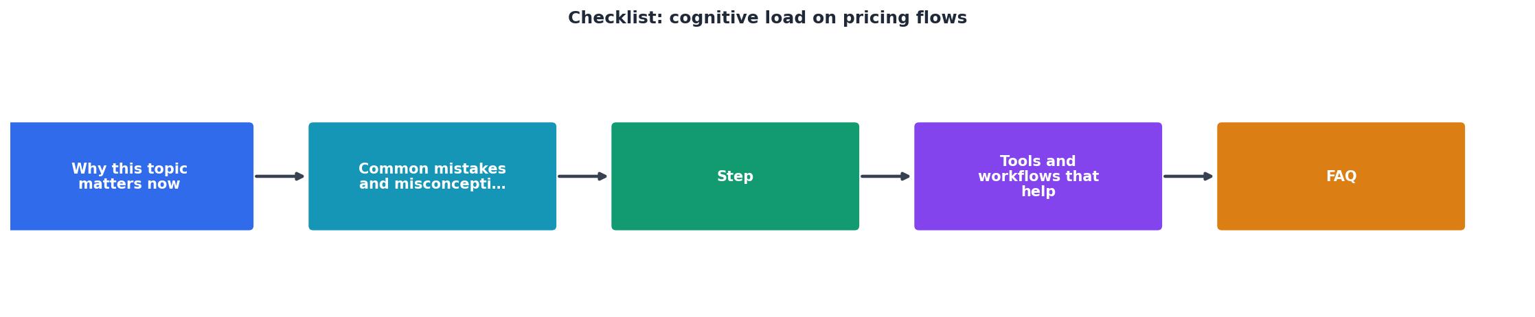
The core workflow is: audit, simplify, reorganize, test, repeat. Each cycle should take one to two weeks. You don't need to overhaul everything at once. Start with the highest-friction point and move forward.
Tools and workflows that help
Heatmaps and session recordings. Tools like Hotjar or Clarity show where visitors spend time on your pricing page and where they drop off. If 80% of visitors never scroll past the feature table, your table is probably too long or confusing.
User testing. Run a quick UserTesting session (30 minutes, $50). Ask: "Which tier is for a small team?" If more than one visitor picks the wrong tier, your tier names need work.
Analytics segmentation. Compare conversion rates by traffic source. If organic traffic converts at 2% but paid traffic converts at 0.5%, your pricing page may be confusing to new visitors unfamiliar with your product.
Competitor audit. Look at pricing pages from Stripe, Notion, Slack, and Zapier. Note which tier names, price formats, and feature lists feel clearest. Borrow the structure that works, not the words.
A/B testing. Pick one variable: tier names, feature list length, or price format. Split traffic 50/50. Run it for two weeks. Let data decide which version wins.
Building blocks for clearer pricing
A few concrete patterns work across most SaaS and DTC businesses:
Show three tiers. Not two, not five. Three. Left tier catches price-sensitive buyers. Middle tier (often the best value) is positioned as "most popular". Right tier for power users. Three is the sweet spot.
Highlight one tier as "recommended". Use a badge, background color, or slight size increase. This reduces decision paralysis. Visitors default to the recommended option.
Use job-to-be-done names. "For Consultants", "For Agencies", "For Enterprises". Not "Starter", "Pro", "Max".
Show real numbers. "$99/month" beats "Starting at $99/month". "Up to 100,000 API calls/month" beats "Unlimited API calls" (which often isn't).
Progressive disclosure for features. Show five key features per tier above the fold. Below, add a collapsible section: "See all features". Visitors can dig deeper if they want.
FAQ for pricing specifics. "Do I pay annually or monthly?" "Can I change tiers anytime?" "What happens if I exceed my limit?" Answer these once at the bottom so you don't repeat them in every tier description.
Interactive pricing clarity audit
Use this interactive tool to assess your current pricing page and get a baseline score before you start optimizing:
Pricing Page Clarity Audit
Honest assessment of your current pricing page is the foundation for improvement. This audit gives you a baseline. Compare yourself now against yourself in three weeks after you implement changes from this checklist.
Actionable checklist
Pricing Page Cognitive Load Audit & Fix
Your progress is saved automatically in your browser.
FAQ
Frequently Asked Questions
Pricing clarity is never finished. Markets change, competitors move, and your audience grows. Revisit this checklist every quarter. Each small improvement compounds into meaningful revenue gains. Start with the audit. Pick one change. Measure. Move forward.
Additional Resources
- 4 Principles to Reduce Cognitive Load in Forms - Four principles of form design — structure, transparency, clarity, and support — minimize users' cognitive load and improve usability.
- Cognitive load during planned and unplanned virtual ... - Cognitive load hampers individual task performance when information processing exceeds working memory capacity (Sweller, 2011).
- How Cognitive Load Shapes E-commerce Behavior - Cognitive Load Assessment Checklist: Count the number of decisions users must make in each purchase flow Identify information processing ...
Need Help with Accessibility?
Improve your site's accessibility and conversion rates with our AI-powered analysis.
Get Started