Checklist: cognitive load on signup flows
Most visitors abandon signup flows not because they're uninterested, but because the form demands too much cognitive effort at once. They're asked to make decisions they're unprepared for, remember rules they weren't told, or fill fields that feel unnecessary. Signup friction costs you conversions, and the root cause is rarely visible in heatmaps or funnel charts. This checklist gives you a step-by-step framework to audit your signup flow for cognitive overload, identify the exact friction points visitors experience, and fix them systematically.

Most visitors abandon signup flows not because they're uninterested, but because the form demands too much cognitive effort at once. They're asked to make decisions they're unprepared for, remember rules they weren't told, or fill fields that feel unnecessary. Signup friction costs you conversions, and the root cause is rarely visible in heatmaps or funnel charts. This checklist gives you a step-by-step framework to audit your signup flow for cognitive overload, identify the exact friction points visitors experience, and fix them systematically.

TL;DR
- Cognitive load in signup flows compounds: confusing copy, too many fields, unexplained requirements, and unclear next steps all add friction simultaneously.
- Most visitors don't fail to sign up because they lack motivation; they fail because they run out of mental energy mid-flow.
- 0%Visitors Struggling with Website Comprehension
- Audit your signup flow by testing it with a cold user, counting decision points and cognitive switches, and removing fields that don't directly convert.
- Use progressive disclosure (ask for the minimum first, ask for more later) and real-time validation to reduce uncertainty and rework.
Why cognitive load matters in signup
Your signup flow is the highest-stakes moment in the customer journey. Visitors have intent, they've decided to try your product, and now they're exhausted by your form. Every additional field, every unclear requirement, every unexplained decision rule burns through finite cognitive resources.
Cognitive load isn't just about how many fields you show. It's the cumulative mental effort to understand what you're asking, why you're asking it, whether the visitor is allowed to do it that way, and what happens next. A form that looks simple on the surface can be cognitively exhausting if the labels are vague, the validation rules are hidden, or the purpose is unclear. The visitor doesn't consciously think, "This is too much cognitive effort." They just close the tab.
By contrast, companies like Notion, Figma, and Slack have mastered signup flows that feel intuitive because they minimize decision points and explain rules upfront. This isn't accident. It's deliberate design that respects the visitor's mental budget.
Common mistakes and misconceptions
"More fields = better data." Teams often load signup with fields that feel nice-to-have (company size, industry, use case) or that the marketing team "wants to know." Each field adds friction. Cold visitors don't want to fill out a survey; they want to try the product. Collect minimum viable data now, ask for the rest after they've experienced value.
"Users understand our terminology." Your product language might be crystal clear to your team, but first-time visitors aren't steeped in your world. If you ask for a "workspace" name or request a "role designation," explain what those mean, or use plain language (e.g., "What do you call your team?" instead of "Enter your organizational role").
"Validation errors can wait until submit." Visitors make mistakes; so do forms. If someone enters an invalid password, a weak email, or a duplicate username, they discover it only after clicking submit. The error appears, they read it, they correct it, they resubmit. That's rework and frustration. Real-time validation (or at least inline validation) tells them immediately, before they leave the field.
"Progressive disclosure is for later." Teams delay explaining why they're asking for certain fields, assuming the visitor will understand as they go. In reality, ambiguity causes hesitation. A visitor who doesn't understand why you're asking for their phone number might skip it, trigger a validation error, or bounce entirely. Explain requirements upfront.
"The same flow works for everyone." Your signup flow is one size fits all, but visitors have different goals. A trial signup is different from a purchase signup. An invite-based signup is different from open signup. Conflating them under one flow creates unnecessary branches and decisions. Use conditional logic to show only what's relevant.
Step-by-step approach to audit cognitive load
Audit your current flow
Start by mapping your signup flow as it exists. Write down every step, every field, every decision point, and every validation rule. Don't interpret or defend it yet; just document what's there.

- How many fields are required before the visitor can submit?
- How many of those fields have validation rules the visitor might not know?
- How many fields require the visitor to make a decision (e.g., "What's your role?") before they can proceed?
- How many times does the visitor's context switch (e.g., "Enter your email" → "Choose a workspace name" → "Select your industry" → "Invite a team member")?
Test with a cold user
Pick someone outside your team who has never used your product. Watch them sign up and narrate their thought process. Don't help, don't explain, don't interrupt. Just observe.
Note the moments they pause, reread, or express confusion. When do they hesitate? Do they ask why you're asking for something? Do they make mistakes? Do they ask what a field means? Those moments reveal where cognitive load is highest.
Count decision points and field justifications
A decision point is anywhere the visitor must choose between options or provide custom input. The more decision points early in the flow, the higher the cognitive load.
For each field, ask: Is there a visible reason the visitor should fill this out? If you're asking for a company name, is it because they need it immediately, or because you want it for CRM? If the latter, ask for it later or make it optional. If it's optional, say so.
Remove fields that don't convert
Audit your form data. Which fields are most commonly skipped or left blank? Which fields do you actually use to deliver value or segment users? If a field is often blank or rarely used, remove it. Every field you keep is a field you're committed to defending; every field you remove is friction eliminated.
Check label clarity and inline help

For each field, the label should be a plain-English question or statement, not jargon. "Email address" is clear. "Primary contact vector" is not.
Add inline help (small text below the field or a tooltip) for fields that have non-obvious rules:- "Password must be at least 12 characters and include a number."
- "This will be your public profile URL."
- "We'll use this to send you updates; you can change it anytime."
Implement real-time validation and progressive disclosure
Real-time validation (checking as they type or after they leave a field) surfaces errors immediately, so the visitor can correct them before submitting. This reduces rework and frustration.
Progressive disclosure means you ask for the minimum required to create an account (email, password), then ask for the rest (name, team setup, preferences) after they've logged in. This moves friction to a moment when they're already invested and can see value.
The companies with onboarding worth studying, Notion, Figma, Slack, Loom, Airtable, share a pattern: simple, contextual, tightly matched to intent.
>, What Great Onboarding Flows Have in Common (and How to Build Them Faster)
Map the flow visually
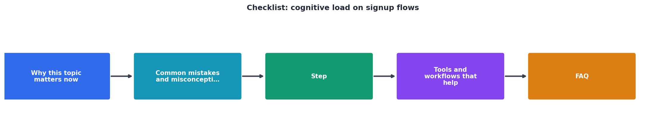
- Fields that appear after the visitor has already committed (sign up later).
- Conditional fields that only appear if the visitor selects a certain option (can be deferred or hidden).
- Repeated questions or context switches that could be consolidated.
Tools and workflows that help
Hotjar or Clarity, Record real users signing up and replay their sessions. Watch where they pause, hesitate, or give up. This shows you cognitive friction in action, not just completion rates.
Google Forms or Typeform, Test your signup flow with a small audience before rolling it out. Ask them to rate clarity, identify confusing fields, and flag unnecessary questions. Real feedback beats assumptions.
A/B testing framework, Test simpler flows against your current one. Reduce the number of fields, combine related fields, or move confirmation to after signup. Measure completion rate, time to convert, and error rate. Let data guide cuts.
Loom or similar, Record a cold user signing up and narrating. Share it with your team to build empathy for the friction they're creating.
Figma or wireframing tool, Mock up a redesigned flow before you build it. Make the cognitive structure visible. Get alignment with product and design before engineering starts.
Use PagePerson Insights to analyze your signup flow and detect comprehension barriers that visitors experience. The extension surfaces how real visitors perceive your form, which fields confuse them, and where they're most likely to abandon.
Visual reference: Cognitive load reduction dashboard
Understanding how your current signup performs is the first step. Here's an example dashboard showing the kinds of metrics to track as you reduce cognitive load:
Cognitive Load Reduction: Before vs. After
This example dashboard represents a typical SaaS product after applying cognitive load reduction techniques. The pattern is consistent: fewer fields, fewer decisions, faster completion, fewer errors, and happier users. Your numbers will vary, but the direction should be the same.
Practical artifact: Signup flow cognitive load audit checklist
Use this checklist to systematically audit your current signup flow and plan your redesign:
Cognitive Load Audit for Signup Flows
Your progress is saved automatically in your browser.
FAQ
Frequently Asked Questions
Reducing cognitive load in signup isn't about removing helpful information or being minimal for minimalism's sake. It's about respecting your visitor's mental budget and removing friction that has nothing to do with your product. Every field you cut, every rule you explain upfront, and every moment of confusion you prevent is a visitor who completes signup, sees value, and converts to customer.
Additional Resources
- What Great Onboarding Flows Have in Common (and How ... - Cognitive Load Users arrive in an unfamiliar environment already spending attention just to orient themselves. Long tours, stacked tooltips, ...
- Leonid Yuriev - Checklist for Reducing App Cognitive Load - Here's a checklist to help you … 1. Task Decomposition: ✅ 2. Cognitive Component Identification: Define the cognitive operations required for ...
- What Steps Should Your Signup and Onboarding Include ... - 70% of users abandon signup forms due to cognitive load. Cognitive Load Theory reveals that the human brain has finite capacity for processing ...
Need Help with Accessibility?
Improve your site's accessibility and conversion rates with our AI-powered analysis.
Get Started