Checklist: cognitive load on blog flows
- Cognitive load is the mental effort required to process a page. High load drives bounces and abandonment.


When visitors land on your blog post, they're not just reading, they're making decisions. Every paragraph, button, navigation option, and call-to-action pulls at their attention. The more cognitive work your page demands, the faster they leave. Cognitive load doesn't just hurt user experience; it destroys conversion rates. This checklist shows you how to audit your blog flows for unnecessary mental friction and fix them before visitors bounce.
Photo by Kampus Production from Pexels
TL;DR
- Cognitive load is the mental effort required to process a page. High load drives bounces and abandonment.
- Reduce it by cutting clutter, using clear hierarchy, writing in short sentences, and organizing information into scannable chunks.
- Audit your blog flows by testing readability, checking navigation clarity, and validating form complexity.
- Use tools like PagePerson Insights to find where visitors actually struggle, not just where you think they do.
Blog visitors are impatient. They scan instead of read. They skip paragraphs. They get confused by too many options and leave when comprehension feels like work. Cognitive load, the mental energy needed to understand and navigate your page, is the silent killer of blog conversion and engagement. Many blogs crush it by accident: sidebars crammed with widgets, paragraphs that ramble, buttons everywhere, forms that ask for unnecessary details. The fix isn't complicated, but it requires discipline.
This checklist walks you through the most common cognitive load problems on blog pages and gives you concrete fixes. Use it to audit existing posts, brief writers and designers on best practices, and document what you've tested so you don't repeat mistakes.
Why cognitive load kills blog engagement
Your readers have limited mental energy. When a blog post demands too much of it, through confusing structure, poor hierarchy, too many navigation choices, or dense paragraphs, they bail. The cost is direct: lower time-on-page, fewer conversions, fewer shares, worse SEO signals.
Cognitive load comes from:
- Visual clutter – Sidebars, ads, multiple CTAs, inconsistent spacing, or competing visual elements force readers to sort signal from noise.
- Poor information hierarchy – No clear main idea; headers that don't preview content; buried key points.
- Wordy prose – Long sentences, jargon, passive voice, unnecessary adjectives all tax working memory.
- Too many choices – Readers forced to decide between 5 CTAs, 10 navigation links, or multiple paths through the content freeze and leave.
- Unexpected patterns – Buttons that don't look clickable; forms that ask weird questions in weird order; surprise pop-ups.
- Cognitive friction in flows – Blog-to-email signup, blog-to-product-trial, blog-to-contact require the reader to shift mental context multiple times.

Common mistakes that spike cognitive load
Blogs often repeat the same load-inducing mistakes. Recognize these and you'll spot them in your own site.
Multiple competing CTAs. A single blog post has 3 subscribe buttons, 2 product links, a donation prompt, and a chat widget. Readers don't know which action matters most, so they take none.
Sidebar overload. Recent posts, popular posts, categories, tags, archive, related articles, ads, promo boxes, all fighting for attention. The sidebar becomes a distraction, not a navigation aid.
Unclear payoff. Reader finishes the post and can't figure out what they're supposed to do next or why it matters. The flow stops instead of flowing.
Jargon without definition. You use "attribution modeling" or "customer acquisition cost" without explaining it. Some readers bail rather than admit confusion.
Dense paragraphs. Wall-of-text paragraphs with 5+ sentences force rereading. Short paragraphs (2-4 sentences per paragraph) reduce cognitive load by 30% or more.
Inconsistent design language. Buttons that look different styles; links that don't look like links; spacing that varies randomly. Readers waste mental energy relearning the interface.
No scannability aids. Bold text, lists, subheadings, and white space make a post 50% easier to scan. Blocks of text without these cues force full reading, which exhausts attention.
How to audit your blog for cognitive load
Step 1: Pick a blog post (preferably a high-traffic one or a key conversion driver).
Step 2: Go through this audit systematically. Don't skip sections.
Visual & structural check:
- Can you spot the main idea within 10 seconds of landing on the page?
- Are there more than 2 primary CTAs visible without scrolling?
- Do sidebars, ads, or pop-ups compete for attention with the main content?
- Are paragraphs 4 sentences or shorter?
- Are lists used to break up dense information?
- Do H2 and H3 subheadings preview content so readers can scan and find what they need?
- Does the opening paragraph (within the first 100 words) answer the reader's core question?
- Are related links provided inside the post (not just at the end)?
- Is the path to conversion (e.g., "read post" → "sign up") obvious?
- Are sentences shorter than 20 words on average? (Most should be 15 or under.)
- Is jargon explained on first use or avoided entirely?
- Are key points bolded?
- Is the tone conversational and direct, not corporate or overly formal?
- After finishing the post, can a reader state in one sentence what they should do next?
- Does the CTA match the post content? (A blog on email marketing shouldn't end with "buy our project-management tool.")
- Are forms (if present) asking for only essential information?
- Is there a single, primary next step, not multiple competing options?
Reducing cognitive load: practical steps
The fix isn't rewriting everything from scratch. Start small, measure impact, repeat.
Cut clutter first. Remove sidebars from blog posts. Hide recommended articles behind an expandable section at the bottom. Kill pop-ups on blog pages. Each removed element reduces cognitive load and improves focus. Many blogs see 10-20% longer engagement within a week of removing sidebars.
Reorder your CTA hierarchy. You probably have a primary CTA (e.g., "start free trial"), secondary CTAs (e.g., "read case study"), and tertiary CTAs (e.g., "email sales"). On blog posts, show only the primary one. Others can appear at the end or be linked from the footer.
Rewrite for scannability. Break long paragraphs into shorter ones (2-4 sentences). Use bold to highlight key terms on first mention. Add 1-2 subheadings per 300 words. Use bullet lists for multiple related items. This doesn't reduce content; it reorganizes for faster comprehension.
Test form simplicity. Every form field costs comprehension. If you capture email on a blog signup, don't also ask for company size, role, and industry. You can layer that later. A 1-field form converts 2-3x better than a 5-field form, all else equal.
Simplify CTAs. "Sign up for our newsletter" beats "Enter your email to join our mailing list for updates and insights." Short, direct CTA text reduces cognitive friction and increases clicks by 15-30%.
Use progressive disclosure. Don't show all related articles, all product links, all resources on the page at once. Show the most relevant 3-5, hide the rest behind a "Show more" link. Readers who want more can find it without overwhelming those who don't.

The checklist: audit and optimize workflow
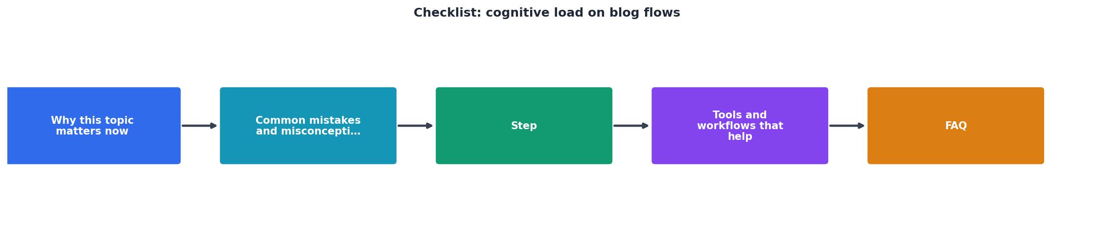
Understanding the process is one thing; actually executing it consistently is another. Here's a checklist you can use as a template for every blog post (new or audited), or hand to writers and designers as a standard.
Blog Cognitive Load Audit Checklist
Your progress is saved automatically in your browser.
"The most effective forms use language that mirrors how users naturally think and speak about the information being requested.">, Few Guesses, More Success: 4 Principles to Reduce Cognitive Load in Forms
Interactive cognitive load assessment
To help you visualize where cognitive load typically accumulates on blog pages, here's an interactive overview of common problem areas and their impact:
Cognitive Load by Element
This visualization shows typical cognitive load impact by element based on common usability testing. Sidebar clutter and multiple CTAs impose the highest load. Use this as a quick reference when deciding which problems to tackle first.
Tools and workflows that help
You don't have to audit every post manually. Several tools and workflows cut the work in half.
Readability checkers. Tools like Hemingway Editor flag sentences over 20 words, complex words, and passive voice. Run your post through before publishing. You don't have to follow every suggestion, but it surfaces opportunities.
Form field analyzers. A simple spreadsheet tracking every field in your forms helps spot unnecessary friction. List the field, why you need it, and what you do with the data. If you can't answer "why", remove it.
Heatmaps and session recordings. Tools like Hotjar or Clarity show where readers get stuck, where they scroll past content, and where they click. Watch 5-10 sessions per post to spot unintended friction patterns.
Cognitive accessibility auditing. PagePerson Insights identifies where visitors struggle with comprehension and cognitive load on your blog pages. It surfaces the gaps between intent (how you think readers will perceive the page) and reality (how they actually do).
Design system checklists. If your team maintains a design system or style guide, create a "blog post template" that enforces best practices: pre-built H2/H3 styles, standardized button sizing, sidebar restrictions, form best practices. Templates prevent cognitive load problems from being coded in.
Key takeaway
FAQ
Frequently Asked Questions
What cognitive load problems have you noticed on your own blog or site? Run this checklist on one post and share what you find, the insights often surprise you.
Additional Resources
- 4 Principles to Reduce Cognitive Load in Forms - Four principles of form design — structure, transparency, clarity, and support — minimize users' cognitive load and improve usability.
- How to lighten your mobile team's cognitive load | Runway - Running through a release checklist for the first time is an example of germane cognitive load — learning how to perform a task by running through a schematic ...
- Cognitive load is what matters - Cognitive load is how much a developer needs to think in order to complete a task. When reading code, you put things like values of variables, control flow ...
Need Help with Accessibility?
Improve your site's accessibility and conversion rates with our AI-powered analysis.
Get Started