Pages people: Practical Guide
Every page on your website was built by a person, for a person, yet most teams treat pages as containers for keywords and buttons instead of conversations with real humans. The gap between what your team understands and what a first-time visitor comprehends is where conversions die. This guide gives you a concrete, step-by-step method to audit your pages through the lens of the people who actually use them and fix the friction that analytics alone cannot explain.

Every page on your website was built by a person, for a person, yet most teams treat pages as containers for keywords and buttons instead of conversations with real humans. The gap between what your team understands and what a first-time visitor comprehends is where conversions die. This guide gives you a concrete, step-by-step method to audit your pages through the lens of the people who actually use them and fix the friction that analytics alone cannot explain.

TL;DR:
- Your pages exist for people with limited attention, varying literacy, and zero context about your product.
- Audit every key page for cognitive load, reading level, and action clarity before touching design or copy.
- Use a repeatable five-step process: identify pages, profile visitors, measure comprehension, fix barriers, and verify improvements.
Why page-level people focus matters
Most conversion optimization starts with funnels and ends with button colors. That skips the actual problem. A visitor lands on your pricing page, reads three sentences, and leaves. The funnel tells you they left. A heatmap tells you they scrolled 40% down. Neither tells you they could not figure out what "per seat" means or that the comparison table triggered decision paralysis.
That number is not a guess. Cognitive accessibility research consistently shows that a significant portion of any general audience faces barriers like ADHD, anxiety, dyslexia, low digital literacy, or simple fatigue. When you optimize pages for these people, everyone else benefits too.
Clarity fixes routinely outperform design changes. Rewriting a confusing headline, removing jargon from a CTA, or breaking a wall of text into scannable chunks can move conversion rates more than any A/B test on button placement.
"In Listening to People, Lareau provides insight into the practicalities of interview-based research and participation observation.">, Listening to People: A Practical Guide to Interviewing, Participant Observation,
The takeaway: stop guessing what visitors think. Start observing how they actually process your pages.
Common mistakes that cost conversions

Three mistakes show up on almost every site I review:
- Writing for yourself, not the visitor. Your team lives inside the product daily. You know what "workspace" means in your context. A new visitor does not. Internal vocabulary leaks into headlines, navigation labels, and CTAs constantly.
- Treating all pages equally. A blog post and a pricing page serve completely different cognitive tasks. The blog post needs scannable structure. The pricing page needs comparison clarity and decision support. Applying the same template to both ignores how people actually read.
- Ignoring reading level. The average adult in the US reads at a 7th-to-8th-grade level. Most SaaS landing pages are written at a college level. That mismatch is invisible in analytics but devastating for comprehension.
- Too many choices on one page. Three plans are manageable. Seven plans with add-ons and toggles create decision fatigue.
- Buried actions. If the primary CTA sits below three paragraphs of feature descriptions, visitors who skim (which is most of them) never see it.
- No visual hierarchy. When everything is bold, nothing is bold. When every section has the same weight, the eye has no path to follow.
Five-step page-people audit
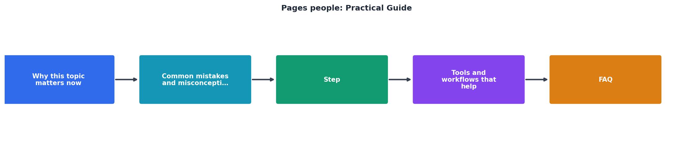
Here is the process, broken into steps you can run in a single afternoon for your top five pages.
Step 1: Identify high-impact pages
Pull your analytics. Sort pages by traffic volume and conversion importance. Your homepage, main landing page, pricing page, signup page, and top blog post are almost always the starting five. Do not try to audit everything at once.
Step 2: Profile your actual visitors
Who lands on each page? A paid ad visitor on your landing page has different context than an organic search visitor on a blog post. Write a one-sentence visitor profile for each page: "First-time visitor from a Google ad for project management tools, comparing three options, has five minutes."
Step 3: Measure comprehension
Read each page as if you have never seen the product. Better yet, ask someone outside your company to read it and tell you:
- What does this company do?
- What is the main action I should take?
- What does this cost?
Step 4: Fix barriers
Prioritize fixes by impact. A confusing headline on a high-traffic page matters more than a suboptimal image on a low-traffic blog post. Common fixes include:
- Rewrite headlines to state the benefit, not the feature
- Replace jargon with plain language
- Add white space between sections
- Reduce the number of choices per page
- Move the primary CTA above the fold
Step 5: Verify improvements
After changes go live, track the same metrics for at least two weeks. Compare bounce rate, time on page, and conversion rate. If comprehension improved, you will see longer engagement and higher conversion from the same traffic.
Tools and workflows that help

You do not need an expensive research lab. Here is a practical toolkit:
- Readability checkers like Hemingway Editor score your text by grade level. Aim for grade 6-8 for landing pages.
- Session replay tools (Hotjar, FullStory) show where visitors hesitate, re-read, or rage-click.
- PagePerson Insights analyzes cognitive accessibility barriers directly on any page, showing you what real visitors struggle with and what to fix.
- Five-second tests (UsabilityHub) confirm whether visitors understand your page's purpose at a glance.
- Plain language guidelines from plainlanguage.gov give you concrete rewriting rules.
| Manual Audit | Tool-Assisted Audit |
|---|---|
| 2-3 hours per page | 15-30 minutes per page |
| Subjective findings | Data-backed findings |
| Hard to repeat consistently | Repeatable across pages |
| Requires UX expertise | Accessible to non-designers |
A good workflow looks like this: run a tool-assisted scan first to flag the obvious issues, then do a manual read-through for nuance. Fix the tool-flagged items, then re-scan to confirm.
Build pages around people

The shift from "pages as containers" to "pages as conversations" changes how you approach every part of your site. Here are the principles that make it stick:
One page, one job. Every page should have a single primary purpose. If your pricing page also tries to explain features, onboard new users, and collect email signups, it does none of those well.
Front-load the answer. Visitors arrive with a question. Your page should answer it in the first visible section. Details, social proof, and secondary information come after.
Design for scanning. Bold key terms. Use short paragraphs. Break lists into bullets. Add descriptive subheadings every 150-200 words. Most visitors scan before they read, and many never read at all.
Test with outsiders. Your team cannot objectively evaluate your own pages. A five-minute test with someone unfamiliar with your product reveals more than a week of internal review.
Here is an example dashboard showing what a typical page-people audit might reveal for a SaaS landing page:
Example: SaaS Landing Page Audit
Your page-people audit checklist
Page-People Audit Checklist
Your progress is saved automatically in your browser.
FAQ
Frequently Asked Questions
Additional Resources
- Listening to People - A down-to-earth, practical guide for interview and participant observation and analysis. This book will help you: Understand the importance of talking to ...
- Managing People: A Practical Guide for Line Managers - It covers performance management, the development and reward of employees, health and safety, and welfare matters.
- a practical guide to interviewing, participant observation, data ... - ; Listening to people : a practical guide to interviewing, participant observation, data analysis, and writing it all up · Tools · Details · Virtual Browse.
Need Help with Accessibility?
Improve your site's accessibility and conversion rates with our AI-powered analysis.
Get Started