Persons website: Practical Guide
Most personal websites fail at the one job they exist to do: communicate clearly to a first-time visitor. You spend weeks picking fonts and writing copy that makes perfect sense to you, then watch bounce rates climb because real people cannot figure out what you offer or where to click next. This guide walks through the exact steps to build a personal website that visitors actually understand, trust, and convert on.

Most personal websites fail at the one job they exist to do: communicate clearly to a first-time visitor. You spend weeks picking fonts and writing copy that makes perfect sense to you, then watch bounce rates climb because real people cannot figure out what you offer or where to click next. This guide walks through the exact steps to build a personal website that visitors actually understand, trust, and convert on.

- A personal website needs to answer "who is this person and what do they offer" within five seconds of landing.
- Most conversion problems come from cognitive overload, not bad design aesthetics.
- Follow a structured audit-fix-test loop to turn a confusing personal site into one that converts visitors into clients, subscribers, or collaborators.
Why personal websites still matter
Social media profiles come and go. Algorithms change overnight. A personal website is the one digital property you fully control. It is your pitch, your portfolio, and your storefront rolled into one URL.
Yet the bar for "good enough" keeps rising. Visitors in 2026 expect instant clarity. They scan, they do not read. If your headline is vague or your navigation buries the important stuff, they leave. The cost is not just a lost pageview. It is a lost lead, a lost sale, a lost opportunity you never even knew about.
That number is not about slow load times. It is about cognitive friction: the mental effort required to understand what a page is saying and what to do next. Personal websites are especially vulnerable because the creator is too close to the content to see the confusion.
Common mistakes that kill conversions

Here are the patterns I see over and over on personal websites that underperform:
- Hero section that talks about you, not the visitor. "I'm a passionate creative with 10 years of experience" tells the visitor nothing about what they get. Flip it: "I help SaaS startups turn landing pages into signup machines."
- Too many navigation items. Seven or more top-level links create decision paralysis. Three to five is the sweet spot.
- No clear call to action above the fold. If a visitor has to scroll to find out what to do next, most will not bother.
- Wall-of-text about pages. Long paragraphs with no subheadings, no bold terms, no visual breaks. Visitors scan. Give them scannable content.
- Ignoring cognitive accessibility. Fancy animations, low-contrast text, and jargon-heavy copy exclude visitors with ADHD, dyslexia, anxiety, or low digital literacy. That is not a niche group. It is a significant chunk of your audience.
Step-by-step approach
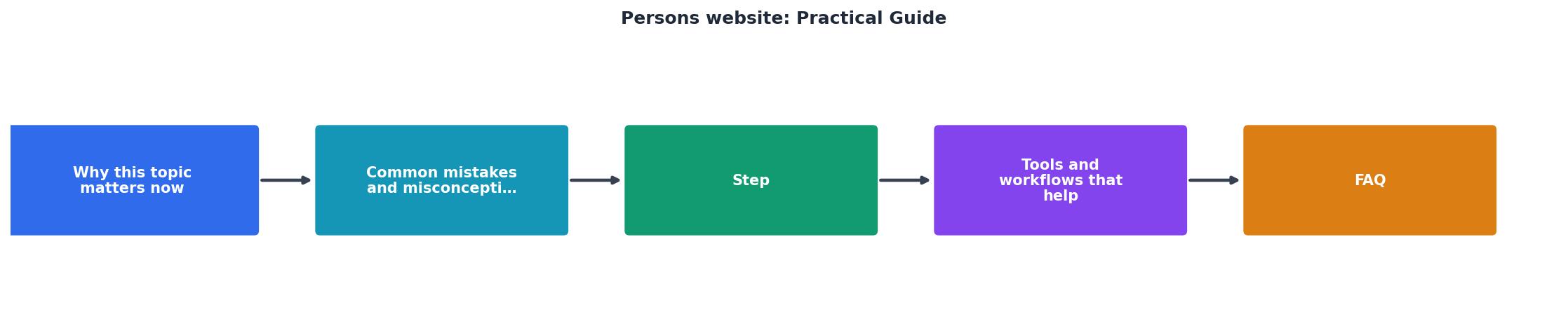
The diagram above shows the core loop: Audit → Prioritize → Fix → Test → Repeat. Here is what each step looks like in practice.
Audit your current site
Open your personal website in an incognito browser window. Better yet, hand your phone to someone who has never seen it. Ask them two questions:
- What does this person do?
- What should you click first?
Prioritize by impact
Not every issue is equal. Rank fixes by how many visitors they affect and how close they are to a conversion point. A confusing headline on your homepage matters more than a typo on your blog's archive page.
Use this simple scoring:
- High impact: Above-the-fold content, primary CTA, navigation structure
- Medium impact: Service/product pages, about page first paragraph, contact form
- Low impact: Blog post formatting, footer links, social icons
Fix with clarity in mind
Every change should reduce the mental effort a visitor needs. Shorter sentences. Fewer choices. Bolder hierarchy. Specific language instead of abstract claims.
| Before | After |
|---|---|
| "I offer a wide range of services" | "I design landing pages for B2B SaaS" |
| "Get in touch" (buried in footer) | "Book a free 15-min call" (sticky header button) |
| Seven navigation links | Four: Work, About, Blog, Contact |
Test and measure
Track two things after each round of changes:
- Bounce rate on key pages. A drop means visitors are finding what they need.
- CTA click-through rate. An increase means your call to action is clearer.
Tools and workflows that help

You do not need a big budget. Here is a practical toolkit:
- Google Analytics 4 for bounce rate and event tracking. Free.
- Microsoft Clarity for session recordings and heatmaps. Free.
- PagePerson Insights for cognitive accessibility audits. It flags the specific comprehension barriers that analytics tools miss.
- Hemingway Editor for simplifying your copy. Aim for grade 8 readability or lower.
- Squoosh or TinyPNG for image compression. Faster pages reduce cognitive load because visitors are not waiting and losing context.
- Monday: Review last week's analytics. Spot the page with the highest bounce rate.
- Tuesday: Run a cognitive accessibility scan on that page.
- Wednesday-Thursday: Implement the top three fixes.
- Friday: Push changes live. Set a reminder to check results next Monday.
Monthly Audit Snapshot (Example)
Measure what actually matters

Vanity metrics like total pageviews or follower counts tell you almost nothing about whether your personal website is doing its job. Focus on these instead:
- Conversion rate on your primary CTA. Whether that is "Book a call," "Download the guide," or "Buy now," this is the number that pays the bills.
- Bounce rate on landing pages. High bounce plus low time-on-page signals a clarity problem.
- Scroll depth. If visitors stop scrolling before they reach your CTA, the content above it is either too long or not compelling enough.
- Return visitor rate. People coming back means your content is worth revisiting. That is trust.
Personal Website Clarity Checklist
Your progress is saved automatically in your browser.
FAQ
Frequently Asked Questions
What is the one change on your personal website you have been putting off that you know would make things clearer for visitors?
Most personal websites fail at the one job they exist to do: communicate clearly to a first-time visitor. You spend weeks picking fonts and writing copy that makes perfect sense to you, then watch bounce rates climb because real people cannot figure out what you offer or what to do next. This guide walks through the exact steps to build a personal website that converts visitors into leads, customers, or subscribers by removing the cognitive barriers that drive them away.

- A personal website needs a single, unmistakable value proposition visible within 3 seconds of landing.
- Cognitive accessibility (clear language, predictable layout, minimal decision points) directly increases conversion rates.
- Follow the five-step process below: audit, simplify, structure, test, iterate.
Why personal websites still lose visitors
Your analytics dashboard shows traffic arriving and leaving. Heatmaps show where people click. Neither tells you why someone read your headline, got confused, and closed the tab. The gap between "people visit" and "people act" is almost always a comprehension problem, not a design problem.
That number is not hypothetical. Cognitive load, unclear navigation, and ambiguous calls to action create friction for a huge slice of your audience. People with ADHD, anxiety, dyslexia, or simply low familiarity with your niche hit these walls first, but they are not the only ones. Tired visitors, distracted mobile users, and anyone scanning between ten browser tabs will bounce for the same reasons.
The cost is direct. Every visitor who leaves confused is paid traffic wasted, a potential client lost, or a referral that never happens. Fixing comprehension issues on a personal website does not require a redesign. It requires a structured audit and targeted changes.

Common mistakes that kill clarity
Mistake 1: The "about me" wall of text. Visitors do not arrive wanting your biography. They arrive wanting to know if you can solve their problem. Leading with a 400-word personal story pushes the value proposition below the fold.
Mistake 2: Too many navigation options. Seven top-level menu items plus a hamburger menu plus footer links plus sidebar widgets. Each additional choice increases cognitive load. Research on decision fatigue shows that more options lead to fewer decisions.
Mistake 3: Jargon-heavy copy. You know what "full-stack growth consulting" means. Your visitor might not. Industry shorthand creates a comprehension barrier that feels invisible to the person who wrote it.
Mistake 4: Inconsistent visual hierarchy. When headings, buttons, and links all compete for attention, nothing wins. The visitor's eye bounces around the page without a clear path forward.
Step-by-step approach
This five-step process takes a personal website from confusing to converting. Each step builds on the previous one.
Step 1: Audit
Open your website in an incognito browser window. Set a 5-second timer. When it rings, write down what you understood. If you cannot articulate the value proposition, neither can your visitors. Check every page for:
- A single, clear headline that states what you do and for whom
- One primary call to action per page
- Reading level at or below grade 8 (use Hemingway Editor or similar)
- Navigation with no more than 5 top-level items
Step 2: Simplify
Cut everything that does not serve the visitor's immediate question. Remove sidebar widgets, reduce footer links, and consolidate pages. A personal website with 4 focused pages outperforms one with 12 thin pages every time.
- Merge "About" and "Story" into one page
- Combine "Services" and "Pricing" if they overlap
- Delete any page that has not been updated in 6 months
Step 3: Structure
Organize each page around one question the visitor is asking. Your homepage answers "What do you do?" Your services page answers "How can you help me?" Your contact page answers "How do I reach you?"
Use progressive disclosure: show the essential information first, then let visitors click to expand details. This reduces cognitive load without hiding important content.
Step 4: Test
Run your updated pages through a cognitive accessibility check. Tools like PagePerson Insights can surface specific comprehension barriers that manual review misses. Pay attention to:
- Sentence complexity scores
- Navigation predictability
- Call-to-action clarity
- Content density per section
Step 5: Iterate
Fix the highest-impact issues first. Retest. Compare conversion rates before and after. A single round of cognitive accessibility improvements typically moves the needle within two weeks.

Tools and workflows that help
You do not need an expensive agency to fix a personal website. A focused toolkit gets the job done.
Content readability: Hemingway Editor (free) flags complex sentences and passive voice. Aim for grade 6-8 reading level on every page.
Navigation testing: TreeJack by Optimal Workshop lets you test your site structure with real users before building it. Five participants are enough to spot major issues.
Cognitive accessibility analysis: PagePerson Insights runs directly in Chrome and highlights where visitors with different cognitive profiles will struggle. It goes beyond standard WCAG checks into comprehension and cognitive load territory.
Performance: Google PageSpeed Insights catches slow-loading elements that add to perceived complexity. A page that takes 4 seconds to load feels broken, and a confused visitor will not wait.
Analytics: Google Analytics 4 with scroll depth tracking shows exactly where visitors stop reading. Pair this with your cognitive audit to understand not just where but why they drop off.
Here is an example dashboard showing what a typical personal website audit might reveal:
Example: Personal Website Audit Results

Measure what actually changed
After implementing fixes, track three numbers:
- Bounce rate on key pages (should decrease)
- Time on page (should increase slightly, not dramatically)
- Conversion rate on your primary CTA (signups, contact form submissions, purchases)
Do not chase vanity metrics. A personal website that converts 3% of visitors into leads is worth more than one that gets 10x the traffic but converts 0.2%.
Personal Website Cognitive Clarity Checklist
Your progress is saved automatically in your browser.
FAQ
Frequently Asked Questions
Additional Resources
- Missing Persons Guide: A practical guide to searching for a ... - What to do immediately. Someone you know is missing. Time is of the essence and efficiency is crucial. Here are some things to do right now.
- Practical Guide on identification of victims and persons at ... - The Guide provides simple guidelines on the screening and identification of trafficked victims and at-risk persons, including specific ...
- The Practical Guide to People-friendly Documentation - This innovative, best-selling guide has been thoroughly revised to bring together practical solutions to the documentation challenges faced by today's ...
Need Help with Accessibility?
Improve your site's accessibility and conversion rates with our AI-powered analysis.
Get Started